- Sales Content Management
- Buyer Engagement
- Sales Training & Effectiveness
- Data-Driven Sales
- Content Personalization
- Sales Presentations
- Content Sharing & Tracking
- Digital Sales Room
- Sales Content Analytics
- Integrations
- Smart Sales Tools
- For Marketers
- For Sales Teams & Dealers
- For Business Leaders
- Customer Stories
- Sales Enablement
- Revenue Enablement
- Help Center
- Learning Management System

10 Most Loved Features – Presented by the Showell Team
- For Leaders

Showell’s Digital Sales Room: Branding Made Easy


9 Steps For An Effective Sales Presentation + 6 Examples
As a sales professional, you're constantly seeking ways to create presentations that not only engage your audience but also close deals. While templates can streamline this process, understanding the fundamental principles behind effective presentations is crucial for truly mastering the art of the pitch.
But what exactly makes a sales presentation effective, and how can you create one that resonates with your prospects?
In this guide, we'll walk you through the key elements of an effective sales presentation and provide you with a step-by-step approach to crafting presentations that convert.
We've also included various presentation formats you can use for your next meeting, along with tools to help you create and deliver impactful presentations.
What you'll find in this blog:
What Makes For an Effective Sales Presentation
Understanding these fundamental components is crucial because they form the foundation of any successful sales presentation.
Nowadays, your prospects are bombarded with sales pitches daily. You need to stand out. By mastering these core elements, you'll be able to craft presentations that not only capture attention but also drive action.
Whether you're aiming to increase your close rate, shorten your sales cycle, or simply make a lasting impression, these key components will give you the edge you need.
1. Clear and compelling value proposition
Your presentation should clearly communicate how your product or service solves your prospect's problems or meets their needs.
Many sales presentations fail because they focus too much on features rather than benefits. This leaves prospects wondering, "So what? How does this help me?"
A clear value proposition addresses this by explicitly connecting your offering to the prospect's needs, making the relevance and importance of your solution immediately apparent.
2. Understanding the audience's needs and pain points
Generic, one-size-fits-all presentations often fall flat because they don't resonate with the specific audience. Prospects may feel that you don't truly understand their unique situation or industry.
That’s why personalization is key here. Your presentation should demonstrate that you understand your prospect's specific challenges and goals.
Not only that, tailoring your presentation shows that you've done your homework and are offering a solution that's relevant to them specifically.
3. Engaging storytelling and visual elements
Dry, fact-heavy presentations can be boring and forgettable! They often fail to create an emotional connection or leave a lasting impression. A great presentation tells a story that resonates with your audience, supported by visuals that enhance understanding and retention.
Storytelling and effective visuals make for a presentation that's more engaging and memorable. This helps overcome information overload and helps your key points stick in the minds of your prospects.
4. Strong call-to-action (CTA)
Many presentations end on a weak note, leaving prospects unsure about what to do next. This can result in lost momentum and missed opportunities.
Your presentation should guide your prospect towards a clear next step, whether that's scheduling a demo, starting a trial, or making a purchase. A strong CTA solves this by providing clear direction, reducing decision paralysis, and helping to move the sales process forward.
Now that we've got all that covered, let's get into the nitty-gritty of creating an effective sales presentation.
/sales-presentation.png?width=1000&height=801&name=sales-presentation.png)
9 Steps to Follow For An Effective Sales Presentation
Creating an effective sales presentation isn't just about having great content; it's about structuring and delivering that content in a way that resonates with your audience and drives them to action.
Here are nine steps to help you craft and deliver presentations that convert:
Step 1: Research your audience thoroughly
Many salespeople rely on generic presentations or make assumptions about their prospects based on limited information.
Before you even open your presentation software, you need to know who you're presenting to.
Dive deep into your prospect's industry, company, and specific challenges. Use tools like LinkedIn, company websites, and industry reports to gather insights.
In addition to that, conducting a thorough customer needs analysis will help you better tailor your presentation to their needs .
This eliminates irrelevance or misaligned presentations. By thoroughly researching your audience, you can create a presentation that speaks directly to their needs, challenges, and goals, increasing engagement and the likelihood of a positive response.
Step 2: Craft a compelling opening
Many presentations start with company history or a long-winded introduction that fails to capture attention.
Gong even reported that starting off with "Did I catch you at a bad time?" decreases your chances of booking a meeting by 40%.
You've got about 30 seconds to grab your audience's attention. Start with a bang by using a surprising statistic, a thought-provoking question, or a brief story that highlights the problem you're solving.
A compelling opening hooks your audience from the start , making them more likely to pay attention to the rest of your presentation.
Step 3: Clearly articulate your value proposition
Don't make your audience guess why they should care about your product or service. Spell it out for them in clear, benefit-driven language. Focus on the outcomes you can deliver, not just features.
This solves the problem of prospects not understanding the relevance or value of your offering. By clearly articulating your value proposition, you make it easy for prospects to see how your product or service will benefit them specifically.
Step 4: Personalize Your Sales Presentation
Use the insights you gathered in step 1 to tailor your presentation to your audience. Reference their specific industry challenges, use their company's name and logo, and even mention key decision-makers by name if appropriate.
This level of personalization shows that you've done your homework and truly understand their needs.
You don’t want your prospects feeling like they're getting a generic, one-size-fits-all solution. Personalization demonstrates that you understand their unique challenges and are offering a tailored solution.
Step 5: Use storytelling to engage your audience
Humans are wired for stories. Use case studies or customer success stories to illustrate how your solution works in real-world scenarios.
Structure your story with a clear beginning (the challenge), middle (the solution), and end (the results). This approach makes your presentation more memorable and relatable.
Storytelling prevents your presentations from being dry and forgettable. It helps your audience visualize how your solution could work for them, making your presentation more engaging and memorable.
/seller-and-buyer-enablement.png?width=1000&height=600&name=seller-and-buyer-enablement.png)
Step 6: Include Social Proof and Testimonials
Many companies rely solely on their own claims about their product or service, which can come across as biased or untrustworthy.
Don't just tell your prospects how great you are – show them.
Don't just tell your prospects how great you are – show them. Include testimonials, case studies, and data from existing clients to build credibility. If possible, use examples from companies in similar industries or with similar challenges to your prospect.
Social proof from satisfied customers builds trust and credibility, making your prospects more likely to believe in the value of your offering.
Step 7: Leverage visual aids and multimedia content effectively
Presentations that are text-heavy and visually unengaging are difficult for the audience to absorb and retain information.
Break up text-heavy slides with infographics, charts, and images that support your key points. If appropriate, consider including short video clips or product demos. Remember, the goal is to enhance understanding, not to distract from your message.
This, again, eases information overload and poor retention. Visual aids and multimedia content make complex information easier to understand and remember, improving the overall effectiveness of your presentation.
Step 8: Address/anticipate objections proactively
If you wait for your prospects to raise objections, it can derail the presentation and put them on the defensive.
Don't wait for your prospects to bring up concerns. Address common objections head-on in your presentation. This shows that you understand their perspective and have solutions ready.
Step 9: End with a compelling CTA
Are you still sending your presentations with a vague "thank you" or "any questions?" This leaves your prospects unsure about next steps.
Make sure your presentation builds towards a clear next step. Whether it's scheduling a demo, starting a free trial, or setting up a follow-up meeting, make your call-to-action clear and compelling. Reinforce the value you've presented throughout and create a sense of urgency.
This solves the problem of losing momentum at the end of a presentation. A strong CTA guides your prospect towards the next step in the sales process, increasing the likelihood of moving the deal forward.
/manufacturing-sales-enablement-1.png?width=1000&height=800&name=manufacturing-sales-enablement-1.png)
6 Examples of Sales Presentations That Convert
Great! Now that we've covered the steps for creating an effective presentation, let's explore some presentation styles you can use for your next meeting.
Each of these styles has its strengths and is suited to different situations.
The key is to choose the style that best fits your product or service, your audience, and the specific goals of your presentation.
1. The Problem-Solution Approach:
This presentation style starts by deeply exploring a common industry problem, then introduces your solution as the answer. It's particularly effective when you're targeting a specific industry or niche.
Here’s how it might look:
- Opening slide: "The $10 Billion Problem Plaguing the Manufacturing Industry"
- Next few slides: Detailed breakdown of the problem (e.g., inefficiencies in supply chain management)
- Middle section: Introduction of your solution (e.g., an AI-powered supply chain optimization platform)
- Closing slides: Case studies showing how your solution solved this problem for other manufacturers
The success of this approach hinges on three critical elements. First, you need an in-depth analysis of the industry problem, demonstrating your expertise and understanding.
Next, establish a clear link between the problem and your solution, showing how your offering directly addresses the issue.
Finally, provide concrete examples of how your solution has worked for others in the same industry, building credibility and showing real-world applicability.
2. The Demonstration-Focused Presentation
If you're selling a product that's best understood through hands-on experience, this approach can be powerful. Just make sure to focus on the features that are most relevant to your specific audience.
How it might look:
- Brief introduction of your product (1-2 slides)
- Live demonstration of key features, narrated to highlight benefits
- Q&A session where audience members can request to see specific functions
At the heart of this presentation style is the live product interaction. Keep slides sparse and let your solution take center stage.
As you navigate through features, provide a clear narrative that bridges the gap between functionality and benefits, helping your audience grasp the real-world value.
Remember to stay flexible– be prepared to pivot your demo based on the audience's reactions and questions, showcasing the features that resonate most with their specific needs.
3. The Data-Driven Pitch
This approach is great for audiences who are particularly analytical or numbers-focused. Use concrete data to back up your claims and demonstrate the tangible value of your offering.
- Opening slide: "The Numbers Don't Lie: Why Our Solution is a Game-Changer"
- Series of data visualizations (graphs, charts) showing industry trends
- Slides breaking down the ROI of your solution with concrete numbers
- Case study slides with before/after statistics from current clients
The cornerstone of this approach is the strategic use of data visualizations. These visual aids transform complex information into easily digestible insights.
Pair these visuals with razor-sharp, quantifiable value propositions that speak directly to your audience's pain points and objectives.
The cherry on top? Tailored ROI calculations that paint a clear picture of how your solution translates into tangible value for the prospect's unique situation.
4. The Storytelling Presentation
This style uses a single, compelling customer story to illustrate the entire journey of working with your company. It's particularly effective for complex or high-value sales where prospects need to envision a long-term relationship.
- Opening slide: "The Day Everything Changed for ACME Corp"
- The challenges they faced
- How they found your company
- The implementation process
- The results they achieved
- Closing slides linking ACME's story to the prospect's situation
Crafting a compelling narrative is the essence of this presentation style. Build your story with a distinct beginning, middle, and end to create an engaging arc that captivates your audience.
Weave emotional touchpoints throughout your tale to forge a connection with your listeners. The key to making this approach resonate is drawing clear parallels between your story and the prospect's own challenges, helping them envision how your solution could transform their business narrative.
5. The Interactive Workshop Style
This approach turns your presentation into a two-way conversation, allowing prospects to get hands-on with your product or actively participate in problem-solving exercises.
Active participation is the driving force behind this approach. Ditch the traditional slideshow in favor of hands-on experiences that keep your audience engaged.
Guide your prospects with crystal-clear instructions to ensure they can fully immerse themselves in the interactive elements. Then cap off the experience with a thoughtful debrief session, connecting the dots between the hands-on activity and the real-world value of your product or service.
- Brief introduction of your product/service
- Guided exercise where audience members use your product to solve a sample problem
- Discussion session where audience members share their experience
- Closing section linking the workshop experience to real-world applications
6. The Social Proof and Testimonial-Centric Presentation
If you have a strong track record of customer success, this approach can be very persuasive. It lets your satisfied customers do the selling for you.
- Opening slide: "Don't Just Take Our Word For It"
- Series of slides, each featuring a different customer testimonial or case study
- Video clips of customers sharing their experiences
- Data slides showing aggregate customer satisfaction scores or other relevant metrics
- Closing slide: "Ready to Join Our Success Story?"
Diversity is key in this presentation style! Blend written testimonials, in-depth case studies, and compelling video content to create a rich tapestry of social proof.
It’s important that you anchor these stories with hard numbers, showcasing quantifiable results that demonstrate the concrete impact of your solution.
And to really drive your point home, feature testimonials from businesses that mirror your prospect's profile, amplifying the relevance and persuasiveness of your social proof.
Each of these presentation styles has its strengths and is suited to different situations. The key is to choose the style that best fits your product or service, your audience, and the specific goals of your presentation.
Remember, the most effective presentations often combine elements from multiple styles to create a compelling and persuasive narrative.

Tools To Use For Creating and Delivering Winning Sales Presentations
We wouldn't leave you hanging without the right gear for the job. To help you put these strategies into action, we've compiled a list of powerful tools that can elevate your sales presentations from good to great.
From design to delivery and beyond, these resources will help you craft, present, and optimize your pitches for maximum impact .

Design Tools
Visuals can make or break your presentation. These design tools can help you create stunning slides and graphics that capture attention and convey information effectively:
- Canva : A user-friendly platform with a vast library of templates, perfect for creating professional-looking slides even if you're not a design expert.
- Adobe Creative Suite : For those who need more advanced design capabilities, tools like Photoshop and Illustrator offer unparalleled control over your visual elements.
- Venngage : Specializes in infographic creation, helping you turn complex data into easily digestible visuals.
Presentation Tools
While PowerPoint is the old standby, there are many other options that can add dynamism and interactivity to your presentations :
- Prezi : Offers a unique, non-linear presentation style that can help you stand out from the typical slide deck.
- Slides.com : Great for collaborative editing and easy sharing of your presentations online.
- Beautiful.ai : Uses AI to help you design professional-looking slides quickly, adapting your content to proven presentation formats.
Presentation Tracking and Analytics Tools
To refine your approach over time, you need data. These tools can help you measure the effectiveness of your presentations:
- Showell : Provides analytics on how your audience interacts with your presentation materials, including which slides get the most attention.
- Looker : Offers in-depth data visualization capabilities, helping you understand and present complex sales data.
- Google Analytics : If you're sharing your presentation online, Google Analytics can provide valuable insights into viewer behavior.
Sales Enablement Tools
These tools can streamline your sales process and ensure your team has access to the most up-to-date and effective presentation materials. In today's fast-paced sales environment, modern sellers require solutions that are mobile-friendly and allow for on-the-go customization while maintaining brand guidelines:
- Showell : Offers a mobile-friendly interface for easy customization of presentations while maintaining brand consistency. It allows sales teams to access and tailor materials on-the-go, perfect for last-minute adjustments before client meetings.
- Showpad : A comprehensive sales enablement platform that centralizes content, provides analytics, and offers coaching tools.
- Highspot : Combines content management, customer engagement, and analytics to improve sales effectiveness.
Remember, the most effective sales presentation is one that resonates with your specific audience and clearly communicates the value you can provide. These tools can help you create, deliver, and optimize your presentations, but they're just that – tools.
The real magic happens when you combine them with the strategies and examples we've discussed throughout this guide.

Crafting an effective sales presentation is both an art and a science. By following the nine steps we've outlined, understanding the different presentation styles, and leveraging the right tools, you can create presentations that not only inform but also persuade and convert.
Remember, the most crucial aspect of any presentation is its ability to resonate with your specific audience and clearly communicate the value you provide. The strategies and examples we've discussed will help you achieve this, but it's the execution that truly matters.
One tool that can significantly enhance your sales presentation process is Showell . As a comprehensive sales enablement platform, Showell offers a mobile-friendly interface for easy customization of presentations while maintaining brand consistency. It allows sales teams to access and tailor materials on-the-go, making it perfect for last-minute adjustments before client meetings.
Let us help you transform your sales presentations from good to great, and start closing more deals with confidence. Get started with Showell Free today or book a demo with our sales enablement experts .
Learn more about Sales Enablement:
Book a Demo!
If you'd like a personalized walk through of how Showell can address your specific needs, book a demo with us.

Related content
7 Amazing Sales Presentation Examples (And How to Make Them Your Own)

7 Types of Slides to Include In Your Sales Presentation
Inside the mind of your prospect: change is hard, before-after-bridge: the only formula you need to create a persuasive sales presentation, facebook — how smiles and simplicity make you more memorable, contently — how to build a strong bridge, brick by brick, yesware — how to go above and beyond with your benefits, uber — how to cater your content for readers quick to scan, dealtap — how to use leading questions to your advantage, zuora — how to win over your prospects by feeding them dots, linkedin sales navigator — how to create excitement with color, how to make a sales pitch in 4 straightforward steps, 7 embarrassing pitfalls to avoid in your presentation, over to you.
A brilliant sales presentation has a number of things going for it.
Being product-centered isn’t one of them. Or simply focusing on your sales pitch won’t do the trick.
So what can you do to make your offer compelling?
From different types of slides to persuasive techniques and visuals, we’ve got you covered.
Below, we look at data-backed strategies, examples, and easy steps to build your own sales presentations in minutes.
- Title slide: Company name, topic, tagline
- The “Before” picture: No more than three slides with relevant statistics and graphics.
- The “After” picture: How life looks with your product. Use happy faces.
- Company introduction: Who you are and what you do (as it applies to them).
- The “Bridge” slide: Short outcome statements with icons in circles.
- Social proof slides: Customer logos with the mission statement on one slide. Pull quote on another.
- “We’re here for you” slide: Include a call-to-action and contact information.
Many sales presentations fall flat because they ignore this universal psychological bias: People overvalue the benefits of what they have over what they’re missing.
Harvard Business School professor John T. Gourville calls this the “ 9x Effect .” Left unchecked, it can be disastrous for your business.

According to Gourville, “It’s not enough for a new product simply to be better. Unless the gains far outweigh the losses, customers will not adopt it.”
The good news: You can influence how prospects perceive these gains and losses. One of the best ways to prove value is to contrast life before and after your product.
Luckily, there’s a three-step formula for that.
- Before → Here’s your world…
- After → Imagine what it would be like if…
- Bridge → Here’s how to get there.
Start with a vivid description of the pain, present an enviable world where that problem doesn’t exist, then explain how to get there using your tool.
It’s super simple, and it works for cold emails , drip campaigns , and sales discovery decks. Basically anywhere you need to get people excited about what you have to say.
In fact, a lot of companies are already using this formula to great success. The methods used in the sales presentation examples below will help you do the same.
We’re all drawn to happiness. A study at Harvard tells us that emotion is contagious .
You’ll notice that the “Before” (pre-Digital Age) pictures in Facebook’s slides all display neutral faces. But the cover slide that introduces Facebook and the “After” slides have smiling faces on them.
This is important. The placement of those graphics is an intentional persuasion technique.
Studies by psychologists show that we register smiles faster than any other expression. All it takes is 500 milliseconds (1/20th of a second). And when participants in a study were asked to recall expressions, they consistently remembered happy faces over neutral ones.
What to do about it : Add a happy stock photo to your intro and “After” slides, and keep people in “Before” slides to neutral expressions.
Here are some further techniques used during the sales presentation:
Tactic #1: Use Simple Graphics
Use simple graphics to convey meaning without text.
Example: Slide 2 is a picture of a consumer’s hand holding an iPhone — something we can all relate to.
Why It Works: Pictures are more effective than words — it’s called Picture Superiority . In presentations, pictures help you create connections with your audience. Instead of spoon-feeding them everything word for word, you let them interpret. This builds trust.
Tactic #2: Use Icons
Use icons to show statistics you’re comparing instead of listing them out.
Example: Slide 18 uses people icons to emphasize how small 38 out of 100 people is compared to 89 out of 100.
Why It Works: We process visuals 60,000 times faster than text.
Tactic #3: Include Statistics
Include statistics that tie real success to the benefits you mention.
Example: “71% lift driving visits to retailer title pages” (Slide 26).
Why It Works: Precise details prove that you are telling the truth.
Just like how you can’t drive from Marin County to San Francisco without the Golden Gate, you can’t connect a “Before” to an “After” without a bridge.
Add the mission statement of your company — something Contently does from Slide 1 of their deck. Having a logo-filled Customers slide isn’t unusual for sales presentations, but Contently goes one step further by showing you exactly what they do for these companies.
They then drive home the Before-After-Bridge Formula further with case studies:
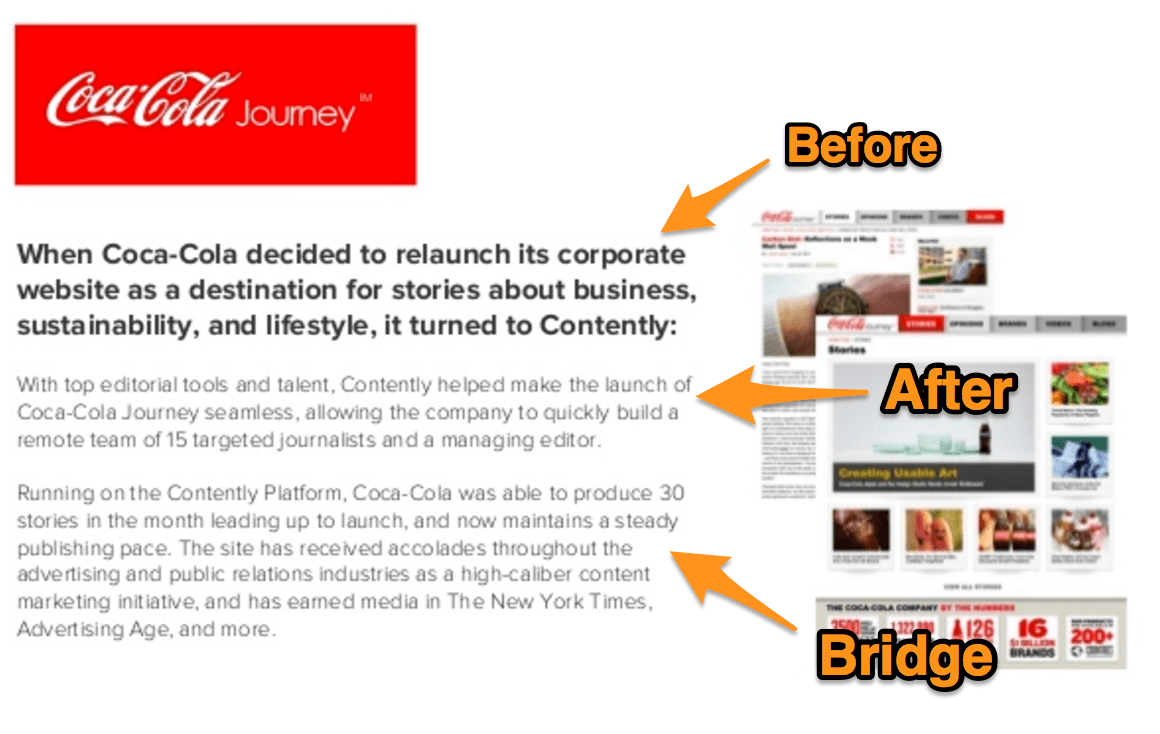
Before : Customer’s needs when they came on
After: What your company accomplished for them
Bridge : How they got there (specific actions and outcomes)
Here are some other tactics we pulled from the sales presentation:
Tactic #1: Use Graphics/Diagrams
Use graphics, Venn diagrams, and/or equations to drive home your “Before” picture.
Why It Works: According to a Cornell study , graphs and equations have persuasive power. They “signal a scientific basis for claims, which grants them greater credibility.”
Tactic #2: Keep Slides That Have Bullets to a Minimum
Keep slides that have bullets to a minimum. No more than one in every five slides.
Why It Works: According to an experiment by the International Journal of Business Communication , “Subjects exposed to a graphic representation paid significantly more attention to , agreed more with, and better recalled the strategy than did subjects who saw a (textually identical) bulleted list.”
Tactic #3: Use Visual Examples
Follow up your descriptions with visual examples.
Example: After stating “15000+ vetted, ready to work journalists searchable by location, topical experience, and social media influence” on Slide 8, Contently shows what this looks like firsthand on slides 9 and 10.
Why It Works: The same reason why prospects clamor for demos and car buyers ask for test drives. You’re never truly convinced until you see something for yourself.
Which is more effective for you?
This statement — “On average, Yesware customers save ten hours per week” — or this image:
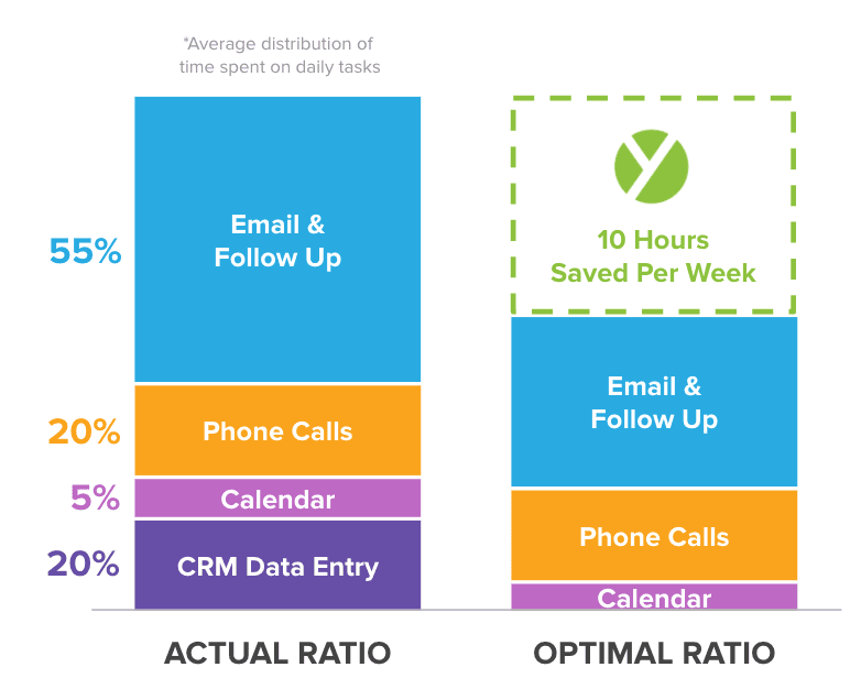
The graphic shows you what that 10 hours looks like for prospects vs. customers. It also calls out a pain that the product removes: data entry.
Visuals are more effective every time. They fuel retention of a presentation from 10% to 65% .
But it’s not as easy as just including a graphic. You need to keep the design clean.

Can you feel it?
Clutter provokes anxiety and stress because it bombards our minds with excessive visual stimuli, causing our senses to work overtime on stimuli that aren’t important.
Here’s a tip from Yesware’s Graphic Designer, Ginelle DeAntonis:
“Customer logos won’t all necessarily have the same dimensions, but keep them the same size visually so that they all have the same importance. You should also disperse colors throughout, so that you don’t for example end up with a bunch of blue logos next to each other. Organize them in a way that’s easy for the eye, because in the end it’s a lot of information at once.”
Here are more tactics to inspire sales presentation ideas:
Tactic #1: Personalize Your Final Slide
Personalize your final slide with your contact information and a headline that drives emotion.
Example: Our Mid-Market Team Lead Kyle includes his phone number and email address with “We’re Here For You”
Why It Works: These small details show your audience that:
- This is about giving them the end picture, not making a sale
- The end of the presentation doesn’t mean the end of the conversation
- Questions are welcomed
Tactic #2: Pair Outcome Statements With Icons in Circles
Example: Slide 4 does this with seven different “After” outcomes.
Why It Works: We already know why pictures work, but circles have power , too. They imply completeness, infiniteness, and harmony.
Tactic #3: Include Specific Success Metrics
Don’t just list who you work with; include specific success metrics that hit home what you’ve done for them.
Example: 35% New Business Growth for Boomtrain; 30% Higher Reply Rates for Dyn.
Why It Works: Social proof drives action. It’s why we wait in lines at restaurants and put ourselves on waitlists for sold-out items.
People can only focus for eight seconds at a time. (Sadly, goldfish have one second on us.)
This means you need to cut to the chase fast.
Uber’s headlines in Slides 2-9 tailor the “After” picture to specific pain points. As a result, there’s no need to explicitly state a “Before.”

Slides 11-13 then continue touching on “Before” problems tangentially with customer quotes:

So instead of self-touting benefits, the brand steps aside to let consumers hear from their peers — something that sways 92% of consumers .
Leading questions may be banned from the courtroom, but they aren’t in the boardroom.
DealTap’s slides ask viewers to choose between two scenarios over and over. Each has an obvious winner:

Ever heard of the Focusing Effect?
It’s part of what makes us tick as humans and what makes this design move effective. We focus on one thing and then ignore the rest. Here, DealTap puts the magnifying glass on paperwork vs. automated transactions.
Easy choice.
Sure, DealTap’s platform might have complexities that rival paperwork, but we don’t think about that. We’re looking at the pile of work one the left and the simpler, single interface on the right.
Here are some other tactics to use in your own sales presentation:
Tactic #1: Tell a Story
Tell a story that flows from one slide to the next.
Example: Here’s the story DealTap tells from slides 4 to 8: “Transactions are complicated” → “Expectations on all sides” → “Too many disconnected tools” → “Slow and error prone process” → “However, there’s an opportunity.
Why It Works: Storytelling in sales with a clear beginning and end (or in this case, a “Before” and “After”) trigger a trust hormone called Oxytocin.
Tactic #2: This vs. That
If it’s hard to separate out one “Before” and “After” vision with your product or service because you offer many dissimilar benefits, consider a “This vs. That” theme for each.
Why It Works: It breaks up your points into simple decisions and sets you up to win emotional reactions from your audience with stock photos.
Remember how satisfying it was to play connect the dots? Forming a bigger picture out of disconnected circles.
That’s what you need to make your audience do.

Zuora tells a story by:
- Laying out the reality (the “Before” part of the Before-After-Bridge formula).
- Asking you a question that you want to answer (the “After”)
- Giving you hints to help you connect the dots
- Showing you the common thread (the “Bridge”)
You can achieve this by founding your sales presentation on your audience’s intuitions. Set them up with the closely-set “dots,” then let them make the connection.
Here are more tactical sales presentation ideas to steal for your own use:
Tactic #1: Use Logos and Testimonials
Use logos and testimonial pull-quotes for your highest-profile customers to strengthen your sales presentation.
Example: Slides 21 to 23 include customer quotes from Schneider Electric, Financial Times, and Box.
Why It Works: It’s called social proof . Prospects value other people’s opinions and trust reputable sources more than you.
Tactic #2: Include White Space
Pad your images with white space.
Example: Slide 17 includes two simple graphics on a white background to drive home an important concept.
Why It Works: White space creates separation, balance, and attracts the audience’s eyes to the main focus: your image.
Tactic #3: Incorporate Hard Data
Incorporate hard data with a memorable background to make your data stand out.
Example: Slide 5 includes statistics with a backdrop that stands out. The number and exciting title (‘A Global Phenomenon’) are the main focuses of the slide.
Why It Works: Vivid backdrops are proven to be memorable and help your audience take away important numbers or data.
Psychology tells us that seeing colors can set our mood .
The color red is proven to increase the pulse and heart rate. Beyond that, it’s associated with being active, aggressive, and outspoken. LinkedIn Sales Navigator uses red on slides to draw attention to main points:
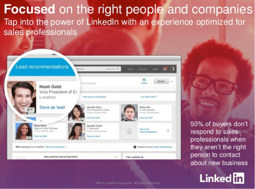
You can use hues in your own slides to guide your audience’s emotions. Green gives peace; grey adds a sense of calm; blue breeds trust. See more here .
Tip: You can grab free photos from Creative Commons and then set them to black & white and add a colored filter on top using a (also free) tool like Canva . Here’s the sizing for your image:

Caveat: Check with your marketing team first to see if you have a specific color palette or brand guidelines to follow.
Here are some other takeaways from LinkedIn’s sales presentation:
Tactic #1: Include a CTA on Final Slide
Include one clear call-to-action on your final slide.
Example: Slide 9 has a “Learn More” CTA button.
Why It Works: According to the Paradox of Choice , the more options you give, the less likely they are to act.
Step One : Ask marketing for your company’s style guide (color, logo, and font style).
Step Two: Answer these questions to outline the “Before → After → Bridge” formula for your sales pitch :
- What are your ICP’s pain points?
- What end picture resonates with them?
- How does your company come into play?
Step Three: Ask account management/marketing which customers you can mention in your slides (plus where to access any case studies for pull quotes).
Step Four: Download photos from Creative Commons . Remember: Graphics > Text. Use Canva to edit on your own — free and fast.
What are the sales presentation strategies that work best for your industry and customers? Tweet us: @Yesware .
Get sales tips and strategies delivered straight to your inbox.
Yesware will help you generate more sales right from your inbox. Try our Outlook add-on or Gmail Chrome extension for free, forever!
Hit your number every month
Works on Outlook or Gmail (+ many more integrations)
Related Articles
![how to give a sales presentation 10 Best Persuasive Techniques for Sales and Marketing [2022]](https://www.yesware.com/blog/_next/image/?url=https%3A%2F%2Fwww.yesware.com%2Fwp-content%2Fuploads%2F2021%2F07%2Fyesware-persuasive-techniques.jpg&w=1280&q=75)
10 Best Persuasive Techniques for Sales and Marketing [2022]
Melissa Williams

SPIN Selling: All-In-One Guide for 2022

High-Ticket Sales: How to Sell High-Ticket Products and Services
Casey O'Connor
Sales, deal management, and communication tips for your inbox
We're on a mission to help you build lasting business relationships.
75 Kneeland Street, Floor 15 Boston, MA 02111

IMAGES
VIDEO