Graphical Representation of Data
Graphical representation of data is an attractive method of showcasing numerical data that help in analyzing and representing quantitative data visually. A graph is a kind of a chart where data are plotted as variables across the coordinate. It became easy to analyze the extent of change of one variable based on the change of other variables. Graphical representation of data is done through different mediums such as lines, plots, diagrams, etc. Let us learn more about this interesting concept of graphical representation of data, the different types, and solve a few examples.

Definition of Graphical Representation of Data
A graphical representation is a visual representation of data statistics-based results using graphs, plots, and charts. This kind of representation is more effective in understanding and comparing data than seen in a tabular form. Graphical representation helps to qualify, sort, and present data in a method that is simple to understand for a larger audience. Graphs enable in studying the cause and effect relationship between two variables through both time series and frequency distribution. The data that is obtained from different surveying is infused into a graphical representation by the use of some symbols, such as lines on a line graph, bars on a bar chart, or slices of a pie chart. This visual representation helps in clarity, comparison, and understanding of numerical data.
Representation of Data
The word data is from the Latin word Datum, which means something given. The numerical figures collected through a survey are called data and can be represented in two forms - tabular form and visual form through graphs. Once the data is collected through constant observations, it is arranged, summarized, and classified to finally represented in the form of a graph. There are two kinds of data - quantitative and qualitative. Quantitative data is more structured, continuous, and discrete with statistical data whereas qualitative is unstructured where the data cannot be analyzed.
Principles of Graphical Representation of Data
The principles of graphical representation are algebraic. In a graph, there are two lines known as Axis or Coordinate axis. These are the X-axis and Y-axis. The horizontal axis is the X-axis and the vertical axis is the Y-axis. They are perpendicular to each other and intersect at O or point of Origin. On the right side of the Origin, the Xaxis has a positive value and on the left side, it has a negative value. In the same way, the upper side of the Origin Y-axis has a positive value where the down one is with a negative value. When -axis and y-axis intersect each other at the origin it divides the plane into four parts which are called Quadrant I, Quadrant II, Quadrant III, Quadrant IV. This form of representation is seen in a frequency distribution that is represented in four methods, namely Histogram, Smoothed frequency graph, Pie diagram or Pie chart, Cumulative or ogive frequency graph, and Frequency Polygon.

Advantages and Disadvantages of Graphical Representation of Data
Listed below are some advantages and disadvantages of using a graphical representation of data:
- It improves the way of analyzing and learning as the graphical representation makes the data easy to understand.
- It can be used in almost all fields from mathematics to physics to psychology and so on.
- It is easy to understand for its visual impacts.
- It shows the whole and huge data in an instance.
- It is mainly used in statistics to determine the mean, median, and mode for different data
The main disadvantage of graphical representation of data is that it takes a lot of effort as well as resources to find the most appropriate data and then represent it graphically.
Rules of Graphical Representation of Data
While presenting data graphically, there are certain rules that need to be followed. They are listed below:
- Suitable Title: The title of the graph should be appropriate that indicate the subject of the presentation.
- Measurement Unit: The measurement unit in the graph should be mentioned.
- Proper Scale: A proper scale needs to be chosen to represent the data accurately.
- Index: For better understanding, index the appropriate colors, shades, lines, designs in the graphs.
- Data Sources: Data should be included wherever it is necessary at the bottom of the graph.
- Simple: The construction of a graph should be easily understood.
- Neat: The graph should be visually neat in terms of size and font to read the data accurately.
Uses of Graphical Representation of Data
The main use of a graphical representation of data is understanding and identifying the trends and patterns of the data. It helps in analyzing large quantities, comparing two or more data, making predictions, and building a firm decision. The visual display of data also helps in avoiding confusion and overlapping of any information. Graphs like line graphs and bar graphs, display two or more data clearly for easy comparison. This is important in communicating our findings to others and our understanding and analysis of the data.
Types of Graphical Representation of Data
Data is represented in different types of graphs such as plots, pies, diagrams, etc. They are as follows,
Related Topics
Listed below are a few interesting topics that are related to the graphical representation of data, take a look.
- x and y graph
- Frequency Polygon
- Cumulative Frequency
Examples on Graphical Representation of Data
Example 1 : A pie chart is divided into 3 parts with the angles measuring as 2x, 8x, and 10x respectively. Find the value of x in degrees.
We know, the sum of all angles in a pie chart would give 360º as result. ⇒ 2x + 8x + 10x = 360º ⇒ 20 x = 360º ⇒ x = 360º/20 ⇒ x = 18º Therefore, the value of x is 18º.
Example 2: Ben is trying to read the plot given below. His teacher has given him stem and leaf plot worksheets. Can you help him answer the questions? i) What is the mode of the plot? ii) What is the mean of the plot? iii) Find the range.
Solution: i) Mode is the number that appears often in the data. Leaf 4 occurs twice on the plot against stem 5.
Hence, mode = 54
ii) The sum of all data values is 12 + 14 + 21 + 25 + 28 + 32 + 34 + 36 + 50 + 53 + 54 + 54 + 62 + 65 + 67 + 83 + 88 + 89 + 91 = 958
To find the mean, we have to divide the sum by the total number of values.
Mean = Sum of all data values ÷ 19 = 958 ÷ 19 = 50.42
iii) Range = the highest value - the lowest value = 91 - 12 = 79
go to slide go to slide

Book a Free Trial Class
Practice Questions on Graphical Representation of Data
Faqs on graphical representation of data, what is graphical representation.
Graphical representation is a form of visually displaying data through various methods like graphs, diagrams, charts, and plots. It helps in sorting, visualizing, and presenting data in a clear manner through different types of graphs. Statistics mainly use graphical representation to show data.
What are the Different Types of Graphical Representation?
The different types of graphical representation of data are:
- Stem and leaf plot
- Scatter diagrams
- Frequency Distribution
Is the Graphical Representation of Numerical Data?
Yes, these graphical representations are numerical data that has been accumulated through various surveys and observations. The method of presenting these numerical data is called a chart. There are different kinds of charts such as a pie chart, bar graph, line graph, etc, that help in clearly showcasing the data.
What is the Use of Graphical Representation of Data?
Graphical representation of data is useful in clarifying, interpreting, and analyzing data plotting points and drawing line segments , surfaces, and other geometric forms or symbols.
What are the Ways to Represent Data?
Tables, charts, and graphs are all ways of representing data, and they can be used for two broad purposes. The first is to support the collection, organization, and analysis of data as part of the process of a scientific study.
What is the Objective of Graphical Representation of Data?
The main objective of representing data graphically is to display information visually that helps in understanding the information efficiently, clearly, and accurately. This is important to communicate the findings as well as analyze the data.

- school Campus Bookshelves
- menu_book Bookshelves
- perm_media Learning Objects
- login Login
- how_to_reg Request Instructor Account
- hub Instructor Commons
- Download Page (PDF)
- Download Full Book (PDF)
- Periodic Table
- Physics Constants
- Scientific Calculator
- Reference & Cite
- Tools expand_more
- Readability
selected template will load here
This action is not available.
2: Graphical Representations of Data
- Last updated
- Save as PDF
- Page ID 22222

In this chapter, you will study numerical and graphical ways to describe and display your data. This area of statistics is called "Descriptive Statistics." You will learn how to calculate, and even more importantly, how to interpret these measurements and graphs.
- 2.1: Introduction In this chapter, you will study numerical and graphical ways to describe and display your data. This area of statistics is called "Descriptive Statistics." You will learn how to calculate, and even more importantly, how to interpret these measurements and graphs. In this chapter, we will briefly look at stem-and-leaf plots, line graphs, and bar graphs, as well as frequency polygons, and time series graphs. Our emphasis will be on histograms and box plots.
- 2.2: Stem-and-Leaf Graphs (Stemplots), Line Graphs, and Bar Graphs A stem-and-leaf plot is a way to plot data and look at the distribution, where all data values within a class are visible. The advantage in a stem-and-leaf plot is that all values are listed, unlike a histogram, which gives classes of data values. A line graph is often used to represent a set of data values in which a quantity varies with time. These graphs are useful for finding trends. A bar graph is a chart that uses either horizontal or vertical bars to show comparisons among categories.
- 2.3: Histograms, Frequency Polygons, and Time Series Graphs A histogram is a graphic version of a frequency distribution. The graph consists of bars of equal width drawn adjacent to each other. The horizontal scale represents classes of quantitative data values and the vertical scale represents frequencies. The heights of the bars correspond to frequency values. Histograms are typically used for large, continuous, quantitative data sets. A frequency polygon can also be used when graphing large data sets with data points that repeat.
- 2.4: Using Excel to Create Graphs Using technology to create graphs will make the graphs faster to create, more precise, and give the ability to use larger amounts of data. This section focuses on using Excel to create graphs.
- 2.5: Graphs that Deceive It's common to see graphs displayed in a misleading manner in social media and other instances. This could be done purposefully to make a point, or it could be accidental. Either way, it's important to recognize these instances to ensure you are not misled.
- 2.E: Graphical Representations of Data (Exercises) These are homework exercises to accompany the Textmap created for "Introductory Statistics" by OpenStax.
Contributors and Attributions
Barbara Illowsky and Susan Dean (De Anza College) with many other contributing authors. Content produced by OpenStax College is licensed under a Creative Commons Attribution License 4.0 license. Download for free at http://cnx.org/contents/[email protected] .

- school Campus Bookshelves
- menu_book Bookshelves
- perm_media Learning Objects
- login Login
- how_to_reg Request Instructor Account
- hub Instructor Commons
- Download Page (PDF)
- Download Full Book (PDF)
- Periodic Table
- Physics Constants
- Scientific Calculator
- Reference & Cite
- Tools expand_more
- Readability
selected template will load here
This action is not available.
2.1: Types of Data Representation
- Last updated
- Save as PDF
- Page ID 5696
Two common types of graphic displays are bar charts and histograms. Both bar charts and histograms use vertical or horizontal bars to represent the number of data points in each category or interval. The main difference graphically is that in a bar chart there are spaces between the bars and in a histogram there are not spaces between the bars. Why does this subtle difference exist and what does it imply about graphic displays in general?
Displaying Data
It is often easier for people to interpret relative sizes of data when that data is displayed graphically. Note that a categorical variable is a variable that can take on one of a limited number of values and a quantitative variable is a variable that takes on numerical values that represent a measurable quantity. Examples of categorical variables are tv stations, the state someone lives in, and eye color while examples of quantitative variables are the height of students or the population of a city. There are a few common ways of displaying data graphically that you should be familiar with.
A pie chart shows the relative proportions of data in different categories. Pie charts are excellent ways of displaying categorical data with easily separable groups. The following pie chart shows six categories labeled A−F. The size of each pie slice is determined by the central angle. Since there are 360 o in a circle, the size of the central angle θ A of category A can be found by:

CK-12 Foundation - https://www.flickr.com/photos/slgc/16173880801 - CCSA
A bar chart displays frequencies of categories of data. The bar chart below has 5 categories, and shows the TV channel preferences for 53 adults. The horizontal axis could have also been labeled News, Sports, Local News, Comedy, Action Movies. The reason why the bars are separated by spaces is to emphasize the fact that they are categories and not continuous numbers. For example, just because you split your time between channel 8 and channel 44 does not mean on average you watch channel 26. Categories can be numbers so you need to be very careful.

CK-12 Foundation - https://www.flickr.com/photos/slgc/16173880801 - CCSA
A histogram displays frequencies of quantitative data that has been sorted into intervals. The following is a histogram that shows the heights of a class of 53 students. Notice the largest category is 56-60 inches with 18 people.

A boxplot (also known as a box and whiskers plot ) is another way to display quantitative data. It displays the five 5 number summary (minimum, Q1, median , Q3, maximum). The box can either be vertically or horizontally displayed depending on the labeling of the axis. The box does not need to be perfectly symmetrical because it represents data that might not be perfectly symmetrical.

Earlier, you were asked about the difference between histograms and bar charts. The reason for the space in bar charts but no space in histograms is bar charts graph categorical variables while histograms graph quantitative variables. It would be extremely improper to forget the space with bar charts because you would run the risk of implying a spectrum from one side of the chart to the other. Note that in the bar chart where TV stations where shown, the station numbers were not listed horizontally in order by size. This was to emphasize the fact that the stations were categories.
Create a boxplot of the following numbers in your calculator.
8.5, 10.9, 9.1, 7.5, 7.2, 6, 2.3, 5.5
Enter the data into L1 by going into the Stat menu.

CK-12 Foundation - CCSA
Then turn the statplot on and choose boxplot.

Use Zoomstat to automatically center the window on the boxplot.

Create a pie chart to represent the preferences of 43 hungry students.
- Other – 5
- Burritos – 7
- Burgers – 9
- Pizza – 22

Create a bar chart representing the preference for sports of a group of 23 people.
- Football – 12
- Baseball – 10
- Basketball – 8
- Hockey – 3

Create a histogram for the income distribution of 200 million people.
- Below $50,000 is 100 million people
- Between $50,000 and $100,000 is 50 million people
- Between $100,000 and $150,000 is 40 million people
- Above $150,000 is 10 million people

1. What types of graphs show categorical data?
2. What types of graphs show quantitative data?
A math class of 30 students had the following grades:
3. Create a bar chart for this data.
4. Create a pie chart for this data.
5. Which graph do you think makes a better visual representation of the data?
A set of 20 exam scores is 67, 94, 88, 76, 85, 93, 55, 87, 80, 81, 80, 61, 90, 84, 75, 93, 75, 68, 100, 98
6. Create a histogram for this data. Use your best judgment to decide what the intervals should be.
7. Find the five number summary for this data.
8. Use the five number summary to create a boxplot for this data.
9. Describe the data shown in the boxplot below.

10. Describe the data shown in the histogram below.

A math class of 30 students has the following eye colors:
11. Create a bar chart for this data.
12. Create a pie chart for this data.
13. Which graph do you think makes a better visual representation of the data?
14. Suppose you have data that shows the breakdown of registered republicans by state. What types of graphs could you use to display this data?
15. From which types of graphs could you obtain information about the spread of the data? Note that spread is a measure of how spread out all of the data is.
Review (Answers)
To see the Review answers, open this PDF file and look for section 15.4.
Additional Resources
PLIX: Play, Learn, Interact, eXplore - Baby Due Date Histogram
Practice: Types of Data Representation
Real World: Prepare for Impact
What Is Data Visualization: Brief Theory, Useful Tips and Awesome Examples
- Share on Facebook
- Share on Twitter
By Al Boicheva
in Insights , Inspiration
3 years ago
Viewed 10,234 times
Spread the word about this article:

Updated: June 23, 2022
To create data visualization in order to present your data is no longer just a nice to have skill. Now, the skill to effectively sort and communicate your data through charts is a must-have for any business in any field that deals with data. Data visualization helps businesses quickly make sense of complex data and start making decisions based on that data. This is why today we’ll talk about what is data visualization. We’ll discuss how and why does it work, what type of charts to choose in what cases, how to create effective charts, and, of course, end with beautiful examples.
So let’s jump right in. As usual, don’t hesitate to fast-travel to a particular section of your interest.
Article overview: 1. What Does Data Visualization Mean? 2. How Does it Work? 3. When to Use it? 4. Why Use it? 5. Types of Data Visualization 6. Data Visualization VS Infographics: 5 Main Differences 7. How to Create Effective Data Visualization?: 5 Useful Tips 8. Examples of Data Visualization
1. What is Data Visualization?
Data Visualization is a graphic representation of data that aims to communicate numerous heavy data in an efficient way that is easier to grasp and understand . In a way, data visualization is the mapping between the original data and graphic elements that determine how the attributes of these elements vary. The visualization is usually made by the use of charts, lines, or points, bars, and maps.
- Data Viz is a branch of Descriptive statistics but it requires both design, computer, and statistical skills.
- Aesthetics and functionality go hand in hand to communicate complex statistics in an intuitive way.
- Data Viz tools and technologies are essential for making data-driven decisions.
- It’s a fine balance between form and functionality.
- Every STEM field benefits from understanding data.
2. How Does it Work?
If we can see it, our brains can internalize and reflect on it. This is why it’s much easier and more effective to make sense of a chart and see trends than to read a massive document that would take a lot of time and focus to rationalize. We wouldn’t want to repeat the cliche that humans are visual creatures, but it’s a fact that visualization is much more effective and comprehensive.
In a way, we can say that data Viz is a form of storytelling with the purpose to help us make decisions based on data. Such data might include:
- Tracking sales
- Identifying trends
- Identifying changes
- Monitoring goals
- Monitoring results
- Combining data
3. When to Use it?
Data visualization is useful for companies that deal with lots of data on a daily basis. It’s essential to have your data and trends instantly visible. Better than scrolling through colossal spreadsheets. When the trends stand out instantly this also helps your clients or viewers to understand them instead of getting lost in the clutter of numbers.
With that being said, Data Viz is suitable for:
- Annual reports
- Presentations
- Social media micronarratives
- Informational brochures
- Trend-trafficking
- Candlestick chart for financial analysis
- Determining routes
Common cases when data visualization sees use are in sales, marketing, healthcare, science, finances, politics, and logistics.
4. Why Use it?
Short answer: decision making. Data Visualization comes with the undeniable benefits of quickly recognizing patterns and interpret data. More specifically, it is an invaluable tool to determine the following cases.
- Identifying correlations between the relationship of variables.
- Getting market insights about audience behavior.
- Determining value vs risk metrics.
- Monitoring trends over time.
- Examining rates and potential through frequency.
- Ability to react to changes.
5. Types of Data Visualization
As you probably already guessed, Data Viz is much more than simple pie charts and graphs styled in a visually appealing way. The methods that this branch uses to visualize statistics include a series of effective types.
Map visualization is a great method to analyze and display geographically related information and present it accurately via maps. This intuitive way aims to distribute data by region. Since maps can be 2D or 3D, static or dynamic, there are numerous combinations one can use in order to create a Data Viz map.
COVID-19 Spending Data Visualization POGO by George Railean
The most common ones, however, are:
- Regional Maps: Classic maps that display countries, cities, or districts. They often represent data in different colors for different characteristics in each region.
- Line Maps: They usually contain space and time and are ideal for routing, especially for driving or taxi routes in the area due to their analysis of specific scenes.
- Point Maps: These maps distribute data of geographic information. They are ideal for businesses to pinpoint the exact locations of their buildings in a region.
- Heat Maps: They indicate the weight of a geographical area based on a specific property. For example, a heat map may distribute the saturation of infected people by area.
Charts present data in the form of graphs, diagrams, and tables. They are often confused with graphs since graphs are indeed a subcategory of charts. However, there is a small difference: graphs show the mathematical relationship between groups of data and is only one of the chart methods to represent data.

Infographic Data Visualization by Madeline VanRemmen
With that out of the way, let’s talk about the most basic types of charts in data visualization.

They use a series of bars that illustrate data development. They are ideal for lighter data and follow trends of no more than three variables or else, the bars become cluttered and hard to comprehend. Ideal for year-on-year comparisons and monthly breakdowns.

These familiar circular graphs divide data into portions. The bigger the slice, the bigger the portion. They are ideal for depicting sections of a whole and their sum must always be 100%. Avoid pie charts when you need to show data development over time or lack a value for any of the portions. Doughnut charts have the same use as pie charts.

They use a line or more than one lines that show development over time. It allows tracking multiple variables at the same time. A great example is tracking product sales by a brand over the years. Area charts have the same use as line charts.
Scatter Plot

These charts allow you to see patterns through data visualization. They have an x-axis and a y-axis for two different values. For example, if your x-axis contains information about car prices while the y-axis is about salaries, the positive or negative relationship will tell you about what a person’s car tells about their salary.
Unlike the charts we just discussed, tables show data in almost a raw format. They are ideal when your data is hard to present visually and aim to show specific numerical data that one is supposed to read rather than visualize.

Data Visualisation | To bee or not to bee by Aishwarya Anand Singh
For example, charts are perfect to display data about a particular illness over a time period in a particular area, but a table comes to better use when you also need to understand specifics such as causes, outcomes, relapses, a period of treatment, and so on.
6. Data Visualization VS Infographics
5 main differences.
They are not that different as both visually represent data. It is often you search for infographics and find images titled Data Visualization and the other way around. In many cases, however, these titles aren’t misleading. Why is that?
- Data visualization is made of just one element. It could be a map, a chart, or a table. Infographics , on the other hand, often include multiple Data Viz elements.
- Unlike data visualizations that can be simple or extremely complex and heavy, infographics are simple and target wider audiences. The latter is usually comprehensible even to people outside of the field of research the infographic represents.
- Interestingly enough, data Viz doesn’t offer narratives and conclusions, it’s a tool and basis for reaching those. While infographics, in most cases offer a story and a narrative. For example, a data visualization map may have the title “Air pollution saturation by region”, while an infographic with the same data would go “Areas A and B are the most polluted in Country C”.
- Data visualizations can be made in Excel or use other tools that automatically generate the design unless they are set for presentation or publishing. The aesthetics of infographics , however, are of great importance and the designs must be appealing to wider audiences.
- In terms of interaction, data visualizations often offer interactive charts, especially in an online form. Infographics, on the other hand, rarely have interaction and are usually static images.
While on topic, you could also be interested to check out these 50 engaging infographic examples that make complex data look great.
7. Tips to Create Effective Data Visualization
The process is naturally similar to creating Infographics and it revolves around understanding your data and audience. To be more precise, these are the main steps and best practices when it comes to preparing an effective visualization of data for your viewers to instantly understand.
1. Do Your Homework
Preparation is half the work already done. Before you even start visualizing data, you have to be sure you understand that data to the last detail.
Knowing your audience is undeniable another important part of the homework, as different audiences process information differently. Who are the people you’re visualizing data for? How do they process visual data? Is it enough to hand them a single pie chart or you’ll need a more in-depth visual report?
The third part of preparing is to determine exactly what you want to communicate to the audience. What kind of information you’re visualizing and does it reflect your goal?
And last, think about how much data you’ll be working with and take it into account.
2. Choose the Right Type of Chart
In a previous section, we listed the basic chart types that find use in data visualization. To determine best which one suits your work, there are a few things to consider.
- How many variables will you have in a chart?
- How many items will you place for each of your variables?
- What will be the relation between the values (time period, comparison, distributions, etc.)
With that being said, a pie chart would be ideal if you need to present what portions of a whole takes each item. For example, you can use it to showcase what percent of the market share takes a particular product. Pie charts, however, are unsuitable for distributions, comparisons, and following trends through time periods. Bar graphs, scatter plots,s and line graphs are much more effective in those cases.
Another example is how to use time in your charts. It’s way more accurate to use a horizontal axis because time should run left to right. It’s way more visually intuitive.
3. Sort your Data
Start with removing every piece of data that does not add value and is basically excess for the chart. Sometimes, you have to work with a huge amount of data which will inevitably make your chart pretty complex and hard to read. Don’t hesitate to split your information into two or more charts. If that won’t work for you, you could use highlights or change the entire type of chart with something that would fit better.
Tip: When you use bar charts and columns for comparison, sort the information in an ascending or a descending way by value instead of alphabetical order.
4. Use Colors to Your Advantage
In every form of visualization, colors are your best friend and the most powerful tool. They create contrasts, accents, and emphasis and lead the eye intuitively. Even here, color theory is important.
When you design your chart, make sure you don’t use more than 5 or 6 colors. Anything more than that will make your graph overwhelming and hard to read for your viewers. However, color intensity is a different thing that you can use to your advantage. For example, when you compare the same concept in different periods of time, you could sort your data from the lightest shade of your chosen color to its darker one. It creates a strong visual progression, proper to your timeline.
Things to consider when you choose colors:
- Different colors for different categories.
- A consistent color palette for all charts in a series that you will later compare.
- It’s appropriate to use color blind-friendly palettes.
5. Get Inspired
Always put your inspiration to work when you want to be at the top of your game. Look through examples, infographics, and other people’s work and see what works best for each type of data you need to implement.
This Twitter account Data Visualization Society is a great way to start. In the meantime, we’ll also handpick some amazing examples that will get you in the mood to start creating the visuals for your data.
8. Examples for Data Visualization
As another art form, Data Viz is a fertile ground for some amazing well-designed graphs that prove that data is beautiful. Now let’s check out some.
Dark Souls III Experience Data
We start with Meng Hsiao Wei’s personal project presenting his experience with playing Dark Souls 3. It’s a perfect example that infographics and data visualization are tools for personal designs as well. The research is pretty massive yet very professionally sorted into different types of charts for the different concepts. All data visualizations are made with the same color palette and look great in infographics.

My dark souls 3 playing data by Meng Hsiao Wei
Greatest Movies of all Time
Katie Silver has compiled a list of the 100 greatest movies of all time based on critics and crowd reviews. The visualization shows key data points for every movie such as year of release, oscar nominations and wins, budget, gross, IMDB score, genre, filming location, setting of the film, and production studio. All movies are ordered by the release date.

100 Greatest Movies Data Visualization by Katie Silver
The Most Violent Cities
Federica Fragapane shows data for the 50 most violent cities in the world in 2017. The items are arranged on a vertical axis based on population and ordered along the horizontal axis according to the homicide rate.

The Most Violent Cities by Federica Fragapane
Family Businesses as Data
These data visualizations and illustrations were made by Valerio Pellegrini for Perspectives Magazine. They show a pie chart with sector breakdown as well as a scatter plot for contribution for employment.

PERSPECTIVES MAGAZINE – Family Businesses by Valerio Pellegrini
Orbit Map of the Solar System
The map shows data on the orbits of more than 18000 asteroids in the solar system. Each asteroid is shown at its position on New Years’ Eve 1999, colored by type of asteroid.

An Orbit Map of the Solar System by Eleanor Lutz
The Semantics Of Headlines
Katja Flükiger has a take on how headlines tell the story. The data visualization aims to communicate how much is the selling influencing the telling. The project was completed at Maryland Institute College of Art to visualize references to immigration and color-coding the value judgments implied by word choice and context.

The Semantics of Headlines by Katja Flükiger
Moon and Earthquakes
This data visualization works on answering whether the moon is responsible for earthquakes. The chart features the time and intensity of earthquakes in response to the phase and orbit location of the moon.

Moon and Earthquakes by Aishwarya Anand Singh
Dawn of the Nanosats
The visualization shows the satellites launched from 2003 to 2015. The graph represents the type of institutions focused on projects as well as the nations that financed them. On the left, it is shown the number of launches per year and satellite applications.

WIRED UK – Dawn of the by Nanosats by Valerio Pellegrini
Final Words
Data visualization is not only a form of science but also a form of art. Its purpose is to help businesses in any field quickly make sense of complex data and start making decisions based on that data. To make your graphs efficient and easy to read, it’s all about knowing your data and audience. This way you’ll be able to choose the right type of chart and use visual techniques to your advantage.
You may also be interested in some of these related articles:
- Infographics for Marketing: How to Grab and Hold the Attention
- 12 Animated Infographics That Will Engage Your Mind from Start to Finish
- 50 Engaging Infographic Examples That Make Complex Ideas Look Great
- Good Color Combinations That Go Beyond Trends: Inspirational Examples and Ideas

Add some character to your visuals
Cartoon Characters, Design Bundles, Illustrations, Backgrounds and more...
Like us on Facebook
Subscribe to our newsletter
Be the first to know what’s new in the world of graphic design and illustrations.
- [email protected]
Browse High Quality Vector Graphics
E.g.: businessman, lion, girl…
Related Articles
8 tips for successful ecommerce website design + amazing examples, 11 infographic design trends 2018: make data look hot, 23 adorable dog illustrations: while some play fetch, others sketch, graphic design trends 2020: breaking the rules, subject matter expert & visuals for elearning projects, check out our infographics bundle with 500+ infographic templates:, enjoyed this article.
Don’t forget to share!
- Comments (2)

Al Boicheva
Al is an illustrator at GraphicMama with out-of-the-box thinking and a passion for anything creative. In her free time, you will see her drooling over tattoo art, Manga, and horror movies.

Thousands of vector graphics for your projects.
Hey! You made it all the way to the bottom!
Here are some other articles we think you may like:

Inspiration
Email newsletter examples: 10 brands that enchant the inbox.
by Iveta Pavlova

How to Use the Principles of Marketing to Boost Your Business
by Boril Obreshkov

How-To Tutorials
Color theory basics for non-designers: everything you should know.
by Al Boicheva
Looking for Design Bundles or Cartoon Characters?
A source of high-quality vector graphics offering a huge variety of premade character designs, graphic design bundles, Adobe Character Animator puppets, and more.

Data visualization is the representation of data through use of common graphics, such as charts, plots, infographics and even animations. These visual displays of information communicate complex data relationships and data-driven insights in a way that is easy to understand.
Data visualization can be utilized for a variety of purposes, and it’s important to note that is not only reserved for use by data teams. Management also leverages it to convey organizational structure and hierarchy while data analysts and data scientists use it to discover and explain patterns and trends. Harvard Business Review (link resides outside ibm.com) categorizes data visualization into four key purposes: idea generation, idea illustration, visual discovery, and everyday dataviz. We’ll delve deeper into these below:
Idea generation
Data visualization is commonly used to spur idea generation across teams. They are frequently leveraged during brainstorming or Design Thinking sessions at the start of a project by supporting the collection of different perspectives and highlighting the common concerns of the collective. While these visualizations are usually unpolished and unrefined, they help set the foundation within the project to ensure that the team is aligned on the problem that they’re looking to address for key stakeholders.
Idea illustration
Data visualization for idea illustration assists in conveying an idea, such as a tactic or process. It is commonly used in learning settings, such as tutorials, certification courses, centers of excellence, but it can also be used to represent organization structures or processes, facilitating communication between the right individuals for specific tasks. Project managers frequently use Gantt charts and waterfall charts to illustrate workflows . Data modeling also uses abstraction to represent and better understand data flow within an enterprise’s information system, making it easier for developers, business analysts, data architects, and others to understand the relationships in a database or data warehouse.
Visual discovery
Visual discovery and every day data viz are more closely aligned with data teams. While visual discovery helps data analysts, data scientists, and other data professionals identify patterns and trends within a dataset, every day data viz supports the subsequent storytelling after a new insight has been found.
Data visualization
Data visualization is a critical step in the data science process, helping teams and individuals convey data more effectively to colleagues and decision makers. Teams that manage reporting systems typically leverage defined template views to monitor performance. However, data visualization isn’t limited to performance dashboards. For example, while text mining an analyst may use a word cloud to to capture key concepts, trends, and hidden relationships within this unstructured data. Alternatively, they may utilize a graph structure to illustrate relationships between entities in a knowledge graph. There are a number of ways to represent different types of data, and it’s important to remember that it is a skillset that should extend beyond your core analytics team.
Use this model selection framework to choose the most appropriate model while balancing your performance requirements with cost, risks and deployment needs.
Register for the ebook on generative AI
The earliest form of data visualization can be traced back the Egyptians in the pre-17th century, largely used to assist in navigation. As time progressed, people leveraged data visualizations for broader applications, such as in economic, social, health disciplines. Perhaps most notably, Edward Tufte published The Visual Display of Quantitative Information (link resides outside ibm.com), which illustrated that individuals could utilize data visualization to present data in a more effective manner. His book continues to stand the test of time, especially as companies turn to dashboards to report their performance metrics in real-time. Dashboards are effective data visualization tools for tracking and visualizing data from multiple data sources, providing visibility into the effects of specific behaviors by a team or an adjacent one on performance. Dashboards include common visualization techniques, such as:
- Tables: This consists of rows and columns used to compare variables. Tables can show a great deal of information in a structured way, but they can also overwhelm users that are simply looking for high-level trends.
- Pie charts and stacked bar charts: These graphs are divided into sections that represent parts of a whole. They provide a simple way to organize data and compare the size of each component to one other.
- Line charts and area charts: These visuals show change in one or more quantities by plotting a series of data points over time and are frequently used within predictive analytics. Line graphs utilize lines to demonstrate these changes while area charts connect data points with line segments, stacking variables on top of one another and using color to distinguish between variables.
- Histograms: This graph plots a distribution of numbers using a bar chart (with no spaces between the bars), representing the quantity of data that falls within a particular range. This visual makes it easy for an end user to identify outliers within a given dataset.
- Scatter plots: These visuals are beneficial in reveling the relationship between two variables, and they are commonly used within regression data analysis. However, these can sometimes be confused with bubble charts, which are used to visualize three variables via the x-axis, the y-axis, and the size of the bubble.
- Heat maps: These graphical representation displays are helpful in visualizing behavioral data by location. This can be a location on a map, or even a webpage.
- Tree maps, which display hierarchical data as a set of nested shapes, typically rectangles. Treemaps are great for comparing the proportions between categories via their area size.
Access to data visualization tools has never been easier. Open source libraries, such as D3.js, provide a way for analysts to present data in an interactive way, allowing them to engage a broader audience with new data. Some of the most popular open source visualization libraries include:
- D3.js: It is a front-end JavaScript library for producing dynamic, interactive data visualizations in web browsers. D3.js (link resides outside ibm.com) uses HTML, CSS, and SVG to create visual representations of data that can be viewed on any browser. It also provides features for interactions and animations.
- ECharts: A powerful charting and visualization library that offers an easy way to add intuitive, interactive, and highly customizable charts to products, research papers, presentations, etc. Echarts (link resides outside ibm.com) is based in JavaScript and ZRender, a lightweight canvas library.
- Vega: Vega (link resides outside ibm.com) defines itself as “visualization grammar,” providing support to customize visualizations across large datasets which are accessible from the web.
- deck.gl: It is part of Uber's open source visualization framework suite. deck.gl (link resides outside ibm.com) is a framework, which is used for exploratory data analysis on big data. It helps build high-performance GPU-powered visualization on the web.
With so many data visualization tools readily available, there has also been a rise in ineffective information visualization. Visual communication should be simple and deliberate to ensure that your data visualization helps your target audience arrive at your intended insight or conclusion. The following best practices can help ensure your data visualization is useful and clear:
Set the context: It’s important to provide general background information to ground the audience around why this particular data point is important. For example, if e-mail open rates were underperforming, we may want to illustrate how a company’s open rate compares to the overall industry, demonstrating that the company has a problem within this marketing channel. To drive an action, the audience needs to understand how current performance compares to something tangible, like a goal, benchmark, or other key performance indicators (KPIs).
Know your audience(s): Think about who your visualization is designed for and then make sure your data visualization fits their needs. What is that person trying to accomplish? What kind of questions do they care about? Does your visualization address their concerns? You’ll want the data that you provide to motivate people to act within their scope of their role. If you’re unsure if the visualization is clear, present it to one or two people within your target audience to get feedback, allowing you to make additional edits prior to a large presentation.
Choose an effective visual: Specific visuals are designed for specific types of datasets. For instance, scatter plots display the relationship between two variables well, while line graphs display time series data well. Ensure that the visual actually assists the audience in understanding your main takeaway. Misalignment of charts and data can result in the opposite, confusing your audience further versus providing clarity.
Keep it simple: Data visualization tools can make it easy to add all sorts of information to your visual. However, just because you can, it doesn’t mean that you should! In data visualization, you want to be very deliberate about the additional information that you add to focus user attention. For example, do you need data labels on every bar in your bar chart? Perhaps you only need one or two to help illustrate your point. Do you need a variety of colors to communicate your idea? Are you using colors that are accessible to a wide range of audiences (e.g. accounting for color blind audiences)? Design your data visualization for maximum impact by eliminating information that may distract your target audience.
An AI-infused integrated planning solution that helps you transcend the limits of manual planning.
Build, run and manage AI models. Prepare data and build models on any cloud using open source code or visual modeling. Predict and optimize your outcomes.
Unlock the value of enterprise data and build an insight-driven organization that delivers business advantage with IBM Consulting.
Your trusted Watson co-pilot for smarter analytics and confident decisions.
Use features within IBM Watson® Studio that help you visualize and gain insights into your data, then cleanse and transform your data to build high-quality predictive models.
Data Refinery makes it easy to explore, prepare, and deliver data that people across your organization can trust.
Learn how to use Apache Superset (a modern, enterprise-ready business intelligence web application) with Netezza database to uncover the story behind the data.
Predict outcomes with flexible AI-infused forecasting and analyze what-if scenarios in real-time. IBM Planning Analytics is an integrated business planning solution that turns raw data into actionable insights. Deploy as you need, on-premises or on cloud.
Data representation
Computers use binary - the digits 0 and 1 - to store data. A binary digit, or bit, is the smallest unit of data in computing. It is represented by a 0 or a 1. Binary numbers are made up of binary digits (bits), eg the binary number 1001. The circuits in a computer's processor are made up of billions of transistors. A transistor is a tiny switch that is activated by the electronic signals it receives. The digits 1 and 0 used in binary reflect the on and off states of a transistor. Computer programs are sets of instructions. Each instruction is translated into machine code - simple binary codes that activate the CPU. Programmers write computer code and this is converted by a translator into binary instructions that the processor can execute. All software, music, documents, and any other information that is processed by a computer, is also stored using binary. [1]
To include strings, integers, characters and colours. This should include considering the space taken by data, for instance the relation between the hexadecimal representation of colours and the number of colours available.
This video is superb place to understand this topic
- 1 How a file is stored on a computer
- 2 How an image is stored in a computer
- 3 The way in which data is represented in the computer.
- 6 Standards
- 7 References
How a file is stored on a computer [ edit ]
How an image is stored in a computer [ edit ]
The way in which data is represented in the computer. [ edit ].
To include strings, integers, characters and colours. This should include considering the space taken by data, for instance the relation between the hexadecimal representation of colours and the number of colours available [3] .
This helpful material is used with gratitude from a computer science wiki under a Creative Commons Attribution 3.0 License [4]
Sound [ edit ]
- Let's look at an oscilloscope
- The BBC has an excellent article on how computers represent sound
See Also [ edit ]
Standards [ edit ].
- Outline the way in which data is represented in the computer.
References [ edit ]
- ↑ http://www.bbc.co.uk/education/guides/zwsbwmn/revision/1
- ↑ https://ujjwalkarn.me/2016/08/11/intuitive-explanation-convnets/
- ↑ IBO Computer Science Guide, First exams 2014
- ↑ https://compsci2014.wikispaces.com/2.1.10+Outline+the+way+in+which+data+is+represented+in+the+computer
A unit of abstract mathematical system subject to the laws of arithmetic.
A natural number, a negative of a natural number, or zero.
Give a brief account.
- Computer organization
- Very important ideas in computer science
tableau.com is not available in your region.
- Business Essentials
- Leadership & Management
- Credential of Leadership, Impact, and Management in Business (CLIMB)
- Entrepreneurship & Innovation
- Digital Transformation
- Finance & Accounting
- Business in Society
- For Organizations
- Support Portal
- Media Coverage
- Founding Donors
- Leadership Team

- Harvard Business School →
- HBS Online →
- Business Insights →
Business Insights
Harvard Business School Online's Business Insights Blog provides the career insights you need to achieve your goals and gain confidence in your business skills.
- Career Development
- Communication
- Decision-Making
- Earning Your MBA
- Negotiation
- News & Events
- Productivity
- Staff Spotlight
- Student Profiles
- Work-Life Balance
- AI Essentials for Business
- Alternative Investments
- Business Analytics
- Business Strategy
- Business and Climate Change
- Design Thinking and Innovation
- Digital Marketing Strategy
- Disruptive Strategy
- Economics for Managers
- Entrepreneurship Essentials
- Financial Accounting
- Global Business
- Launching Tech Ventures
- Leadership Principles
- Leadership, Ethics, and Corporate Accountability
- Leading with Finance
- Management Essentials
- Negotiation Mastery
- Organizational Leadership
- Power and Influence for Positive Impact
- Strategy Execution
- Sustainable Business Strategy
- Sustainable Investing
- Winning with Digital Platforms
17 Data Visualization Techniques All Professionals Should Know

- 17 Sep 2019
There’s a growing demand for business analytics and data expertise in the workforce. But you don’t need to be a professional analyst to benefit from data-related skills.
Becoming skilled at common data visualization techniques can help you reap the rewards of data-driven decision-making , including increased confidence and potential cost savings. Learning how to effectively visualize data could be the first step toward using data analytics and data science to your advantage to add value to your organization.
Several data visualization techniques can help you become more effective in your role. Here are 17 essential data visualization techniques all professionals should know, as well as tips to help you effectively present your data.
Access your free e-book today.
What Is Data Visualization?
Data visualization is the process of creating graphical representations of information. This process helps the presenter communicate data in a way that’s easy for the viewer to interpret and draw conclusions.
There are many different techniques and tools you can leverage to visualize data, so you want to know which ones to use and when. Here are some of the most important data visualization techniques all professionals should know.
Data Visualization Techniques
The type of data visualization technique you leverage will vary based on the type of data you’re working with, in addition to the story you’re telling with your data .
Here are some important data visualization techniques to know:
- Gantt Chart
- Box and Whisker Plot
- Waterfall Chart
- Scatter Plot
- Pictogram Chart
- Highlight Table
- Bullet Graph
- Choropleth Map
- Network Diagram
- Correlation Matrices
1. Pie Chart

Pie charts are one of the most common and basic data visualization techniques, used across a wide range of applications. Pie charts are ideal for illustrating proportions, or part-to-whole comparisons.
Because pie charts are relatively simple and easy to read, they’re best suited for audiences who might be unfamiliar with the information or are only interested in the key takeaways. For viewers who require a more thorough explanation of the data, pie charts fall short in their ability to display complex information.
2. Bar Chart

The classic bar chart , or bar graph, is another common and easy-to-use method of data visualization. In this type of visualization, one axis of the chart shows the categories being compared, and the other, a measured value. The length of the bar indicates how each group measures according to the value.
One drawback is that labeling and clarity can become problematic when there are too many categories included. Like pie charts, they can also be too simple for more complex data sets.
3. Histogram

Unlike bar charts, histograms illustrate the distribution of data over a continuous interval or defined period. These visualizations are helpful in identifying where values are concentrated, as well as where there are gaps or unusual values.
Histograms are especially useful for showing the frequency of a particular occurrence. For instance, if you’d like to show how many clicks your website received each day over the last week, you can use a histogram. From this visualization, you can quickly determine which days your website saw the greatest and fewest number of clicks.
4. Gantt Chart

Gantt charts are particularly common in project management, as they’re useful in illustrating a project timeline or progression of tasks. In this type of chart, tasks to be performed are listed on the vertical axis and time intervals on the horizontal axis. Horizontal bars in the body of the chart represent the duration of each activity.
Utilizing Gantt charts to display timelines can be incredibly helpful, and enable team members to keep track of every aspect of a project. Even if you’re not a project management professional, familiarizing yourself with Gantt charts can help you stay organized.
5. Heat Map

A heat map is a type of visualization used to show differences in data through variations in color. These charts use color to communicate values in a way that makes it easy for the viewer to quickly identify trends. Having a clear legend is necessary in order for a user to successfully read and interpret a heatmap.
There are many possible applications of heat maps. For example, if you want to analyze which time of day a retail store makes the most sales, you can use a heat map that shows the day of the week on the vertical axis and time of day on the horizontal axis. Then, by shading in the matrix with colors that correspond to the number of sales at each time of day, you can identify trends in the data that allow you to determine the exact times your store experiences the most sales.
6. A Box and Whisker Plot

A box and whisker plot , or box plot, provides a visual summary of data through its quartiles. First, a box is drawn from the first quartile to the third of the data set. A line within the box represents the median. “Whiskers,” or lines, are then drawn extending from the box to the minimum (lower extreme) and maximum (upper extreme). Outliers are represented by individual points that are in-line with the whiskers.
This type of chart is helpful in quickly identifying whether or not the data is symmetrical or skewed, as well as providing a visual summary of the data set that can be easily interpreted.
7. Waterfall Chart

A waterfall chart is a visual representation that illustrates how a value changes as it’s influenced by different factors, such as time. The main goal of this chart is to show the viewer how a value has grown or declined over a defined period. For example, waterfall charts are popular for showing spending or earnings over time.
8. Area Chart

An area chart , or area graph, is a variation on a basic line graph in which the area underneath the line is shaded to represent the total value of each data point. When several data series must be compared on the same graph, stacked area charts are used.
This method of data visualization is useful for showing changes in one or more quantities over time, as well as showing how each quantity combines to make up the whole. Stacked area charts are effective in showing part-to-whole comparisons.
9. Scatter Plot

Another technique commonly used to display data is a scatter plot . A scatter plot displays data for two variables as represented by points plotted against the horizontal and vertical axis. This type of data visualization is useful in illustrating the relationships that exist between variables and can be used to identify trends or correlations in data.
Scatter plots are most effective for fairly large data sets, since it’s often easier to identify trends when there are more data points present. Additionally, the closer the data points are grouped together, the stronger the correlation or trend tends to be.
10. Pictogram Chart

Pictogram charts , or pictograph charts, are particularly useful for presenting simple data in a more visual and engaging way. These charts use icons to visualize data, with each icon representing a different value or category. For example, data about time might be represented by icons of clocks or watches. Each icon can correspond to either a single unit or a set number of units (for example, each icon represents 100 units).
In addition to making the data more engaging, pictogram charts are helpful in situations where language or cultural differences might be a barrier to the audience’s understanding of the data.
11. Timeline

Timelines are the most effective way to visualize a sequence of events in chronological order. They’re typically linear, with key events outlined along the axis. Timelines are used to communicate time-related information and display historical data.
Timelines allow you to highlight the most important events that occurred, or need to occur in the future, and make it easy for the viewer to identify any patterns appearing within the selected time period. While timelines are often relatively simple linear visualizations, they can be made more visually appealing by adding images, colors, fonts, and decorative shapes.
12. Highlight Table

A highlight table is a more engaging alternative to traditional tables. By highlighting cells in the table with color, you can make it easier for viewers to quickly spot trends and patterns in the data. These visualizations are useful for comparing categorical data.
Depending on the data visualization tool you’re using, you may be able to add conditional formatting rules to the table that automatically color cells that meet specified conditions. For instance, when using a highlight table to visualize a company’s sales data, you may color cells red if the sales data is below the goal, or green if sales were above the goal. Unlike a heat map, the colors in a highlight table are discrete and represent a single meaning or value.
13. Bullet Graph

A bullet graph is a variation of a bar graph that can act as an alternative to dashboard gauges to represent performance data. The main use for a bullet graph is to inform the viewer of how a business is performing in comparison to benchmarks that are in place for key business metrics.
In a bullet graph, the darker horizontal bar in the middle of the chart represents the actual value, while the vertical line represents a comparative value, or target. If the horizontal bar passes the vertical line, the target for that metric has been surpassed. Additionally, the segmented colored sections behind the horizontal bar represent range scores, such as “poor,” “fair,” or “good.”
14. Choropleth Maps

A choropleth map uses color, shading, and other patterns to visualize numerical values across geographic regions. These visualizations use a progression of color (or shading) on a spectrum to distinguish high values from low.
Choropleth maps allow viewers to see how a variable changes from one region to the next. A potential downside to this type of visualization is that the exact numerical values aren’t easily accessible because the colors represent a range of values. Some data visualization tools, however, allow you to add interactivity to your map so the exact values are accessible.
15. Word Cloud

A word cloud , or tag cloud, is a visual representation of text data in which the size of the word is proportional to its frequency. The more often a specific word appears in a dataset, the larger it appears in the visualization. In addition to size, words often appear bolder or follow a specific color scheme depending on their frequency.
Word clouds are often used on websites and blogs to identify significant keywords and compare differences in textual data between two sources. They are also useful when analyzing qualitative datasets, such as the specific words consumers used to describe a product.
16. Network Diagram

Network diagrams are a type of data visualization that represent relationships between qualitative data points. These visualizations are composed of nodes and links, also called edges. Nodes are singular data points that are connected to other nodes through edges, which show the relationship between multiple nodes.
There are many use cases for network diagrams, including depicting social networks, highlighting the relationships between employees at an organization, or visualizing product sales across geographic regions.
17. Correlation Matrix

A correlation matrix is a table that shows correlation coefficients between variables. Each cell represents the relationship between two variables, and a color scale is used to communicate whether the variables are correlated and to what extent.
Correlation matrices are useful to summarize and find patterns in large data sets. In business, a correlation matrix might be used to analyze how different data points about a specific product might be related, such as price, advertising spend, launch date, etc.
Other Data Visualization Options
While the examples listed above are some of the most commonly used techniques, there are many other ways you can visualize data to become a more effective communicator. Some other data visualization options include:
- Bubble clouds
- Circle views
- Dendrograms
- Dot distribution maps
- Open-high-low-close charts
- Polar areas
- Radial trees
- Ring Charts
- Sankey diagram
- Span charts
- Streamgraphs
- Wedge stack graphs
- Violin plots

Tips For Creating Effective Visualizations
Creating effective data visualizations requires more than just knowing how to choose the best technique for your needs. There are several considerations you should take into account to maximize your effectiveness when it comes to presenting data.
Related : What to Keep in Mind When Creating Data Visualizations in Excel
One of the most important steps is to evaluate your audience. For example, if you’re presenting financial data to a team that works in an unrelated department, you’ll want to choose a fairly simple illustration. On the other hand, if you’re presenting financial data to a team of finance experts, it’s likely you can safely include more complex information.
Another helpful tip is to avoid unnecessary distractions. Although visual elements like animation can be a great way to add interest, they can also distract from the key points the illustration is trying to convey and hinder the viewer’s ability to quickly understand the information.
Finally, be mindful of the colors you utilize, as well as your overall design. While it’s important that your graphs or charts are visually appealing, there are more practical reasons you might choose one color palette over another. For instance, using low contrast colors can make it difficult for your audience to discern differences between data points. Using colors that are too bold, however, can make the illustration overwhelming or distracting for the viewer.
Related : Bad Data Visualization: 5 Examples of Misleading Data
Visuals to Interpret and Share Information
No matter your role or title within an organization, data visualization is a skill that’s important for all professionals. Being able to effectively present complex data through easy-to-understand visual representations is invaluable when it comes to communicating information with members both inside and outside your business.
There’s no shortage in how data visualization can be applied in the real world. Data is playing an increasingly important role in the marketplace today, and data literacy is the first step in understanding how analytics can be used in business.
Are you interested in improving your analytical skills? Learn more about Business Analytics , our eight-week online course that can help you use data to generate insights and tackle business decisions.
This post was updated on January 20, 2022. It was originally published on September 17, 2019.

About the Author
- Math Article
Graphical Representation
Graphical Representation is a way of analysing numerical data. It exhibits the relation between data, ideas, information and concepts in a diagram. It is easy to understand and it is one of the most important learning strategies. It always depends on the type of information in a particular domain. There are different types of graphical representation. Some of them are as follows:
- Line Graphs – Line graph or the linear graph is used to display the continuous data and it is useful for predicting future events over time.
- Bar Graphs – Bar Graph is used to display the category of data and it compares the data using solid bars to represent the quantities.
- Histograms – The graph that uses bars to represent the frequency of numerical data that are organised into intervals. Since all the intervals are equal and continuous, all the bars have the same width.
- Line Plot – It shows the frequency of data on a given number line. ‘ x ‘ is placed above a number line each time when that data occurs again.
- Frequency Table – The table shows the number of pieces of data that falls within the given interval.
- Circle Graph – Also known as the pie chart that shows the relationships of the parts of the whole. The circle is considered with 100% and the categories occupied is represented with that specific percentage like 15%, 56%, etc.
- Stem and Leaf Plot – In the stem and leaf plot, the data are organised from least value to the greatest value. The digits of the least place values from the leaves and the next place value digit forms the stems.
- Box and Whisker Plot – The plot diagram summarises the data by dividing into four parts. Box and whisker show the range (spread) and the middle ( median) of the data.

General Rules for Graphical Representation of Data
There are certain rules to effectively present the information in the graphical representation. They are:
- Suitable Title: Make sure that the appropriate title is given to the graph which indicates the subject of the presentation.
- Measurement Unit: Mention the measurement unit in the graph.
- Proper Scale: To represent the data in an accurate manner, choose a proper scale.
- Index: Index the appropriate colours, shades, lines, design in the graphs for better understanding.
- Data Sources: Include the source of information wherever it is necessary at the bottom of the graph.
- Keep it Simple: Construct a graph in an easy way that everyone can understand.
- Neat: Choose the correct size, fonts, colours etc in such a way that the graph should be a visual aid for the presentation of information.
Graphical Representation in Maths
In Mathematics, a graph is defined as a chart with statistical data, which are represented in the form of curves or lines drawn across the coordinate point plotted on its surface. It helps to study the relationship between two variables where it helps to measure the change in the variable amount with respect to another variable within a given interval of time. It helps to study the series distribution and frequency distribution for a given problem. There are two types of graphs to visually depict the information. They are:
- Time Series Graphs – Example: Line Graph
- Frequency Distribution Graphs – Example: Frequency Polygon Graph
Principles of Graphical Representation
Algebraic principles are applied to all types of graphical representation of data. In graphs, it is represented using two lines called coordinate axes. The horizontal axis is denoted as the x-axis and the vertical axis is denoted as the y-axis. The point at which two lines intersect is called an origin ‘O’. Consider x-axis, the distance from the origin to the right side will take a positive value and the distance from the origin to the left side will take a negative value. Similarly, for the y-axis, the points above the origin will take a positive value, and the points below the origin will a negative value.

Generally, the frequency distribution is represented in four methods, namely
- Smoothed frequency graph
- Pie diagram
- Cumulative or ogive frequency graph
- Frequency Polygon
Merits of Using Graphs
Some of the merits of using graphs are as follows:
- The graph is easily understood by everyone without any prior knowledge.
- It saves time
- It allows us to relate and compare the data for different time periods
- It is used in statistics to determine the mean, median and mode for different data, as well as in the interpolation and the extrapolation of data.
Example for Frequency polygonGraph
Here are the steps to follow to find the frequency distribution of a frequency polygon and it is represented in a graphical way.
- Obtain the frequency distribution and find the midpoints of each class interval.
- Represent the midpoints along x-axis and frequencies along the y-axis.
- Plot the points corresponding to the frequency at each midpoint.
- Join these points, using lines in order.
- To complete the polygon, join the point at each end immediately to the lower or higher class marks on the x-axis.
Draw the frequency polygon for the following data
Mark the class interval along x-axis and frequencies along the y-axis.
Let assume that class interval 0-10 with frequency zero and 90-100 with frequency zero.
Now calculate the midpoint of the class interval.
Using the midpoint and the frequency value from the above table, plot the points A (5, 0), B (15, 4), C (25, 6), D (35, 8), E (45, 10), F (55, 12), G (65, 14), H (75, 7), I (85, 5) and J (95, 0).
To obtain the frequency polygon ABCDEFGHIJ, draw the line segments AB, BC, CD, DE, EF, FG, GH, HI, IJ, and connect all the points.

Frequently Asked Questions
What are the different types of graphical representation.
Some of the various types of graphical representation include:
- Line Graphs
- Frequency Table
- Circle Graph, etc.
Read More: Types of Graphs
What are the Advantages of Graphical Method?
Some of the advantages of graphical representation are:
- It makes data more easily understandable.
- It saves time.
- It makes the comparison of data more efficient.
Leave a Comment Cancel reply
Your Mobile number and Email id will not be published. Required fields are marked *
Request OTP on Voice Call
Post My Comment
Very useful for understand the basic concepts in simple and easy way. Its very useful to all students whether they are school students or college sudents
Thanks very much for the information
- Share Share
Register with BYJU'S & Download Free PDFs
Register with byju's & watch live videos.

Talk to our experts
1800-120-456-456
- Introduction to Data Representation
- Computer Science

About Data Representation
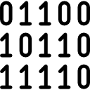
Data can be anything, including a number, a name, musical notes, or the colour of an image. The way that we stored, processed, and transmitted data is referred to as data representation. We can use any device, including computers, smartphones, and iPads, to store data in digital format. The stored data is handled by electronic circuitry. A bit is a 0 or 1 used in digital data representation.

Data Representation Techniques
Classification of Computers
Computer scans are classified broadly based on their speed and computing power.
1. Microcomputers or PCs (Personal Computers): It is a single-user computer system with a medium-power microprocessor. It is referred to as a computer with a microprocessor as its central processing unit.

Microcomputer
2. Mini-Computer: It is a multi-user computer system that can support hundreds of users at the same time.

Types of Mini Computers
3. Mainframe Computer: It is a multi-user computer system that can support hundreds of users at the same time. Software technology is distinct from minicomputer technology.

Mainframe Computer
4. Super-Computer: With the ability to process hundreds of millions of instructions per second, it is a very quick computer. They are used for specialised applications requiring enormous amounts of mathematical computations, but they are very expensive.

Supercomputer
Types of Computer Number System
Every value saved to or obtained from computer memory uses a specific number system, which is the method used to represent numbers in the computer system architecture. One needs to be familiar with number systems in order to read computer language or interact with the system.

Types of Number System
1. Binary Number System
There are only two digits in a binary number system: 0 and 1. In this number system, 0 and 1 stand in for every number (value). Because the binary number system only has two digits, its base is 2.
A bit is another name for each binary digit. The binary number system is also a positional value system, where each digit's value is expressed in powers of 2.
Characteristics of Binary Number System
The following are the primary characteristics of the binary system:
It only has two digits, zero and one.
Depending on its position, each digit has a different value.
Each position has the same value as a base power of two.
Because computers work with internal voltage drops, it is used in all types of computers.

Binary Number System
2. Decimal Number System
The decimal number system is a base ten number system with ten digits ranging from 0 to 9. This means that these ten digits can represent any numerical quantity. A positional value system is also a decimal number system. This means that the value of digits will be determined by their position.
Characteristics of Decimal Number System
Ten units of a given order equal one unit of the higher order, making it a decimal system.
The number 10 serves as the foundation for the decimal number system.
The value of each digit or number will depend on where it is located within the numeric figure because it is a positional system.
The value of this number results from multiplying all the digits by each power.

Decimal Number System
Decimal Binary Conversion Table
3. octal number system.
There are only eight (8) digits in the octal number system, from 0 to 7. In this number system, each number (value) is represented by the digits 0, 1, 2, 3,4,5,6, and 7. Since the octal number system only has 8 digits, its base is 8.
Characteristics of Octal Number System:
Contains eight digits: 0,1,2,3,4,5,6,7.
Also known as the base 8 number system.
Each octal number position represents a 0 power of the base (8).
An octal number's last position corresponds to an x power of the base (8).

Octal Number System
4. Hexadecimal Number System
There are sixteen (16) alphanumeric values in the hexadecimal number system, ranging from 0 to 9 and A to F. In this number system, each number (value) is represented by 0, 1, 2, 3, 5, 6, 7, 8, 9, A, B, C, D, E, and F. Because the hexadecimal number system has 16 alphanumeric values, its base is 16. Here, the numbers are A = 10, B = 11, C = 12, D = 13, E = 14, and F = 15.
Characteristics of Hexadecimal Number System:
A system of positional numbers.
Has 16 symbols or digits overall (0, 1, 2, 3, 4, 5, 6, 7, 8, 9, A, B, C, D, E, F). Its base is, therefore, 16.
Decimal values 10, 11, 12, 13, 14, and 15 are represented by the letters A, B, C, D, E, and F, respectively.
A single digit may have a maximum value of 15.
Each digit position corresponds to a different base power (16).
Since there are only 16 digits, any hexadecimal number can be represented in binary with 4 bits.

Hexadecimal Number System
So, we've seen how to convert decimals and use the Number System to communicate with a computer. The full character set of the English language, which includes all alphabets, punctuation marks, mathematical operators, special symbols, etc., must be supported by the computer in addition to numerical data.
Learning By Doing
Choose the correct answer:.
1. Which computer is the largest in terms of size?
Minicomputer
Micro Computer
2. The binary number 11011001 is converted to what decimal value?
Solved Questions
1. Give some examples where Supercomputers are used.
Ans: Weather Prediction, Scientific simulations, graphics, fluid dynamic calculations, Nuclear energy research, electronic engineering and analysis of geological data.
2. Which of these is the most costly?
Mainframe computer
Ans: C) Supercomputer
FAQs on Introduction to Data Representation
1. What is the distinction between the Hexadecimal and Octal Number System?
The octal number system is a base-8 number system in which the digits 0 through 7 are used to represent numbers. The hexadecimal number system is a base-16 number system that employs the digits 0 through 9 as well as the letters A through F to represent numbers.
2. What is the smallest data representation?
The smallest data storage unit in a computer's memory is called a BYTE, which comprises 8 BITS.
3. What is the largest data unit?
The largest commonly available data storage unit is a terabyte or TB. A terabyte equals 1,000 gigabytes, while a tebibyte equals 1,024 gibibytes.
- Reviews / Why join our community?
- For companies
- Frequently asked questions
Data Representation
Literature on data representation.
Here’s the entire UX literature on Data Representation by the Interaction Design Foundation, collated in one place:
Learn more about Data Representation
Take a deep dive into Data Representation with our course AI for Designers .
In an era where technology is rapidly reshaping the way we interact with the world, understanding the intricacies of AI is not just a skill, but a necessity for designers . The AI for Designers course delves into the heart of this game-changing field, empowering you to navigate the complexities of designing in the age of AI. Why is this knowledge vital? AI is not just a tool; it's a paradigm shift, revolutionizing the design landscape. As a designer, make sure that you not only keep pace with the ever-evolving tech landscape but also lead the way in creating user experiences that are intuitive, intelligent, and ethical.
AI for Designers is taught by Ioana Teleanu, a seasoned AI Product Designer and Design Educator who has established a community of over 250,000 UX enthusiasts through her social channel UX Goodies. She imparts her extensive expertise to this course from her experience at renowned companies like UiPath and ING Bank, and now works on pioneering AI projects at Miro.
In this course, you’ll explore how to work with AI in harmony and incorporate it into your design process to elevate your career to new heights. Welcome to a course that doesn’t just teach design; it shapes the future of design innovation.
In lesson 1, you’ll explore AI's significance, understand key terms like Machine Learning, Deep Learning, and Generative AI, discover AI's impact on design, and master the art of creating effective text prompts for design.
In lesson 2, you’ll learn how to enhance your design workflow using AI tools for UX research, including market analysis, persona interviews, and data processing. You’ll dive into problem-solving with AI, mastering problem definition and production ideation.
In lesson 3, you’ll discover how to incorporate AI tools for prototyping, wireframing, visual design, and UX writing into your design process. You’ll learn how AI can assist to evaluate your designs and automate tasks, and ensure your product is launch-ready.
In lesson 4, you’ll explore the designer's role in AI-driven solutions, how to address challenges, analyze concerns, and deliver ethical solutions for real-world design applications.
Throughout the course, you'll receive practical tips for real-life projects. In the Build Your Portfolio exercises, you’ll practice how to integrate AI tools into your workflow and design for AI products, enabling you to create a compelling portfolio case study to attract potential employers or collaborators.
All open-source articles on Data Representation
Visual mapping – the elements of information visualization.

- 3 years ago
Rating Scales in UX Research: The Ultimate Guide

Open Access—Link to us!
We believe in Open Access and the democratization of knowledge . Unfortunately, world-class educational materials such as this page are normally hidden behind paywalls or in expensive textbooks.
If you want this to change , cite this page , link to us, or join us to help us democratize design knowledge !
Privacy Settings
Our digital services use necessary tracking technologies, including third-party cookies, for security, functionality, and to uphold user rights. Optional cookies offer enhanced features, and analytics.
Experience the full potential of our site that remembers your preferences and supports secure sign-in.
Governs the storage of data necessary for maintaining website security, user authentication, and fraud prevention mechanisms.
Enhanced Functionality
Saves your settings and preferences, like your location, for a more personalized experience.
Referral Program
We use cookies to enable our referral program, giving you and your friends discounts.
Error Reporting
We share user ID with Bugsnag and NewRelic to help us track errors and fix issues.
Optimize your experience by allowing us to monitor site usage. You’ll enjoy a smoother, more personalized journey without compromising your privacy.
Analytics Storage
Collects anonymous data on how you navigate and interact, helping us make informed improvements.
Differentiates real visitors from automated bots, ensuring accurate usage data and improving your website experience.
Lets us tailor your digital ads to match your interests, making them more relevant and useful to you.
Advertising Storage
Stores information for better-targeted advertising, enhancing your online ad experience.
Personalization Storage
Permits storing data to personalize content and ads across Google services based on user behavior, enhancing overall user experience.
Advertising Personalization
Allows for content and ad personalization across Google services based on user behavior. This consent enhances user experiences.
Enables personalizing ads based on user data and interactions, allowing for more relevant advertising experiences across Google services.
Receive more relevant advertisements by sharing your interests and behavior with our trusted advertising partners.
Enables better ad targeting and measurement on Meta platforms, making ads you see more relevant.
Allows for improved ad effectiveness and measurement through Meta’s Conversions API, ensuring privacy-compliant data sharing.
LinkedIn Insights
Tracks conversions, retargeting, and web analytics for LinkedIn ad campaigns, enhancing ad relevance and performance.
LinkedIn CAPI
Enhances LinkedIn advertising through server-side event tracking, offering more accurate measurement and personalization.
Google Ads Tag
Tracks ad performance and user engagement, helping deliver ads that are most useful to you.
Share Knowledge, Get Respect!
or copy link
Cite according to academic standards
Simply copy and paste the text below into your bibliographic reference list, onto your blog, or anywhere else. You can also just hyperlink to this page.
New to UX Design? We’re Giving You a Free ebook!

Download our free ebook The Basics of User Experience Design to learn about core concepts of UX design.
In 9 chapters, we’ll cover: conducting user interviews, design thinking, interaction design, mobile UX design, usability, UX research, and many more!

Data Representation in Computer: Number Systems, Characters, Audio, Image and Video
- Post author: Anuj Kumar
- Post published: 16 July 2021
- Post category: Computer Science
- Post comments: 0 Comments
Table of Contents
- 1 What is Data Representation in Computer?
- 2.1 Binary Number System
- 2.2 Octal Number System
- 2.3 Decimal Number System
- 2.4 Hexadecimal Number System
- 3.4 Unicode
- 4 Data Representation of Audio, Image and Video
- 5.1 What is number system with example?
What is Data Representation in Computer?
A computer uses a fixed number of bits to represent a piece of data which could be a number, a character, image, sound, video, etc. Data representation is the method used internally to represent data in a computer. Let us see how various types of data can be represented in computer memory.
Before discussing data representation of numbers, let us see what a number system is.
Number Systems
Number systems are the technique to represent numbers in the computer system architecture, every value that you are saving or getting into/from computer memory has a defined number system.
A number is a mathematical object used to count, label, and measure. A number system is a systematic way to represent numbers. The number system we use in our day-to-day life is the decimal number system that uses 10 symbols or digits.
The number 289 is pronounced as two hundred and eighty-nine and it consists of the symbols 2, 8, and 9. Similarly, there are other number systems. Each has its own symbols and method for constructing a number.
A number system has a unique base, which depends upon the number of symbols. The number of symbols used in a number system is called the base or radix of a number system.
Let us discuss some of the number systems. Computer architecture supports the following number of systems:
Binary Number System
Octal number system, decimal number system, hexadecimal number system.

A Binary number system has only two digits that are 0 and 1. Every number (value) represents 0 and 1 in this number system. The base of the binary number system is 2 because it has only two digits.
The octal number system has only eight (8) digits from 0 to 7. Every number (value) represents with 0,1,2,3,4,5,6 and 7 in this number system. The base of the octal number system is 8, because it has only 8 digits.
The decimal number system has only ten (10) digits from 0 to 9. Every number (value) represents with 0,1,2,3,4,5,6, 7,8 and 9 in this number system. The base of decimal number system is 10, because it has only 10 digits.
A Hexadecimal number system has sixteen (16) alphanumeric values from 0 to 9 and A to F. Every number (value) represents with 0,1,2,3,4,5,6, 7,8,9,A,B,C,D,E and F in this number system. The base of the hexadecimal number system is 16, because it has 16 alphanumeric values.
Here A is 10, B is 11, C is 12, D is 13, E is 14 and F is 15 .
Data Representation of Characters
There are different methods to represent characters . Some of them are discussed below:

The code called ASCII (pronounced ‘’.S-key”), which stands for American Standard Code for Information Interchange, uses 7 bits to represent each character in computer memory. The ASCII representation has been adopted as a standard by the U.S. government and is widely accepted.
A unique integer number is assigned to each character. This number called ASCII code of that character is converted into binary for storing in memory. For example, the ASCII code of A is 65, its binary equivalent in 7-bit is 1000001.
Since there are exactly 128 unique combinations of 7 bits, this 7-bit code can represent only128 characters. Another version is ASCII-8, also called extended ASCII, which uses 8 bits for each character, can represent 256 different characters.
For example, the letter A is represented by 01000001, B by 01000010 and so on. ASCII code is enough to represent all of the standard keyboard characters.
It stands for Extended Binary Coded Decimal Interchange Code. This is similar to ASCII and is an 8-bit code used in computers manufactured by International Business Machines (IBM). It is capable of encoding 256 characters.
If ASCII-coded data is to be used in a computer that uses EBCDIC representation, it is necessary to transform ASCII code to EBCDIC code. Similarly, if EBCDIC coded data is to be used in an ASCII computer, EBCDIC code has to be transformed to ASCII.
ISCII stands for Indian Standard Code for Information Interchange or Indian Script Code for Information Interchange. It is an encoding scheme for representing various writing systems of India. ISCII uses 8-bits for data representation.
It was evolved by a standardization committee under the Department of Electronics during 1986-88 and adopted by the Bureau of Indian Standards (BIS). Nowadays ISCII has been replaced by Unicode.
Using 8-bit ASCII we can represent only 256 characters. This cannot represent all characters of written languages of the world and other symbols. Unicode is developed to resolve this problem. It aims to provide a standard character encoding scheme, which is universal and efficient.
It provides a unique number for every character, no matter what the language and platform be. Unicode originally used 16 bits which can represent up to 65,536 characters. It is maintained by a non-profit organization called the Unicode Consortium.
The Consortium first published version 1.0.0 in 1991 and continues to develop standards based on that original work. Nowadays Unicode uses more than 16 bits and hence it can represent more characters. Unicode can represent characters in almost all written languages of the world.
Data Representation of Audio, Image and Video
In most cases, we may have to represent and process data other than numbers and characters. This may include audio data, images, and videos. We can see that like numbers and characters, the audio, image, and video data also carry information.
We will see different file formats for storing sound, image, and video .
Multimedia data such as audio, image, and video are stored in different types of files. The variety of file formats is due to the fact that there are quite a few approaches to compressing the data and a number of different ways of packaging the data.
For example, an image is most popularly stored in Joint Picture Experts Group (JPEG ) file format. An image file consists of two parts – header information and image data. Information such as the name of the file, size, modified data, file format, etc. is stored in the header part.
The intensity value of all pixels is stored in the data part of the file. The data can be stored uncompressed or compressed to reduce the file size. Normally, the image data is stored in compressed form. Let us understand what compression is.
Take a simple example of a pure black image of size 400X400 pixels. We can repeat the information black, black, …, black in all 16,0000 (400X400) pixels. This is the uncompressed form, while in the compressed form black is stored only once and information to repeat it 1,60,000 times is also stored.
Numerous such techniques are used to achieve compression. Depending on the application, images are stored in various file formats such as bitmap file format (BMP), Tagged Image File Format (TIFF), Graphics Interchange Format (GIF), Portable (Public) Network Graphic (PNG).
What we said about the header file information and compression is also applicable for audio and video files. Digital audio data can be stored in different file formats like WAV, MP3, MIDI, AIFF, etc. An audio file describes a format, sometimes referred to as the ‘container format’, for storing digital audio data.
For example, WAV file format typically contains uncompressed sound and MP3 files typically contain compressed audio data. The synthesized music data is stored in MIDI(Musical Instrument Digital Interface) files.
Similarly, video is also stored in different files such as AVI (Audio Video Interleave) – a file format designed to store both audio and video data in a standard package that allows synchronous audio with video playback, MP3, JPEG-2, WMV, etc.
FAQs About Data Representation in Computer
What is number system with example.
Let us discuss some of the number systems. Computer architecture supports the following number of systems: 1. Binary Number System 2. Octal Number System 3. Decimal Number System 4. Hexadecimal Number System
Related posts:
10 Types of Computers | History of Computers, Advantages
What is microprocessor evolution of microprocessor, types, features, what is operating system functions, types, types of user interface, what is cloud computing classification, characteristics, principles, types of cloud providers, what is debugging types of errors.
- What are Functions of Operating System? 6 Functions
- What is Flowchart in Programming? Symbols, Advantages, Preparation
Advantages and Disadvantages of Flowcharts
What is c++ programming language c++ character set, c++ tokens, what are c++ keywords set of 59 keywords in c ++, what are data types in c++ types.
- What are Operators in C? Different Types of Operators in C
What are Expressions in C? Types
What are decision making statements in c types, types of storage devices, advantages, examples, you might also like.

Data and Information: Definition, Characteristics, Types, Channels, Approaches

10 Evolution of Computing Machine, History

Advantages and Disadvantages of Operating System

What is Computer System? Definition, Characteristics, Functional Units, Components

Types of Computer Memory, Characteristics, Primary Memory, Secondary Memory

Generations of Computer First To Fifth, Classification, Characteristics, Features, Examples

What is Big Data? Characteristics, Tools, Types, Internet of Things (IOT)

Types of Computer Software: Systems Software, Application Software
- Entrepreneurship
- Organizational Behavior
- Financial Management
- Communication
- Human Resource Management
- Sales Management
- Marketing Management

- School Guide
- Mathematics
- Number System and Arithmetic
- Trigonometry
- Probability
- Mensuration
- Maths Formulas
- Class 8 Maths Notes
- Class 9 Maths Notes
- Class 10 Maths Notes
- Class 11 Maths Notes
- Class 12 Maths Notes
What are the different ways of Data Representation?
- What are the Different Kinds of Data Scientists?
- Different types of Coding Schemes to represent data
- Graphical Representation of Data
- What are the types of statistics?
- Textual Presentation of Data: Meaning, Suitability, and Drawbacks
- Diagrammatic and Graphic Presentation of Data
- Different Types of Data in Data Mining
- Tabular Presentation of Data: Meaning, Objectives, Features and Merits
- What is a Dataset: Types, Features, and Examples
- Data Manipulation: Definition, Examples, and Uses
- Collection and Presentation of Data
- What is Data Organization?
- Different forms of data representation in today's world
- Difference Between Presentation and Representation
- What are the Basic Data Types in PHP ?
- Processing of Raw Data to Tidy Data in R
- Graph and its representations
- Difference between Information and Data
- Data Preprocessing and Its Types
The process of collecting the data and analyzing that data in large quantity is known as statistics. It is a branch of mathematics trading with the collection, analysis, interpretation, and presentation of numeral facts and figures.
It is a numerical statement that helps us to collect and analyze the data in large quantity the statistics are based on two of its concepts:
- Statistical Data
- Statistical Science
Statistics must be expressed numerically and should be collected systematically.
Data Representation
The word data refers to constituting people, things, events, ideas. It can be a title, an integer, or anycast. After collecting data the investigator has to condense them in tabular form to study their salient features. Such an arrangement is known as the presentation of data.
It refers to the process of condensing the collected data in a tabular form or graphically. This arrangement of data is known as Data Representation.
The row can be placed in different orders like it can be presented in ascending orders, descending order, or can be presented in alphabetical order.
Example: Let the marks obtained by 10 students of class V in a class test, out of 50 according to their roll numbers, be: 39, 44, 49, 40, 22, 10, 45, 38, 15, 50 The data in the given form is known as raw data. The above given data can be placed in the serial order as shown below: Roll No. Marks 1 39 2 44 3 49 4 40 5 22 6 10 7 45 8 38 9 14 10 50 Now, if you want to analyse the standard of achievement of the students. If you arrange them in ascending or descending order, it will give you a better picture. Ascending order: 10, 15, 22, 38, 39, 40, 44. 45, 49, 50 Descending order: 50, 49, 45, 44, 40, 39, 38, 22, 15, 10 When the row is placed in ascending or descending order is known as arrayed data.
Types of Graphical Data Representation
Bar chart helps us to represent the collected data visually. The collected data can be visualized horizontally or vertically in a bar chart like amounts and frequency. It can be grouped or single. It helps us in comparing different items. By looking at all the bars, it is easy to say which types in a group of data influence the other.
Now let us understand bar chart by taking this example Let the marks obtained by 5 students of class V in a class test, out of 10 according to their names, be: 7,8,4,9,6 The data in the given form is known as raw data. The above given data can be placed in the bar chart as shown below: Name Marks Akshay 7 Maya 8 Dhanvi 4 Jaslen 9 Muskan 6
A histogram is the graphical representation of data. It is similar to the appearance of a bar graph but there is a lot of difference between histogram and bar graph because a bar graph helps to measure the frequency of categorical data. A categorical data means it is based on two or more categories like gender, months, etc. Whereas histogram is used for quantitative data.
For example:
The graph which uses lines and points to present the change in time is known as a line graph. Line graphs can be based on the number of animals left on earth, the increasing population of the world day by day, or the increasing or decreasing the number of bitcoins day by day, etc. The line graphs tell us about the changes occurring across the world over time. In a line graph, we can tell about two or more types of changes occurring around the world.
For Example:
Pie chart is a type of graph that involves a structural graphic representation of numerical proportion. It can be replaced in most cases by other plots like a bar chart, box plot, dot plot, etc. As per the research, it is shown that it is difficult to compare the different sections of a given pie chart, or if it is to compare data across different pie charts.
Frequency Distribution Table
A frequency distribution table is a chart that helps us to summarise the value and the frequency of the chart. This frequency distribution table has two columns, The first column consist of the list of the various outcome in the data, While the second column list the frequency of each outcome of the data. By putting this kind of data into a table it helps us to make it easier to understand and analyze the data.
For Example: To create a frequency distribution table, we would first need to list all the outcomes in the data. In this example, the results are 0 runs, 1 run, 2 runs, and 3 runs. We would list these numerals in numerical ranking in the foremost queue. Subsequently, we ought to calculate how many times per result happened. They scored 0 runs in the 1st, 4th, 7th, and 8th innings, 1 run in the 2nd, 5th, and the 9th innings, 2 runs in the 6th inning, and 3 runs in the 3rd inning. We set the frequency of each result in the double queue. You can notice that the table is a vastly more useful method to show this data. Baseball Team Runs Per Inning Number of Runs Frequency 0 4 1 3 2 1 3 1
Sample Questions
Question 1: Considering the school fee submission of 10 students of class 10th is given below:
In order to draw the bar graph for the data above, we prepare the frequency table as given below. Fee submission No. of Students Paid 6 Not paid 4 Now we have to represent the data by using the bar graph. It can be drawn by following the steps given below: Step 1: firstly we have to draw the two axis of the graph X-axis and the Y-axis. The varieties of the data must be put on the X-axis (the horizontal line) and the frequencies of the data must be put on the Y-axis (the vertical line) of the graph. Step 2: After drawing both the axis now we have to give the numeric scale to the Y-axis (the vertical line) of the graph It should be started from zero and ends up with the highest value of the data. Step 3: After the decision of the range at the Y-axis now we have to give it a suitable difference of the numeric scale. Like it can be 0,1,2,3…….or 0,10,20,30 either we can give it a numeric scale like 0,20,40,60… Step 4: Now on the X-axis we have to label it appropriately. Step 5: Now we have to draw the bars according to the data but we have to keep in mind that all the bars should be of the same length and there should be the same distance between each graph
Question 2: Watch the subsequent pie chart that denotes the money spent by Megha at the funfair. The suggested colour indicates the quantity paid for each variety. The total value of the data is 15 and the amount paid on each variety is diagnosed as follows:
Chocolates – 3
Wafers – 3
Toys – 2
Rides – 7
To convert this into pie chart percentage, we apply the formula: (Frequency/Total Frequency) × 100 Let us convert the above data into a percentage: Amount paid on rides: (7/15) × 100 = 47% Amount paid on toys: (2/15) × 100 = 13% Amount paid on wafers: (3/15) × 100 = 20% Amount paid on chocolates: (3/15) × 100 = 20 %
Question 3: The line graph given below shows how Devdas’s height changes as he grows.
Given below is a line graph showing the height changes in Devdas’s as he grows. Observe the graph and answer the questions below.

(i) What was the height of Devdas’s at 8 years? Answer: 65 inches (ii) What was the height of Devdas’s at 6 years? Answer: 50 inches (iii) What was the height of Devdas’s at 2 years? Answer: 35 inches (iv) How much has Devdas’s grown from 2 to 8 years? Answer: 30 inches (v) When was Devdas’s 35 inches tall? Answer: 2 years.
Please Login to comment...
Similar reads.
- School Learning
Improve your Coding Skills with Practice
What kind of Experience do you want to share?
Computer Network
- Operating Systems
- Computer Fundamentals
- Interview Q
Physical Layer
Data link layer, network layer, routing algorithm, transport layer, application layer, application protocols, network security.
Interview Questions

- Send your Feedback to [email protected]
Help Others, Please Share

Learn Latest Tutorials

Transact-SQL

Reinforcement Learning

R Programming

React Native

Python Design Patterns

Python Pillow

Python Turtle

Preparation

Verbal Ability
Company Questions
Trending Technologies

Artificial Intelligence

Cloud Computing

Data Science

Machine Learning

B.Tech / MCA

Data Structures

Operating System

Compiler Design

Computer Organization

Discrete Mathematics

Ethical Hacking

Computer Graphics

Software Engineering

Web Technology

Cyber Security

C Programming

Control System

Data Mining

Data Warehouse

Help | Advanced Search
Computer Science > Computation and Language
Title: analyzing the role of semantic representations in the era of large language models.
Abstract: Traditionally, natural language processing (NLP) models often use a rich set of features created by linguistic expertise, such as semantic representations. However, in the era of large language models (LLMs), more and more tasks are turned into generic, end-to-end sequence generation problems. In this paper, we investigate the question: what is the role of semantic representations in the era of LLMs? Specifically, we investigate the effect of Abstract Meaning Representation (AMR) across five diverse NLP tasks. We propose an AMR-driven chain-of-thought prompting method, which we call AMRCoT, and find that it generally hurts performance more than it helps. To investigate what AMR may have to offer on these tasks, we conduct a series of analysis experiments. We find that it is difficult to predict which input examples AMR may help or hurt on, but errors tend to arise with multi-word expressions, named entities, and in the final inference step where the LLM must connect its reasoning over the AMR to its prediction. We recommend focusing on these areas for future work in semantic representations for LLMs. Our code: this https URL .
Submission history
Access paper:.
- Other Formats
References & Citations
- Google Scholar
- Semantic Scholar
BibTeX formatted citation
Bibliographic and Citation Tools
Code, data and media associated with this article, recommenders and search tools.
- Institution
arXivLabs: experimental projects with community collaborators
arXivLabs is a framework that allows collaborators to develop and share new arXiv features directly on our website.
Both individuals and organizations that work with arXivLabs have embraced and accepted our values of openness, community, excellence, and user data privacy. arXiv is committed to these values and only works with partners that adhere to them.
Have an idea for a project that will add value for arXiv's community? Learn more about arXivLabs .
ABA Issues Opinion on Disclosing to Clients When Using Listservs
By Sam Skolnik

Lawyers should not reveal any information relating to a client’s representation to a wide group of lawyers in a computer listserv, or group email list, without informed consent, the American Bar Association has advised in a formal opinion Wednesday.
The new guidance for the use of email lists by lawyers addresses when it’s permissible to ask large groups of other lawyers questions that could identify a client and their legal issues.
“Participation in most lawyer listserv discussion groups is significantly different from seeking out an individual lawyer or personally selected group of lawyers practicing in other firms for a consultation about a matter,” according to the opinion issued Wednesday by the ABA Standing Committee on Ethics and Professional Responsibility.
Without informed client consent, the opinion found, “a lawyer participating in listserv groups should not disclose any information relating to the representation that may be reasonably connected to an identifiable client.”
The opinion added that lawyers may participate in listserv discussions related to legal news or changes in the law without getting a client’s consent, if the lawyer doesn’t disclose information about a client representation.
The opinion was released to help interpret ABA Model Ethics Rule 1.6, which advises that lawyers “shall not reveal information relating to the representation of a client unless the client gives informed consent, the disclosure is impliedly authorized in order to carry out the representation,” or the info needs to be revealed to prevent death, bodily harm, or to stop the client from committing a crime.
The ABA’s model ethics rules aren’t legally binding but most states have largely adopted the rules.
The standing committee periodically issues ethics opinions for lawyers and the public to interpret and apply the ABA’s model ethics rules to specific issues of legal practice, including client-lawyer relationships.
To contact the reporter on this story: Sam Skolnik in Washington at [email protected]
To contact the editor responsible for this story: Alessandra Rafferty at [email protected]
Learn more about Bloomberg Law or Log In to keep reading:
Learn about bloomberg law.
AI-powered legal analytics, workflow tools and premium legal & business news.
Already a subscriber?
Log in to keep reading or access research tools.
IMAGES
VIDEO
COMMENTS
Data representations are useful for interpreting data and identifying trends and relationships. When working with data representations, pay close attention to both the data values and the key words in the question. When matching data to a representation, check that the values are graphed accurately for all categories.
Graphical representation is a form of visually displaying data through various methods like graphs, diagrams, charts, and plots. It helps in sorting, visualizing, and presenting data in a clear manner through different types of graphs. Statistics mainly use graphical representation to show data.
Data Representation: Data representation is a technique for analysing numerical data. The relationship between facts, ideas, information, and concepts is depicted in a diagram via data representation. It is a fundamental learning strategy that is simple and easy to understand. It is always determined by the data type in a specific domain.
2.3: Histograms, Frequency Polygons, and Time Series Graphs. A histogram is a graphic version of a frequency distribution. The graph consists of bars of equal width drawn adjacent to each other. The horizontal scale represents classes of quantitative data values and the vertical scale represents frequencies. The heights of the bars correspond ...
Displaying Data. It is often easier for people to interpret relative sizes of data when that data is displayed graphically. Note that a categorical variable is a variable that can take on one of a limited number of values and a quantitative variable is a variable that takes on numerical values that represent a measurable quantity.Examples of categorical variables are tv stations, the state ...
Data visualization is the graphical representation of information and data. By using v isual elements like charts, graphs, and maps, data visualization tools provide an accessible way to see and understand trends, outliers, and patterns in data. Additionally, it provides an excellent way for employees or business owners to present data to non ...
Data Visualization is a graphic representation of data that aims to communicate numerous heavy data in an efficient way that is easier to grasp and understand.In a way, data visualization is the mapping between the original data and graphic elements that determine how the attributes of these elements vary.
Data visualization is the representation of information and data using charts, graphs, maps, and other visual tools. These visualizations allow us to easily understand any patterns, trends, or outliers in a data set. Data visualization also presents data to the general public or specific audiences without technical knowledge in an accessible ...
This guide to data representation covers all the key concepts you need to know to understand the principles of representing data in computer systems. Whether you're a GCSE, IB or A-level computer science student, our guide provides a detailed explanation of how data is represented in binary, hexadecimal, and ASCII formats, as well as the ...
Data visualization is the representation of data through use of common graphics, such as charts, plots, infographics and even animations. These visual displays of information communicate complex data relationships and data-driven insights in a way that is easy to understand.
Data representation. Computers use binary - the digits 0 and 1 - to store data. A binary digit, or bit, is the smallest unit of data in computing. It is represented by a 0 or a 1. Binary numbers are made up of binary digits (bits), eg the binary number 1001. The circuits in a computer's processor are made up of billions of transistors.
Graphical Representation of Data: In today's world of the internet and connectivity, there is a lot of data available, and some or other method is needed for looking at large data, the patterns, and trends in it. There is an entire branch in mathematics dedicated to dealing with collecting, analyzing, interpreting, and presenting numerical data in visual form in such a way that it becomes ...
The Power of Good Data Visualization. Data visualization involves the use of graphical representations of data, such as graphs, charts, and maps. Compared to descriptive statistics or tables, visuals provide a more effective way to analyze data, including identifying patterns, distributions, and correlations and spotting outliers in complex ...
Data Representation Data Representation Eric Roberts CS 106A February 10, 2016 Claude Shannon Claude Shannon was one of the pioneers who shaped computer science in its early years. In his master's thesis, Shannon showed how it was possible to use Boolean logic and switching circuits to perform arithmetic calculations. That work led
Data visualisation is the graphical representation of information and data. By using visual elements like charts, graphs and maps, data visualisation tools provide an accessible way to see and understand trends, outliers and patterns in data. In the world of big data, data visualisation tools and technologies are essential for analysing massive ...
Some data visualization tools, however, allow you to add interactivity to your map so the exact values are accessible. 15. Word Cloud. A word cloud, or tag cloud, is a visual representation of text data in which the size of the word is proportional to its frequency. The more often a specific word appears in a dataset, the larger it appears in ...
Graphical Representation is a way of analysing numerical data. It exhibits the relation between data, ideas, information and concepts in a diagram. It is easy to understand and it is one of the most important learning strategies. It always depends on the type of information in a particular domain. There are different types of graphical ...
The way that we stored, processed, and transmitted data is referred to as data representation. We can use any device, including computers, smartphones, and iPads, to store data in digital format. The stored data is handled by electronic circuitry. A bit is a 0 or 1 used in digital data representation. Data Representation Techniques.
Learn more about Data Representation. Take a deep dive into Data Representation with our course AI for Designers . In an era where technology is rapidly reshaping the way we interact with the world, understanding the intricacies of AI is not just a skill, but a necessity for designers. The AI for Designers course delves into the heart of this ...
A computer uses a fixed number of bits to represent a piece of data which could be a number, a character, image, sound, video, etc. Data representation is the method used internally to represent data in a computer. Let us see how various types of data can be represented in computer memory. Before discussing data representation of numbers, let ...
Data Representation. The word data refers to constituting people, things, events, ideas. It can be a title, an integer, or anycast. After collecting data the investigator has to condense them in tabular form to study their salient features. Such an arrangement is known as the presentation of data.
Data Representation. A network is a collection of different devices connected and capable of communicating. For example, a company's local network connects employees' computers and devices like printers and scanners. Employees will be able to share information using the network and also use the common printer/ scanner via the network.
Traditionally, natural language processing (NLP) models often use a rich set of features created by linguistic expertise, such as semantic representations. However, in the era of large language models (LLMs), more and more tasks are turned into generic, end-to-end sequence generation problems. In this paper, we investigate the question: what is the role of semantic representations in the era ...
Next-generation methylation-aware sequencing of DNA sheds light on the fundamental role of methylation in cellular function in health and disease. These data are commonly represented at a single CpG resolution, while single-molecule fragment-level analysis is often overlooked. Here, we present wgbstools, an extensive computational suite tailored for methylation sequencing data. wgbstools ...
The opinion was released to help interpret ABA Model Ethics Rule 1.6, which advises that lawyers "shall not reveal information relating to the representation of a client unless the client gives informed consent, the disclosure is impliedly authorized in order to carry out the representation," or the info needs to be revealed to prevent ...