
Presentation Drawing
The importance of presentation drawing.
Presentation drawing, also known as a rendering, is a crucial aspect of the design process. It's a means of visually communicating ideas to clients, colleagues, and contractors. Presentation drawings can take many forms, from quick sketches to highly detailed, realistic illustrations. Regardless of the format, the goal of presentation drawing is to convey the essence of a design in a visually compelling way.
The Types of Presentation Drawing
There are several types of presentation drawing, each with its own unique strengths and weaknesses. Here are four of the most common types of presentation drawing:
Sketches are quick, informal drawings that are used to explore ideas and communicate concepts. They are typically done by hand using pencil or pen and paper. Sketches are valuable because they allow designers to express their ideas quickly and without the need for expensive tools or software. That said, sketches are generally less polished than other forms of presentation drawing, so they may not be suitable for more formal presentations.
Concept Drawings
Concept drawings are more detailed than sketches and are intended to convey a more developed idea. They are still relatively informal, but they often incorporate color and shading to give the drawing depth and texture. Concept drawings can be done by hand or using digital tools like Photoshop or SketchUp.
Renderings are highly detailed, realistic illustrations of a design. They are typically created using 3D modeling software and are intended to give clients and colleagues a sense of what a finished project will look like. Renderings are often used in marketing materials and presentations because they are visually impressive and highly detailed.
Construction Documents
Construction documents are highly technical drawings that are used to communicate specific details about a project to contractors and builders. They include things like floor plans, elevations, and sections, and they are typically created using a combination of hand drawing and computer software.
Tips for Effective Presentation Drawing
Regardless of the type of presentation drawing you are creating, there are a few tips that can help ensure that your drawing is effective and communicates your ideas clearly.
Focus on Legibility
One of the most important aspects of presentation drawing is legibility. Your drawing should be easy to read and understand, even when viewed from a distance. Make sure that you use a font size and style that is easy to read, and avoid cluttering your drawing with unnecessary details that can distract from the main ideas you are trying to convey.
Choose the Right Format
Different types of presentation drawing are better suited to different formats. Sketches, for example, are best presented on paper or on a whiteboard. Renderings, on the other hand, are best viewed on a large screen or printed out at a high resolution. Make sure that you choose the right format for your drawing to ensure that it is presented in the most effective way possible.
Use Color Wisely
Color can be a powerful tool in presentation drawing, but it must be used wisely. Too much color can be distracting, while too little color can make your drawing look flat and lifeless. Use color to highlight important details and to create depth and texture in your drawing, but be sure to use it sparingly.
Be Consistent
Consistency is key in presentation drawing. Make sure that your drawing is consistent in terms of scale, proportion, and style. This will ensure that it is easy to read and that your ideas are communicated clearly.
Practice, Practice, Practice
Finally, the best way to improve your presentation drawing skills is to practice. Take the time to practice drawing different types of illustrations, and experiment with different tools and techniques to find what works best for you. The more you practice, the better you will become at conveying your ideas visually.
The Bottom Line
Presentation drawing is an essential aspect of the design process. It allows designers to communicate their ideas in a clear and compelling way and is crucial for getting buy-in from clients, colleagues, and contractors. Whether you're creating quick sketches or detailed renderings, there are a few key principles to keep in mind that can help ensure that your presentation drawing is effective and communicates your ideas clearly.

Leave a Reply Cancel reply
Your email address will not be published. Required fields are marked *
Save my name, email, and website in this browser for the next time I comment.
Exploring the most sophisticated spatial concepts from across the globe. Discover innovative building techniques and materials available, worldwide.
What Are Presentation Drawings In Architecture
Making a building look amazing is not something that should be taken lightly. And for that reason, architects have to make use of something called presentation drawings. This form of drawing has been used for centuries, and it still holds a very important place in the profession today. But what exactly are presentation drawings, and why are they so important?
These drawings are important because they serve as a way for the architect to demonstrate to the client what they have in mind. They allow the client to get a feel for the building and to get a better understanding of the design process. For architects, presentation drawings are also an opportunity to showcase their creative abilities and to show off their skills. The more effective the drawings are, the more likely it is that the client will be impressed.
At the same time, presentation drawings should also be aesthetically pleasing. By using colors and styles that are pleasing to the eye, the architect can help boost the credibility of their project and make it more attractive to potential customers. It is also important to make sure that the drawings accurately reflect the architect’s vision for the project, as it will give potential customers a better understanding of what the project is all about.
Documentation
Presentation drawings are also important for documentation purposes. Architects must keep records of their projects so that they can refer back to them if needed. The drawings serve as a record of what was done and make it easier to review the project in the future. In addition, the drawings can also be used to prove that certain regulations were followed and to determine if certain elements of the design were successful.
Presentation drawings also provide evidence that the architect has done their job properly. They demonstrate the level of detail and care that went into the project and show that the architect took all the necessary steps to ensure that the project was done right. In addition, they can be used in court to prove that the architect was responsible for any mistakes or issues that may have occurred during the construction process.
Time and Money Saving
Presentation drawings can be a great way to save time and money on projects. By providing clients with detailed and accurate drawings, architects can avoid costly mistakes in the construction process and ensure that the project is completed on time and on budget. By providing clients with a realistic representation of what their project will ultimately look like, architects can help to ensure that the project goes as smoothly as possible.
Presentation drawings can also help architects to identify potential problems with the project before they occur. By analyzing the presentation drawings, architects can spot potential problems with the project and address them before they become costly issues. This can help to save time and money during the construction process, as any issues can be dealt with more quickly and efficiently.
Technological Advancement
In addition, the use of 3D printing has revolutionized the presentation drawing process. By using 3D printers, architects can quickly and accurately produce presentations that are as close to the actual project as possible. This can be especially helpful when creating drawings of complex structures that would otherwise be difficult to accurately depict.
Presentation Drawing Generators
In addition to the advances in technology, there are also many tools available to help architects create presentation drawings. In particular, presentation drawing generators are a great way to quickly and easily create drawings that are higher in quality than traditional drawing methods. These generators can help cut out a lot of the time and effort associated with producing high-quality presentation drawings.
Impact on the Overall Project
Presentation drawings are one of the most important tools available to an architect, and they can have a huge impact on the success of a project. From allowing the client to get a better understanding of the project to helping to identify potential problems in the construction process, presentation drawings can make a huge difference in the overall outcome of the project.
For this reason, it is important for architects to take their time and effort in creating presentation drawings that accurately reflect their vision. Not only will this ensure that the drawings are effective and appealing, but it will also help the project be completed to the highest standard possible.
Anita Johnson
Leave a comment cancel reply.
Four Choices in Architectural Presentation Drawings
Winning a project bid requires architectural presentation drawings that demonstrate to the potential client the merits of the structure’s design concept and is a direct indication of an architectural firm’s skill in creativity and technical ability. Poorly drafted presentation drawings can result in losing great projects to other firms. We offer four different avenues to presenting your architectural concept which are highly illustrative and demonstrate professionalism to your clients:
2D Elevations and Sections Simple projects such as warehouses and small office complexes may only require 2D elevations of the building facade and cross-sections that illustrate interior area functions. Overall dimensions and floor heights of the building are detailed along with the proper tones and hatching applied to the exterior surfaces to emphasize different materials can supply ample information and clearly illustrate simpler structures. These drawings are best printed in high resolution color on heavy board surfaces to enhance the presentation.
Isometric and Perspectives Drawings A better visual solution for non-technical clients is given with an isometric or perspective view of the structure which emulates a three-dimensional view and shows the relationship between multiple sides of the building. Color and texture rendering of these drawings along with landscaping features will offer clients a greater representation of the proposed structure. The ability to alter view orientation in real-time can help create an exciting presentation as the building is tilted and rotated to different angles.
3D Wire Frame Models As the pre-cursor to rendered models, wire frame 3D models are often employed to allow simultaneous viewing of underlying facets of the structure, such as beams, floors and walls. When the structural solution to a project outweighs the building appearance, wire frame models are the perfect solution. With the application of automatic hidden line removal, the model easily converts to a vector line exterior view of the structure.
3D Rendered Models Fully rendered 3D models of the proposed structure is an optimum solution and well worth the investment for projects that are high-end or have great public interest. Surface textures can nearly replicate real world materials and give your clients a glimpse of what the new building will look like in the real world. The ability to simulate an actual building walk-through is an added benefit to solids models.
Contact us to learn more details on the process and pricing of each of these architectural presentation drawing options.
Related links: Creative 3D Interior Modeling Design, Plan and Construct Using Building Information Modeling Give Clients a Virtual Tour Using Architectural Walkthroughs Curtain Wall Shop Drawings – Add Creativity, Beauty, and Function to Any Building Design Improve Your Presentations with Photorealistic Architectural Rendering BIM Advantages for HVAC Drafting Businesses Advanced Technology for 3D Architectural Design Three Business Development Strategies with Architectural CAD Drafting Services Choosing the Right Architectural Rendering Firm Can Make All the Difference BIM for mechanical, electrical, and plumbing services
Related Articles
Accurate structural steel fabrication drawings central to successful steel construction projects, the benefits of virtual reality in architecture, 5 trends reshaping the building information modeling process.
10 Benefits Of Live Drawing For Presentations- No Artistic Skills Required
Hrideep barot.
- Presentation

Drawing for presentations is more than just doodles on a page—it’s the art of transforming ideas into visuals that captivate and communicate. As Picasso once said, “Every child is an artist; the problem is staying an artist when you grow up.” So, let’s unleash our inner Picasso and master the art of presentation drawing!
What Is Live Drawing for Presentations?
Live drawing in presentations, also known as real-time or interactive drawing, is a dynamic and engaging technique where an artist or presenter creates visuals on a digital or physical canvas during a live event.
This approach adds an element of excitement and interactivity to presentations, making them more memorable and impactful. It can involve sketching, diagramming, or illustrating ideas on the spot, helping to clarify complex concepts and capture the audience’s attention in real-time.
Live drawing can be a powerful tool for educators, speakers, and businesses looking to enhance their communication and storytelling abilities.
What Is The Art Of Presentation Skills?
The art of presentation skills is a multifaceted craft that involves the ability to communicate, captivate, and persuade an audience effectively. It’s not just about conveying information; it’s about creating an experience that leaves a lasting impact. Effective presenters master the art of connecting with their audience, conveying their message clearly, and engaging their listeners on both intellectual and emotional levels.
Presentations, whether they’re in a business, educational, or public speaking context, require a delicate balance of several key elements. These elements include content organization, body language, vocal tone, and the use of visual aids. Presentation skills encompass the art of storytelling, the power of persuasion, and the ability to adapt to the needs and preferences of your audience.
Now, let’s introduce Drawing as one of the essential skills within the Art of Presentation:
Drawing, as an integral part of presentation skills , brings a unique dimension to the craft. It allows presenters to visually illustrate their ideas, clarify complex concepts, and create a stronger connection with the audience. Whether it’s through live drawing during the presentation or integrating pre-made visuals, drawing adds a creative and engaging element that can leave a lasting impression.
Drawing can be used to create diagrams, charts, and illustrations that simplify complex data, making it more accessible and relatable to the audience. Visual metaphors, sketches, and illustrations can be powerful tools to reinforce your message, evoke emotions, and enhance the overall storytelling experience.
Moreover, drawing doesn’t require advanced artistic skills. Even simple sketches can effectively convey ideas and make your presentation more engaging. Whether you’re presenting in a boardroom, classroom, or on a stage, the ability to incorporate drawing into your presentation skills toolkit can set you apart as a more dynamic and compelling communicator.
In the art of presentation skills, drawing is a creative tool that transforms presentations into Visual stories , making them more memorable and impactful. It’s a skill that, when mastered, can take your presentations to a whole new level, making your messages not only heard but also seen and felt by your audience.
10 Benefits Of Live Drawing For Presentations
Live drawing in presentations is not just about putting pen to paper; it’s a dynamic and captivating technique that can transform your communication. Let us explore ten compelling benefits of incorporating live drawing into your presentations:
1. Drawing Improves Memory and Recall
Drawing engages both the visual and motor cortex of the brain, which enhances memory retention. When you draw during a presentation, you create a visual memory for yourself and your audience, making the information more memorable.
A study published in the “Quarterly Journal of Experimental Psychology” found that drawing information led to significantly better recall compared to writing or visualizing alone.
2. Greater Understanding and Clarity:
Live drawing helps in breaking down complex concepts into simple, visually digestible elements. Visual representations can make abstract or intricate ideas more accessible, reducing cognitive load for the audience and increasing comprehension and clarity. This simplification aids in greater understanding and clarity, making it easier for the audience to grasp the content.
“When information is presented pictorially, it is often easier to understand and recall than when it is presented verbally.” – Barbara Tversky, Professor of Psychology at Stanford University.
3. Picturization of Content:
By translating information into visual form, live drawing allows you to represent data and ideas as images, making them more relatable. It allows you to transform abstract ideas and data into tangible images. This approach aligns with the brain’s preference for processing information visually, with up to 90% of the information transmitted to the brain being visual. This makes the content more relatable and accessible for the audience, as they can connect with the visuals on a deeper level.
The brain processes visual information 60,000 times faster than text, and 90 percent of information transmitted to the brain is visual.
4. Enhanced Engagement and Interactivity:
Live drawing is inherently engaging as the audience witnesses the creation of visuals in real-time. It adds an element of interactivity, as viewers can ask questions or provide input, fostering a more dynamic and participative environment.
A study in “The Journal of Educational Psychology” showed that interactive learning methods, like live drawing, can lead to significantly improved learning outcomes and engagement.
5. Storytelling Amplification:
Visuals created through live drawing enhance storytelling by adding depth and emotional resonance to the narrative. Visual metaphors and illustrations can convey complex emotions and ideas more effectively. This is supported by research indicating that stories are far more memorable than facts alone, and visuals enhance the emotional impact of a narrative.
“Stories are remembered up to 22 times more than facts alone.” – Jennifer Aaker, Professor of Marketing at Stanford Graduate School of Business.
6. Customization for Specific Audiences:
Live drawing enables presenters to adapt their visuals in real-time, catering to the specific needs and preferences of the audience. This customization fosters a more personalized and impactful presentation.
“Audience engagement increases by 18% when content is personalized.” – Demand Metric Research Corporation.
7. Improved Information Processing:
The combination of spoken words and live visuals creates dual coding, reinforcing the message in the audience’s memory. This leads to higher information processing rates.
The Cognitive Load Theory suggests that the use of visual aids, such as live drawing, can significantly reduce cognitive load, making it easier for the brain to process and retain information.
8. Overcoming Language Barriers:
Live drawing transcends language barriers, making it an effective tool for international or diverse audiences. Visuals can convey universal concepts, ensuring a broader reach and understanding.
“Visual language is a global medium for communication.” – Keith Williams, Professor of Visual Communication at Yale University.
9. Demonstration of Creative Thinking:
Live drawing showcases creativity and problem-solving skills, which can enhance the presenter’s credibility and engage the audience on a deeper level.
Studies have shown that creative demonstrations can lead to increased trust and positive perception of the presenter.
10. Enhanced Emotional Connection:
Visuals created through live drawing have the power to evoke emotions and create a stronger connection between the audience and the content, leaving a lasting impact.
“The more emotional the content, the more likely it is to be shared and remembered.” – Jonah Berger, Professor at the Wharton School of the University of Pennsylvania.
Incorporating live drawing into presentations can yield numerous cognitive, emotional, and practical benefits, enhancing the overall impact and effectiveness of your communication.
How Drawing Helps You To Think Better?
Drawing is a powerful tool that can enhance your thinking processes, fostering creativity, problem-solving, and communication. This TEDxTalk offers valuable insights into how drawing can contribute to improved thinking. Let’s explore each of the five points that are mentioned:
1. Intuition
Drawing can help tap into your intuition by allowing you to express ideas, feelings, and concepts that might be difficult to articulate with words alone. Through the act of drawing, you can access your inner thoughts and emotions, enabling a more intuitive understanding of complex issues.
In the video, the speaker discusses how drawing can help individuals connect with their inner selves and harness their intuition as a valuable source of insight.
Drawing, whether it’s creating art or diagrams, can elevate the aesthetics of your thoughts and ideas. Visualizing concepts in a visually appealing way can make them more attractive and engaging, enhancing the overall quality of your thinking.
The video emphasizes the importance of incorporating aesthetics into your work and how visual beauty can be a driving force in creative thinking.
3. Reflection:
Drawing provides an opportunity for reflection. When you put your thoughts on paper or canvas, it becomes easier to evaluate, analyze, and refine your ideas. You can step back and critically assess your work, facilitating deeper thinking and self-reflection.
The video highlights the role of drawing as a tool for self-reflection, helping individuals gain clarity and insight into their thoughts and emotions.
4. Imagination:
Drawing is a medium that encourages imagination and creativity. It allows you to explore possibilities, experiment with ideas, and push the boundaries of your thinking. By sketching and visualizing your imagination, you can discover new perspectives and solutions.
The video underscores the role of drawing in unlocking one’s imagination, enabling a free flow of creative ideas and solutions to problems.
5. Communication:
Drawing is a universal language that transcends barriers. It enables effective communication by simplifying complex concepts and making them accessible to a wide audience. Whether you’re explaining a complex scientific theory or a new product design, visuals created through drawing can convey your message with clarity.
The video emphasizes the role of drawing as a means of communication, highlighting its power in connecting with and compellingly engaging others.
In summary, drawing can be a transformative tool for thinking. It engages intuition, enhances beauty, promotes reflection, fuels imagination, and facilitates effective communication. The video offers further insights and inspiration on how drawing can be harnessed to improve your thinking processes.
What Are The Requirements Of Presentation Drawing?
Creating effective presentation drawings requires a combination of skills, tools, and considerations to ensure that your visuals are engaging and communicate your message effectively. Here are the 7 key requirements for presentation drawing:
1. Clear Message and Objective:
The foundation of a successful presentation drawing is a well-defined message and objective. Your drawing should align with the core message you want to convey. Before you begin drawing, clarify what you want your audience to take away from your visual.
2. Understanding Your Audience:
Understanding your audience is crucial to creating effective presentation drawings. Consider their knowledge level, interests, and preferences. Tailor your visuals to resonate with your specific audience, making the content more relatable and engaging for them.
3. Storyboard or Plan:
Planning your drawing in advance is essential. Create a rough outline or storyboard to map out the structure and sequence of your drawing. This helps ensure a logical flow and consistency in your visuals, allowing for a smooth and coherent narrative.
4. Basic Drawing Skills:
While you don’t need to be an expert artist, having basic drawing skills is important. This includes the ability to create simple shapes, lines, and symbols that effectively convey your ideas. Practice and hone your skills to become more confident in your drawing abilities.
5. Visual Hierarchy and Consistency:
Establish a visual hierarchy to emphasize key points in your drawing. This can be achieved through the size, color, or positioning of elements. Consistency in style and formatting across all your drawings within a presentation is crucial for creating a cohesive look and maintaining audience engagement.
6. Simplicity and Relevance:
Keep your drawings simple and relevant. Avoid clutter and unnecessary details that could distract from your message. Each element in your drawing should directly relate to the content you’re presenting. Simplicity enhances clarity and helps the audience focus on what’s important.
7. Choice of Medium:
Your choice of drawing medium, whether traditional or digital, depends on your comfort and available resources. Traditional tools, like markers and paper, offer a tactile experience, while digital tools provide flexibility and ease of editing. Choose the medium that suits your style and resources.
A. Drawing In PowerPoint Presentation
PowerPoint allows for in-slide drawing, which is particularly useful for digital presentations. It offers basic drawing tools, shapes, and the ability to annotate slides directly. It’s an excellent option for enhancing visuals during virtual or in-person presentations.
Drawing in PowerPoint is effective for real-time, digital presentations. You can highlight key points, underline text, add arrows, or create simple illustrations on your slides. It’s a versatile tool that integrates seamlessly with your presentation, making it interactive and engaging.
Basic Guide:
– Open your PowerPoint presentation.
– Select the slide where you want to add a drawing.
– Go to the “Insert” tab and choose “Shapes” or “Scribble” from the “Illustrations” group.
– Use the drawing tools to create your visual elements.
– Customize colors, line thickness, and style.
– Annotate your slides as needed.
B. Drawing In Canva
Canva is a graphic design tool known for its user-friendly interface and extensive library of templates and elements. It offers a wide range of drawing and illustration options, making it ideal for creating visually stunning graphics, infographics, and presentations.
Canva’s design features are highly effective for creating professional and aesthetically pleasing visuals. You can choose from a wide variety of templates, graphics, and drawing tools to make your presentations visually compelling. Canva’s collaborative features also make it a great choice for team projects.
Basic Guide:
– Sign in to your Canva account or create one.
– Start a new presentation project or select an existing one.
– Use the “Elements” tab to access various drawing tools and shapes.
– Drag and drop elements onto your canvas.
– Customize colors, size, and position.
– Save your work and download it for use in your presentation.
C. Live Drawing On Board
Live drawing on a board, whether physical or digital, provides a dynamic and engaging experience during presentations. It allows presenters to illustrate concepts in real time, fostering a direct connection with the audience.
Live drawing on a board is highly effective for face-to-face presentations or virtual events with a shared whiteboard. It enables real-time interaction, allowing presenters to respond to audience questions and ideas immediately. This technique adds a personal touch and can make complex concepts more accessible.
D. White Chart Paper
Using white chart paper is a traditional, low-tech method for drawing and presenting. It’s often used in classrooms and brainstorming sessions. It’s unique for its simplicity and accessibility.
White chart paper is effective for interactive group discussions and brainstorming sessions. It allows participants to collaborate and visualize their ideas collectively. It’s particularly useful in settings where technology is limited or when a tactile, hands-on approach is desired.
In summary, the choice of drawing tools and methods depends on the context and your specific presentation needs. PowerPoint and Canva offer digital options with various features and templates, while live drawing on a board and using white chart paper provide a more hands-on, interactive approach. Choose the method that best suits your presentation style and objectives.
Do I Need To Be Good At Drawing To Add It To My Presentations?
No, you don’t need to be exceptionally skilled at drawing to incorporate it into your presentations effectively. While having advanced drawing skills can be an asset, there are various ways to add drawing elements to your presentations, even if you consider yourself a novice artist.

Let me give you an example, I very well remember some memories of my dad drawing funny figures on paper as he narrated captivating tales. It was all about the sheer joy of the moment, not the perfection of the artwork. I mean, the dog hardly ever resembled a real dog, and the human figure was nothing more than a basic stick figure, but those drawings added a touch of whimsy that made the stories unforgettable and incredibly engaging.
Drawing in presentations can be a lot like that. You don’t need to be a professional artist. Here’s why:
1. Expression over Perfection:
Presentations are about conveying ideas and engaging your audience, not showcasing your artistic skills. Simple drawings or sketches can effectively express your message, and sometimes, the authenticity of a less-than-perfect drawing can be endearing and relatable.
2. Digital Tools:
With modern presentation software and graphic design tools, you can leverage pre-made shapes, icons, and templates. These tools make it easy to create professional-looking visuals without needing advanced drawing skills.
3. Concept Clarity:
The primary goal of adding drawings to your presentation is to enhance conceptual clarity. Even basic illustrations can serve this purpose by simplifying complex ideas, making them more understandable to your audience.
4. Audience Engagement:
Drawing can enhance audience engagement. It adds a personal touch to your presentation and can spark curiosity. When your audience sees that you’ve put effort into creating visuals, it can leave a positive impression.
5. Practice and Improvement:
If you’re interested in enhancing your drawing skills, presentations are a perfect platform to practice. As you use drawing more frequently, you’ll likely see improvement over time.
6. Uniqueness:
Hand-drawn visuals can set your presentations apart. They give your content a distinct, human touch that can make it more memorable and relatable.
In a nutshell, the key is not your artistic prowess but the effectiveness of your visuals in conveying your message. Simple drawings and graphics can work wonders in making your presentations engaging and memorable. So, go ahead and have some fun with your drawings in your presentations. Who knows, just like those funny stories stuck in my head that my dad used to tell, your presentation drawings might become unforgettable for your audience!
In conclusion, drawing for presentations is a versatile and powerful tool that doesn’t require advanced artistic skills. Whether you’re using basic shapes, templates, or digital tools, the goal is to enhance the clarity and impact of your message. The authenticity and simplicity of drawings often resonate with audiences, making your content more engaging and memorable.
With a bit of practice and the right tools, you can unleash the creative potential of drawing and take your presentations to a whole new level. So, don’t hesitate to add a personal touch to your presentations through the art of drawing!
To Know more about Presentation Skills and Communication you can reach out to us here.

Enroll in our transformative 1:1 Coaching Program
Schedule a call with our expert communication coach to know if this program would be the right fit for you

High-Stakes Presentations: Strategies for Engaging and Influencing Senior Leaders

Crisis Leadership 101: Cultivating Empathy While Exercising Authority

Lost Voice? Here’s How to Recover Sore Throat and Speak Again
- [email protected]
- +91 98203 57888
Get our latest tips and tricks in your inbox always
Copyright © 2023 Frantically Speaking All rights reserved

Architectural Presentation and Rendering
Architectural presentation and rendering: learning the creative methods of rendering and presenting..
Architectural Presentation and Rendering! In this comprehensive course, you'll explore a variety of creative methods for presenting and rendering architectural designs. We'll start by covering the importance of visual communication skills and the fundamentals of architectural presentation. From there, we'll dive into topics such as digital rendering techniques, 3D modeling, and the use of software tools like Autodesk 3ds Max, Autodesk Maya, and Blender. Throughout the course, you'll learn how to effectively communicate your design ideas through compelling visual presentations, mastering techniques such as shading, texture mapping, and composition. By the end of the course, you'll have the skills and knowledge to create stunning architectural presentations that will impress clients and colleagues alike.
Course Overview: Architectural Presentation and Rendering
- Importance of visual communication skills
- Fundamentals of architectural presentation
- Digital rendering techniques
- 3D modeling software: Autodesk 3ds Max, Autodesk Maya, Blender
- Shading, texture mapping, and composition techniques
Importance of Visual Communication Skills
Your skills as an architect in producing graphic documents or visual communication are crucial for effectively presenting architectural designs to clients.
Architectural Presentation & Rendering Curriculum Essentials
This course covers all essentials about visual communication and architectural presentation skills expected of new architects.
This course will be sufficient to teach all the essentials about visual communication and architectural presentation skills expected of new architects. The architectural presentation is a required course within the architectural education architectural education curriculum.
Goals of the Course
The primary goal is to develop visual communication skills required to present architectural projects effectively.
The most important goal of the course is develop, through extensive practice, the visual communication skills required to effectively present a graphic model of a final project or to highlight specific details of a project. Architectural presentation is also important as a way of studying architectural problems in order to produce solutions.
Architectural Presentation & Rendering Focus Areas
Emphasis is on digital presentation tools like 3D rendering, alongside the importance of freehand lettering.
The focus of this course is not on the use of monochrome media such as pencils, pens, and ink; instead, the focus is on digital architectural presentation tools such as 3D presentation. However, you should study and understand the importance of neat and legible freehand lettering before focusing on the development of 2-D and 3-D sketching skills.
Learning Objectives
Understanding drawing types.
Differentiate between Architectural/Engineering Presentation Drawings and Working Drawings.
Planning and Sketching
Learn the importance of planning, organizing, and sketching before starting computer-aided drafting.
By the time you finish studying this course, you should be able to:
- Explain the difference between Architectural/Engineering Presentation Drawings and Architectural/Engineering Working Drawings.
- Understand the importance of planning, organizing, and sketching, prior to starting a computer aided drafting data input.
Digital Presentation Skills
Produce digital drawings that effectively communicate dimensions, materials, and textures.
- Produce architectural digital presentation drawings that effectively communicate the depth or 3rd dimension of an object, as well as material finishes and textures.
Architectural Presentation & Rendering Techniques and Methods
Master shading, stippling, cross-hatching, and other methods to enhance object form and project impressions.
- Use the techniques of shading, stippling, and cross-hatching, as well as being able to provide value, tone and contrast, as well as shade and shadow to enhance the geometric form of an object and the overall sense or impression of a project.
Drawing Generation
Generate 2-D orthographic views and 3-D pictorial views of architectural structures.
- Generate the 2-D orthographic views such as floor plans, elevations, and cross sections, and generate 3-D pictorial views such as perspective, axonometric and oblique of a straightforward and simple architectural structure.
- Describe how and where to effectively place the representation of trees (and other vegetation), people and vehicles, and explain their role or value within an architectural presentation drawing.
Composition and Layout
Understand the importance of composition and consistency in architectural drawings.
- Describe the importance of composition within a drawing and the consistency and continuity of composition within a set of drawings.
Final Presentation
Produce a complete set of Architectural Presentation Drawings for a structure.
- Generate a final set of Architectural Presentation Drawings for a structure including floor plan with landscaping, elevations, and a 3-D view.
Graphical Concepts
Exploring tone and value.
Understanding and applying tone and value in architectural rendering.
The following graphical concepts will be explained mostly through extensive practice of 3D presentation and architectural rendering:
- Tone and value:
Architectural Entourage
- Incorporating scale figures, vehicles, vegetation, and other elements to enhance architectural presentations.
Shade, Shadow, Texture, and Material
Mastering representation techniques for shade, shadow, texture, and materials in architectural rendering.
- Shade and shadow
- Texture and material representations
Software Usage
Architectural rendering software:, autodesk 3ds max:.
Autodesk 3ds Max is a powerful 3D modeling, animation, and rendering software widely used in the architecture industry. It offers a comprehensive set of tools for creating photorealistic architectural renderings, including advanced lighting, materials, and texture mapping features. Architects use 3ds Max to visualize and communicate their design concepts effectively.
Autodesk Maya:
Autodesk Maya is another popular 3D modeling and animation software commonly used in architectural rendering. It offers a wide range of tools for creating detailed 3D models, animations, and visual effects. Architects utilize Maya's advanced features to produce high-quality architectural renderings and walkthrough animations.
Blender is a free and open-source 3D creation suite that includes modeling, animation, rendering, and compositing capabilities. While initially developed for animation and filmmaking, Blender has gained popularity in the architecture industry due to its robust feature set and accessibility. Architects use Blender to create architectural models, renderings, and visualizations, leveraging its powerful tools and community-driven support.
Presentation Software:
Autodesk revit:.
Autodesk Revit is a Building Information Modeling (BIM) software widely used by architects for design, documentation, and collaboration. In addition to its modeling and drafting capabilities, Revit offers presentation tools for creating architectural drawings, diagrams, and visualizations. Architects use Revit to produce professional-looking presentation documents and project documentation.
SketchUp is a user-friendly 3D modeling software commonly used by architects for conceptual design and visualization. It offers intuitive tools for creating 3D models, including buildings, landscapes, and interior spaces. Architects use SketchUp to generate quick, sketch-like renderings and presentations, allowing them to communicate design ideas effectively to clients and stakeholders.
Adobe Creative Suite:
Adobe Creative Suite, including software such as Photoshop, Illustrator, and InDesign, is widely used by architects for graphic design and presentation purposes. Architects utilize Adobe software to enhance architectural renderings, create presentation boards, and produce marketing materials. With its extensive range of tools and capabilities, Adobe Creative Suite allows architects to create visually stunning presentations that showcase their design concepts effectively.
Course Conclusion
Upon completion of this course, students will possess a deeper understanding of architectural presentation requirements and software usage, better preparing them for the demands of the architecture industry. By exploring and utilizing software tools such as Autodesk 3ds Max, Autodesk Maya, Blender, Autodesk Revit, SketchUp, and Adobe Creative Suite, students will gain valuable skills for creating compelling architectural renderings and presentations. With this knowledge and expertise, students will be equipped to communicate their design ideas effectively and excel in their professional careers as architects.
Mastering 3D Architectural Rendering: The Ultimate Checklist for Stunning Results!
Mastering the art of 3D architectural rendering is essential for architects looking to showcase their designs in the most compelling and visually stunning way possible. Whether you're presenting to clients, collaborating with colleagues, or showcasing your portfolio, following a comprehensive checklist can ensure that your 3D renderings leave a lasting impression. Let's explore the ultimate checklist for achieving jaw-dropping 3D architectural rendering results:
Clear Design Brief : Begin by understanding the project requirements and objectives. Clarify the scope, style preferences, and desired outcomes with your clients or stakeholders to ensure alignment from the outset.
High-Quality 3D Models : Invest time in creating or obtaining high-quality 3D models of the architectural design. Pay attention to detail, accuracy, and scale to achieve realistic and lifelike renderings.
Optimized Geometry : Ensure that your 3D models have optimized geometry for efficient rendering. Minimize unnecessary complexity and polygon counts to improve rendering performance and reduce file sizes.
Texture Mapping : Apply high-resolution textures and materials to your 3D models to enhance realism and visual appeal. Use texture mapping techniques such as UV mapping and procedural textures to achieve realistic surface finishes.
Lighting Setup : Experiment with different lighting setups to achieve the desired mood and ambiance in your renderings. Consider natural lighting, artificial lighting, and environmental effects to create dynamic and immersive scenes.
Camera Composition : Pay attention to camera composition and framing to create visually engaging renderings. Experiment with different camera angles, perspectives, and focal lengths to highlight key design features and evoke emotion.
Attention to Detail : Add intricate details and embellishments to your 3D models to enrich the visual storytelling. Incorporate elements such as furniture, fixtures, landscaping, and decor to bring your renderings to life.
Realistic Materials : Use physically accurate materials and shaders to achieve realistic material effects in your renderings. Experiment with reflective surfaces, roughness values, and transparency settings to mimic real-world materials accurately.
Post-Processing Effects : Apply post-processing effects such as depth of field, motion blur, and color correction to enhance the final look of your renderings. Experiment with different effects to achieve the desired aesthetic and mood.
Feedback and Iteration : Seek feedback from colleagues, peers, or clients throughout the rendering process. Iterate on your renderings based on feedback to refine and improve the final results.
By following this comprehensive checklist, architects can ensure that their 3D architectural renderings stand out for their realism, visual impact, and ability to communicate design intent effectively. Whether you're aiming to impress clients, win competitions, or simply showcase your design prowess, mastering the art of 3D rendering is key to achieving jaw-dropping results.
Architectural Presentation and Rendering Questions and Answers
What is meant by architectural rendering.
Architectural rendering refers to the process of creating visual representations of architectural designs using computer software or traditional rendering techniques. These renderings are used to communicate the design intent and aesthetic qualities of a building or space to clients, stakeholders, and other interested parties. Architectural renderings can range from simple sketches to photorealistic images or animations, depending on the level of detail required and the intended purpose of the presentation.
Architectural rendering plays a crucial role in the design process by allowing architects to visualize and communicate their ideas effectively. It helps clients and stakeholders better understand the proposed design, enabling them to provide feedback and make informed decisions. Additionally, architectural renderings can be used for marketing and promotional purposes, helping to attract potential clients and investors.
What is architectural presentation?
Architectural presentation refers to the act of presenting architectural designs, concepts, and ideas to clients, stakeholders, or the public. It involves communicating the vision, functionality, and aesthetic qualities of a building or space through various means, such as drawings, renderings, models, and verbal explanations. Architectural presentations aim to convey the design intent, highlight key features, and address any concerns or questions raised by the audience.
Architectural presentations can take place at different stages of the design process, from initial concept presentations to final design reviews. They may be delivered in formal settings such as meetings or presentations, or informally through informal discussions or walkthroughs. Regardless of the format, effective architectural presentations require clear communication, visual clarity, and engaging storytelling to captivate the audience and convey the design vision effectively.
What do you say in an architectural presentation?
In an architectural presentation, it is essential to convey key information about the design, including its purpose, functionality, aesthetic qualities, and any unique features or innovations. Here are some key points to cover:
Introduction: Begin by introducing yourself, your role in the project, and the purpose of the presentation.
Project Overview: Provide a brief overview of the project, including its location, client, and scope.
Design Concept: Explain the underlying design concept or vision behind the project and how it addresses the client's needs and objectives.
Design Features: Highlight key design features, such as the building's form, layout, materials, and sustainability initiatives.
Visualization: Use architectural renderings, drawings, or models to illustrate the design concept and showcase the proposed building or space from different perspectives.
Functionality: Discuss how the design meets functional requirements, such as space planning, circulation, accessibility, and environmental comfort.
Innovation: If applicable, discuss any innovative or unique aspects of the design, such as new construction methods, sustainable technologies, or cultural considerations.
Conclusion: Summarize the key points of the presentation and invite feedback or questions from the audience.
How do you structure an architecture presentation?
Structuring an architectural presentation involves organizing the content in a logical and engaging manner to effectively communicate the design vision. Here's a suggested structure:
Introduction:
- Introduce yourself and your role in the project.
- Briefly explain the purpose and objectives of the presentation.
Project Overview:
- Provide background information about the project, including its location, client, and scope.
- Highlight any key challenges or constraints that influenced the design.
Design Concept:
- Explain the overarching design concept or vision behind the project.
- Discuss how the design concept addresses the client's needs, site context, and project goals.
Design Features:
- Present the key design features of the project, such as the building's form, materials, and spatial organization.
- Use visual aids such as renderings, drawings, or models to illustrate the design features.
Functionality:
- Discuss how the design meets functional requirements, such as programmatic needs, circulation, and accessibility.
- Highlight any innovative solutions or sustainable design strategies incorporated into the project.
Visualization:
- Showcase architectural renderings, drawings, or models to provide a visual representation of the proposed design.
- Use a combination of floor plans, elevations, sections, and perspectives to illustrate different aspects of the design.
Conclusion:
- Summarize the key points of the presentation.
- Invite feedback, questions, and discussion from the audience.
- Thank the audience for their time and participation.
How do you incorporate client feedback into an architectural presentation?
Incorporating client feedback into an architectural presentation is crucial for ensuring that the final design meets the client's expectations and requirements. Here's how you can do it:
Active Listening : Start by actively listening to the client's feedback during meetings, presentations, or design reviews. Take notes and ask clarifying questions to ensure that you fully understand their concerns and preferences.
Identify Key Points : Identify the key points of feedback raised by the client, focusing on both positive aspects of the design that they appreciate and areas that require improvement or revision.
Address Concerns : Address each of the client's concerns or suggestions in the presentation. Clearly explain how you have addressed or incorporated their feedback into the design, whether it's through revisions to the floor plan, material selection, or design details.
Visual Demonstrations : Use visual aids such as renderings, drawings, or models to demonstrate how specific changes or modifications will impact the design. Visual representations can help clients better understand proposed solutions and make informed decisions.
Provide Options : Present alternative design options or solutions based on the client's feedback, if applicable. Discuss the pros and cons of each option and guide the client in making informed decisions that align with their vision and project goals.
Iterative Process : Approach client feedback as part of an iterative design process. Be open to revising and refining the design based on ongoing feedback and collaboration with the client, ensuring that their needs and preferences are fully addressed.
Document Changes : Document any changes or revisions made to the design based on client feedback. Clearly communicate the rationale behind each change and ensure that the client is kept informed throughout the process.
By incorporating client feedback into the architectural presentation in a proactive and collaborative manner, you can build trust, foster positive relationships, and ultimately deliver a design solution that meets the client's expectations and exceeds their aspirations.
What role does storytelling play in an architecture presentation?
Storytelling plays a vital role in an architecture presentation as it helps to engage the audience, convey the design narrative, and create an emotional connection with the project. Here's how storytelling contributes to an architecture presentation:
Contextualization : Storytelling provides context for the project by explaining its background, inspirations, and objectives. It helps the audience understand the project's significance within its broader social, cultural, and environmental context.
Engagement : A well-crafted story captures the audience's attention and keeps them engaged throughout the presentation. By weaving together narrative elements such as anecdotes, personal experiences, or historical references, you can create a compelling narrative that resonates with the audience.
Emotional Connection : Storytelling creates an emotional connection with the audience by appealing to their emotions, values, and aspirations. By highlighting the human aspect of the project and its impact on people's lives, you can evoke empathy, curiosity, and excitement among the audience.
Visualization : Storytelling helps the audience visualize the design concept and imagine themselves experiencing the space. By describing the project in vivid detail and painting a picture with words, you can bring the design to life in the minds of the audience.
Memorability : A well-told story is memorable and leaves a lasting impression on the audience. By crafting a narrative that resonates with the audience's values and interests, you can ensure that the project is remembered long after the presentation is over.
In summary, storytelling is a powerful tool in an architecture presentation, helping to engage the audience, convey the design narrative, and create an emotional connection that enhances the overall impact and effectiveness of the presentation.
How do you ensure clarity and coherence in an architectural presentation?
Ensuring clarity and coherence in an architectural presentation is essential for effectively communicating the design vision and engaging the audience. Here are some strategies to achieve this:
Clear Structure : Organize the presentation in a logical and coherent manner, with clear sections and transitions between topics. Clearly define the purpose and objectives of the presentation at the outset.
Consistent Visual Language : Maintain a consistent visual language throughout the presentation, including fonts, colors, and graphic styles. This helps to create a cohesive and professional-looking presentation that is easy to follow.
Visual Hierarchy : Use visual hierarchy to prioritize information and guide the audience's attention to key points. Highlight important information using visual cues such as bold text, color accents, or larger font sizes.
Succinct Messaging : Keep your messaging clear, concise, and to the point. Avoid jargon or technical language that may confuse or alienate the audience. Use plain language that is accessible to a non-expert audience.
Engaging Visuals : Use high-quality visuals such as renderings, drawings, or photographs to illustrate key points and concepts. Ensure that visuals are relevant, impactful, and support the narrative of the presentation.
Practice Delivery : Rehearse your presentation multiple times to ensure smooth delivery and confident communication. Practice pacing, tone of voice, and body language to engage the audience and maintain their interest throughout the presentation.
Feedback and Iteration : Seek feedback from colleagues or peers to identify areas for improvement and refine your presentation. Be open to constructive criticism and willing to make adjustments to enhance clarity and coherence.
By following these strategies, you can create an architectural presentation that is clear, coherent, and effectively communicates the design vision to the audience.
What are some common pitfalls to avoid in architectural presentations?
While conducting architectural presentations, several common pitfalls should be avoided to ensure their success:
Overcomplicated Language : Avoid using overly technical or complex language that may confuse or alienate the audience. Use clear and concise language that is accessible to all participants.
Lack of Preparation : Failure to adequately prepare for the presentation can lead to disorganization, stumbling over key points, or missing important details. Prepare thoroughly and rehearse your presentation multiple times to ensure smooth delivery.
Poor Visuals : Low-quality or irrelevant visuals can detract from the presentation and fail to effectively convey the design concept. Use high-quality visuals that are relevant, impactful, and support the narrative of the presentation.
Ignoring Time Constraints : Going over the allotted time for the presentation can lead to frustration among the audience and may result in important points being rushed or overlooked. Practice pacing and time management to ensure that your presentation fits within the allocated time frame.
Lack of Audience Engagement : Failure to engage the audience can result in disinterest or distraction during the presentation. Use storytelling, interactive elements, and opportunities for audience participation to keep the audience engaged and invested in the presentation.
Ignoring Feedback : Disregarding feedback from clients, stakeholders, or colleagues can lead to missed opportunities for improvement and may result in misunderstandings or misaligned expectations. Actively listen to feedback and be willing to make adjustments to enhance the presentation.
Failure to Follow Up : Neglecting to follow up with the audience after the presentation can result in missed opportunities for further discussion, clarification, or action. Follow up with attendees to address any lingering questions or concerns and to reinforce key points from the presentation.
By avoiding these common pitfalls and implementing best practices, you can deliver an effective and engaging architectural presentation that effectively communicates the design vision and resonates with the audience.
Explore Further
Learn more about architecture with these additional topics:
3D Architecture Presentation Techniques
Utilizing 3D architecture presentation techniques enhances the visual communication of architectural designs. By employing 3D modeling software, architects can create immersive and realistic representations of their projects. These techniques allow for dynamic visualization of spatial relationships, material finishes, and lighting effects, providing clients and stakeholders with a clearer understanding of the proposed design.
Architectural Rendering Examples
Architectural rendering examples showcase the application of rendering techniques to depict architectural designs. These examples encompass a variety of styles, from photorealistic renderings to conceptual sketches. By studying architectural rendering examples, architects can gain inspiration and insight into different rendering approaches and styles. Analyzing these examples also helps architects understand how to effectively convey design concepts and narratives through visual representation.
Architectural Rendering Drawing
Architectural rendering drawing involves the creation of detailed illustrations or visualizations of architectural designs. These drawings can range from hand-drawn sketches to digital renderings produced using specialized software. Architectural rendering drawings serve as valuable tools for communicating design intent, capturing spatial qualities, and conveying the aesthetic vision of a project. Architects use rendering drawings to present their ideas to clients, collaborators, and regulatory authorities, facilitating discussions and decision-making throughout the design process.
Architectural Rendering Services
Architectural rendering services offer specialized expertise in creating high-quality renderings for architectural projects. These services may include 3D modeling, rendering, animation, and visualization capabilities. Architects often collaborate with rendering services to produce photorealistic renderings and visualizations that effectively communicate design concepts to clients and stakeholders. Rendering services employ advanced software and rendering techniques to create compelling visual representations of architectural designs, helping architects bring their ideas to life.
Early Renaissance Architecture
Early Renaissance architecture refers to the architectural style that emerged in Italy during the 15th century. Characterized by a revival of classical elements and a focus on symmetry, proportion, and harmony, early Renaissance architecture marked a departure from the Gothic style that preceded it. Architects such as Filippo Brunelleschi and Leon Battista Alberti played key roles in shaping the early Renaissance architectural aesthetic, which laid the foundation for the Renaissance architecture that followed.
History of Islamic Architecture
The history of Islamic architecture spans centuries and encompasses a diverse range of architectural styles and traditions. Influenced by Islamic principles and cultural practices, Islamic architecture is characterized by elements such as geometric patterns, arabesques, and ornate decoration. From the grand mosques of Andalusia to the intricate palaces of Persia, Islamic architecture reflects the rich cultural heritage and architectural achievements of Islamic civilizations throughout history.
Gothic vs Renaissance Architecture
Gothic and Renaissance architecture represent two distinct architectural styles that emerged during different periods in history. Gothic architecture, which flourished in Europe during the Middle Ages, is characterized by its pointed arches, ribbed vaults, and soaring cathedrals. In contrast, Renaissance architecture, which emerged in Italy during the 15th century, is characterized by a return to classical forms and a focus on symmetry, proportion, and humanism. While Gothic architecture evokes a sense of grandeur and verticality, Renaissance architecture embodies ideals of balance, harmony, and classical beauty.
- News & Events
- Architecture & Interiors
- Fashion & Lifestyle
- Interviews/Features
Color Blocking – Using colors for dominance
A very elegant example of how colors can be used in architectural presentation styles to make elements stand out. Mostly used to denote massing in a 2d drawing, the color blocking technique is very obvious, but very attractive. Designers can chose colors depending on the number of elements, or based on the heirarchy of masses. So, the colors can be a variation of shades, for eg. one color used in different hues, or the same color tone, for eg. neutral or earthy shades, or bright colors used in the background with the drawing in plain white in the foreground etc. etc. There are n number of permutations and combinations which can be tried in this style and each would give an interesting result.

Axonometric Style – All in one drawing style
One of my favourite techniques for presentation, the axonometric or simply axo style is according to me the easiest to read. Using an axo view, the designer can very well explain the concept and the inter-relationship between various stories, the play of levels or heights, as well as function of every space of the project. An all in one technique, this one diagram is enough to explain the plan, the facade, the inner details, sections and view of a single building. The axo can also be drawn in a variety of ways like sectional axo or floor plan axo etc. to explain further details. This technique is especially useful when the floor plate needs to be explained in minute detail, whereas the facade is a continuous element on all sides. It also conveys the process of design, for instance the steps in the making of the building. What’s more is, this style is the easiest to achieve on software, making it a go-to for students and small firms.

Perspective Drawing – 3D visualization
A 3D render is the best way to express what a designer has in his/her mind. The client understands the atmosphere of a space more than a 2D drawing. The sense of scale, colors, textures and feel of a space is best conveyed in this technique. There are a lot of ways to achieve 3D renders, especially with the tools available nowadays. It can be a photo-realistic render or a photoshop collage or a wireframe or white render. However a perspective drawing, where one has the sense of actually being in the space is my top pick. The angle or the camera placed is the most important thing in this style. Where the view gets cut and the kind of textures and colors one uses, with the correct light and shadow setting is also very essential.

Info-graphic – Minimalist drawing style
The single line drawing presentation styles is used extensively these days, where the presentation appears to be more an info-graphic than an architectural drawing. This style is used mostly when the 3D view expresses the major portion of the design and the elevation and section drawings are merely present for further understanding. Often, drawings are not even part of the scheme, only a few details or plans are expressed, in single line for conveying the volumes. This style is perfect for architectural portfolios, where one project is to be displayed on one sheet, where there isn’t much scope for a lot of drawings.

Geometric Style – Clean lines and shapes
Sometimes, the drawing or the main focus of the project is lost in context with too many shapes on the sheet. The geometric style expresses everything in sharp straight lines. The absense of organic drawings in the form of trees, cars, etc. or expressing them in lines makes it more interesting to look at and doesn’t distract from the main project. This style is very eye-catching and extremely easy to achieve. Another way to add to this style, is by playing with the opacity of elements. For example, elements which have a more complex shape, like humans or trees, can have a very low opacity as opposed to the main components of the sheet like the facade etc. In this way, the project is highlighted and other elements, while present, do not overpower the sheet.

LEAVE A REPLY Cancel reply
Save my name, email, and website in this browser for the next time I comment.
Cindrebay Locations
- Interior Design College in Bangalore
- Interior Design College in Coimbatore
- Interior Design College in Indore
- Interior Design College in Nagpur
- Interior Design College in Kochi
- Interior Design College in Calicut
- Interior Design College in Kannur
- Interior Design College in Trivandrum
- Interior Design College in Thodupuzha
- Interior Design College in Kollam
- Interior Design College in Mangalore
- Interior Design College in Thrissur
- Interior Design College in Malappuram
- Interior Design College in Chennai
Stay in Touch
Please subscribe to our newsletter to get the latest news in your domain of interest. Don't forget to follow us on social networks!
How Parametric Architecture is Reinterpreting Building Design
Top 10 interior designers in bangalore, interior design – premium potential career for aspiring students, how to get the best bollywood looks, graphic design – expressing through design and imagery, all about columns – interior column treatments, the future of interior design, creating boundaries – fences, compound and border walls, career options after fashion design, residential architecture in south india – 5 best contemporary houses, italy – art and architecture, the right & wrong reasons to choose architecture, visual communication for designers, top 15 architectural marvels of modern india: from tradition to tech, sensory design: architecture for the senses, our courses.
- BSc Interior Design
- Diploma in Interior Design
- BSc Fashion Design
- BSc Animation & VFX
- BDes – Interior Design
- MDes – Furniture & Interior design
© Cindrebay | All rights reserved
- Subscriber Services
- For Authors
- Publications
- Archaeology
- Art & Architecture
- Bilingual dictionaries
- Classical studies
- Encyclopedias
- English Dictionaries and Thesauri
- Language reference
- Linguistics
- Media studies
- Medicine and health
- Names studies
- Performing arts
- Science and technology
- Social sciences
- Society and culture
- Overview Pages
- Subject Reference
- English Dictionaries
- Bilingual Dictionaries
Recently viewed (0)
- Save Search
- Share This Facebook LinkedIn Twitter
Related Content
Related overviews.
Michelangelo (1475—1564)
Lorenzo Monaco (c. 1370—1425)
Leonardo da Vinci (1452—1519)
Giorgio Vasari (1511—1574) Italian painter, architect, and biographer
See all related overviews in Oxford Reference »
More Like This
Show all results sharing this subject:
presentation drawing
Quick reference.
A term coined in the 20th century by the Hungarian art historian Johannes Wilde to describe certain drawings made by Michelangelo, for example those he gave as presents to various aristocratic young men. Presentation drawings were finished, non-utilitarian works of art, as opposed to preparatory drawings for a work in another medium. The earliest known presentation drawings dating from the Italian Renaissance are two drawings of the 1420s by Lorenzo Monaco.
From: presentation drawing in The Concise Oxford Dictionary of Art Terms »
Subjects: Art & Architecture
Related content in Oxford Reference
Reference entries.
View all related items in Oxford Reference »
Search for: 'presentation drawing' in Oxford Reference »
- Oxford University Press
PRINTED FROM OXFORD REFERENCE (www.oxfordreference.com). (c) Copyright Oxford University Press, 2023. All Rights Reserved. Under the terms of the licence agreement, an individual user may print out a PDF of a single entry from a reference work in OR for personal use (for details see Privacy Policy and Legal Notice ).
date: 28 June 2024
- Cookie Policy
- Privacy Policy
- Legal Notice
- Accessibility
- [195.190.12.77]
- 195.190.12.77
Character limit 500 /500
Drawing From Observation
10 tips for better presentation slides.
Credit: http://blog.ted.com/10-tips-for-better-slide-decks/
Aaron Weyenberg is the master of slide decks. Our UX Lead creates Keynote presentations that are both slick and charming—the kind that pull you in and keep you captivated, but in an understated way that helps you focus on what’s actually being said. He does this for his own presentations and for lots of other folks in the office. Yes, his coworkers ask him to design their slides, because he’s just that good.
We asked Aaron to bottle his Keynote mojo so that others could benefit from it. Here, 10 tips for making an effective slide deck, split into two parts: the big, overarching goals, and the little tips and tricks that make your presentation sing.
The big picture…
- Think about your slides last . Building your slides should be the tail end of developing your presentation. Think about your main message, structure its supporting points, practice it and time it—and then start thinking about your slides. The presentation needs to stand on its own; the slides are just something you layer over it to enhance the listener experience. Too often, I see slide decks that feel more like presenter notes, but I think it’s far more effective when the slides are for the audience to give them a visual experience that adds to the words. .
- Create a consistent look and feel . In a good slide deck, each slide feels like part of the same story. That means using the same or related typography, colors and imagery across all your slides. Using pre-built master slides can be a good way to do that, but it can feel restrictive and lead to me-too decks. I like to create a few slides to hold sample graphic elements and type, then copy what I need from those slides as I go. .
- Think about topic transitions . It can be easy to go too far in the direction of consistency, though. You don’t want each slide to look exactly the same. I like to create one style for the slides that are the meat of what I’m saying, and then another style for the transitions between topics. For example, if my general slides have a dark background with light text, I’ll try transition slides that have a light background with dark text. That way they feel like part of the same family, but the presentation has texture—and the audience gets a visual cue that we’re moving onto a new topic. .
- With text, less is almost always more . One thing to avoid—slides with a lot of text, especially if it’s a repeat of what you’re saying out loud. It’s like if you give a paper handout in a meeting—everyone’s head goes down and they read, rather than staying heads-up and listening. If there are a lot of words on your slide, you’re asking your audience to split their attention between what they’re reading and what they’re hearing. That’s really hard for a brain to do, and it compromises the effectiveness of both your slide text and your spoken words. If you can’t avoid having text-y slides, try to progressively reveal text (like unveiling bullet points one by one) as you need it. .
- Use photos that enhance meaning . I love using simple, punchy photos in presentations, because they help what you’re saying resonate in your audience’s mind without pulling their attention from your spoken words. Look for photos that (1) speak strongly to the concept you’re talking about and (2) aren’t compositionally complex. Your photo could be a metaphor or something more literal, but it should be clear why the audience is looking at it, and why it’s paired with what you’re saying. For example, I recently used the image above—a photo of a container ship about to tip over (it eventually sank)—to lead off a co-worker’s deck about failure preparation. And below is another example of a photo I used in a deck to talk about the launch of the new TED.com . The point I was making was that a launch isn’t the end of a project—it’s the beginning of something new. We’ll learn, adapt, change and grow.
And now some tactical tips…
- Go easy on the effects and transitions . Keynote and Powerpoint come with a lot of effects and transitions. In my opinion, most of these don’t do much to enhance the audience experience. At worst, they subtly suggest that the content of your slides is so uninteresting that a page flip or droplet transition will snap the audience out of their lethargy. If you must use them, use the most subtle ones, and keep it consistent. .
- Try panning large images . Often, I want to show screen shot of an entire web page in my presentations. There’s a great Chrome extension to capture these—but these images are oftentimes much longer than the canvas size of the presentation. Rather than scaling the image to an illegible size, or cropping it, you can pan it vertically as you talk about it. In Keynote, this is done with a Move effect, which you can apply from an object’s action panel. .
- For video, don’t use autoplay . It’s super easy to insert video in Keynote and Powerpoint—you just drag a Quicktime file onto the slide. And when you advance the deck to the slide with the video that autoplays, sometimes it can take a moment for the machine to actually start playing it. So often I’ve seen presenters click again in an attempt to start the video during this delay, causing the deck to go to the next slide. Instead, set the video to click to play. That way you have more predictable control over the video start time, and even select a poster frame to show before starting. .
Check 50+ Abstract Business Concepts Visualized by Icons
Using Hand Drawn Graphics in Your presentation: Why and How
- May 4, 2017
- Creative graphical presentation styles , Creative ideas
Last Updated on October 5, 2023 by Justyna
Kids love drawing at an early age. From doodling with crayons to later learning and utilizing other utensils, we’re innately drawn to art and want to create it.
Unfortunately, as in the case of young children, adults are not all equal in the artistic ability department. That is one of the reasons why our master designer Izabela, started creating these Hand drawn presentation graphics .
We want to help people who don’t have the time and skills to draw their own graphics. To allow everybody to create presentations with this visually engaging handwritten style . Our own presentation experience proved to us that various sketched-out graphics catch the eye. Beyond the unconscious pull of artistic elements, there are other motives for using hand-drawn, creative styles when building presentations. Adding scribbled or hand-drawn diagrams can make your documents look more interesting, and seem more personalized. You can also check out this TED talk by sketcher Sunni Brown about learning the visual language and doodling as a powerful tool .
The Power of Hand-Drawn Graphics
The goal of creating these handcrafted graphics was to allow presenters to give their projects personality and tap into their creative side . We wanted to form a toolbox based on our expertise and feedback from our community to build something you could use for any presentation.

Whether your presentations need charts, graphs, or filled tables – by using a simple hand-drawn mark you can emphasize the details and ideas. That is why our sets include a variety of items such as arrows, lines, circles, charts, graphs, word balloons, and even people who can help illustrate whatever concepts you need.

How You Can Make the Most Impact with Presentation
In order to make the most impact, you should follow the path of Presentation Zen by Garr Reynolds. In his book, he recommends that each slide should represent one idea . Even if your slide needs to contain a lot of information to be displayed or a large field of text, you should only focus on one key message to have the most impact. This is true for presentations filled with charts, graphs, tables, or passages of text. When you need to highlight specific, key data hand-drawn elements are perfect!
You can underline information using ovals, point it out using arrows, or utilize speech balloons to accentuate what you need to say. The best part is that design elements are completely customizable so you can make the sketched graphics match your branding or style of presentation.

Four Ways to Use Hand Drawn Graphics in Your Projects
If you are not inspired yet, check out some of the ways we’ve been told people use our handwritten elements and the way we use them every day:
- Underlining Scribbles – ( Arrows, ovals, speech balloons, etc. ) These are used to highlight information the same way you might if you were working on a tangible, paper document.

- Illustrative Icons – ( People, charts, etc. ) They allow you to visualize your theme. Using these, you can enable people who are unfamiliar with your topic to create a mnemonic association to better remember the topic and content on your slide.

- Progress Indicators – ( Timelines ) – These are to indicate plans, and projects, or even share the outline of your presentation in an organic way around the progression of time.

- Diagrams – ( Charts, graphs, pieces of charts & graphs ) – Alternately, you may use the elements to create your very own charts and illustrations to represent your own process, structure, or relationship.

The motive of all of the items in our hand-drawn sets, from lines to pie charts, is to make your presentations more memorable and interesting for viewers.
Using hand-drawn graphics beyond PowerPoint slides
Notice that the title says to use hand-drawn graphics in projects, not just presentations. Although we’ve been talking about how our handwritten icons can be used to embellish presentations, they have also been utilized successfully in eBooks and blog posts.
We use it in many places on our own infoDiagram blog – see scribble illustrations, for example, Seth Godin’s blogs.
If you’re still not sure how to incorporate graphics into your projects, contact us !
Remember the design rules applies also with freehand drawing
Of course, when you’re using any kind of artistic embellishments you need to remember the importance of design consistency . Learn three design hints to make sure your diagrams are professional-looking and remain readable.
Presentations that combine too many style elements can distract the audience. (The goal is to highlight your message and create mnemonic devices for your content, not to detract from it!).
Therefore we suggest
- using no more than two handwritten styles per presentation. For example: Only use charcoal or ink style elements, but not all together. The same goes for fonts, stick to 1-2 fonts.
- Have enough white space . Let the slide breathe – leave margins from the slide edge and don’t put elements too close together.
- Keep alignment and equal distribution of elements, e.g. if your icons of the flowchart are in one vertical or horizontal line, they should not jump around by a few pixels.
- And be careful with resizing the elements – keep them proportional, to avoid the “sun to egg” effect. With PowerPoint there’s a simple trick – hold Ctrl when resizing the vector icon.
Source of Hand-Drawn Graphics
If you need to graphically illustrate a concept or idea, try our handwritten PowerPoint icons and shapes collection. We put there several graphical styles:
- scribble graphics
- chalk or charcoal-style graphics
- pencil style sketchnoting graphics
Our collection of hand-sketched shapes is probably the largest collection of shapes like this available online. We have over 500 handcrafted doodles, and our collection is constantly growing . Browse the bundle collection of hand-drawn PPT graphics here:
Hand Drawn Icons and Diagram Shapes PPT Collection
We created our hand-drawn graphics sets so we could all have a unique method of highlighting, accentuating, and underlining the key data, points, and messages of slides .
To give you the tools to draw (no pun intended!) attention and focus on important information in a fun and clever way. By making our graphical representation interesting, we are making our presentations interesting as well, and we’re also making them more memorable.
With these instruments, we’re able to strike a chord with audiences in a way we cannot with a standard formal look of printed material alone.
PS. If you are still not convinced, get a free sample of our hand drawn shapes to try first.

Chief Diagram Designer, infoDiagram co-founder
Related Posts
How to Design Unique Personalized Holiday Cards in PowerPoint
- December 21, 2022
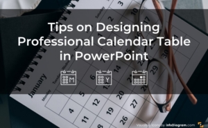
5 Tips on Designing Professional Calendar Table in PowerPoint
- October 17, 2022
Five Creative Ways to Embed an Icon in Your Slide Design
- January 13, 2022
Trending now
How to add a drawing to a PowerPoint presentation
Let your creativity shine in your presentations

Who said that school and business meetings have to be boring? Drawings are quick and easy ways to display information without the buttoned-up feel of graphs and tables. Here, we’ll learn how to add and use Microsoft PowerPoint ’s dedicated Draw tab. You will also learn how to add your own drawings.
Studies over the years have proven that visual data aids in retention when delivering a message. For this reason, everyone from teachers to professional speakers tend to make use of images, drawings, or short videos to drive points home when giving a presentation. A drawing in PowerPoint is a great way to grab attention.
Using the Draw feature allows you to add these visual elements once you know how to find the correct tab in PowerPoint. While it’s not immediately obvious how to use the feature, you’re only a few clicks away from first adding the tab, and then drawing in PowerPoint.
How to add the draw tab to PowerPoint
1. To activate the Draw Tab, right-click anywhere on your PowerPoint ribbon. Then, select Customize the Ribbon from the context menu that appears. This step will open the PowerPoint options window in the Customize Ribbon tab.

2. Next, tick the checkbox beside Draw under the Customize Ribbon section. Finally, click OK . You should notice that a new tab with the name Draw has been added to your PowerPoint Ribbon.

How to draw in PowerPoint
1. To start drawing on PowerPoint, go to the Draw tab at the top of the application.

2. Select your preferred drawing medium under the Drawing Tools section. By default, you can choose between a black pen, a red pen, and a yellow highlighter.
Stay in the know with Laptop Mag
Get our in-depth reviews, helpful tips, great deals, and the biggest news stories delivered to your inbox.

3. To modify your drawing tools, right-click any of them and select either Modify Tool or Add Another Tool.

How to convert PDF to JPG, PNG, or TIFF
How to add Outlook Calendar to Google Calendar
Forget Prime Day deals! You'll be able to start saving early with these 5 fantastic Walmart home office deals
Most Popular
- 2 Forget Prime Day deals! You'll be able to start saving early with these 5 fantastic Walmart home office deals
- 3 Get 5 free months of Amazon Music Unlimited to stream 'It's Prime Day' by Megan Thee Stallion
- 4 When is Amazon Prime Day 2024? Date, start time, what to buy in July
- 5 Amazon Prime Day phone deals 2024: What to expect, early sales
- Presentations
- Most Recent
- Infographics
- Data Visualizations
- Forms and Surveys
- Video & Animation
- Case Studies
- Design for Business
- Digital Marketing
- Design Inspiration
- Visual Thinking
- Product Updates
- Visme Webinars
- Artificial Intelligence
17 Presentation Apps and PowerPoint Alternatives for 2024

Written by: Chloe West
If you’re putting together a new presentation, you’re likely looking for the perfect presentation apps to help you design, present and share it effectively.
Well, you’re in luck. We’ve put together a list of the best presentation apps for both desktop and mobile that can help you to seamlessly create and produce your presentation.
Plus, we’ve put together a list of pros and cons for each to help you determine which presentation apps will work best for you. After all, you don’t want to put on a boring and ugly presentation.
Jump into our list of 17 presentation apps. You’ll find desktop apps, mobile presentation apps and presentation apps for iPad. All are valuable PowerPoint alternatives to help you create and present a beautiful and engaging slideshow.
Putting together your presentation can be design and content-heavy. If you can, edit and produce multiple slides on mobile and do the heavy lifting on the computer or laptop. iPads are also good for the main part, depending on the app’s functionality. Use the mobile versions for smaller edits and presenting the slides to an audience.
Let’s start with Visme–the best app for presentations that empowers you to design beautiful presentation slides .
Visme is a cloud-based graphic design software that allows designers and non-designers alike to create beautiful and professional presentations, infographics, social media graphics and more.
It has millions of design assets, including stock photography and video, animated vector icons, data visualization tools, hundreds of fonts, and preset color themes. Visme also offers a vast range of templates for presentations of any style; slideshow, video or interactive.

When looking at presentation design, you also want to make sure you’re going to come out with a beautiful and engaging slideshow. With pre-designed templates and themes with hundreds of slide layouts to choose from, you’ll find the perfect design in Visme to fit your content.
What sets Visme apart from other presentation apps and software is that it’s not just a presentation-making tool ; it’s a full-scale content authoring platform.
The AI presentation maker enables you to create stunning and professional-looking presentations with a text prompt. With the AI text generator , you can create drafts for your presentation. The tool is handy for proofreading and other content-related tasks.
Your Visme presentation editor has a wide variety of features for making many types of content, from classic static designs that you can share or print to interactive digital experiences that can be collaborated on, shared and tracked .
If you're looking for apps for interactive presentations, Visme is also your best bet.
Try the various interactivity options , like hyperlinked elements, video embed, audio upload and recording features.
Learn more about creating a presentation in just five minutes by watching this video below:
- A drag-and-drop editor and thousands of templates that allow users with any level of graphic design experience to create visually appealing presentations.
- Built-in library of free icons, illustrations, characters, fonts, images, shapes and other graphic elements—both static and animated.
- Use the AI-image tool to generate professional-quality photos, paintings, pencil drawings, 3D graphics, icons, abstract art, and more.
- Unblur and upscale images, remove unwanted backgrounds, erase and replace objects with the AI Edit tools .
- Find design assets and create projects faster using the Visme Shortcuts.
- The ability to present your slideshow online or download it as PDF, HTML5, or PPTX so you can present it without an internet connection.
- Beautiful animation and transition options that won’t overwhelm your audience.
- Brand kit and branded templates feature to help you store your brand elements for later use.
- Organize your work, share custom templates and collaborate with other team members.
- Manage roles, tasks, progress, deadlines and corrections all in one place with the workflow feature .
- Use the Visme App on iPad and iPhone.
- Track presentation performance with integrated analytics.
- Master Layout helps create a presentation that carries a base design across all slides.
- Create and store content blocks and slides to use across other presentations.
- Use Dynamic Fields to autofill updated information across slides and presentations.
- Due to the large amount of design elements and slide layouts involved, there can be an initial learning curve when first using the software.
Create a stunning presentation in less time
- Hundreds of premade slides available
- Add animation and interactivity to your slides
- Choose from various presentation options
Sign up. It’s free.

2. Google Slides

Everyone has heard of Google, right? So it’s no surprise that Google Slides is one of the more popular presentation apps and PowerPoint alternatives available.
But popular does not always mean best. While the service is free to any Google account holder, its slide layouts are basic at best and its design capabilities are extremely limited.

However, if you need a quick and to-the-point presentation, Google Slides can be a great option since it’s free and has next to no learning curve. If you’ve used PowerPoint, you know how to use Google Slides.
- Free for anyone with a Google account.
- Easy to use for creating a basic presentation.
- Users can collaborate in real time and make comments and edits throughout the slides.
- Integrate with all Google workspaces, including Google Meet.
- Limited design capabilities.
- Essentially a PowerPoint clone.

Another popular presentation app is Prezi. The main feature that Prezi is known for is allowing its users to easily create non-linear presentations.
This type of presentation can be highly engaging for your audience because instead of side-to-side transitions, you can create a pan and zoom effect each time you switch over to another slide.

While this type of presentation can be a fun change of pace for your audience, Prezi’s slide design options are not very visually appealing, and non-linear presentations can still be created in many other presentation makers by linking slides.
Prezi templates are also an excellent starting point for creating stunning presentations.
- Can create engaging and non-linear presentations.
- Embed interactive elements like video and audio into your presentations.
- Can only create non-linear presentations, which can actually cause motion sickness in some viewers.
- Non-linear presentations can also be created in other presentation software, making the need for Prezi obsolete.

Canva is a well-known cloud-based graphic design software , but it's not too popular for presentations. While it still has the “capabilities” for presentation design, it's main focus is on social media graphics.
As a creative presentation app, it offers a few visually appealing slide templates and you can create designs in the correct presentation dimensions.

There are a few static chart options and Canva also has tons of graphic elements to choose from, such as photos, shapes and icons, so you can still create static presentations in their software.
- Beautiful premade presentation templates to choose from.
- Graphic elements like photos, shapes and icons to spice up your design.
- No content blocks or slide library available to save larger pieces of content and reuse later.
5. Venngage

Venngage is first and foremost an infographic maker.
Similarly to Canva, they have added basic capabilities for creating presentations , but their design dashboard isn’t nearly as robust as some other presentation apps and software on this list.
While there are a number of presentation templates available for each of their plans, Venngage also doesn’t offer any type of animation or transition features for moving from slide to slide.

When it comes to creating a presentation, Venngage is in the same boat as Canva. Both certainly can be used to create a presentation, but they aren’t ideal, and they don’t offer as many features as a presentation app meant for building slideshows.
- Well-designed templates to get you started on your presentation design.
- Icons and photos to choose from for use in your slideshow.
- Not created with presentations in mind, so while it’s possible to create one, it’s not ideal.
6. Beautiful.ai

Beautiful.ai is a presentation maker that was created to focus on presentation design, like Visme. But while it’s meant for creating presentations, it doesn’t offer full-range design capabilities.
Instead, you’re given eight different themes with about 60 slide layouts to choose from that keep elements snapped into place, regardless of how you might want to customize your slides.

While this software is a great way to “stay in the lines,” per se, with your presentation design, it doesn’t allow you to design your presentation the way you want. If you’re trying to create a slide that falls outside of their parameters, you’re stuck.
- Visually appealing templates and slide layouts to choose from in your presentation.
- Easy to use drag-and-drop editor that allows you to quickly slide your points around on your slide to re-order them.
- Don’t have full-range design capabilities on your slide. You’re stuck only designing in the areas the software lets you design in.
- No free plans. Basic plan starts at $12 a month.
7. Slidebean

Slidebean advertises itself as an AI-powered presentation maker. It allows users to separate the content and design of its slides, inputting content in one section and adjusting the slide design in a separate area.
When creating a presentation in Slidebean, once you add your content into the text boxes, you can switch over to the design section and have their AI automatically assemble your content pieces around the page in a way that makes sense.

You’re also able to refresh different AI designs until you find one that you like. Although this can be helpful for those who don’t really want to worry about their design, it is extremely limited, and they don’t have a lot of templates to choose from.
As one of the best business presentation apps, their templates also focus on startups and entrepreneurs , so if your presentation doesn’t have that focus, your selection is limited.
- No need to worry about design at all.
- It’s a comprehensive pitching tool for entrepreneurs, not just a presentation maker.
- Doesn’t give you full range of design capabilities.
- Has limited templates.
8. Infogram

Infogram is another cloud-based graphic design software that tries to do everything, including presentations, but really wasn’t built for that specific purpose.
There are less than 50 available premade templates and they aren’t very well designed. Redeeming qualities include the fact that animation and transition features are available, as well as data visualization tools .

While there are icons and photos to choose from, most of them are premium and not available for use in the free plan.
- Animation and transitions available for your slideshows.
- Charts and graphs to add into your slides.
- Limited presentation templates available.
- Many graphic elements are premium only.
9. Zoho Show

Looking for good presentation editing apps? Zoho Show is one you should take a look at.
Zoho Show is a presentation-making app from the Zoho family of Work and Business apps. What once was a simple presentation maker is now a full-fledged collaboration tool for making presentations with impact. Zoho presentations can be static or animated; the level of interactivity is up to you.

Create and share Show presentations on any Mac or PC plus device using iOS and Android operating systems. Zoho Show also has many integrations with other apps for better productivity. The minimalistic UI is a positive addition to the editor.
Use on any device. Mac, PC, iOS, Android. Large selection of premade templates for every industry. Available to create both online and offline. Lots of integrations.
It makes more sense to use the Zoho suite than Show on its own. You can’t buy just Show; subscriptions are for groups of apps. Not enough data visualization features.
10. Haiku Deck

Haiku Deck is a web and mobile-based app that allows you to create and edit presentations. It works well for making some on-the-go edits to a presentation you’ve previously created.

You can even download the app onto your smartphone or tablet to create full presentation decks straight from your mobile device. It also syncs presentations between your computer and phone apps, making it easy to create and edit in different areas.
The biggest caveat is that its presentation template design is outdated and not very pretty.
- Syncs between your desktop and mobile apps, allowing you to create and edit in different areas.
- Presentation templates are not professionally designed.
- Design dashboard is outdated.
11. Keynote

Keynote is another presentation editing app that offers both desktop and mobile versions. It’s exclusively available for iOS smartphones, tablets and computers as it’s the Apple version of PowerPoint.
You can create presentations right on your mobile device and get them ready to present on your computer, which can be handy.

You can download the app from the Apple App Store for $9.99. It does come on most Macs and Macbooks automatically, but you’ll have to purchase it for your smartphone or tablet.
- Allows you to create and edit presentations on both your mobile device and computer.
- Keynote is designed for Mac. To use it on PC, you need a workaround.
- Similar to PowerPoint, so it doesn’t really focus on the design of your presentation, just gives you the ability to create one.
12. Flowvella

Flowvella is a downloadable desktop and mobile app that allows you to create interactive presentations wherever and whenever you need to. While it’s a fast and efficient app, it lacks some of the features any good presentation needs.
Since it’s a downloadable app, users are able to work on their presentations without WiFi.
It creates an online link for you to present your slideshow from any device, and offers analytics for you to see who has viewed your presentation.
- Has offline editing capabilities.
- Has analytics for you to view presentation performance.
- Used by museums for interactive displays.
- Must have space on your phone or computer to download the app.
- Simple technology with outdated features.
The app has integrations with other platforms like Chart Mogul and Brandfetch. Presentations on pro plans have analytics features and better image and video capabilities.
- Lots of beautiful templates to choose from.
- Pricing is affordable
Presentations are all you can create on Pitch.
14. Showpad
Showpad is another app that works well for sales teams. It allows users to put together various types of content and share it with a tablet user for them to scroll through and annotate.
This can be very useful for sales reps that are on the go with meetings and appointments , so they can easily share their screens with potential customers and walk them through the process.

The app is available on both Android and Apple devices, so there aren’t limitations to which smartphones and tablets will have access.
- Can share and annotate various types of content on the go.
- Caters to sales teams, so it isn’t an all-in-one presentation maker.
15. SlideShare

LinkedIn’s SlideShare app is a great way to share and view presentation content on the go. You can create your presentation in any online software, like Visme , export it and upload it onto SlideShare.
You can then use the mobile app to share your presentation and help get the word out. You can also view other presentations and learn more about a certain topic.

There are millions of professional presentations that have been published on SlideShare, so it’s a great community of slideshows to watch and save.
- Great for viewing and sharing your presentations.
- Provides an embed code for sharing on your website.
- There are millions of presentations published on the platform, so you’ll have to do a lot of self-promoting to get yours seen.

If you’re looking for apps for online presentation but with advanced video capabilities, here’s a great pick.
Vyond is a video presentation app with solutions for all industries and education. If you’re looking for a simple presentation, Vyond isn’t for you. This app creates engaging video presentations with talking characters and moving parts. Each slide is an animated scene, and they all come together as a group to make an animated video.

Choose characters, scene backgrounds and props from a large library of design assets. Use their text to speech feature to add easy voiceovers and narrations. Collaborate with your team to create video presentations for sales, training, pitching and more.
- Making animated presentation videos is easy.
- The features and editing controls don’t have a high learning curve.
- Monthly fees are high
- You can’t create anything else apart from video presentations.
17. Presentation Timer

Presentation Timer can be helpful both during your prep time and actual presentation time. This app lets you set a timer for how long your presentation will be and it will change the screen color based on how much speaking time you have left.
Using an app like this can be very helpful when you’re rehearsing your content so that you don’t go over on time, and you know which anecdotes you can fit in.
Just make sure when you’re giving your actual presentation, you can see your phone screen so you’ll know when you’re running out of time.
- Gives you a heads up when you’re getting close to the end of your speaking time.
- You have to be within eyeshot of your phone, so you won’t be able to do much moving around the stage or speaking area.
Choose Your Favorite Presentation Apps
There you go. We’ve rounded up some of the best apps for presentations. Which one of the desktop and mobile presentation apps is your favorite?
Some are perfect for creating your presentation, while others can be helpful for presenting and sharing your slideshow.
The Visme presentation app lets you access thousands of branded and premade themes and templates , graphic elements, animations, transition effects and more to create the perfect presentation.
Easily create an interactive presentation with audio, video, popups and hotspots and share it as a live link. Your viewer will be able to see the presentation as an interactive flipbook or slideshow. The best part? If something in the content needs to be changed, you don’t need to resend a link, your edits will show up automatically for everyone with a link.
Sign up today for a free account and take it for a test drive!
Create beautiful presentations faster with Visme.

Trusted by leading brands
Recommended content for you:
![15 Best AI Presentation Makers in 2024 [Free & Paid]](https://visme.co/blog/wp-content/uploads/2023/11/Best-AI-Presentation-Makers-in-2024-Thumbnail-500x280.jpg "another name for presentation drawing")
Create Stunning Content!
Design visual brand experiences for your business whether you are a seasoned designer or a total novice.
About the Author
Chloe West is the content marketing manager at Visme. Her experience in digital marketing includes everything from social media, blogging, email marketing to graphic design, strategy creation and implementation, and more. During her spare time, she enjoys exploring her home city of Charleston with her son.
Wise-Answer
Find answers to all questions with us
What is the purpose of a presentation drawing?
Table of Contents
- 1 What is the purpose of a presentation drawing?
- 2 What is the benefit of freehand drawing?
- 3 Why are visuals so important?
- 4 What is a purpose of working drawing?
- 5 Are there any health benefits to drawing and painting?
Another type of drawing is a presentation drawing. The purpose is to describe the design. Generally, presentation drawings are shown to clients during the design process. While in school, these drawings are presented to instructors and classmates.
Why are visuals important in presentations?
In summary Visual aids are worth including in your presentations because they can help you explain information more coherently which makes presenting easier for you and learning easier for the audience. They also help add variety to your presentation thus making it more interesting for the audience.
What does presentation drawing mean?
Any of a set of design drawings made to articulate and communicate a design concept or proposal; such as for an exhibition, review, or publication.
What is the benefit of freehand drawing?
Freehand drawing enables visualization of an idea in the form of a sketch. It is also a universal language designers use to communicate with other participants of a project. That is why freehand drawing ought to be an inherent element of a design process, especially in the first conceptual phase.
What is the difference between presentation drawing and working drawing?
Presentation drawings Drawings intended to explain a scheme and to promote its merits. Working drawings may include tones or hatches to emphasize different materials, but they are diagrams, not intended to appear realistic.
What do architects use to draw plans?
For architects, AutoCAD is primarily used as a 2D drawing tool for creating floor plans, elevations, and sections. The software speeds up the drawing process with pre-built objects like walls, doors, and windows that behave like real-world objects.
Why are visuals so important?
Visual communication helps the audience understand the information. It increases the comprehension of the subject matter. Types of two-dimensional images which aid communication include drawings, pie charts, animation, signs, typography, graphic designs, among many others.
Why is it important to use color when preparing a presentation?
Why is it important to use color when preparing a presentation aid? Color adds visual interest to your aid. Most members of an audience are used to colored media; black and white is considered “boring”. A manipulative aid is any presentation aid that the speaker actively changes during the course of the speech.
What is in working drawing?
Working drawings and specifications are the primary working documents used by a contractor to bid and execute a project. Specifications are the written documents that go with the construction documents and describe the materials as well as the installation methods.
What is a purpose of working drawing?
The primary role or function of working drawings is to convert design data into construction information and to clearly communicate that information to building industry, code officials, product manufacturers, suppliers and fabricators.
What are the advantages and disadvantages of drawing?
Why are drawings important in the design process?
Are there any health benefits to drawing and painting?
Share this post
Privacy overview.
| Cookie | Duration | Description |
|---|---|---|
| cookielawinfo-checkbox-analytics | 11 months | This cookie is set by GDPR Cookie Consent plugin. The cookie is used to store the user consent for the cookies in the category "Analytics". |
| cookielawinfo-checkbox-functional | 11 months | The cookie is set by GDPR cookie consent to record the user consent for the cookies in the category "Functional". |
| cookielawinfo-checkbox-necessary | 11 months | This cookie is set by GDPR Cookie Consent plugin. The cookies is used to store the user consent for the cookies in the category "Necessary". |
| cookielawinfo-checkbox-others | 11 months | This cookie is set by GDPR Cookie Consent plugin. The cookie is used to store the user consent for the cookies in the category "Other. |
| cookielawinfo-checkbox-performance | 11 months | This cookie is set by GDPR Cookie Consent plugin. The cookie is used to store the user consent for the cookies in the category "Performance". |
| viewed_cookie_policy | 11 months | The cookie is set by the GDPR Cookie Consent plugin and is used to store whether or not user has consented to the use of cookies. It does not store any personal data. |
In order to continue enjoying our site, we ask that you confirm your identity as a human. Thank you very much for your cooperation.
Want to create or adapt books like this? Learn more about how Pressbooks supports open publishing practices.
3 Views and Projections
Camosun College
Learning Objectives
By the end of this chapter, you should be able to:
- identify views used in technical drawings including perspective, isometric, oblique, orthographic, plans, elevations, and sections
Architectural drawings are made according to a set of conventions, which include particular views (floor plan, section, etc.), sheet sizes, units of measurement and scales, annotation, and cross-referencing.
Types of views used in drawings
The two main types of views (or “projections”) used in drawings are:
- orthographic
Pictorial views
Pictorial views show a 3-D view of how something should look when completed. There are three types of pictorial views:
- perspective
Perspective view
A perspective view presents a building or an object just as it would look to you. A perspective view has a vanishing point ; that is, lines that move away from you come together in the distance. For example, in Figure 1, we see a road and line of telephone poles. Even though the poles get smaller in their actual measurement, we recognize them as being the same size but more distant.

Figure 1 – Perspective view
Isometric view
An isometric view is a three-dimensional view. The plumb lines are vertical. The horizontal lines are set at 30 degree angles from a line parallel to the bottom of the page. Isometric views have no vanishing point, so the objects do not appear as they would in a perspective view. Lengths are exact on isometric drawings only when the item is parallel to one of the axes of the drawing. Figure 2 shows an isometric view of a simple object, as well as the lines that represent the three dimensions.

Figure 2 – An isometric view
Oblique view
An oblique view is similar to an isometric view, except that the face or front view is drawn to exact scale and the oblique lines are extended at a 30 degree to 45 degree angle to create a three-dimensional representation (Figure 3).

Figure 3 – Oblique view of the object in Figure 2
Multi-view (orthographic) drawings
Pictorial drawings are excellent for presenting easy-to-visualize pictures to the viewer, but there are some problems. The main problem is that these drawings cannot be accurately drawn to scale. Also, they cannot accurately duplicate exact shapes and angles. As this information can be essential, another form of drawing is used, one that has several names, including orthographic projection , third angle projection , multi-view projection , and working drawing . Each projection is a view that shows only one face of an object, such as the front, side, top, or back. These views are not pictorial.
To interpret or read these drawings you must first understand how the views in a multi-view drawing are developed and how each view relates to the other views. The best way to understand the principle of orthographic views is to suspend the object you wish to draw inside an imaginary glass box. If you were to look at the object through each side of the box and draw onto the glass the view of the object you see through the glass, you would end up with a sketch similar to that shown in Figure 4.
The view through each side of the glass box shows only the end view of one side of the object. All lines are straight and parallel because the original object has sides that are straight and parallel. Each view represents what you see when you look directly at the object.

Figure 4 – Multi-view through a glass box
If you were to open up the glass box, as shown in Figure 5, each view would be in the correct position for a true orthographic drawing. Each view is given a name that reflects its position in relation to the other views.

Figure 5 – Box opened to produce orthographic views
When the imaginary glass box is flattened as shown in Figure 6, you can see that each view is in line with the adjacent view. Then the edges of the box are removed and you have a six-view orthographic drawing of the original object (Figure 7). These six views are called the six principal orthographic views. This view alignment is important and is always consistent in orthographic projection. You will seldom need to show views of all six sides of an object; usually it is sufficient to show just two or three. You should remember the names of these six views and understand how they are obtained in case you ever need to show an object that cannot be truly represented in two or three views.

Figure 6 – Drawing with the glass box flattened out

Figure 7 – Orthographic views of the object in Figure 2
Unless the object is very complex, only the front, top, and right-side views are necessary. If the object has a uniform thickness, only one or two views are necessary. You should not show more views than are necessary. The front, left, back, and right views are also referred to as elevations.
A floor plan (or floor drawing) is an orthographic plan view (or top view) looking down on the various floor levels. Floor plans are one of the most important drawings for construction, as they provide the most information about the building. Floor plans identify rooms by name or number. They give the:
- room dimensions
- overall dimensions
- plumbing fixtures
- location of structural members and walls
Figure 8 shows the floor plan for the main floor of a house.

Figure 8 – Main floor plan of a house
Elevation drawings
An elevation drawing (called an elevation) is a view of any vertical surface and is taken from the floor plans (Figure 9). Normally, elevation drawings include the front, back, and side orthographic projections of the buildings. The elevation drawings show what the exterior of the building will look like when it is finished. The drawings show the finished grade line, the finish materials, and the door and the window locations. Elevation drawings may also show interior walls that have special features, such as fireplaces or kitchen cabinets.

Figure 9 – Left elevation of house in Figure 8
Section drawing
Section drawings (called sections) provide detailed drawings of the cross-section of a building or wall unit (Figure 10). The scale of these drawings is large (about 1:20), which allows different structural members to be drawn so that the construction details are seen clearly.

Figure 10 – Section A-A
Sectional views give information about wall construction and exterior and interior wall finish. To avoid any confusion, the precise location or cut of a sectional view is given in another drawing, such as detail drawing or a floor plan. For example, the reference in the lower left-hand corner of Figure 11 shows the location of the section in Figure 10. The line drawn through the wall indicates the point and span of the cut and the arrows indicate the direction of view.

Figure 11 – Plan showing section A-A
Measurements on orthographic drawings
To get all of the measurements required, you will need to refer to more than one view. For example, you cannot take elevation measurements from a plan view.

- Pictorial views show a 3-D view of the object of the drawing and are the best views for visualizing an object’s shape.
- Orthographic views show a 2-D view of the object from multiple directions and are the best view for showing detail and measurements.
Technically Drawn Copyright © by Camosun College is licensed under a Creative Commons Attribution-NonCommercial-ShareAlike 4.0 International License , except where otherwise noted.
Share This Book
How-To Geek
How to animate a drawing in microsoft powerpoint.

Your changes have been saved
Email Is sent
Please verify your email address.
You’ve reached your account maximum for followed topics.
Verizon Internet Now Includes Discounted Netflix, Max, Disney, and Hulu
Today's nyt connections hints and answer for june 27 (#382), how xbox lost the console wars (and what microsoft can do now), quick links, create your drawing in powerpoint, animate the drawing in powerpoint.
If you want to take advantage of Microsoft Office's draw tools in PowerPoint, you might add an animation to your drawing to make it a useful demonstration.
This lets you create anything from a basic letter to teach a student to write to a fully detailed mockup to show your team a process.
When you visit the Draw tab in PowerPoint, you'll see all of your ink tools at the top. You can pick a pen, pencil, or highlighter, choose the line thickness, and pick a color or pattern.

Each continuous line you use becomes an element on the slide. You can select and move these elements using the arrow on the left side of the ribbon.

To animate one of these elements, select it and head to the Animations tab.
Related: How to Make a Typewriter or Command Line Animation in PowerPoint
With the drawing or part of the drawing selected, pick either "Replay" or "Rewind" in the Animation box on the ribbon. Replay shows your drawing from start to finish while Rewind shows it from finish to start.

You'll only see these animation options for drawings you create with the ink tools.
Click "Preview" on the left side of the ribbon to see the animation in action. You should see your drawing as if you were creating it for the first time.

If you want to animate an entire drawing that contains more than one piece, simply select each additional piece in the order you want to display them and apply the Replay or Rewind effect.
You can then use the tools in the Timing section of the ribbon to pick how to Start the animation on the slide, the Duration for how quickly the animation moves, and the Delay to hold off on the animation for a few seconds.

Along with the Replay and Rewind animations specific to the ink and drawing tools, you can apply other effects to your drawing if you like. Select the drawing or part of it, click "Add Animation" in the Advanced Animation section of the ribbon, and choose the additional effect.

Keep in mind that animations display in the order you apply them. To adjust this order, select the animation number and use the Move Earlier or Move Later button on the right side of the ribbon. You can also open the Animation Pane and drag the effects to rearrange them .

Related: How to Reorder Animations in Microsoft PowerPoint
Animations have their place in PowerPoint and displaying a drawing as you created it is a great use. For more, look at how to animate part of a chart to make it stand out or reveal one line at a time in a bullet list.
- Microsoft Office
- Microsoft PowerPoint
Live drawings for presentations
Are you working hard on a project, pitch, or proposal to make sure your ideas are presented at their fullest potential? Hand-drawn visuals are the best way to grab your audience's attention and keep them focused on your content. Watching the drawings come to life in real-time is a proven way to make your presentation more memorable.
Get a Quote
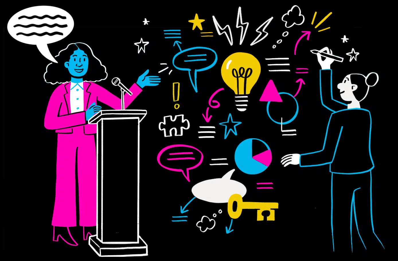
Drawn ahead of time or in the moment
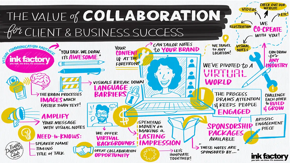
Digital Graphic Recording
If your presentation is happening during an online event, our artists can connect to your virtual platform and draw along live. Graphic recordings are a welcome dose of creative inspiration in the monotonous virtual work landscape.

Live Sketch Artists
Our artists work with markers, creating unique visual notes drawn live for the length of your presentation. Audiences and presenters alike love to see artists bring ideas to life by drawing.
Illustrations for Presentations
For a polished visual, our team can work with you to create an illustrated, building slide deck that pairs with your presentation.
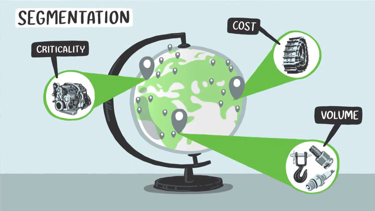
Animated Presentation Videos
Incorporate a video explaining a new process or initiative into your presentation. Videos are the most engaging way to present your content.

What our clients are saying
“Our attendees were amazed at how well the artist visualized the messages from each presenter’s session.”
Kelley Shannon, Bozzuto
“Ink Factory interpreted our words and inked our vision. They walked 1,000 of my colleagues down a path of learning like it was nobody's business.”
Sean Manzanares, Autodesk
“The entire Ink Factory team is easy to work with when coordinating details and never fail to prepare and follow-through, making our event team very happy!” Susan Mooney Cusick, Chicago Theological Seminary
Why visuals are great for presentations
Impress Your Audience
Unlike typical slide decks, hand-drawn visuals grab attendees' attention and keep them interested throughout the duration of your presentation.
Clarify Your Content
Our artists listen and distill your presentation content down into its key concepts, illustrating them in a way that's quick and easy to understand.

Stay Memorable
Visual notes, illustrations, and videos are great for sharing with your audience after a presentation ends. Use your visuals for newsletters, social posts, and more.
you talk. we draw. it’s awesome.
Contact us to bring visual note-taking to your next event.
Get started
Privacy Overview
Necessary cookies are absolutely essential for the website to function properly. This category only includes cookies that ensures basic functionalities and security features of the website. These cookies do not store any personal information.
Any cookies that may not be particularly necessary for the website to function and is used specifically to collect user personal data via analytics, ads, other embedded contents are termed as non-necessary cookies. It is mandatory to procure user consent prior to running these cookies on your website.

- SUGGESTED TOPICS
- The Magazine
- Newsletters
- Managing Yourself
- Managing Teams
- Work-life Balance
- The Big Idea
- Data & Visuals
- Reading Lists
- Case Selections
- HBR Learning
- Topic Feeds
- Account Settings
- Email Preferences
How to Make a “Good” Presentation “Great”
- Guy Kawasaki

Remember: Less is more.
A strong presentation is so much more than information pasted onto a series of slides with fancy backgrounds. Whether you’re pitching an idea, reporting market research, or sharing something else, a great presentation can give you a competitive advantage, and be a powerful tool when aiming to persuade, educate, or inspire others. Here are some unique elements that make a presentation stand out.
- Fonts: Sans Serif fonts such as Helvetica or Arial are preferred for their clean lines, which make them easy to digest at various sizes and distances. Limit the number of font styles to two: one for headings and another for body text, to avoid visual confusion or distractions.
- Colors: Colors can evoke emotions and highlight critical points, but their overuse can lead to a cluttered and confusing presentation. A limited palette of two to three main colors, complemented by a simple background, can help you draw attention to key elements without overwhelming the audience.
- Pictures: Pictures can communicate complex ideas quickly and memorably but choosing the right images is key. Images or pictures should be big (perhaps 20-25% of the page), bold, and have a clear purpose that complements the slide’s text.
- Layout: Don’t overcrowd your slides with too much information. When in doubt, adhere to the principle of simplicity, and aim for a clean and uncluttered layout with plenty of white space around text and images. Think phrases and bullets, not sentences.
As an intern or early career professional, chances are that you’ll be tasked with making or giving a presentation in the near future. Whether you’re pitching an idea, reporting market research, or sharing something else, a great presentation can give you a competitive advantage, and be a powerful tool when aiming to persuade, educate, or inspire others.
- Guy Kawasaki is the chief evangelist at Canva and was the former chief evangelist at Apple. Guy is the author of 16 books including Think Remarkable : 9 Paths to Transform Your Life and Make a Difference.
Partner Center
| |||||||||||||||||||||||||||||||||||||||||||||||||||||||||||||||||||||||||||||||||||||||||||||||||||||||||||||||||||||||||||||||||


IMAGES
VIDEO
COMMENTS
The Importance of Presentation Drawing Presentation drawing, also known as a rendering, is a crucial aspect of the design process. It's a means of visually communicating ideas to clients, colleagues, and contractors. Presentation drawings can take many forms, from quick sketches to highly detailed, realistic illustrations. Regardless of the format, the goal of presentation drawing […]
Another challenge of presentation drawing is making sure all parties involved are on the same page. The drawings must accurately portray the concept and provide enough detail to explain the project to everyone involved. Furthermore, the drawings need to appear professional and presentable in order to obtain the necessary approvals to execute ...
Impact on the Overall Project. Presentation drawings are the drawings that architects make to show the client their ideas for a building. Usually this includes the exterior design of the building, as well as details such as the materials used, the layout of the interior space, and sometimes even the furniture that will be used inside.
Another type of drawing is a presentation drawing. The purpose is to describe the design. Generally, presentation drawings are shown to clients during the design process. While in school, these drawings are presented to instructors and classmates. A construction drawing will include the information necessary to assemble the project.
Winning a project bid requires architectural presentation drawings that demonstrate to the potential client the merits of the structure's design concept and is a direct indication of an architectural firm's skill in creativity and technical ability. Poorly drafted presentation drawings can result in losing great projects to other firms. We offer four different avenues to presenting your ...
1. Intuition. Drawing can help tap into your intuition by allowing you to express ideas, feelings, and concepts that might be difficult to articulate with words alone. Through the act of drawing, you can access your inner thoughts and emotions, enabling a more intuitive understanding of complex issues.
Use PowerPoint's draw feature + ink replay animation. Use PowerPoint's shapes and icons to create visuals. Use PowerPoint's shapes + special tools to edit those shapes. Add speech bubbles to a photo to make it a fun comic-style visual. Create your own vector illustrations (see next section about Affinity Designer) 5.
Produce a complete set of Architectural Presentation Drawings for a structure. Generate a final set of Architectural Presentation Drawings for a structure including floor plan with landscaping, elevations, and a 3-D view. ... Autodesk Maya is another popular 3D modeling and animation software commonly used in architectural rendering. It offers ...
The single line drawing presentation styles is used extensively these days, where the presentation appears to be more an info-graphic than an architectural drawing. This style is used mostly when the 3D view expresses the major portion of the design and the elevation and section drawings are merely present for further understanding.
Presentation drawings were finished, non-utilitarian works of art, as opposed to preparatory drawings for a work in another medium. The earliest known presentation drawings dating from the Italian Renaissance are two drawings of the 1420s by Lorenzo Monaco. From: presentation drawing in The Concise Oxford Dictionary of Art Terms ».
Here's the original image. Here's the process for masking it. (1) Set the image transparency to something less than 100. (2) Duplicate that image so there is one directly over the top of the other. (3) Set the dup'd image transparency back to 100. and (4) Follow the technique here to mask the dup'd image.
using no more than two handwritten styles per presentation. For example: Only use charcoal or ink style elements, but not all together. The same goes for fonts, stick to 1-2 fonts. Have enough white space. Let the slide breathe - leave margins from the slide edge and don't put elements too close together.
1. To start drawing on PowerPoint, go to the Draw tab at the top of the application. (Image credit: Laptop Mag) 2. Select your preferred drawing medium under the Drawing Tools section. By default ...
1. Visme. Let's start with Visme-the best app for presentations that empowers you to design beautiful presentation slides. Visme is a cloud-based graphic design software that allows designers and non-designers alike to create beautiful and professional presentations, infographics, social media graphics and more.
The primary role or function of working drawings is to convert design data into construction information and to clearly communicate that information to building industry, code officials, product manufacturers, suppliers and fabricators. Another type of drawing is a presentation drawing. The purpose is to describe the design.
A traditional method of reproducing technical. drawings using a contact print process and light-sensitive. paper that resulted in white lines on a blue background. Also, the traditional name used to describe construction. drawings. Computer-aided drafting (CAD): The making of a set of.
Answer and Explanation: Become a Study.com member to unlock this answer! Create your account. View this answer. Presentation drawing in architecture is the production of a drawing for the purpose of gaining support, such as at a presentation of an architectural... See full answer below.
To avoid any confusion, the precise location or cut of a sectional view is given in another drawing, such as detail drawing or a floor plan. For example, the reference in the lower left-hand corner of Figure 11 shows the location of the section in Figure 10. The line drawn through the wall indicates the point and span of the cut and the arrows ...
Animate the Drawing in PowerPoint. With the drawing or part of the drawing selected, pick either "Replay" or "Rewind" in the Animation box on the ribbon. Replay shows your drawing from start to finish while Rewind shows it from finish to start. You'll only see these animation options for drawings you create with the ink tools.
Live drawings for presentations. Are you working hard on a project, pitch, or proposal to make sure your ideas are presented at their fullest potential? Hand-drawn visuals are the best way to grab your audience's attention and keep them focused on your content. Watching the drawings come to life in real-time is a proven way to make your ...
An extravagant or eccentric piece of music, literature, or drama. A film or broadcast that provides a factual report on a particular subject. The action of repeating something aloud from memory. A formal presentation of one person to another. A definite or clear expression of something in speech or writing. The action of providing or supplying ...
Sketchpad: Free online drawing application for all ages. Create digital artwork to share online and export to popular image formats JPEG, PNG, SVG, and PDF.
Flow: Removing Barriers. Let's begin with the opening of your presentation. A good opening or first slide should be able to grab the audience's attention and state the purpose and objectives ...
Verb. To give a summary of. To draw, trace, or define the outer edge or shape of. To strategically plan a course of action. To tell someone about something that has happened. To form a ring or circle around. To arrange into groups or into a systematic order. To highlight or outline a differentiating or important feature.
Select Files in the sidebar. A list of the apps on your device that support file sharing appears. Drag a file or selection of files from your Windows device to an app in the Apple Devices window. Select the app from the list to see files already transferred to your device. To delete files, select them, press Control-Delete, then select Delete.