Home Blog Design How to Design a Winning Poster Presentation: Quick Guide with Examples & Templates

How to Design a Winning Poster Presentation: Quick Guide with Examples & Templates

How are research posters like High School science fair projects? Quite similar, in fact.
Both are visual representations of a research project shared with peers, colleagues and academic faculty. But there’s a big difference: it’s all in professionalism and attention to detail. You can be sure that the students that thrived in science fairs are now creating fantastic research posters, but what is that extra element most people miss when designing a poster presentation?
This guide will teach tips and tricks for creating poster presentations for conferences, symposia, and more. Learn in-depth poster structure and design techniques to help create academic posters that have a lasting impact.
Let’s get started.
Table of Contents
- What is a Research Poster?
Why are Poster Presentations important?
Overall dimensions and orientation, separation into columns and sections, scientific, academic, or something else, a handout with supplemental and contact information, cohesiveness, design and readability, storytelling.
- Font Characteristics
- Color Pairing
- Data Visualization Dimensions
- Alignment, Margins, and White Space
Scientific/Academic Conference Poster Presentation
Digital research poster presentations, slidemodel poster presentation templates, how to make a research poster presentation step-by-step, considerations for printing poster presentations, how to present a research poster presentation, final words, what is a research poster .
Research posters are visual overviews of the most relevant information extracted from a research paper or analysis. They are essential communication formats for sharing findings with peers and interested people in the field. Research posters can also effectively present material for other areas besides the sciences and STEM—for example, business and law.
You’ll be creating research posters regularly as an academic researcher, scientist, or grad student. You’ll have to present them at numerous functions and events. For example:
- Conference presentations
- Informational events
- Community centers
The research poster presentation is a comprehensive way to share data, information, and research results. Before the pandemic, the majority of research events were in person. During lockdown and beyond, virtual conferences and summits became the norm. Many researchers now create poster presentations that work in printed and digital formats.

Let’s look at why it’s crucial to spend time creating poster presentations for your research projects, research, analysis, and study papers.

Research posters represent you and your sponsor’s research
Research papers and accompanying poster presentations are potent tools for representation and communication in your field of study. Well-performing poster presentations help scientists, researchers, and analysts grow their careers through grants and sponsorships.
When presenting a poster presentation for a sponsored research project, you’re representing the company that sponsored you. Your professionalism, demeanor, and capacity for creating impactful poster presentations call attention to other interested sponsors, spreading your impact in the field.
Research posters demonstrate expertise and growth
Presenting research posters at conferences, summits, and graduate grading events shows your expertise and knowledge in your field of study. The way your poster presentation looks and delivers, plus your performance while presenting the work, is judged by your viewers regardless of whether it’s an officially judged panel.
Recurring visitors to research conferences and symposia will see you and your poster presentations evolve. Improve your impact by creating a great poster presentation every time by paying attention to detail in the poster design and in your oral presentation. Practice your public speaking skills alongside the design techniques for even more impact.
Poster presentations create and maintain collaborations
Every time you participate in a research poster conference, you create meaningful connections with people in your field, industry or community. Not only do research posters showcase information about current data in different areas, but they also bring people together with similar interests. Countless collaboration projects between different research teams started after discussing poster details during coffee breaks.
An effective research poster template deepens your peer’s understanding of a topic by highlighting research, data, and conclusions. This information can help other researchers and analysts with their work. As a research poster presenter, you’re given the opportunity for both teaching and learning while sharing ideas with peers and colleagues.
Anatomy of a Winning Poster Presentation
Do you want your research poster to perform well? Following the standard layout and adding a few personal touches will help attendees know how to read your poster and get the most out of your information.

The overall size of your research poster ultimately depends on the dimensions of the provided space at the conference or research poster gallery. The poster orientation can be horizontal or vertical, with horizontal being the most common. In general, research posters measure 48 x 36 inches or are an A0 paper size.
A virtual poster can be the same proportions as the printed research poster, but you have more leeway regarding the dimensions. Virtual research posters should fit on a screen with no need to scroll, with 1080p resolution as a standard these days. A horizontal presentation size is ideal for that.
A research poster presentation has a standard layout of 2–5 columns with 2–3 sections each. Typical structures say to separate the content into four sections; 1. A horizontal header 2. Introduction column, 3. Research/Work/Data column, and 4. Conclusion column. Each unit includes topics that relate to your poster’s objective. Here’s a generalized outline for a poster presentation:
- Condensed Abstract
- Objectives/Purpose
- Methodology
- Recommendations
- Implications
- Acknowledgments
- Contact Information
The overview content you include in the units depends on your poster presentations’ theme, topic, industry, or field of research. A scientific or academic poster will include sections like hypothesis, methodology, and materials. A marketing analysis poster will include performance metrics and competitor analysis results.
There’s no way a poster can hold all the information included in your research paper or analysis report. The poster is an overview that invites the audience to want to find out more. That’s where supplement material comes in. Create a printed PDF handout or card with a QR code (created using a QR code generator ). Send the audience to the best online location for reading or downloading the complete paper.
What Makes a Poster Presentation Good and Effective?
For your poster presentation to be effective and well-received, it needs to cover all the bases and be inviting to find out more. Stick to the standard layout suggestions and give it a unique look and feel. We’ve put together some of the most critical research poster-creation tips in the list below. Your poster presentation will perform as long as you check all the boxes.
The information you choose to include in the sections of your poster presentation needs to be cohesive. Train your editing eye and do a few revisions before presenting. The best way to look at it is to think of The Big Picture. Don’t get stuck on the details; your attendees won’t always know the background behind your research topic or why it’s important.
Be cohesive in how you word the titles, the length of the sections, the highlighting of the most important data, and how your oral presentation complements the printed—or virtual—poster.
The most important characteristic of your poster presentation is its readability and clarity. You need a poster presentation with a balanced design that’s easy to read at a distance of 1.5 meters or 4 feet. The font size and spacing must be clear and neat. All the content must suggest a visual flow for the viewer to follow.
That said, you don’t need to be a designer to add something special to your poster presentation. Once you have the standard—and recognized—columns and sections, add your special touch. These can be anything from colorful boxes for the section titles to an interesting but subtle background, images that catch the eye, and charts that inspire a more extended look.
Storytelling is a presenting technique involving writing techniques to make information flow. Firstly, storytelling helps give your poster presentation a great introduction and an impactful conclusion.
Think of storytelling as the invitation to listen or read more, as the glue that connects sections, making them flow from one to another. Storytelling is using stories in the oral presentation, for example, what your lab partner said when you discovered something interesting. If it makes your audience smile and nod, you’ve hit the mark. Storytelling is like giving a research presentation a dose of your personality, and it can help turning your data into opening stories .
Design Tips For Creating an Effective Research Poster Presentation
The section above briefly mentioned how important design is to your poster presentation’s effectiveness. We’ll look deeper into what you need to know when designing a poster presentation.
1. Font Characteristics
The typeface and size you choose are of great importance. Not only does the text need to be readable from two meters away, but it also needs to look and sit well on the poster. Stay away from calligraphic script typefaces, novelty typefaces, or typefaces with uniquely shaped letters.
Stick to the classics like a sans serif Helvetica, Lato, Open Sans, or Verdana. Avoid serif typefaces as they can be difficult to read from far away. Here are some standard text sizes to have on hand.
- Title: 85 pt
- Authors: 65 pt
- Headings: 36 pt
- Body Text: 24 pt
- Captions: 18 pt

If you feel too prone to use serif typefaces, work with a font pairing tool that helps you find a suitable solution – and intend those serif fonts for heading sections only. As a rule, never use more than 3 different typefaces in your design. To make it more dynamic, you can work with the same font using light, bold, and italic weights to put emphasis on the required areas.
2. Color Pairing
Using colors in your poster presentation design is a great way to grab the viewer’s attention. A color’s purpose is to help the viewer follow the data flow in your presentation, not distract. Don’t let the color take more importance than the information on your poster.

Choose one main color for the title and headlines and a similar color for the data visualizations. If you want to use more than one color, don’t create too much contrast between them. Try different tonalities of the same color and keep things balanced visually. Your color palette should have at most one main color and two accent colors.
Black text over a white background is standard practice for printed poster presentations, but for virtual presentations, try a very light gray instead of white and a very dark gray instead of black. Additionally, use variations of light color backgrounds and dark color text. Make sure it’s easy to read from two meters away or on a screen, depending on the context. We recommend ditching full white or full black tone usage as it hurts eyesight in the long term due to its intense contrast difference with the light ambiance.
3. Data Visualization Dimensions
Just like the text, your charts, graphs, and data visualizations must be easy to read and understand. Generally, if a person is interested in your research and has already read some of the text from two meters away, they’ll come closer to look at the charts and graphs.

Fit data visualizations inside columns or let them span over two columns. Remove any unnecessary borders, lines, or labels to make them easier to read at a glance. Use a flat design without shadows or 3D characteristics. The text in legends and captions should stay within the chart size and not overflow into the margins. Use a unified text size of 18px for all your data visualizations.
4. Alignment, Margins, and White Space
Finally, the last design tip for creating an impressive and memorable poster presentation is to be mindful of the layout’s alignment, margins, and white space. Create text boxes to help keep everything aligned. They allow you to resize, adapt, and align the content along a margin or grid.
Take advantage of the white space created by borders and margins between sections. Don’t crowd them with a busy background or unattractive color.

Calculate margins considering a print format. It is a good practice in case the poster presentation ends up becoming in physical format, as you won’t need to downscale your entire design (affecting text readability in the process) to preserve information.
There are different tools that you can use to make a poster presentation. Presenters who are familiar with Microsoft Office prefer to use PowerPoint. You can learn how to make a poster in PowerPoint here.
Poster Presentation Examples
Before you start creating a poster presentation, look at some examples of real research posters. Get inspired and get creative.
Research poster presentations printed and mounted on a board look like the one in the image below. The presenter stands to the side, ready to share the information with visitors as they walk up to the panels.

With more and more conferences staying virtual or hybrid, the digital poster presentation is here to stay. Take a look at examples from a poster session at the OHSU School of Medicine .
Use SlideModel templates to help you create a winning poster presentation with PowerPoint and Google Slides. These poster PPT templates will get you off on the right foot. Mix and match tables and data visualizations from other poster slide templates to create your ideal layout according to the standard guidelines.
If you need a quick method to create a presentation deck to talk about your research poster at conferences, check out our Slides AI presentation maker. A tool in which you add the topic, curate the outline, select a design, and let AI do the work for you.
1. One-pager Scientific Poster Template for PowerPoint
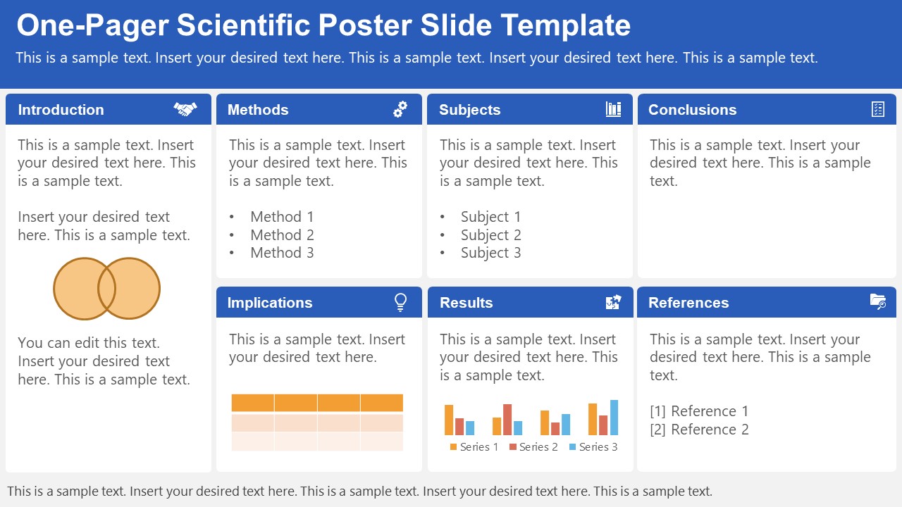
A PowerPoint template tailored to make your poster presentations an easy-to-craft process. Meet our One-Pager Scientific Poster Slide Template, entirely editable to your preferences and with ample room to accommodate graphs, data charts, and much more.
Use This Template
2. Eisenhower Matrix Slides Template for PowerPoint
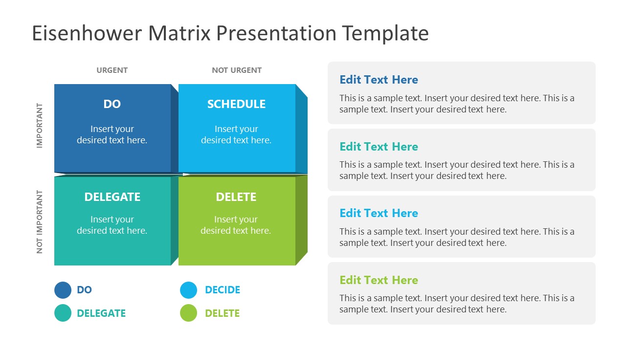
An Eisenhower Matrix is a powerful tool to represent priorities, classifying work according to urgency and importance. Presenters can use this 2×2 matrix in poster presentations to expose the effort required for the research process, as it also helps to communicate strategy planning.
3. OSMG Framework PowerPoint Template
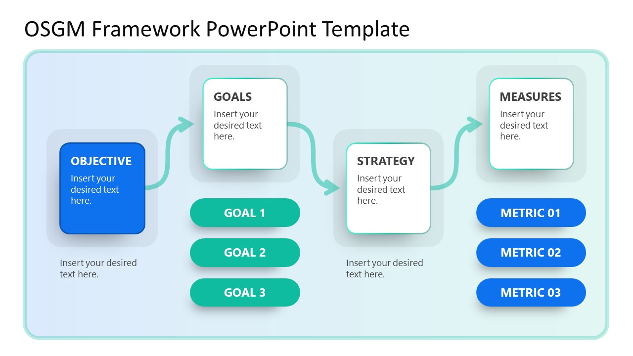
Finally, we recommend presenters check our OSMG Framework PowerPoint template, as it is an ideal tool for representing a business plan: its goals, strategies, and measures for success. Expose complex processes in a simplified manner by adding this template to your poster presentation.
Remember these three words when making your research poster presentation: develop, design, and present. These are the three main actions toward a successful poster presentation.

The section below will take you on a step-by-step journey to create your next poster presentation.
Step 1: Define the purpose and audience of your poster presentation
Before making a poster presentation design, you’ll need to plan first. Here are some questions to answer at this point:
- Are they in your field?
- Do they know about your research topic?
- What can they get from your research?
- Will you print it?
- Is it for a virtual conference?
Step 2: Make an outline
With a clear purpose and strategy, it’s time to collect the most important information from your research paper, analysis, or documentation. Make a content dump and then select the most interesting information. Use the content to draft an outline.
Outlines help formulate the overall structure better than going straight into designing the poster. Mimic the standard poster structure in your outline using section headlines as separators. Go further and separate the content into the columns they’ll be placed in.
Step 3: Write the content
Write or rewrite the content for the sections in your poster presentation. Use the text in your research paper as a base, but summarize it to be more succinct in what you share.
Don’t forget to write a catchy title that presents the problem and your findings in a clear way. Likewise, craft the headlines for the sections in a similar tone as the title, creating consistency in the message. Include subtle transitions between sections to help follow the flow of information in order.
Avoid copying/pasting entire sections of the research paper on which the poster is based. Opt for the storytelling approach, so the delivered message results are interesting for your audience.
Step 4: Put it all together visually
This entire guide on how to design a research poster presentation is the perfect resource to help you with this step. Follow all the tips and guidelines and have an unforgettable poster presentation.
Moving on, here’s how to design a research poster presentation with PowerPoint Templates . Open a new project and size it to the standard 48 x 36 inches. Using the outline, map out the sections on the empty canvas. Add a text box for each title, headline, and body text. Piece by piece, add the content into their corresponding text box.

Transform the text information visually, make bullet points, and place the content in tables and timelines. Make your text visual to avoid chunky text blocks that no one will have time to read. Make sure all text sizes are coherent for all headings, body texts, image captions, etc. Double-check for spacing and text box formatting.
Next, add or create data visualizations, images, or diagrams. Align everything into columns and sections, making sure there’s no overflow. Add captions and legends to the visualizations, and check the color contrast with colleagues and friends. Ask for feedback and progress to the last step.
Step 5: Last touches
Time to check the final touches on your poster presentation design. Here’s a checklist to help finalize your research poster before sending it to printers or the virtual summit rep.
- Check the resolution of all visual elements in your poster design. Zoom to 100 or 200% to see if the images pixelate. Avoid this problem by using vector design elements and high-resolution images.
- Ensure that charts and graphs are easy to read and don’t look crowded.
- Analyze the visual hierarchy. Is there a visual flow through the title, introduction, data, and conclusion?
- Take a step back and check if it’s legible from a distance. Is there enough white space for the content to breathe?
- Does the design look inviting and interesting?
An often neglected topic arises when we need to print our designs for any exhibition purpose. Since A0 is a hard-to-manage format for most printers, these poster presentations result in heftier charges for the user. Instead, you can opt to work your design in two A1 sheets, which also becomes more manageable for transportation. Create seamless borders for the section on which the poster sheets should meet, or work with a white background.
Paper weight options should be over 200 gsm to avoid unwanted damage during the printing process due to heavy ink usage. If possible, laminate your print or stick it to photographic paper – this shall protect your work from spills.
Finally, always run a test print. Gray tints may not be printed as clearly as you see them on screen (this is due to the RGB to CMYK conversion process). Other differences can be appreciated when working with ink jet plotters vs. laser printers. Give yourself enough room to maneuver last-minute design changes.
Presenting a research poster is a big step in the poster presentation cycle. Your poster presentation might or might not be judged by faculty or peers. But knowing what judges look for will help you prepare for the design and oral presentation, regardless of whether you receive a grade for your work or if it’s business related. Likewise, the same principles apply when presenting at an in-person or virtual summit.
The opening statement
Part of presenting a research poster is welcoming the viewer to your small personal area in the sea of poster presentations. You’ll need an opening statement to pitch your research poster and get the viewers’ attention.
Draft a 2 to 3-sentence pitch that covers the most important points:
- What the research is
- Why was it conducted
- What the results say
From that opening statement, you’re ready to continue with the oral presentation for the benefit of your attendees.
The oral presentation
During the oral presentation, share the information on the poster while conversing with the interested public. Practice many times before the event. Structure the oral presentation as conversation points, and use the poster’s visual flow as support. Make eye contact with your audience as you speak, but don’t make them uncomfortable.
Pro Tip: In a conference or summit, if people show up to your poster area after you’ve started presenting it to another group, finish and then address the new visitors.
QA Sessions
When you’ve finished the oral presentation, offer the audience a chance to ask questions. You can tell them before starting the presentation that you’ll be holding a QA session at the end. Doing so will prevent interruptions as you’re speaking.
If presenting to one or two people, be flexible and answer questions as you review all the sections on your poster.
Supplemental Material
If your audience is interested in learning more, you can offer another content type, further imprinting the information in their minds. Some ideas include; printed copies of your research paper, links to a website, a digital experience of your poster, a thesis PDF, or data spreadsheets.
Your audience will want to contact you for further conversations; include contact details in your supplemental material. If you don’t offer anything else, at least have business cards.
Even though conferences have changed, the research poster’s importance hasn’t diminished. Now, instead of simply creating a printed poster presentation, you can also make it for digital platforms. The final output will depend on the conference and its requirements.
This guide covered all the essential information you need to know for creating impactful poster presentations, from design, structure and layout tips to oral presentation techniques to engage your audience better .
Before your next poster session, bookmark and review this guide to help you design a winning poster presentation every time.
Like this article? Please share
Cool Presentation Ideas, Design, Design Inspiration Filed under Design
Related Articles

Filed under Google Slides Tutorials • August 20th, 2024
How to Insert an Emoji in Google Slides
Add a creative touch to your slides by learning how to insert an emoji in Google Slides. Step-by-step instructions and third-party extensions list.

Filed under Design • August 14th, 2024
Creating Custom Themes for PowerPoint and Google Slides
Do you want your slides to go beyond the average result from a template? If so, learn how to create custom themes for presentations with this guide.

Filed under Google Slides Tutorials • August 13th, 2024
How to Curve Text in Google Slides
Despite Google Slides not offering a native tool for this, there are multiple ways to curve text in Google Slides. Check them out here!
Leave a Reply
How to Create a Research Poster
- Poster Basics
- Design Tips
- Logos & Images
What is a Research Poster?
Posters are widely used in the academic community, and most conferences include poster presentations in their program. Research posters summarize information or research concisely and attractively to help publicize it and generate discussion.
The poster is usually a mixture of a brief text mixed with tables, graphs, pictures, and other presentation formats. At a conference, the researcher stands by the poster display while other participants can come and view the presentation and interact with the author.
What Makes a Good Poster?
- Important information should be readable from about 10 feet away
- Title is short and draws interest
- Word count of about 300 to 800 words
- Text is clear and to the point
- Use of bullets, numbering, and headlines make it easy to read
- Effective use of graphics, color and fonts
- Consistent and clean layout
- Includes acknowledgments, your name and institutional affiliation
A Sample of a Well Designed Poster
View this poster example in a web browser .

Image credit: Poster Session Tips by [email protected], via Penn State
Where do I begin?
Answer these three questions:.
- What is the most important/interesting/astounding finding from my research project?
- How can I visually share my research with conference attendees? Should I use charts, graphs, photos, images?
- What kind of information can I convey during my talk that will complement my poster?
What software can I use to make a poster?
A popular, easy-to-use option. It is part of Microsoft Office package and is available on the library computers in rooms LC337 and LC336. ( Advice for creating a poster with PowerPoint ).
Adobe Illustrator, Photoshop, and InDesign
Feature-rich professional software that is good for posters including lots of high-resolution images, but they are more complex and expensive. NYU Faculty, Staff, and Students can access and download the Adobe Creative Suite .
Open Source Alternatives
- OpenOffice is the free alternative to MS Office (Impress is its PowerPoint alternative).
- Inkscape and Gimp are alternatives to Adobe products.
- For charts and diagrams try Gliffy or Lovely Charts .
- A complete list of free graphics software .
A Sample of a Poorly Designed Poster
View this bad poster example in a browser.

Image Credit: Critique by Better Posters
- Next: Design Tips >>
- Last Updated: Jul 9, 2024 5:34 PM
- URL: https://guides.nyu.edu/posters
- Electrophysiology Rigs
- Multiphoton Imaging
- Optogenetics and Uncaging
- Manipulators
- Microscopes
- Stages and Platforms
- By technique
- Electrophysiology
- Three-Photon Imaging
- Two-Photon Imaging
- Optogenetics
- Fluorescence Imaging
- Microinjection
- Network Studies
- Learning Zone
- Research Articles
- Events News
- Careers at Scientifica
- Research Jobs
- Company News
- Our Service & Support
- Distributors

Tips for presenting your scientific poster at a conference
A scientific poster is a visual presentation that summarises your research findings and is typically displayed at conferences or academic events. Presenting one can be intimidating, but it's a valuable opportunity for feedback and confidence-building. Check out our top 9 top tips for successfully presenting your poster at a scientific conference.
Be welcoming
You should do your best to stand at your poster for the entirety of the conference poster session. If you do need to leave your poster for any reason, ensure you include your email address on it, so you can be contacted by conference attendees who may read your poster while you are not there. Read more tips for making your poster stand out here.
To make everyone feel welcome, stand to the side of your poster. This will make it easy for your potential audience to move closer and see the whole thing.
Think of your poster as a conversation starter. Smile and say hello to everyone who walks past and looks at you or your poster. Invite them to read more and, if they seem interested, ask if they would like you to talk them through it or if they have any questions.
Engage your audience
Remember to be enthusiastic - your research is exciting! Even towards the end of the poster session, when your energy levels may be lower, it is important to remain enthusiastic. If it is clear you find your work interesting, your audience are more likely to as well!
As you are presenting your poster, point to relevant parts of the poster so that people can follow as your talk through it. Try to avoid putting your hands in your pockets or behind your back.
Remember to also keep looking back at the audience, to keep them engaged and feeling involved in the presentation.
If you are already presenting your research to someone or a small group and someone else walks up, acknowledge them by making eye contact with them and smiling. Once you have finished with your initial visitors ask the newcomer if there was anything they missed that they would like a further explanation of, or whether they have any questions.
The most important aspect of presenting a poster at a conference is to make the most out of the opportunity you’ve been given. Who knows what might become of an interaction that you have in front of that notice board?

Tips for presenting your scientific poster at a conference: Engage your audience
The “elevator” pitch
First impressions really count in poster presentations. To pique the interest of your potential audience you should have a very short synopsis (maximum three sentences and no longer than two minutes) of your research prepared, which contains three vital bits of information:
- What is your research topic?
- What have you found?
- Why is that important?
The aim here is to get your audience hooked and wanting further details. Keep the bigger picture in mind, as the audience first needs the background info to then get excited about the small details of your research. Make sure your pitch is punchy, intriguing and relevant.
Creating a story
Once you’ve reeled in your audience and they are eager to learn more, it’s time to build the narrative of your research. Like all great stories your research needs a beginning, a middle and an end. Aim for this to be 10 minutes long, or less.
The introduction should set the scene and introduce the main characters:
- What is the necessary background information about your research topic that the audience must know?
- How did this lead you to your research question, what were you hoping to find out and why?
- Who are the main characters (e.g. a disease, a drug, a cell type, a brain region, a technique)? What are the relevant parts of their “characteristics” to the story?
The middle section is the adventure, it answers:
- How did you get from your research question to your conclusion? Why did you choose to take that route?
- What did you find on your way? Were there any interesting twists to your research?
The final section is the conclusion to the story:
- What is the ultimate consequence of your journey? What does this mean for your characters?
- Is this really the end of the adventure or are there plenty more adventures still to come? What might they look like?
Remember: You are the narrator; it is up to you as the story teller to make the content both compelling and exciting. Attendees are not all experts in your field.; if you are unsure how familiar your audience is with your subject area, ask them.

Tips for presenting your scientific poster at a conference: Create a story
The importance of practice
Presenting your poster is ultimately a form of performance. In performances, whether they involve acting, music, sport or presenting, practice is a major factor in success. After all, however much of a cliché it is: practice makes perfect. Rehearse what you will say and practice presenting on your friends and family. Once you begin speaking at your poster session you will be pleased that you spent time preparing and practising.
Before the poster session starts make sure that you:
- Understand exactly what all the figures on the poster show, that you can explain them fully and know their full implications.
- Have your elevator pitch memorised
- Know all the key points to your research story without referring to written notes
- Are ready to answer likely questions with confidence, and know how to deal with difficult questions that you might not be able to answer fully.

Tips for presenting your scientific poster at a conference: Practice, practice, practice
Check the audience's understanding
Ask members of the audience whether you have been clear or if you should go into more detail, rather than asking if they understand, as this could make them feel stupid or ignorant.
For example, say something like “Have I been clear enough” or “should I go into more detail about……?” instead of “do you understand how this works?”
The handout
There are pros and cons to having a handout with additional supporting materials or key information from your poster. You must decide for yourself if it will be of benefit to you depending on several factors including:
- What is the purpose of your poster?
- What are you hoping to achieve with your presentation?
- Will it enhance your audience’s engagement with your research or not?
The major positive outcome of a handout is that gives your audience something to take away with them to remind them about you, your research and why they were interested in it. It also gives them a way to get in touch with you should they have further questions.
The main negative is that some people who may be interested and could benefit from speaking to you about your poster will take the leaflet, read it (or not) and never engage with your research again. It is an easy way for them to avoid talking to you, for whatever reason that may be.
If you decide to go ahead with a handout there are several items that should be included:
- The project title
- Your name and affiliation
- Your professional email address (and phone number if your happy for people to contact you that way)
- The key information from your poster (including a link to the relevant paper if it has already been published.
- Any supporting materials not included on the poster that may be of help.

Tips for presenting your scientific poster at a conference: The handout
Expand your network
Look for opportunities to exchange contact information. If someone is particularly interested in your poster and wants to know all the details of your research, it may be better to suggest meeting them for a coffee after the poster session, or arranging another time for further discussions. This will ensure that other potential audience members don’t get bored and wander off without talking to you because they have been waiting too long.
Exchanging contact information and having further discussions can be a great way to expand your network and find potential collaborators for the future.

Tips for presenting your scientific poster at a conference: Expand your network
Dealing with feedback
It is important to welcome feedback, be prepared for discussion and not to be too defensive in the face of criticism.
If someone asks you a question or makes a comment that you don’t think is relevant, ask them to explain the relevance of their comment. They may have stumbled across something that you haven’t thought of because of their fresh perspective on the topic, or they might just not understand your research. Also, a negative comment or question might not actually be a criticism, but a genuine desire to understand why you’ve done something so they can fully interpret the poster. It is unlikely that someone has visited your poster to be vindictive, and if they have it is important not to engage them, shrug off their comments and move on to the next person who is genuinely interested.
Remember to thank the audience for listening and thank them for their feedback. People who have visited your poster could potentially be employers or colleagues in the future.
You got this!
In summary, presenting your poster at a conference is a chance to showcase your research, receive feedback, and connect with peers. Embrace the opportunity, be welcoming and enthusiastic, and enjoy the experience of sharing your work with others.

Neurowire blog posts
How to make your scientific posters stand out

Less is more: Advice for keeping your poster concise

10 tips for presenting your poster online at a virtual conference

How to get the most out of a scientific conference

9 simple and effective public speaking tips for scientists
Contact Form
* denotes required field
- Sign me up for the Scientifica newsletter to receive news based on the above interests
- I agree to my data being held and processed in accordance with the privacy policy *
0" x-text="errorMessage" class="tw-text-red-500">
Get more advice
Receive the latest tips straight to your inbox
- Feb 27, 2018
- 12 min read
How to Design an Award-Winning Scientific Conference Poster
Before we get started, I want you to think about three things that you know about scientific conference posters. Think hard now.
Done? Great! Now erase those ideas from your memory. F O R E V E R.
We need to start fresh.

The problem is that 90% of the scientific posters that you’ve seen at conferences and in
the corridors of your university are TERRIBLE. I mean VERY TERRIBLE!!! Therefore, any
ideas you might have about what a scientific poster should look like are probably, well. . . terrible. But it’s not your fault, and we’ll set things straight in this post, so hang tight!
First off, let’s make clear what a poster is NOT.
A poster is not a bottomless pit where you dump all of your data and technical lingo. Only carefully selected information and visuals should go into your poster. I know you have eight fancy 3D plots that you can’t wait to share with the world, but ask yourself, are they really necessary? Do you really need eight of them when just one would do the trick?
Now let’s talk about what a poster should be instead.
Above all, a poster should be a networking tool . The primary purpose of a poster is not to communicate every little detail of your fantastic research, but rather to attract
people’s attention and serve as a conversation starter. Think about the typical conference poster session; it’s at the end of the day, and there is often copious amounts of alcohol in the mix. Seriously, after a long day of presentations, no one wants to read walls of text as the wine kicks in. What they want is for you to share the story of your research and engage in informal conversation about it. Repeat after me, a poster is a conversation starter. And the poster is not going to do the talking for you.
Second, a poster is a communication tool. A poster should use visuals to draw people in from a distance. Then, as people step closer and begin reading it, go ahead and give the background information necessary so that they can put your work into context, understand what you have done, why you have done it, and come to realize its broader impact.
Does this ring a bell? It’s no coincidence that the key information you’d include in your poster is the same information that you’d find in any scientific abstract. And here’s the secret: a scientific poster is simply a visual abstract . It’s also known as a graphical abstract. A concise and visual summary of your research. Its purpose is to be accessible and to drive attention to your research.
If you’re the type of researcher who best learns by example, take some inspiration from some amazing posters made by scientists who have mastered the fundamentals!

As academics, we like to write using impossible words, passive tenses, and convoluted sentences. We believe this is the way it should be done and what makes us seem most intelligent. The reality is, this is a selfish way of writing and does not take the reader into account . So please, break this vicious cycle of selfish scientific writing and design your poster with the reader in mind from the start.
How? Let me show you.
Step 1 – Scripting
Before you consider opening PowerPoint, or any other design software, open Microsoft Word.
Any word processor will do, but make sure that it has the ability to track your word count and checks your spelling. The latter is particularly important, as I learned the hard way by missing an award because of a bloody typo!
Target audience . Ask yourself, who is my ideal audience for this poster? Is it other experts in your field, or perhaps the broader public? What is their level of understanding of the subject? This is an important question because if you put a bit of effort into making your poster understandable to the broader public, you automatically increase your potential audience and impact. Also consider that a poster written in plain English works with both experts and non-experts alike, while technical and complicated writing greatly limits your potential audience.
Bullet points. A poster should not look like a paper, therefore, bullet points are your friend. 200-word paragraphs on a poster would discourage even the most motivated, sober, and caffeinated conference attendant. Bullet points on the other hand are a lot less frightening. There is a trend among some academics to slap a solid 200-or-so word abstract right at the top of their posters. Let me set the record straight. This has to stop. Your whole poster is a VISUAL abstract, so it makes no sense whatsoever to put a solid block of text that no one is going to read at the top of your poster. Exception: If you’re ashamed of how terrible your data are and you don’t want people to look at your poster, then go for it, put that abstract at the top. It’ll do a wonderful job at keeping people at a safe distance!
Use sections with headers. Because we are writing with the reader in mind, we want to make the logical flow of the sections as easy as possible for the viewer to follow. My advice is to have large, easy-to-read and numbered sections that cover the main pillars of the story, which typically are:
1 – Background
2 – Questions / knowledge gap
3 – Methods (keep this to the bare minimum or skip it if you can)
4 – Results
5 – Conclusions
6 – References and acknowledgements (smaller at the bottom)
Less words. I know this is going to shock many of you, but you should keep your word count under 250 in total. Possibly <150 words. I’m serious. The harsh reality is that if your poster is wordy, people will ignore it. Less is definitely more.
Graphs. I know that you’re proud of your amazing graphs (especially those fancy multi-dimensional plots with lots of colours). Unfortunately, I have a bad news for you. You need to leave most of them out. You need to carefully select only the very essentials. One or two graphs is better than three or four, and certainly better than eight or nine! When selecting the graphs to display, also ask yourself who your audience is. This is important because if you are using your poster as an outreach tool for the general public, then there is no point in including complicated graphs that no one is going to understand. However, things are different if you are showing your poster exclusively to an audience of experts. In that case, it’s safe to assume your audience can read your graphs.
Step 2 – Concept
Here is where the fun starts. Grab a piece of paper, or open up your design software , and make a first draft. There’s definitely some logic involved in how you choose to blueprint your poster.

Layout and size. Vertical or horizontal? You better check with the conference organisers, as you don’t want to show up at the conference with a poster that doesn’t fit the panels. A0 (841 x 1189 mm or 33.1 x 46.8 inches) is a good standard size to start. Keep in mind that when you design posters, it’s always safer to downsize than to upsize, as upsizing a digital image based on a pixel grid will inevitably cause a loss of resolution.
Panels. How do we read, left to right or right to left? Top-down or bottom-up? It may seem obvious, but I always see posters that are visually confusing and don’t have a clear directional flow. Start with an enlarged and readable title right at the top, then create a simple layout of panels that make it easy for the viewer to navigate. Remember that we’re committed to keep the reader in mind, so use arrows and numbered headers to help them out.

Leave space at the edges. Notice the grey space in the images above? It’s important to leave some blank space around the edges for a couple of reasons. First, you don’t want to risk important information to be cut off when printing, and second, you don’t want your poster to feel cluttered. This blank space is also known as negative space, and we’re going to unpack this concept more in the next section.
You’re half-way there! If you’re finding this useful, we recommend our online course: How to Design an Award-Winning Scientific Poster. You can learn at your own pace and arm yourself with the tools, templates, skills and knowledge to create your own award-winning scientific posters. It includes 33 video lessons, 3 hours of learning, 8 templates & downloads and is an excellent investment for your career.

Step 3 – Design
Negative space. For some strange reason, many academics feel the need to cover every inch of their poster with text or images. This is the wrong idea! It’s bad because it makes it difficult for the viewer to find the relevant information and to rest their eye. Clear space, also known as negative space, is a super important design concept, one that you should use to your advantage. Get ready for it. . . 40% of your poster should be clear. I am serious!
Eye-catching visuals. Imagine you’re walking around a poster session, and you’re far enough away from the posters that you can’t read titles or graphs. What will compel you to walk towards a particular poster? It’ll likely be a recognisable image that grabs your attention. Without a big and recognisable image, your poster will look like a fuzzy wall of text and it will likely go unnoticed. Therefore, it’s smart to include one big visual that’s related to your research and has the ability to hook people in from a distance. Be it a rocket, a lion, or an octopus — what matters is that it’s there.
Colour. This should be common sense, yet still I often get my retina scarred by the most unbearable colour combinations on scientific posters. Choosing a colour scheme is more than just intuition - there’s logic involved too.

Use a limited number of colours, say three-to-five, and stick with them! Graphs included. My suggestion is that you have two or three shades of a primary colour of your choice, an accent colour that stands out, and a couple of text colours. In a colour scheme of this kind, you can use the accent colour to draw attention to where you want people to look. The important thing is that you use the accent colour in moderation. Let me show you what I mean.

See how the 87% and the dot points stand out? This is the effect you want to recreate on your own posters. Feel free to steal these colour schemes, and in case you need some more inspiration, Material Palette is a free tool that creates colour palettes for you based on two colours of your choice.
Background. I know you have that awesome photo you really want to include in the poster. Why not blow it up and use it as the background of the whole poster?
NO! Don’t do it! You’re not doing yourself or the viewer any favours. A photo used as a background is too distracting and makes it impossible to have negative space on your poster. It’s much better to leave the background white, grey, or filled with a light colour from your colour palette.
Fonts. Fonts and font sizes work a bit like colours. That is, the fewer you use, the better. My suggestion is to use only one or two different fonts. Boldface should be used on titles and headlines, while all the rest should be normal. When picking what fonts to use, play it safe. Stick with the classic Arial, Myriad Pro, and other familiar fonts and you can’t go wrong. I know you’re tempted to use that super-original font that you’ve just discovered, but please, spare us. In terms of font size, try 90 for the Title, 60 for the headlines, and 36 for the body text. And remember that your poster should not require a magnifying glass to be read, but rather it should be easily readable from a meter away. If you’re keen to learn more about the word of fonts, and what the heck ‘serif’ means, we’ve got you covered .

Contact information. It may seem strange, but a lot of people forget to write their contact information on their posters. You may have a stunning poster, but how are people going to contact you and offer you a postdoc if you’re not around and your email is not on the poster? Slap on a QR code to your Twitter profile or LinkedIn! Even better, put a few business cards or a miniature A4 version of the poster (with contact info) beside the poster for people to take. This will have you looking very professional!
Photo. Most people don’t even think about this, but it’s a good idea to put a photo of you in one of the lower corners of your poster near your contact info. This is good practice as it makes the poster more human and even allows people to identify you and, if you’re lucky, buy you a drink because you impressed them with such a stunning poster. Hey, you never know.
Resources. You’re probably not an artist, so where can you source quality visuals to put on your poster? Well, you can hire a professional scientific illustrator, or you can utilise one of the plenty free resources on the web. If you’re in the environmental sciences, the IAN image library is a great free library of graphics. Another great website to find free illustrations and icons is Freepik . Happy browsing! Though if you feel like getting in touch with your creative side, we’ve got a handy guide for making some simple scientific icons and diagrams.
Software. Some of you may be thinking that to make great posters you need great (and expensive) software. Wrong! All you really need is Microsoft PowerPoint and the principles contained in this blog post. Feeling like trying something more powerful? We’ve put together an extensive list of free and paid software recommendations for not only making posters, but for also learning the foundations of graphic design. But if you’re in the market for a quick and FREE solution, check out Canva . Then if you’re really up for a challenge, use Affinity Designer , Adobe Illustrator or Indesign . However, be ready for a steep learning curve and a substantial investment on these latter options. On the bright side, Adobe always has significant educational discounts for students and university staff.

Step 4 – Getting your poster ready for print.
Get feedback. You’ve designed your masterpiece. Awesome! Congratulations! Now it’s time to get feedback from your supervisor and/or colleagues before printing it. Ask them to proofread it too. And remember that people are busy, so do this well in advance, as printing often takes longer than you’d imagine.
Dummy. Before spending money printing your poster, you really want to make a dummy as a final check. Print your poster A4, or even better A3 size if you can, and triple check that important information isn’t too close to the margins. You’re likely going to put your picture in a corner, so you want to ensure your face isn’t going to get cut in half!
Colour profile. If you designed your poster with professional software, you’ll have the ability to control the colour profile. Nothing complicated, there are two options: RGB and CMYK. The first one is for digital use, and the second one is for printing — pick the second one. That’s all you need to know.
Resolution. If you designed your poster big enough from the start (e.g. A0), you should be alright. As a rule of thumb, your resolution for high-quality printing posters and images should be around 300 dpi (dots per inch).
Where to print. You have many options, from the big office supplies stores like Officeworks , to the small print shops around campus. Print time varies from place to place, so be sure to plan this ahead of time.
Paper. Shiny things are pretty, but it’s better to avoid shiny and glossy papers when it comes to posters, as they can create annoying reflections. Matte papers are best. But paper isn’t the only option these days, some stores can even print your poster on canvas or cloth.
Tubes and foldable posters. The most common is to print your poster on paper which fits into a cardboard tube. This is fine if you don’t need to take you poster on a flight, but have you considered that the tube might exceed the standard carry-on size limit? There is a solution! Some stores like Officeworks can print your poster on soft cloth materials that you can fold into your suitcase! And in case your poster gets a little wrinkly, all you need to do is to iron it. I tried this and I was very impressed by the print quality. The colours looked great!
Conference got cancelled? And it’s now online? We completely understand the frustration of having to cancel your travel plans to that amazing conference in the Swiss Alps. While we can’t solve the travelling part, your poster can still make the trip! We’re now living in an internet-native society, so having your poster on the world wide web should be a no-brainer. We call these ePosters. Check out how to convert your poster to this exciting new format. But for argument’s sake let’s hope your conference stays in person, because who would want to miss out on the Alps?
Oh, and one last thing. Remember when I said that a poster is a conversation starter? It’s true, so you need to prepare and sharpen your pitch! Practice walking people through your poster in about a minute, and then start a conversation with them. How? Asking them what they work on is a good start. The secret to a good conversation is showing interest and listening. People love to talk about themselves and their research, so let them talk! It’s as easy as that.
This was a long post with lots of information, so I’m impressed you made it this far!
But, we’ve only just scratched the surface.
To properly cover this topic, we’ve developed a whole online course: How to Design an Award-Winning Scientific Poster. You can learn at your own pace and arm yourself with the tools, templates, skills and knowledge to create your own award-winning scientific posters. We’ve had excellent feedback on the 33 video lessons, 3 hours of learning and 8 templates & downloads included - so we’re confident that you’ll love it too.
Haven’t got the time to make your own Award-Winning poster?
We completely understand that learning is a huge time commitment, especially for busy researchers. We’ve been there and totally sympathise. But don’t fret, you still have another award-winning option we KNOW you'll love.
Animate Your Science now has their very own line of scientific poster templates! These are perfect for those who really need to get started on their poster for next week’s conference (you know who you are 🙋🏻♀️🙋🏾♂️), without the fuss of making it from scratch.
Lovingly handcrafted by our creative experts, these templates are downloadable across 4 different file formats, include 50 science icons, feature 8 unique colour schemes, and include our specially selected list of fonts to match your aesthetic.
Plug and play, and try them out today!
Until next time!
Dr Tullio Rossi
Juan Miguel Balbin
#scicomm #poster #science

Related Posts
How to choose appropriate font sizes for your scientific poster
Scientific posters: a step-by-step planning guide
How to select the best images for your scientific poster

+31 (0)6 5465 1346 | [email protected]
CAUSE AN EFFECT
Blog on science communication
How to design a poster presentation that makes your research stand out

Have you submitted an abstract for a conference poster? Great! It can be an amazing opportunity to get valuable feedback, advance your career, and make lasting connections. But let’s face it: most conference posters are crammed with too much text, unclear graphs, and are difficult to understand. Don’t worry, we’re here to help. This is a step-by-step practical guide to help you create a poster that’s so good, that people actually stop to read it, start a conversation and even remember your poster years later.
This blog is based on our extensive Poster Design Guidelines , where we’ve visualized all the tips in six posters.
Define the true goal of your poster presentation
When we ask researchers why they’re presenting a poster, the typical response is, “I want to share my research.” Fair enough, but let’s be honest: if sharing your research was the only goal, there are much easier ways to do it. You could submit a summary in the conference booklet, email your paper to colleagues, or put it on social media.
Poster sessions are social events. The main goal is to network and connect with other researchers.
But here’s the thing—a poster session isn’t just about showing off your data. It’s your chance to dive into conversations, make new connections, and get instant feedback. In fact, it’s a social event! While sharing your results is important, the primary goal of a poster session is to connect with others.
What is your personal goal for the poster session?
Beyond that, you can also set personal goals. What do you want to get out of the poster session? How can you use this opportunity to advance your research, get answers to pressing technical questions, make an impact, or learn from others in your field?
Don’t just create a poster because you have to, this is your moment to define what you want to achieve with it. Here are some ideas for personal goals to inspire you:
- Get valuable feedback on your research. Receive tips on improving your methodology, avoiding pitfalls in your dataset, or addressing issues with participants. Constructive criticism and suggestions from others can be incredibly beneficial for refining your work.
- Connect with key figures in your field. Networking with (influential) people can advance your career. They might even point you toward a great post-doc position or other opportunities.
- Find potential collaborators. Meet researchers who can join forces with you on your project. Sometimes, the missing piece is just the right team or a fresh perspective.
- Share and promote best practices. Whether you’ve developed a new methodology or discovered flaws in existing treatments, use your poster to recommend better practices or warn others of potential mistakes. Think about ways that you can help others in their work.
- Test new research ideas. Are you considering a new research direction? Use the poster session to gauge interest and gather feedback before diving in. This can help you refine your ideas before committing significant time and resources.
- Influence funding decisions. Funders and grant reviewers often attend conferences. A compelling poster can catch their eye and improve your chances of securing funding for future projects.
Use these ideas to make the poster session work for you and then design your poster to help you achieve it.
Idea: Gather valuable feedback through your poster

Viviam attended our poster design workshop in Norway and was struggling with significant challenges in her PhD. She decided that her personal goal for her poster was to gather as much feedback as possible. To achieve this, she designed her poster around these roadblocks, and asked visitors to stick post-it notes with their tips and advice on the poster board. This approach not only provided her with valuable input but also earned her two poster awards!
“It was an amazing experience and the outcome was exactly what I wanted, a lot of interaction with the public, feedback, questions, many post-it notes, lots of connections in LinkedIn and possibly new collaborations. Also, my supervisors are extremely proud and happy. I couldn’t ask for more! THANK YOU!”
See her poster in our Hall of Fame .
Read more about the goal of your poster and writing a pitch in our blog Define the goal & pitch for your poster presentation
The essential elements of a poster
Before diving into the design, let’s make sure you’re including everything a good poster needs. Remember that your poster is a summary of your most important research results, so keep it short and to the point. If visitors want to learn more about the details, they can read (a printout of) your paper or start a conversation.
- Title: Your title is your first impression and the one thing people will remember, so make it count! It should be big, clear, concise, and ideally communicate your main message or conclusion. Avoid jargon and abbreviations unless you’re confident that your audience will get it.
- Context: Provide a brief background or context to orient your viewers or explain why your research is important. Keep this section short, a single sentence is often enough.
- Study details: A quick overview of your study design (e.g., type of study, number of participants, duration, intervention, outcome measure, etc). This is essential, but not the most exciting part, so stick to the essentials.
- Evidence (data) : The evidence for your main message statement. This can be a graph or even a written description of your main results. Don’t fall into the trap of including every graph and making them so small that nobody can read them.
- Visuals: We often include a large visual to draw attention to the topic or main result. This could be an illustration, picture, or diagram from your research result. You get the most effect if this is a large image that can be seen from across the room.
- Call-to-action: What do you want your audience to when they visit your poster? Give feedback on how to improve your work? Connect with you on LinkedIn? Have a fruitful discussion? Visit your website? Contact you for more details? Get the most out of your poster and tell people how they can help you.
- Contact details: Include your full name, affiliation, and contact details. Make sure people can reach out if they’re interested in your work or want to connect. You can usually leave out departments and author degrees. I can be nice to include a photo of yourself. This way people can recognize who presents the poster when you’re not standing next to it, and walk up to you later.
- References : If your poster is based on a published paper, you may include a reference. However, keep it short (you don’t have to include all authors) and use a small font size. This way, your audience can find the paper, without it taking up too much space or attention.
- Add sections for extra interaction and your personal goal : Include a section to highlight important elements of your research with a title like “What’s new”. Or add a highlighted box with “Give feedback”, or “How can you help?” to encourage visitors to talk to you. Starting a conversation can be intimidating for visitors too, so these sections can also give them a starting point for a discussion.
QR code or not?
If you have additional materials or want to make it easy for people to find your LinkedIn page, you can consider adding a QR code to your poster. It can link to your full paper, other references, a video explanation, or any other online resource that complements your poster. However, keep the limitations of QR codes in mind. People might not have a phone that can scan a QR code, forgot their phone or have low phone battery. And most importantly: you probably don’t want people to stare at their phone in the middle of an engaging conversation.
If you decide to add a QR code, make sure you:
- Clearly explain where the link leads to , and write down what people can find there. e.g. “Download my full paper”, “Watch the video about my methods”, “Connect with me on LinkedIn”. Or a combination of these: “Connect with me on LinkedIn to get my paper”.
- Always provide an alternative , like a short URL so you don’t rely on the code, and show people where it leads. It’s also wise to have a pen and paper handy to jot down someone’s email address or name, just in case technology fails.
- Design the QR code with a tool like QRcodemonkey , where you can customize the color, pattern, and add an icon to match your poster’s style. And remember to remove the ugly white background.
Check out part 1 of our Poster Guideline about the essential elements of a poster:

The most important thing first: write a title that captures your main message
Now that you know the essential elements to include on your poster, let’s dive in to some of the elements to make them great. We start by focusing on the most crucial part—your title. Your title is often the first thing people read: it should capture attention and communicate your main message.
Don’t write vague descriptive titles!
Whatever you do, resist the urge to just slap the title of your paper onto your poster. Descriptive titles are used in almost all peer-reviewed papers, but for posters they are terrible: they don’t give any information about the main conclusion, and only tell us about the topic you’re researching.
Let’s have a look at this generic descriptive title from this article on air pollution as an example:
“ Urban Air Pollution and Greenness in Relation to Public Health ”.
When we read it, we still don’t know anything! And at the same time it raises all these questions: “Is there a relation?”, “Is less pollution related to greenness?”, “Does this paper answer how we can reduce pollution?”.
When you write a title like this, you’re delaying communication of the main message, which will frustrate your audience. Imagine if every newspaper headline was that vague—no one would bother reading past the first line.
The one thing all the people at a poster session are looking for is your main message . That’s why you want your main message to be the first thing people read. And that’s usually your title, since it’s big and bold and catches the most attention.
Think about the one thing you want people to remember after they’ve seen your poster. That’s your title.
When creating your title, think about the one thing you want people to remember after they’ve seen your poster. That’s your main message, and it should be front and center. Most of the time, your main message is your research conclusion, but it doesn’t have to be. It could be a recommendation, a warning, or promoting a new research method that’s more effective than the old ones.
Conclusive title are better than descriptive ones
The best titles don’t just hint at your research—they spell it out. A conclusive title ensures that even if someone only reads your title and nothing else, they’ve still walked away with your key message. And that’s a win in communication!
Let’s compare the following titles, and see which one tells you more useful information about the study:
Descriptive title : Urban Air Pollution and Greenness in Relation to Public Health.
Conclusive title : Expanding green spaces and enforcing low-carbon policies can effectively combat health risks from air pollution in Addis Ababa.
Write a conclusive title, so people can read your main message at a glance!
If you’re struggling to write a conclusive statement, or if your results aren’t finalized yet, consider writing your title as a question. A title question does not tell the whole story but it might make people curious enough to walk up to your poster to find out the answer or have a discussion with you. What about “Mental health in hospitals: what can health professionals do to ease the pain?”. It’s the perfect start to a conversation. Think about the first question that you would ask a person approaching you, that can be your title.
TIP: Does your research show negative results? Shout it from the rooftops! Don’t be disappointed, your research is just as important as anyone else’s. Do not hide it, show it, so other people can learn from it.
For more examples and tips on how to formulate your title, read our blog Write a compelling title about your research . Learn why descriptive titles are the worst for good science communication and try out different main messages to see which one works best for your research.
Write headings to tell a story
To be an effective science communication tool, your poster needs to be easy to scan. At a conference, most people will glance at your poster, spend a few seconds reading the title and maybe some bold headings, and then decide whether to stop and talk or move on.
If your main headings are the traditional Introduction, Methods, Results, Discussion, and Conclusion, then you’re missing a chance to communicate your message quickly. Those headings won’t tell your audience anything new, and they’ll delay getting your main point across.
Your goal should be for everyone to quickly grasp your entire research story without squinting at that tiny 12pt paragraph text. So, let’s dive into how to rewrite your headings to tell your story clearly and concisely:
Turn your lengthy introduction into a sentence for context
Start with a single, punchy sentence that gives context for your research. Forget the long paragraphs about why you’re doing this work—most people at the conference already know the big issues in your field (everyone’s out to cure cancer or save the planet, right?). Instead, summarize the core issue or background of your study in a single sentence. For example:
- T-cell therapy works very well for ‘liquid cancers’ such as leukemia, but is much less effective for solid tumors.
- Crucian carp can survive in ice-covered lakes without oxygen for months. We want to know if DNA methylation acts as a switch to transition from summer to winter months.
Turn your headings into sentences
With that context in place, keep the momentum going by writing conclusive statements for each of your headings. These sentences become the bold, eye-catching headings on your poster—the “chapters” of your story. This way, anyone can quickly scan your poster and immediately grasp the main message of your research.
Once you’ve set the stage with a brief context, continue with this to write a conclusive statement for each of your headings. These sentences become the bold headings on your poster, effectively turning them into the “chapters” of your story. This way, your audience can quickly scan the headings and immediately grasp the main message of your research.
For instance, instead of vague headings like “ Introduction ” or even the slightly better “ Costs of diabetes ,” go for something more informative like: “ Total costs of diabetes have increased to $245 billion .” This gives much more information at a glance.
People scan your poster, so turn your headings into a compelling story.
In our workshops, we encourage participants to start by writing their research in a single paragraph or a one-minute speech. Then, trim it down to just a few sentences. Those sentences will become your poster headings (think of them as the chapters of your story). This way, your audience doesn’t have to dig through paragraphs to find the key points—they can simply scan the bold headings and immediately understand your research.
If you’re afraid your supervisor is not going to like this departure from the traditional academic structure, you can keep those familiar headings as smaller, lighter eyebrow headings. This way you satisfy the more traditional academics while still making your main message stand out. (Learn more about eyebrow headings and text design in part 3 of our Poster Guidelines .)
Which behavioral and nutritional factors are targets for stomach cancer prevention programmes?
A meta-analysis and systematic review of 14 behavioral and nutritional factors in 52,916 studies.
Helicobacter pylori infection, smoking, alcohol, high salt intake were identified as the main factors contributing to stomach cancer.
These results may be utilized for ranking and prioritizing preventable risk factors to implement effective prevention programs.
Learn how you can write an engaging research story for your poster in our blog How to write a story from your research for posters & infographics .
Example of a story-based poster
Let’s have a look at this example poster we created from a paper on microbes in the Antarctic. Instead of sticking to dry, traditional headings, we transformed each section—Introduction, Methods, Results, Conclusion—into a conclusive statement that tells the story of the research. This makes it easy to scan. You can add more details in the paragraph text or graphs under each section. But don’t overcrowd your poster with details. If people want more information, it’s better to discuss these details or hand out your actual peer-reviewed journal article. The more information you give, the less people will remember.

Design your poster like a professional
How do you think you will come across if you use different backgrounds, colors and fonts for every section? Does that really make you look creative and professional? We know it’s tempting, but don’t use every tool PowerPoint has given you to design with. Don’t use gradients, drop-shadows, text effects if you don’t know how to use them.
The design of your poster should support your story, provide structure, and make your presentation more effective. Design can also help distinguish between the main message and supporting information. By using different designs for your main thread and quotes, anecdotes, or examples you make sure people don’t lose sight of your most important messages.
We love to show bad examples, so check out this poster presentation dissection:

Get inspired by creative posters in our Poster Hall of Fame
We’re so proud of our workshops participants when they create a beautiful poster or win a poster award! So we created a hall of fame to showcase great posters. As you will see, there is no one standard, you can create any type of poster and still attract attention. Each poster is made under different circumstances and conference requirements.
Design your texts to make them easier to read
Since text is often the bulk of your poster, let’s see how we can design it better to help your audience understand it better.
- Write in simple and active language . Write “We analyzed the data” instead of “The data was analyzed”. Active text is more engaging and understandable, so avoid passive sentences as much as possible. TIP: Write as if you’re talking to your visitor and read your text out loud to see if it makes sense.
- Keep sentences short . Sentences should be short and to the point. Keep most sentences to a maximum of 14 words if possible. Paragraphs are no longer than 35 words, or 5 lines.
- Write full sentences . Writing short sentences doesn’t mean you should remove important words (and make it impossible to understand). Every sentence should contain a subject and a verb (yes, this includes bullet-points and titles). Without those, they miss essential information.
- Font size: Your main title should be bold and easy to read, between 100 and 150 points . If your title is too long, split it up with a short bold main title, and a smaller subtitle with more nuance or details. Section headings should be bold and between 60 and 80 points . The text of your headings should include important information (and not just introduction, methods, results). The paragraph text of your poster should be between 30 – 40 point size. Viewers should be able to read it from a few steps away. Details and references can be smaller, but don’t go below 24 point size.
- Align left : Unless you have a very good reason, left-align your titles, sentences, bullet-points, and paragraphs. Centering or justifying text slows down reading time and is not considered good practice for accessibility.
- Highlight: If you cannot make paragraphs shorter, you can highlight important sentences in bold to make them stand out.
- Make it legible : All your text should be legible and easy to read. So keep uppercase to a minimum (we reserve it for eyebrow headings). And don’t underline text unless it’s a hyperlink in a digital version of your poster.
Only use bullet points for actual lists
If there is one piece of advice we would love for you to remember from this post: do NOT use bullet points for sentences! It transforms them into weird short sentences and doesn’t make your messages any clearer. Please, only use bullet points for actual lists. Like countries, study details, or different outcomes you are measuring. Disregard your instinct to put bullets before sentences and just write a nice readable paragraph instead. People will love you for it!
Check out part 3 of our Poster Guideline for tips on structure, and writing texts:

Font size guidelines, a poster
We like to create posters about posters. So check out this A1 poster that shows the best practices for legible fonts on your poster:

Use images and icons, but make sure they’re effective
Text alone can be a bit uninspiring sometimes. We encourage the use of images but make sure they contribute to your message. Either use them to show which topic you are researching (e.g. plane aerodynamics, body fat distribution, or the history of women’s rights), or when they have intrinsic value and show something that you cannot point out in words (e.g. the location of an aorta stent, or the flow of information between low-orbit satellites). Don’t add cute images of people, landscapes, university buildings or flower patterns to spice up your poster.
So please don’t use random useless stock photo’s like these in your presentation! #facepalm

Images aren’t just there to make your poster pretty—they’re there to attract attention and help people understand your message. Here’s how to use images effectively:
- Draw attention with a large visual that shows your topic or supports your main message. Make sure it reflects your personality, this will make it more memorable for people (and make it more fun for conference attendees to browse posters).
- Use high-quality images: Use clear, high-resolution images. Blurry visuals scream amateur and can distract from your message. If you need to, remove the white background from images and graphs in PowerPoint or go to remove.bg .
- Icons: Use meaningful icons that help your audience scan your poster quickly. Realize that a lot of people will not have the same idea of what an icon means, so avoid using vague icons for vague concepts like process or implementation . And always add text to an icon.
- Don’t decorate, educate: Leave out fun, cliché, or decorative visuals that distract from your main message. Choose visuals that enhance the content and are easy to understand at a glance. They should be directly relevant to your study and should not require extensive explanation.
- Be consistent: Create a consistent professional design by picking icons in the same style (e.g. choose between line icons and solid icons) and do not combine illustrations and images from different styles (line-drawings, 3D design, or photographs).
- Be inclusive & avoid stereotypes . Think about it: Do the elderly all use canes? Is your population all white and able? Are all human shapes male? We encourage you to acknowledge diversity and use appropriate descriptions, including those for gender, sexual orientation, racial and ethnic identity, disabilities, and age.
Don’t use Google to find images (these are usually copyright protected). Instead, check out these websites for great images:
- pexels.com (stock images & videos)
- unsplash.com (stock images)
- Phosphor icons (general icons)
- bioicons.com (biology & medicine icons)
- scidraw.io (lab research icons)
For a huge collection of useful websites where you can find images, illustrations and icons, check out our blog Our favorite (free) tools to create better designs for science communication
Visualize your data clearly and effectively
Data is the heart of your research, but it needs to be presented in a way that’s easy to digest. Here’s how to nail your data visualization:
- Save space by visualizing only the most important results from your research that support your main message and give evidence for your conclusion. One or two graphs is enough. There is usually no need to include diagrams, tables, or graphs in your introduction or methods section.
- Create graphs instead of tables to make it easier to see trends and compare data. Graphs and other data visualizations help your audience see patterns in the data and allow them to quickly compare data points. Tables take too much time to understand in the limited time you have to make your point.
- Give the conclusion from your graph in the title above it (instead of a descriptive title), and highlight the data that support your main conclusion. Which title do you think is better? Projected disease prevalence and mortality reduction over 20 years for the population aged 18 to 95 years in nine European countries with lower salt intake. OR Lower salt intake reduced the prevalence of stroke in Poland by 13.5% . You can even write sentences inside graphs to clarify certain data.
- Use direct labels instead of legends, adding your data labels right next to the graph lines (instead of further away) makes it easier to understand your data.
- Tell a story . Show people where the interesting data is hiding in a graph and tell a story. Do this by highlighting the data that supports your main conclusion and writing short explanations to tell people what it means.
- Simplify your graphs: Keep your graphs simple and easy to read. Remove anything that does not help people understand your data like (grid) lines, borders, and (white) backgrounds.
Check out part 4 of our Poster Guideline for tips on datavisualization.

Choose and apply colors wisely in your design
Color can make your poster stand out from a sea of boring light blue posters, but too many colors can turn it into a visual assault. Here’s how to use color wisely:
- Be intentional . Don’t just use colors randomly because it’s ‘pretty’. Think about their purpose. Do you want to highlight and draw attention? Do you need colors to show differences between items? If there is no reason to use different colors for clarity, don’t do it.
- Use a simple color scheme: Stick to a maximum of two colors to create a cohesive look. If you’re having trouble choosing colors, use a single accent color with black, white, and grey. Using shades of a single color is often a better idea than using multiple bright colors. The darkest color will draw the most attention, so use it to create visual hierarchy. Use an online shade generator tool like shadegenerator.com .
- Avoid color coding. Don’t use five colors for different datasets in a graph, or make each section a different color. It can be hard for people to distinguish between colors, and they might assume the colors have specific meanings. Plus, with color-blind visitors in mind, it’s essential to make your point clear without depending on color alone.
- Contrast: Make sure there’s enough contrast between your background and text. Use a contrast checker to make sure the contrast is at least 4.5 (the minimum for accessibility). This improves readability and helps important information stand out.
- Draw attention : Color is a great way to draw attention to a part of your poster that contains important information. But don’t do this more than one or two times. If you highlight everything, nothing stands out.
- Re-use colors for a professional look. See if you can re-use colors from images elsewhere to make the design look professional. You can use the eyedropper tool in PowerPoint or browser extensions like ColorZilla to pick the color code (HEX or RGB) from any image.
There are many tools and articles to help you pick the right colors. Learn from their expertise:
- blog.datawrapper.de/beautifulcolors/
- learnui.design/tools/data-color-picker.html
- chartio.com/learn/charts/how-to-choose-colors-data-visualization/
Check out part 5 of our Poster Guideline for tips on the use of colors.

Achieve balance and symmetry in your poster design
A well-balanced poster is a joy to look at. Here’s how to achieve that perfect balance:
- Reading direction. Give clues on how to read your design. The standard reading patterns (in the English-speaking world) are the F and Z-pattern, so when in doubt, stick to the top-to-bottom and left-to-right patterns. If your design is more complex, add arrows to indicate the reading order.
- Balance all the elements on your poster by aligning them to each other and apply the same amount of spacing between and around (text) boxes. You can choose to align the text inside a box with other elements, or you can align the box itself with the other elements (see the visual examples in part X of our poster guideline).
- Be consistent and apply the same styles to elements like boxes, lines, text, icons and images.
- Margins and spacing: Use margins to frame your content. Don’t take text all the way to the edges of a text box—give it some breathing room.
- White Space: Don’t be afraid of white space. It’s not empty—it’s strategic. It gives your design room to breathe and makes the content more digestible.
Prepare for a conversation
Don’t just prepare your pitch, also think of what you want to say when someone approaches your poster. Or better yet, what you want to ask them. It’s an opportunity to learn something yourself. It also helps to reduce your nerves if it’s your first time (or if it’s just not your cup of tea to talk to dozens of strangers).
Also think about what critical questions people may have about your poster and prepare a short answer. Is your research about the benefits of cheese and it is funded by the dairy industry? Expect some critical questions. Be grateful you get these questions, it’s what proper scientific discussion is all about!
Do not conform to the (invisible) design standards set by other academics!
That other people are cramming graphs and text into their poster is not your problem. You don’t have to copy them. Do all posters need to be blue on white and have hundreds of bullet-points? The reason why so many academic posters are badly designed is because everybody is copying everyone else. And since almost nobody has followed a design or science communication course, they just do what everyone else does: copy their paper to a poster.
Institution templates
Institution templates are another hurdle to tackle. Maybe you have to abide by a standard template from your institution, or add huge logos from every single collaborator (and even pictures of their locations!) on it. We advise that you do NOT give in to these demands without a fight. Remember: these guidelines are not made by science communication experts, but often by the press officer with a desire for a uniform look, or by more senior scientists who think design is something achieved by rainbow-colored text effects in Word. You get our frustration…
Of course, it’s good to adhere to the physical format of the poster mount and have large and legible text, but we’ll try to push you out of your comfort zone here a bit. You will not get punished by anyone for using different colors than your institution, use a more legible font size, and use design in a way that makes your research pop. Remember: you can not stand out if your poster looks like all the other boring posters in the room!

An ugly template well done
Leonardo came to our workshop to design a poster for a conference that uses a specific template. It was a very ugly template with a brown gradient and a large conference logo and title. Since we could not change any of that, we advized to go all-in with the template colors. So we used the same browns as the header and made sure it was easy on the eyes.
With this poster Leonardo even won the best poster award! This shows that even with badly designed template you can still create a good poster if you apply all the design tips.
Conference guidelines
Conference guidelines are not all bad. We were surprised to learn that a lot of conferences actually want you to create something beautiful! Here’s a selection of some tips international conference organizers gave on their websites that we fully agree with:
- Avoid overcrowding figures and cramming too many numbers into tables.
- Avoid long text paragraphs and try to be clear and concise.
- Remember to keep illustrated and written material simple.
- Include your email address so that attendees can follow up with you on any questions related to your poster presentation.
- Add pictures describing your idea.
- Some text to present the main contributions and the achieved results.
Use handouts for the details of your study
There is a fear among PhD students that someone will come up to their poster and dislike it because it’s missing a specific detail. We get it, doing your first poster presentation can be terrifying. But remember, your poster is not the only source of information, you are! You’ll be there, ready to fill in any details that didn’t make it onto the poster.
If this doesn’t ease your mind, print out the (preliminary) paper or additional details not included on your poster, and keep them handy. Chances are, nobody will ask for them, but just having them around might give you peace of mind.
However, you might end up with 20 printed copies and no one to give them to. Plus, let’s be honest—how often do people actually read all the handouts they collect when they get home? Instead of focusing on the details, think about how you can make a lasting connection.
We think that making connections is more important than sharing all the details of your research right then and there. So instead, give out your LinkedIn or ResearchGate details, or your personal website URL, so you are instantly connected and they will see any new updates you post in their timeline. If they are still interested in the details, you have their contact information to send them your paper when it’s published!
Get creative
Do you want to stand out? Bring a prop related to your research to the stand. Do you research fat cells? Bring a pound of lard with you (in a sealed bag please). Do you research tooth health? Bring a plastic jaw with you that people can touch. This will ensure that people visit your poster and can be a fun way to meet new people.
Bring post-it notes for people to write tips and feedback on. Or laminate your poster and give people a whiteboard marker to write things on it or highlight sections they think are important. This is not only a nice gimmick that people will remember, but can be good for you as a reminder of the feedback you were given. As an added bonus it gives visitors a chance to interact with each other.
A template to get you started
Want to get a head-start on designing your poster? We’ve developed a simple template for your poster to get you ahead of the curve. But don’t take this template too seriously! In fact, we usually advise against using templates; if everybody starts using them to create the exact same poster, nobody will stand out. It’s your job to make it interesting and fit your needs and limitations.

Poster design checklist
Use the good design checklist from our workshops after you finished the design. If you tick all the boxes, you can be confident that you have created a good poster:
- Is the main message clear at first glance?
- Is there a clear hierarchy in the design?
- Are important points properly emphasized ?
- Is the reading direction clearly indicated?
- Are the texts and visuals easy to understand without extra explanation?
- Does every sentence have a verb?
- Is the meaning of the arrows clear?
- Do all images , icons , and illustrations have a purpose?
- Is the design balanced and consistent in terms of style and color?
- Is the design accessible and inclusive?

Submit your award-winning poster design and inspire others

Are you proud of your poster design? Did it win an award, or do you think it could inspire others? We’re on the lookout for well-designed, original posters to showcase how effective and beautiful poster presentations can be in our hall of fame .
We’d love to feature your work and help inspire the scientific community! Send us your best poster design as a PDF or PPT, along with your name and LinkedIn profile, to [email protected] . Feel free to include a short quote about the feedback and discussions your poster generated, and how you felt presenting it. Your work might be featured, helping others create impactful posters too!
Learn more in our hands-on workshops
Want to learn more about how to create amazing posters? Check out our workshop on Poster presentation & Infographic design .
Are you’re a university communication officer or conference organiser, get in touch to learn about our webinars so we can train your researchers to present their work better.

About the Author: Liesbeth Smit
Search for more scicomm tips:, read more about science communication:.
Write a compelling title about your research

How to write a story from your research: structure for posters & infographics
Tool to create your own data visualisation with icons

Increase the visibility of your research project website and reach your target audience

Find inspiration for your design & create a unique style for your research website

Define the goal & pitch for your poster presentation
Become a pro science communicator with our workshops.
Impact through creative science communication
Do you want to have a positive effect on the world? We'll make you think about your goal, audience, and message and ensure you know what it takes to create impact! Also available as a keynote lecture.

Basics of science communication, pitch your research to any audience
By understanding your audience and aligning your message to their needs, you can really get your point across. In this workshop you’ll create a short pitch or article to practice just that.

Design effective posters, graphical abstracts & infographics about your research
Create beautiful and effective infographics, posters and graphical abstracts. You will learn the best practices in design to make sure your work gets noticed and is easier to understand.

Science and journalism: how to pursue and navigate media attention
Do you want to be more confident around journalists or the media? Or do you want to take advantage of the opportunities that social media offer for scientists? We'll get you started!
Contact us to find out what we can do for you!
In English or Dutch
Call Liesbeth: +31 (0)6 5465 1346
Call Stephan: +31 (0)6 245 92 770
Working around the world from the Netherlands Pricing General Terms and Conditions Algemene Voorwaarden Privacy & Cookies
Home → Presenting Research → Master the Art of Scientific Posters for Conferences: Step-by-Step
Master the Art of Scientific Posters for Conferences: Step-by-Step

Jordan Kruszynski
- January 4, 2024

Scientific posters for conferences – a curious blend of art, data and academic explanation that should get those who look at them chatting like a flock of parrots over your research.
We say should because in reality, it doesn’t always work out that way. There are a lot of pitfalls that can prevent you from nailing that poster design, which in turn might get your work less attention than it deserves.
But we’re getting ahead of ourselves slightly – first, we need to answer the crucial question: ‘what is a scientific poster and why should I make one?’
To make your life easier, we here at Research Unwrapped have decided to put together a guide to the whole business of academic posters, from planning and design right through to final presentation at conference.
Are you ready to balance content and design to make sure your research gets noticed?
Let’s do it.
What Is a Scientific Poster?
Simply put, scientific posters are visual representations of your research that summarise your findings and conclusions. They are an essential part of scientific conferences, as they allow researchers to share their work with a wider audience. A scientific poster typically consists of a title, author list, abstract, introduction, methods, results, discussion, and conclusions.
Posters are usually displayed on boards or walls as part of a poster session and the presenter (you) stands beside the poster to answer questions and engage with other attendees. Poster sessions can be enormous and end up turning the conference hall into something resembling a temporary art gallery, so it’s critical that your poster stands out amongst a sea of rivals.
The Importance of Scientific Posters for Conferences
The importance of scientific posters for conferences cannot be overstated. Posters provide an opportunity for researchers to showcase their work, network with peers, and receive feedback from the scientific community. It’s worth noting that while poster sessions can in theory take place at any kind of academic conference, they’re most common at the scientific ones.
A well-designed and informative poster can help you to stand out from the crowd and make valuable connections with other researchers. Moreover, scientific posters are an efficient way to communicate your research to a wider audience, as they are often viewed by many attendees during the conference.
Understanding the Purpose of Your Scientific Poster
Before designing your scientific poster, you need to understand its purpose. Typically, the purpose of a scientific poster is to communicate your research findings and conclusions to a wider audience. Your poster should be designed to attract the attention of attendees, convey your research in a clear and concise manner, and engage viewers in a discussion about your work. So, think about the key message you want to convey and how you can best present your research to achieve this goal.
If you know which key points you want to impress upon your audience, you can wrap your whole design structure around them.
Designing Your Scientific Poster – Layout and Content
The layout and content of your scientific poster are crucial to its success. Your poster should be visually appealing, easy to read, and informative. A typical scientific poster is divided into sections, including a title, author list, abstract, introduction, methods, results, discussion, and conclusions. Each section should be clearly labelled and easy to follow. Use headings, subheadings, and bullet points to organise your content and make it easy to read. Avoid using long paragraphs or dense blocks of text, as these can be overwhelming for viewers.
At this point, let’s dive into a great example courtesy of Nicholas Wu , ecological physiologist at Western Sydney University.

Notice the visual appeal of the poster – more on that in a moment – but particularly the way the content is presented. Plenty of bullet points, sentences of a digestible length, nicely defined and clearly-headed sections – all of these features make the poster easy to read. Everything is broken up by relevant graphs and tables, which help to illustrate the key points as well as make the whole poster more attractive.
Choosing the Right Colours, Fonts and Images for Your Scientific Poster
The choice of colours, fonts, and images can make or break your scientific poster. The colours you choose should be eye-catching and complementary, but not too bright or distracting. Stick to a palette of two to three colours to keep your poster looking cohesive. Notice how well our example above harmonises ocean colours to create something that’s simply a pleasure to look at.
The fonts you choose should be easy to read and consistent throughout your poster. Avoid using too many different fonts or font sizes, as this can make your poster look cluttered. Finally, choose images that are relevant to your research and high-quality. Avoid using low-resolution or blurry images, as these can detract from the overall quality of your poster. What we love about the image of the turtle above is that it boldly illustrates Wu’s research findings – that plastic disrupts aquatic life.
Tips for Effective Scientific Poster Design
Here are some additional tips to help you design an effective scientific poster for conferences:
- Keep it simple: Avoid using too many colours, fonts, or images, as this can make your poster look cluttered.
- Use blank space: Leave some empty space around your text and images to make your poster easier to read.
- Highlight your key findings: Use graphs, tables, or images to highlight your key findings and conclusions.
- Use bullet points: Use bullet points to break up long paragraphs and make your content easier to read.
- Proofread your poster: Make sure to proofread your poster for spelling and grammar errors before printing it.
Printing and Presenting Your Scientific Poster
Once you have designed your scientific poster, it’s time to print and present it. Make sure to follow the guidelines provided by the conference for poster size and format. Double-check this so your poster doesn’t get rejected! Print your poster on high-quality paper or vinyl to ensure that it looks professional.
When presenting your poster, be prepared to answer questions and engage with attendees. Practice your presentation thoroughly beforehand to ensure that you can convey your research in a clear and concise manner.
Examples of Successful Scientific Posters for Conferences
One of the best ways to learn how to design a successful scientific poster is to look at examples from past conferences. Take a look at some of the posters presented at previous conferences in your field to get an idea of what works and what doesn’t. Pay attention to the layout, content, colours, fonts, and images employed in these posters, and use them as inspiration for your own design.

Another great example from Nicholas Wu – not strictly a conference poster, but take note of the excellent design principles on display and try to apply them to your own poster design!
Scientific Poster Templates and Tools
There are many scientific poster templates and tools available online that can help you to design an effective poster. These templates often come with pre-designed layouts and placeholders for your content, making it easier for you to create a professional-looking poster in a short amount of time. Some popular tools for designing scientific posters include Canva , Adobe Spark , and PowerPoint.
When it comes to planning and executing a poster, organising your resources can help every step of the way. Find out how Audemic can save you time and streamline the research process, keeping you sharp for your poster presentation.
Final Thoughts
As you can see, designing effective scientific posters for conferences requires a careful combination of design and content skills. By following our steps, you should be able to create a poster that will dazzle your audience. Remember to keep it simple, use bullet points, highlight your key findings, and proofread your poster before printing it. Utilise images, style and design principles and you’ll take things to an even higher level. By mastering the art of scientific posters, you’ll enhance your professional reputation and make valuable connections with other researchers in your field.
Keep striving, researchers! ✨
Table of Contents
Related articles.

How to Publish a Research Paper: A Step-by-Step Guide
You’re in academia. You’re going steady. Your research is going well and you begin to wonder: ‘How exactly do I get a

Behind the Scenes: What Does a Research Assistant Do?
Have you ever wondered what goes on behind the scenes in a research lab? Does it involve acting out the whims of

How to Write a Research Paper Introduction: Hook, Line, and Sinker
Want to know how to write a research paper introduction that dazzles? Struggling to hook your reader in with your opening sentences?
Blog Podcast
Privacy policy Terms of service
Subscribe to our newsletter!
Discover more from Audemic: Access any academic research via audio
Subscribe now to keep reading and get access to the full archive.
Type your email…
Continue reading
Scientific Conference Posters: Conference Posters
Poster samples & sharing.
Search these sites to get ideas on how posters are presented within your discipline.
Also, if you upload your poster to one of these sites you can provide handouts or bookmarks with links to the electronic version of your poster at the conference, and keep your work accessible long after the conference.
- Faculty of 1000 Research Posters Open access repository for posters and slide presentations across biology and medicine.
- eposters Open-access journal that provides free access to over 1,800 scientific and medical posters presented at conferences from around the world.
- FigShare This link opens in a new window figshare allows users to upload any file format so that scholarly information can be disseminated electronically.
Designing a Research Poster
The following resources provide guidance on the poster creation process .
- ACP American College of Physicians - Preparing a Poster Presentation This article addresses poster planning, production, and presentation.

- Makesigns Scientific Poster Tutorial Step-by-step guide to poster design and creation.
These resources can be used to obtain copyright compliant images . Image resolution will vary.
- USC Academic Unit Logotypes University approved logos.
- Open-i - Open Access Biomedical Image Search Engine This link opens in a new window Open-i searches for images in all Open Access articles indexed in PubMed Central. Search over 600,000 copyright compliant images by keyword, topic, or image to find relevant or visually similar images.
- Pixabay This link opens in a new window Repository of free, high quality, copyright compliant images. Begin typing "medical" into the search box. Click dropdown menu to filter by image type. Sign up for free account to download images.
- Wikimedia Commons This link opens in a new window A database of freely usable, high resolution image files.
- Google Images This link opens in a new window For copyright compliant images: type in keywords, click "Search tools", click on "Usage rights" dropdown menu, select from the "Labeled for reuse" options.
- Multimedia Resources (in the Health Sciences) Guide Find videos, audio clips, images, and cases to use in education.
Working with images
- Tips for working with images in Publisher Vendor tips for working with images in Publisher. Includes content about image size, resolution, file formats, and refining.
- Photoshop isn’t the only solution: 5 best programs for resizing images This article provides step-by-step instructions on how to upsample images using Photoshop, GIMP, Windows Live Photo Gallery, Preview, and Pixlr.
Image Manipulation Guidelines
Low resolution images may be manipulated to improve print quality, however you want to proceed with caution when it comes to images that represent research data.
- Rossner, M., & Yamada, K. (2004). What's in a picture? The temptation of image manipulation. The Journal of Cell Biology, 11-15. PMID: 15240566 This article provides specific guidelines on the do's and dont's of image manipulation in scientific publishing in order to ensure the integrity of your data.
Poster Sample / Tips

Diagram image citation: Blausen.com staff. " Blausen gallery 2014". Wikiversity Journal of Medicine. DOI:10.15347/ wjm /2014.010. ISSN 20018762. (Own work) [CC BY 3.0 (http://creativecommons.org/licenses/by/3.0)], via Wikimedia Commons
- Scientific Conference Posters - Webinar This video provides an overview of some tools, resources and key elements to creating a conference poster. Content covers software, general content, design tips, provides image resources, and tips for improved print quality. ~35 min.
- Conference Poster Click here to download a pdf copy of the poster above.
- Scientific Posters PPT slides Click here to download video PPT slides.
Click on chart to access online.

https://www.flickr.com/photos/new-pastpresentfuture/3800240305 /
- Psychology of Color This site provides information on the meaning of color and how it is perceived.
- The Art of Color Coordination How to combine colors in order to have a positive effect on your audience.
Upsampling images in Photoshop
Through a process called upsampling , you can add pixels to low resolution images , and thereby improve the print quality . The short video below demonstrates how to upsample images in Photoshop .
Final Checklist

https://www.acponline.org/system/files/documents/education_recertification/education/program_directors/abstracts/prepare/poster_checklist.pdf
Universal Design
Universal Design is the design and composition of an environment so that it can be accessed, understood and used to the greatest extent possible by all people, regardless of their age, size or disability.
- Equal Access: Universal Design of Conference Exhibits and Presentations A checklist for making conference exhibits and presentations welcoming and accessible to everyone.
Microsoft Publisher Tutorials
The following resources provide guidance on how to use Microsoft Publisher . Resources at the top provide step-by-step guidance about poster creation. Links at the bottom provide general guidance on using Publisher.
- Microsoft Publisher: Conference Poster Sessions University of Liverpool's Microsoft Publisher software video tutorial. Step-by-step demonstration of the key features used to create a poster. Applicable to Publisher 2010, 2013, and 2016. Run time ~12 min.
- Publisher 2016 Essential Training Training videos via Lynda.com that offer in-depth instruction to Publisher 2016.
- Text wrapping in Publisher Guide on how to wrap text around images in Publisher.
PowerPoint Templates & Tutorials
Links to freely available PowerPoint conference poster templates , and guidance for specific software features relevant to poster creation .
- PhD Posters - Power Point Template Files PPT templates in a variety of sizes. Packed with helpful tips and easy to customize.
- Mega Print Inc - Free Powerpoint Scientific Research Poster Templates PowerPoint® 2007-2013 templates in a variety of sizes.
- Colin Purrington's PPT Poster Templates Free PPT templates and poster making tips.
- Using grids in PowerPoint Guide on how to set up grids in PPT for better content alignment.
- Creating a Poster in PowerPoint 2010 Eastern Michigan University's detailed guide to creating a poster in PowerPoint.
Other Software
Graphics , such as charts and tables can easily be created in Excel .
- Creating Excel charts with the Recommended Charts feature Lynda.com video tutorial that demonstrates how to create charts in Excel 2013. Requires login.
Print Vendors
The following list is provided as a convenience , and is not meant to endorse or promote any particular vendor.
- PhD Posters Fabric or paper options. Also offers free PPT templates and many poster creation tips.
- PosterSmith Fabric posters.
Help from Norris Medical Library
During business hours (M-F)
- Chat with USC Libraries
- Email: [email protected]
- Request a consultation
- Ask a Norris Librarian form
- View Health Sciences Libraries tutorials or all USC Libraries tutorials
- Last Updated: Aug 8, 2024 10:42 AM
- URL: https://libguides.usc.edu/healthsciences/posters

- Event Website Publish a modern and mobile friendly event website.
- Registration & Payments Collect registrations & online payments for your event.
- Abstract Management Collect and manage all your abstract submissions.
- Peer Reviews Easily distribute and manage your peer reviews.
- Conference Program Effortlessly build & publish your event program.
- Virtual Poster Sessions Host engaging virtual poster sessions.
- Customer Success Stories
- Wall of Love ❤️
How to Make a Successful Scientific Poster

Published on 18 Apr 2023
Good science goes nowhere if it’s not communicated well.
Poster sessions at scientific conferences are a hub for knowledge dissemination and research networking. So, knowing how to design a good conference poster is a big part of becoming a successful scientific communicator and sharing your work with a larger community.
Making a scientific poster can be an exciting and rewarding experience. A well-designed poster can help you showcase your research to attract the attention of fellow scientists and potential collaborators or sponsors.
So, to help you get started, this scientific poster guide covers all the bases. From a step-by-step poster creation process to useful examples and templates, you’ll find everything you need here to put together a successful scientific poster.

Students discussing during a scientific poster session.
What is a scientific poster?
A scientific poster is a visual representation of research or scientific work presented at a conference or other professional gathering. The goal is to present complex research information in a way that is easy to understand and visually engaging for conference attendees. You want to concisely tell the story behind your science, all while making it accessible to non-expert audiences.
Scientific posters can include text, figures, tables, graphs, infographics, charts, and images to convey the key findings of a research project (these elements may also be used to highlight the significance or implications of the research). A scientific poster typically consists of a large, printed sheet of paper or fabric, on which the presenter displays the results of their research in a clear, concise, and visually appealing manner. If you’re presenting at a virtual poster session , your “poster” might be a digital file, a presentation, or a recorded video.
During a conference poster session, a researcher usually stands by their poster display while other conference participants wander through the room, viewing presentations and interacting with various authors as they go.
What is a good size for a scientific poster?
The ideal size for a scientific poster will vary depending on your conference or event requirements. However, the most common size is 48 inches (122 cm) wide by 36 inches (91 cm) tall. This size allows for easy transportation and can fit on most poster boards or display areas.
Regardless of the common size given here, it's still important that you check the specific requirements of the event where you will be presenting, as they may have different size limitations or guidelines (the event or conference website is usually a good place to find this information). Resizing a finished poster can be a real pain. So, it’s best to check the conference requirements first thing so you can start your poster off on the right track.

One important thing to keep in mind when designing your academic poster with any digital software: It’s better to start bigger (when it comes to pixels). Also, make sure to send a high DPI image (eg. 300 DPI) for printing to ensure a high quality print.
What is the best software to make a scientific poster?
Microsoft PowerPoint and Google Slides are two of the most common and easy-to-use programs for making scientific posters. Adobe Illustrator is sometimes used by individuals with more advanced design skills. The best software to make an effective poster will depend on your personal preference and/or familiarity with the tools available.
Here’s a handful of popular software options for making scientific posters (and their benefits):
Microsoft PowerPoint : PowerPoint is a widely used software for creating presentations, and it can also be used to create scientific posters (by designing an entire poster on a single presentation slide). It also offers a variety of design templates and tools to create visually appealing posters. Many university computers give students and staff access to the Microsoft suite of tools, so this can be a good free option.
Google Slides : Similar to PowerPoint, Google Slides is a popular software for creating presentations (with the added ability to create scientific posters). It’s free to use which makes it one of the preferred options for early-career researchers.
Adobe Illustrator : Illustrator is a vector-based design software that is ideal for creating high-quality graphics and images. It offers advanced features for typography, color management, and image editing. However, using any Adobe software often comes with a hefty subscription price (and a steep learning curve if you’re unfamiliar with the tools).
Canva : Canva is a web-based graphic design platform that offers a variety of templates and tools for creating posters and other visual media. It is user-friendly and requires no design experience. You can get a free personal account (or pay for upgraded features).
LaTeX : LaTeX is a document preparation system that is often used for scientific publications and presentations. It offers advanced features for typesetting equations and mathematical symbols.
Mac Pages : I made 3 posters during my PhD using Mac Pages. I found it quite easy to work with to add text boxes and colored sections. It’s very similar to PowerPoint in many ways. This is an excellent option for Mac users since it’s free.
InkScape : InkScape is a great tool for students on a budget (it’s free). It offers a simple and efficient way to create vector designs or scientific illustrations.

If you’re attending a virtual conference, you may have additional options for creating a virtual scientific poster. In this case, recording on Zoom, adding audio to a slideshow on PowerPoint, or recording on Quicktime are all good options to consider. Check out our article on guidelines for a virtual poster presentation for more advice.
How to make a good scientific poster for a conference
A well-designed and informative poster that effectively communicates the key findings of your research is your primary goal.
You’ll want to make sure you tailor your poster to the context you’ll be presenting in (i.e. the size of the space, your presentation format, and the level of knowledge your audience is likely to have about your research topic). You’ll also want to give yourself enough time to finish your poster (anywhere between 5 days to a few weeks depending on how much experience you have).
Before we dive into the details of the scientific poster creation process, here’s a highlight of what makes a great scientific poster (and common mistakes to avoid):

So, keeping the above highlights in mind, here’s our step-by-step guide to help you make a scientific poster that will stand out at any conference:
1) Decide on the poster narrative and key messages
Before you begin designing your poster, plan the core content. Start by considering the purpose of your poster and the key message that you want to convey. Identify the main findings of your research and the most important conclusions that you want your audience to take away from your poster. Keep these messages in mind and then think of the varied ways you could weave them into a connected narrative (both visually and verbally) when presenting your poster. This is a great exercise to help you get better at storytelling in science in general.
Later on, when you design your poster and format it, these key messages will need to visually stand out so that someone walking by or scanning your poster can pick them up without stopping to read the full thing.
2) Decide on the sections of your scientific poster
Once you’ve determined your key message(s), you’ll need to organize your research content into sections that make logical sense. Like the abstract in a scientific paper, your poster should have sections summarizing the background and rationale, methodology, results, and the implications of your work. Some common sections included in a scientific poster include:
Title, Key Finding or Takeaway - Highlight the core message in a catchy way.
Introduction - Provide background information and a clear research question or hypothesis. Introduce only what’s necessary to address any knowledge gap.
Methods - Explain the methodology used in your research. This is often the easiest section to skip (or merge with the results to save space and tell your story better).
Results - Present the key findings of your research in a visually appealing way in the results section. Use graphs and tables with legends and titles.
Discussion - Interpret and discuss the implications of your findings.
Conclusion - Summarize your research and its significance. Comment on possible future research. This section can easily be combined with the discussion section.
Citations & Acknowledgements - Reference important materials, your institutional affiliation and thank individuals for specific contributions to your research. This can be smaller than other text so as not to distract from the core message, but it should be included somewhere.
Prompt to Find Out More - Give interested readers an easy option to dive further into your research. Include a resource link (or a QR code) to additional materials.
Keep in mind: these are common sections included in a poster, NOT required sections. Feel free to get creative with more descriptive headings or combine sections if it helps you communicate your message better (and in fewer words). And, wherever possible, think of ways to tell your story through figures and illustrations rather than through text. Biorender and the Noun Project are both great resources to help you find and create visuals for your poster.
3) Create your poster layout and structure
Once you have a clear idea of the content that you want to include, create a rough layout of your poster. Decide on the overall structure of your poster and the placement of each section. This is a great time to pull out a sketchbook and a pencil to mess around with a few different ideas. Or, if you prefer a digital drafting process, you can start making your layout in your software of choice right away.
To make the design process easier, you might want to choose a poster template to customize. There are heaps of useful scientific poster templates available online that you can use ( this collection is a good starting point). Some universities and research centers even provide poster templates that use a specific color scheme and already include the necessary logos. Check whether your institution has a template like this and consider using it if they do - it will save you a lot of time!
Your poster layout should be well-organized, with each section following clearly from the previous one, creating a visual path that tells a coherent story. Decide what will be the direction that the information flows (i.e. left to right and then down? OR top to bottom and then to the right?). Someone who is looking at your poster should not have to jump from one side to the other in order to understand your work. Consider the use of numbers or arrows to indicate the flow of what comes next. Or get creative with eye-catching visuals that naturally draw the reader's eye through the sections in a logical order.
4) Spruce up your scientific poster with a bit of style
The visual design elements (especially colors and fonts) that you choose for your poster can have a big impact on its effectiveness. When choosing a font, consider both the font type and the font size. Picking to read and size is important to help to structure the poster content.
Choose a color scheme that is visually appealing and easy to read (free generators like Material Palette are handy for this if you don’t have an eye for design). Be sure to use high-contrast colors to make important information stand out and to help visually impaired visitors.
Choose fonts that are easy to read and make sure your chosen font size is readable from a distance. Also, consider using a pattern of varying font sizes and/or types to help visually differentiate between poster title, body text, headings, and poster highlights. Use no more than two or three different fonts in your poster overall to avoid clutter and confusion.
If you’re planning to feature a specific image or illustration in your poster, consider using it for inspiration for your color scheme or fonts. It will ensure that your final poster has a more cohesive and less cluttered look.
5) Put all the pieces of your poster together
If you’re using software like Powerpoint: First, choose your page size. Then, start to create content blocks and insert text where appropriate.
If you’re uploading pictures of any sort to your poster design, be sure to use high-quality, high-resolution images. Only import images with 300 dpi resolution (saved in PNG or TIFF formats) to your poster. Double-check to be sure you’ve uploaded good pictures: a high-quality image should not appear blurry or pixelated at 100% zoom.
Once you have your template and design elements in place, it's time to add your content. Begin with the main sections of your poster, such as the introduction, results, and discussion. Use graphs, charts, tables, and images to present your data in a clear and visually appealing way.
When adding text, use short sentences and bullet points to make it easy to read. Use headings and subheadings to break up the content and make it more visually appealing.
6) Print your scientific poster and get ready to present it
Once your poster is complete, it's time to print it so it’s ready to present at the conference. Again, it’s important that you read the conference guidelines very carefully and print your poster in the correct size and orientation. Make sure you print in the highest-quality as well.
Some institutions have dedicated printing facilities, but you can also visit a copy shop that has a large-format printer. If you haven’t had to get a poster printed before, it’s worth asking a colleague for recommendations on a good local spot. Or, if you are feeling creative, you might want to go a different route and print your poster on fabric (this gives you the option to reuse it as a unique table cloth or picnic blanket in the future).
Whatever your printing format, make sure you budget enough time for a reprint if disaster strikes (a week or more of buffer time is a good bet). It’s also worth testing printing out with a “dummy poster” on a small piece of paper. This will allow you to check that everything looks okay when printed before you spend a good chunk of change on the final, full-sized poster.
Finally, when preparing for the conference, be sure to bring all of the necessary materials with you, such as pins or velcro strips, to hang your poster. It doesn’t hurt to also have a digital copy of your poster on a thumb drive just in case something happens to yours in transit. Many conferences have onsite printing services that you could resort to in the event of a mishap.
A few extra tips to help you make a scientific poster
Just a few more helpful things to keep in mind when designing your scientific poster:
1) Quality over quantity
A little bit of text goes a long way on a poster - in fact, the fewer words the better. Posters with less text are more inviting and easier to absorb. Don’t forget that you will be there to explain your work, so there is no reason to try to include everything in the text. Shorten your text by summarizing sections with bullet points and highlighting the key messages.
As mentioned in this article on designing conference posters: If all of your text is kept to a minimum (500 words), an average person could fully read your poster in about 5 minutes. Think about how long you’d want to spend reading through a poster, and use that as motivation to chop your content down to even less than that 5-minute reading mark.
2) Use color, visuals, and white space strategically
Great posters maintain a good amount of white space around the text boxes and figures. A cramped poster is hard to read (and intimidating to passing attendees looking for catchy, quick takeaways). A safe bet is to always include more white space than you think you’ll need.
As much as graphics and visuals can help, they should only be used if they truly are helpful. Don’t get too wrapped up in “decorating your poster.” Get rid of any images or illustrations that aren’t directly related to your research and that don’t help you highlight the key messages you want to deliver.
Finally, resist the urge to use a blown up photo as your poster background. All it adds is confusion and clutter. You’re better off using a light, neutral tone in the background and adding interest with relevant, informational graphics.

This image from brightcarbon shows how good visuals and spacing can make a poster catchier and better at quickly delivering information. They’ve also got great templates for posters if you’re looking.
3) Get picky about your poster fonts and formatting
After you’ve looked at the big picture design and made sure your key message is coming across clearly, dive into the details to perfect your poster:
- Try to make all of your text boxes the same width. It keeps things visually consistent.
- If possible, keep paragraphs to 1-2 sentences rather than big blocks of text.
- Use italics instead of underlining. Underlining draws too much attention to a word.
- Don't use fancy fonts. They make your poster look busy and can make it harder to read (especially for people with dyslexia). In general, sans serif fonts are easiest to read.
- Except for a few words that you might want to highlight, ensure that all of your text is black or a dark color to create better contrast and readability.
4) Don’t be afraid to get a bit creative
We’ve listed some common poster elements and templates in this article, but that doesn’t mean you should hesitate to be creative. Think about design elements or images that are relevant to your research and that could make your poster stand out from the crowd. A few ideas to get your creative brainstorming started:
- Add hidden informational panels behind paper flaps on your poster to make the experience more interactive.
- Attach objects or physical things to add some dimension/interest to your poster.
- Bring props or handouts to supplement your poster beyond what exists on it.
The same goes for your poster layout. Don’t be afraid to completely switch things up in a way that suits your research. A twitter-famous example of this was Mike Morrisons take on the best conference poster layout:

Mike displays his poster layout (Image Source: NPR )
Mike’s innovative take on the research poster template prompted other researchers to think about how to reinvent the wheel. His video on poster sessions captures the need for this kind of creative approach perfectly. A few conferences even adopted it as their required template.
5) Get a second (and third) opinion on your scientific poster
Before you finalize your poster, make sure to review it carefully for accuracy, completeness, and visual appeal. Check for spelling and grammar errors and make sure that all of your data is presented accurately.
Print out a draft of your poster and ask a colleague or mentor to review it and provide feedback. It’s also worth getting feedback from someone with limited understanding of your research topic (they’ll be able to give you an idea of how accessible the wording is and a good review on your design without being bogged down in the technical details). Based on the feedback you receive, make any necessary revisions before finalizing your poster.
Some scientific poster examples (and reviews)
So far, this article has outlined the theory behind making a great poster. But, putting it into practice isn’t always as simple as a 6-step process. You might still be having difficulty visualizing what a good poster looks like (or thinking of ideas for your own). So, take this next section as a bit of creative inspiration. I’ve gathered a handful of posters from my network and given them a quick review based on the design recommendations above.
POSTER ONE - A Fine Figure (or a Few)
Made with: Mac Pages Shared by: Matthieu Chartier (Founder, Fourwaves)

Poster highlights:
- The use of figures and visuals helps to explain the method developed.
- Paragraphs are short and highlight key information.
- The poster isn’t divided into the classic scientific poster sections (let that creativity through!). Instead, because it’s describing a newly developed method, it’s divided into an introduction, method, validation, and applications.
Pieces to improve:
- There are a lot of different colors used. This makes it hard to identify the different sections and the structure of the poster at a glance. Converting the figures and fonts to a more uniform color scheme could help with the visual appeal to people walking by.
- The use of white space could be better (it feels a bit cramped). It would be better to leave some text out and simply mention that information when speaking with visitors during the poster session.
POSTER TWO - An Effective Contrast
Made with: Powerpoint (and figures with BioRender) Shared by: Simon Fournier (Business Development, CQDM)

- The poster contains clear sections with headings that have good contrasting colors to draw the eye (dark blue on white).
- The figure generated with Biorender is clear and is a good support material to use during the actual poster presentation.
- The use of bullet points helps distinguish the key messages.
- The title of the poster could be a bit more punchy to attract attention.
- Figures could be incorporated more to illustrate the data and draw the eye to the poster.
POSTER THREE - Colorful
Made with: Inkscape Shared by: Vincent Nault (CEO, Lumed)

- The use of figures helps to illustrate the data and break up the paragraphs.
- A good amount of information is delivered with a relatively small amount of text.
- The combination of colors is distracting at times. It’s not a complementary palette.
- The font sizes seem to vary widely and the bright yellow font is difficult to read.
- Sections don’t flow in a continuous logical order (gives the sensation of jumping around a bit when you’re trying to find the next section).
POSTER FOUR - Beauty in Simplicity
Made with: Adobe Illustrator (contains 3D rendered images created in Autodesk Maya). Shared by: Mouhanad Babi (PhD, Microscopist and Scientific Illustrator)

- The best thing about this poster is its simplicity. It only has 3 main sections.
- It’s not cramped with text and data and has a lot of white space.
- Easily read and understood in a short period of time.
- Bullet points are used well to share key information.
- The title could be a tad bit catchier.
- There is no contact information if someone wanted to reach out to the presenter.
FUN FACT: This poster was presented at the Biophysical Society of Canada in Montreal in 2017 and won the best poster prize 🏆!
POSTER FIVE - Room to Breathe
Made with : PowerPoint Shared by: Maxime Descoteaux (CSO at Imeka, Research chair in neuroinformatics)

- This poster really breathes! It’s mostly white with only darker colors used to clearly delineate the different sections.
- The content is straight to the point. It highlights the problems with existing compression formats then goes straight into the developed method and results.
- A short sentence to summarize the key conclusions would be helpful. However, leaving it out could also encourage the reader to ask the presenter and spark a conversation!
POSTER SIX - Curiosity and QR Codes
Made with: PowerPoint Shared by: Natália Teruel (from the Najmanovich Research Group )

- The presenter used small lines to link each bordered section. This guides the viewer well from one section to the next.
- The quality of the figures is high and gives a good first impression.
- The use of QR codes with a small label is a handy way to get people to dive deeper.
- A larger font-size or unique section header style would help make the structure clearer.
- The font color is far too light. It’s hard to read.
Conclusion: Making a great scientific poster
You’ve read the advice. You’ve reviewed the examples. You’ve heard what NOT to do.
What’s next?
As daunting as the task may seem, creating a scientific poster can be a lot of fun. It’s extremely rewarding to set up on the day of the poster session and see your work summarized and displayed in one big, visually appealing package.
So, plan your content carefully, choose a template that works for you, experiment with design elements, and present your research in a clear and visually appealing way. And, as always, don’t be afraid to get creative as you work toward your finished poster!
Acknowledgements
I'd like to thanks all those who contributed some tips and poster examples: Maxime Descoteaux, Natália Teruel, Rafael Najmanovich, Mouhanad Babi, Vincent Nault and Simon Fournier.
Mastering the Art of Writing an Effective Conference Abstract
Conference abstracts are crucial in the world of academic research and professional health associati...
5 Best Event Registration Platforms for Your Next Conference
By having one software to organize registrations and submissions, a pediatric health center runs aro...
The Art of Effective Poster Presentations at Conferences

Conference poster presentations are a vital platform for researchers to share their work, exchange ideas, and engage with fellow scholars. A well-executed poster can effectively communicate your research findings, captivate your audience, and spark meaningful conversations. In this article, we will delve into the art of crafting and delivering effective poster presentations at conferences, offering valuable insights and strategies to help you make the most of this opportunity.
Why Are Poster Presentations Important?
In the realm of academic conferences, where researchers from diverse fields converge to exchange knowledge and ideas, poster presentations hold a distinct and essential place. These visual displays of research findings are more than just static images on a board; they are dynamic tools for communication, engagement, and networking. Here, we explore why poster presentations are integral to the conference experience and academic discourse.
1. Accessibility and Inclusivity: One of the primary virtues of poster presentations is their accessibility. Unlike oral presentations that are limited by concurrent sessions, poster sessions typically span longer durations, ensuring that attendees have ample opportunities to engage with the content. This inclusivity allows researchers to reach a broader audience and receive feedback from peers who may not have attended their oral presentation.
2. Ideal for Complex Visual Content: Some research findings are inherently visual, relying on graphs, charts, images, and diagrams to convey complex information. Posters provide an ideal platform for presenting such content effectively. They allow for the integration of visuals that can be absorbed at a glance, enhancing the audience's understanding of intricate data.
3. Engaging Interactions: Poster sessions foster interactive and one-on-one engagements between presenters and attendees. Researchers have the chance to discuss their work, answer questions, and engage in meaningful dialogues. This direct interaction enables deeper dives into the research, encourages brainstorming, and often leads to valuable insights and collaborations.
4. Sharing Preliminary and Ongoing Work: Not all research is finalized and ready for a full oral presentation. Poster presentations offer the flexibility to share preliminary findings, ongoing projects, or research in progress. This openness allows researchers to receive early feedback, refine their methodologies, and make connections that can propel their work forward.
5. Enhancing Presentation Skills: Crafting an effective poster and presenting it succinctly enhance researchers' communication and presentation skills. They must distill their work into a visually appealing and concise format, which is a valuable skill for conveying complex ideas to a broader audience.
6. Opportunities for Early-Career Researchers: Poster sessions often provide an excellent platform for early-career researchers to gain exposure and build their professional networks. It offers a less intimidating setting for them to share their work, receive constructive feedback, and connect with experienced researchers who can offer mentorship and guidance.
7. Showcasing Multidisciplinary Research: Conferences bring together scholars from various disciplines. Posters enable researchers to showcase multidisciplinary projects that bridge the gaps between different fields. This interdisciplinary exchange can lead to innovative solutions and collaborations that transcend traditional academic boundaries.
8. A Visual Snapshot of Research: Poster presentations serve as visual snapshots of research projects. Attendees can quickly scan the content to determine if a poster aligns with their interests, making it easier to decide which presentations to explore further.
Receive Free Grammar and Publishing Tips via Email
The key elements of a successful conference poster.
Creating a successful conference poster is both an art and a science. It requires careful consideration of design, content, and presentation to effectively communicate your research findings. Here are the key elements that contribute to a successful conference poster:
1. Clear and Compelling Title: The poster's title should be concise, engaging, and instantly convey the essence of your research. A well-crafted title captures the attention of viewers and invites them to learn more. It's often the first impression your poster makes, so make it count.
2. Engaging Design: Visual appeal is crucial. Your poster should have a clean and balanced layout with a logical flow. Use fonts that are easy to read and choose colors that enhance readability. Visual elements like graphs, images, and diagrams should be integrated seamlessly into the design.
3. Structured Content: Organize your poster content in a structured manner. Include sections such as an introduction, methods, results, discussion, and conclusions. Use clear headings and subheadings to guide viewers through your research journey. A well-organized poster makes it easier for viewers to follow your narrative.
4. Captivating Visuals: Visuals are a powerful tool for conveying information. Use graphs, charts, images, and diagrams to illustrate key points and trends in your research. Ensure that visuals are of high quality and directly support your findings. Visuals should be easy to understand at a glance.
5. Concise Text: Keep text concise and focused. Avoid long paragraphs and excessive jargon. Use bullet points and numbered lists to break up information into digestible chunks. Your text should complement the visuals and provide context without overwhelming the viewer.
6. Clear Data Representation: If your research involves data, present it clearly and concisely. Use appropriate data visualization techniques to convey trends and results. Ensure that axes are labeled, units are specified, and data points are clearly defined. Viewers should be able to grasp your findings without confusion.
7. Effective Use of Space: Utilize the available space wisely. Avoid clutter and allow for ample white space to prevent visual overload. Space should be allocated to different sections and visuals in a balanced manner, ensuring that no aspect of your research is overshadowed.
8. Cohesive Visual Theme: Maintain a cohesive visual theme throughout your poster. Consistency in fonts, colors, and overall design enhances the professional appearance of your poster. A well-designed poster reflects positively on your research.
9. Engaging Headings and Captions: Headings and captions should be engaging and informative. Use them to highlight key findings and insights. A well-crafted heading or caption can draw viewers' attention to specific aspects of your research.
10. Contact Information and References: Include your contact information, such as an email address or QR code linked to your professional profile. Don't forget to provide references for your research sources, which adds credibility to your work.
A successful conference poster is a harmonious blend of design, content, and presentation. Clear and compelling visuals, concise text, structured content, and an engaging title are essential elements for effectively conveying your research. By carefully considering these key elements, you can create a poster that captivates your audience and leaves a lasting impression at your next conference presentation.
Preparing for Your Poster Presentation
Creating a stellar conference poster is only part of the equation for a successful presentation. Equally important is your preparation to engage with your audience effectively. Here's how to prepare for your poster presentation:
1. Practice Your Elevator Pitch: Be ready to deliver a concise summary of your research in a minute or less. This elevator pitch should capture the essence of your work and pique the interest of passersby. It serves as the initial hook to draw viewers to your poster.
2. Anticipate Questions: Think about the questions and comments you might receive during your presentation. Prepare concise and informative responses to common queries related to your research. Anticipating questions helps you stay confident and composed during interactions.
3. Rehearse Your Presentation: Practice presenting your poster to colleagues, mentors, or friends. Seek their feedback on your delivery, clarity, and overall presentation skills. Rehearsing your presentation multiple times ensures you can confidently convey your research findings.
4. Set Up Your Space: Arrive early at the conference venue to set up your poster and any supplementary materials. Ensure that your poster is properly affixed and easy to read. Check that your presentation area is well-lit and free of distractions.
5. Organize Supporting Materials: Prepare handouts, business cards, or QR codes linked to your research for interested attendees. These materials provide additional information for those who want to explore your work further. Be ready to distribute them as needed.
6. Dress Professionally: Your attire should be professional and appropriate for the conference. A polished appearance enhances your credibility and professionalism when engaging with attendees.
7. Develop a Presentation Strategy: Decide how you will approach engagement with attendees. Will you actively invite passersby to your poster? Will you use visual aids to guide your discussions? Having a strategy in mind helps you manage interactions effectively.
8. Maintain Eye Contact: When engaging with attendees, maintain eye contact and a welcoming demeanor. A friendly and approachable attitude can encourage more interactions and make attendees feel comfortable asking questions.
9. Share Your Passion: Showcase your enthusiasm for your research. Passion is infectious and can draw attendees to your poster. Explain why your work matters and how it contributes to the field.
10. Be Adaptable: Be flexible and adaptable during your presentation. Tailor your discussions to the interests and knowledge levels of your audience. Some may seek detailed technical information, while others may prefer a high-level overview.
11. Respect Time Constraints: Be mindful of the time available for each interaction. Respect attendees' schedules and avoid monopolizing their time. Concisely convey your research and offer to provide more information if requested.
12. Collect Feedback: Encourage attendees to share their feedback and insights. Constructive criticism can help you refine your research and presentation skills. Consider providing a feedback form or inviting verbal comments.
Effective preparation is the key to a successful poster presentation. Practice your elevator pitch, anticipate questions, and rehearse your presentation. Arrive early, organize supporting materials, and maintain a professional appearance. Develop a presentation strategy, engage attendees with enthusiasm, and adapt to their needs. By preparing diligently, you can confidently showcase your research and engage with your audience effectively at the conference.
Engaging With Your Audience
A conference poster presentation isn't just about displaying your research; it's an opportunity to engage with your audience, foster discussions, and share your passion for your work. Here are strategies for effectively engaging with your audience during your poster presentation:
1. Maintain Eye Contact: When attendees approach your poster, greet them with a smile and make eye contact. Establishing this personal connection creates a welcoming atmosphere and encourages interaction.
2. Use Visual Aids: Visual aids, such as a pointer or your own finger, can help direct attendees' attention to specific sections of your poster. Use them to highlight key findings or data points as you explain your research.
3. Ask Open-Ended Questions: Encourage conversations by asking open-ended questions. Instead of questions with yes-or-no answers, pose inquiries that invite attendees to share their thoughts or experiences related to your research. For example, "What are your thoughts on this approach?" or "Have you encountered similar challenges in your work?"
4. Share Anecdotes and Stories: Weave relatable anecdotes or stories into your presentation to humanize your research. Personal experiences or challenges you've encountered on your research journey can make your work more relatable and memorable.
5. Tailor Your Explanation: Adjust your explanation based on your audience's level of familiarity with your field. Some attendees may be experts, while others may have limited knowledge. Tailor your discussion to their needs, offering more in-depth explanations when necessary.
6. Use Analogies and Metaphors: Complex research concepts can be simplified with the use of analogies or metaphors. Compare your findings to everyday experiences or objects to make them more accessible and relatable.
7. Provide Real-World Relevance: Emphasize the real-world relevance of your research. Explain how your findings can address practical problems or contribute to advancements in your field. Attendees are more likely to engage when they see the practical implications.
8. Listen Actively: Engaging with your audience is a two-way interaction. Listen actively to their questions and comments. Show appreciation for their input, and ask follow-up questions to delve deeper into the discussion.
9. Offer Handouts or Additional Information: Some attendees may want to explore your research in greater detail. Offer handouts, business cards, or QR codes linked to supplementary materials, such as your full paper or additional data. This provides an avenue for further engagement.
10. Be Respectful of Time: Respect attendees' time constraints. If someone is in a hurry, provide a concise overview of your research and offer to share more information later. For those interested in a more in-depth discussion, allocate additional time.
11. Foster a Positive Environment: Create a positive and inviting environment at your poster. Be approachable, patient, and enthusiastic. Attendees are more likely to engage when they feel comfortable and welcomed.
Networking Opportunities
While your primary goal at a conference poster presentation is to showcase your research, it's also an excellent opportunity for networking. Building connections with fellow researchers, potential collaborators, and experts in your field can be as valuable as presenting your work. Here's how to make the most of networking opportunities during your poster presentation:
1. Be Approachable: Approachability is key to successful networking. Smile, make eye contact, and welcome attendees who visit your poster. A friendly and open demeanor encourages interactions.
2. Elevator Pitch: Perfect your elevator pitch—an engaging and concise summary of your research. It serves as an icebreaker and provides a starting point for conversations.
3. Exchange Contact Information: Be prepared to exchange contact information. Business cards, contact cards, or simply sharing your email address can facilitate future communication.
4. Share Your Passion: Express your enthusiasm for your research. Passion is contagious and can make you more memorable to those you meet. Explain why your work matters and how it can benefit the field.
5. Ask About Others' Work: Show genuine interest in others' research. Ask questions about their projects, findings, and interests. Active listening and curiosity can leave a positive impression.
6. Find Common Ground: Seek common ground or shared research interests. Identifying shared research areas can lay the foundation for potential collaborations or further discussions.
7. Attend Networking Events: Many conferences organize dedicated networking events or receptions. Attend these gatherings to meet a wider range of attendees, including keynote speakers and senior researchers.
8. Visit Other Posters: Don't limit your interactions to your own poster. Visit other poster presentations to learn about diverse research topics and meet fellow presenters.
9. Utilize Social Media: Follow the conference's official social media accounts and use event-specific hashtags to connect with attendees online. This can lead to post-conference networking opportunities.
10. Join Discussion Panels: If the conference includes discussion panels or forums, participate actively. Sharing your insights can help you connect with others who share your interests.
11. Attend Workshops and Symposia: Workshops and symposia are great places to meet like-minded researchers. Engage in discussions, ask questions, and explore potential collaborations.
12. Follow Up After the Conference: After the conference concludes, follow up with individuals you met. Send personalized emails expressing your interest in continuing the conversation or collaborating on research projects.
13. Use Conference Apps: Many conferences offer dedicated apps or platforms for networking. Utilize these tools to identify potential contacts, send messages, and arrange meetings.
14. Seek Mentorship: If you admire the work of senior researchers or experts in your field, don't hesitate to express your interest in their work and seek mentorship. Many established researchers are open to mentoring younger scholars.
15. Be Respectful of Time: While networking, be mindful of attendees' time constraints. Respect their schedules and offer to continue discussions at a later time if necessary.
Networking during a poster presentation extends beyond the event itself. The connections you establish can lead to collaborations, research opportunities, and professional growth. Approach networking with an open and enthusiastic attitude, and you'll discover the vast potential for building meaningful relationships within your academic and professional community.
Mastering the art of effective poster presentations at conferences is a valuable skill for any researcher. By focusing on clear design, engaging content, practiced delivery, and active engagement with your audience, you can make the most of this platform to share your research, connect with peers, and contribute to the vibrant academic community that conferences offer.
Connect With Us
Dissertation Editing and Proofreading Services Discount (New for 2018)
May 3, 2017.
For March through May 2018 ONLY, our professional dissertation editing se...
Thesis Editing and Proofreading Services Discount (New for 2018)
For March through May 2018 ONLY, our thesis editing service is discounted...
Neurology includes Falcon Scientific Editing in Professional Editing Help List
March 14, 2017.
Neurology Journal now includes Falcon Scientific Editing in its Professio...
Useful Links
Academic Editing | Thesis Editing | Editing Certificate | Resources
- About the LSE Impact Blog
- Comments Policy
- Popular Posts
- Recent Posts
- Subscribe to the Impact Blog
- Write for us
- LSE comment
May 11th, 2018
How to design an award-winning conference poster.
17 comments | 345 shares
Estimated reading time: 6 minutes

Enjoying this blogpost? 📨 Sign up to our mailing list and receive all the latest LSE Impact Blog news direct to your inbox.
Before we get started, I want you to think about three things that you know about scientific posters. Think hard now.
Done? Great! Now erase those ideas from your memory. Forever .
We need to start fresh.

The problem is that 90% of the scientific posters that you’ve seen at conferences and in the corridors of your university are terrible . I mean very terrible ! Therefore, any ideas you might have about what a scientific poster should look like are probably, well…terrible. But it’s not your fault, and we’ll set things straight in this post, so hang tight!
First off, let’s make clear what a poster is not .
A poster is not a bottomless pit where you dump all of your data and technical lingo. Only carefully selected information and visuals should go into your poster. I know you have eight fancy 3D plots that you can’t wait to share with the world, but ask yourself, are they really necessary? Do you really need eight of them when just one would do the trick?
Now let’s talk about what a poster should be instead.
Above all, a poster should be a networking tool . The primary purpose of a poster is not to communicate every little detail of your fantastic research, but rather to attract people’s attention and serve as a conversation starter. Think about the typical conference poster session; it’s at the end of the day, and there is often a copious amount of alcohol in the mix. Seriously, after a long day of presentations, no one wants to read walls of text as the wine kicks in. What they want is for you to share the story of your research and engage in informal conversation about it. Repeat after me: a poster is a conversation starter. And the poster is not going to do the talking for you.
Second, a poster is a communication tool. A poster should use visuals to draw people in from a distance. Then, as people step closer and begin reading it, go ahead and give the background information necessary so that they can put your work into context, understand what you have done, why you have done it, and come to realise its broader impact.
Does this ring a bell? It’s no coincidence that the key information you’d include in your poster is the same information that you’d find in any scientific abstract. And here’s the secret: a scientific poster is simply a visual abstract . It’s also known as a graphical abstract. A concise and visual summary of your research. Its purpose is to be accessible and to drive attention to your research.

As academics, we like to write using impossible words, passive tenses, and convoluted sentences. We believe this is the way it should be done and what makes us seem most intelligent. The reality is, this is a selfish way of writing and does not take the reader into account . So please, break this vicious cycle of selfish scientific writing and design your poster with the reader in mind from the start.
How? Let me show you.
Step 1 – Scripting
Before you consider opening PowerPoint, or any other design software, open Microsoft Word. Any word processor will do, but make sure that it has the ability to track your word count and check your spelling. The latter is particularly important, as I learned the hard way by missing an award because of a typo!
- Target audience : ask yourself, who is my ideal audience for this poster? Is it other experts in your field, or perhaps the broader public? What is their level of understanding of the subject? This is an important question because if you put a bit of effort into making your poster understandable to the broader public, you automatically increase your potential audience and impact. Also consider that a poster written in plain English works with both experts and non-experts alike, while technical and complicated writing greatly limits your potential audience.
- Bullet points : a poster should not look like a paper, therefore, bullet points are your friend. 200-word paragraphs on a poster would discourage even the most motivated, sober, and caffeinated conference attendant. Bullet points on the other hand are a lot less frightening. There is a trend among some academics to slap a solid 200-or-so word abstract right at the top of their posters. Let me set the record straight. This has to stop. Your whole poster is a visual abstract, so it makes no sense whatsoever to put a solid block of text that no one is going to read at the top of your poster. Exception: If you’re ashamed of how terrible your data are and you don’t want people to look at your poster, then go for it, put that abstract at the top. It’ll do a wonderful job at keeping people at a safe distance!
- Use sections with headers : because we are writing with the reader in mind, we want to make the logical flow of the sections as easy as possible for the viewer to follow. My advice is to have large, easy-to-read and numbered sections that cover the main pillars of the story, which typically are:
1. Background 2. Questions/knowledge gap 3. Methods (keep this to the bare minimum or skip it if you can) 4. Results 5. Conclusions 6. References and acknowledgements (smaller at the bottom)
- Fewer words : I know this is going to shock many of you, but you should keep your word count under 250 in total. Possibly <150 words. I’m serious. The harsh reality is that if your poster is wordy, people will ignore it. Less is definitely more.
- Graphs : I know that you’re proud of your amazing graphs (especially those fancy multi-dimensional plots with lots of colours). Unfortunately, I have a bad news for you: you need to leave most of them out. You need to carefully select only the very essentials. One or two graphs is better than three or four, and certainly better than eight or nine! When selecting the graphs to display, also ask yourself who your audience is. This is important because if you are using your poster as an outreach tool for the general public, then there is no point in including complicated graphs that no one is going to understand. However, things are different if you are showing your poster exclusively to an audience of experts. In that case, it’s safe to assume your audience can read your graphs.
Step 2 – Concept
Here is where the fun starts. Grab a piece of paper, or open up your design software, and make a first draft.

- Layout and size : vertical or horizontal? You better check with the conference organisers, as you don’t want to show up at the conference with a poster that doesn’t fit the panels. A0 (841 x 1189 mm or 33.1 x 46.8 inches) is a good standard size to start. Keep in mind that when you design posters, it’s always safer to downsize than to upsize, as upsizing a digital image based on a pixel grid will inevitably cause a loss of resolution.
- Panels : how do we read; left to right or right to left? Top-down or bottom-up? It may seem obvious, but I always see posters that are visually confusing and don’t have a clear directional flow. Start with an enlarged and readable title right at the top, then create a simple layout of panels that make it easy for the viewer to navigate. Remember that we’re committed to keep the reader in mind, so use arrows and numbered headers to help them out.

- Leave space at the edges : notice the grey space in the images above? It’s important to leave some blank space around the edges for a couple of reasons. First, you don’t want to risk important information to be cut off when printing, and second, you don’t want your poster to feel cluttered. This blank space is also known as negative space, and we’re going to unpack this concept more in the next section.
Step 3 – Design
- Negative space : for some strange reason, many academics feel the need to cover every inch of their poster with text or images. This is the wrong idea! It’s bad because it makes it difficult for the viewer to find the relevant information and to rest their eye. Clear space, also known as negative space, is a super important design concept, one that you should use to your advantage. Get ready for it…40% of your poster should be clear. I am serious!
- Eye-catching visuals : imagine you’re walking around a poster session, and you’re far enough away from the posters that you can’t read titles or graphs. What will compel you to walk towards a particular poster? It’ll likely be a recognisable image that grabs your attention. Without a big and recognisable image, your poster will look like a fuzzy wall of text and it will likely go unnoticed. Therefore, it’s smart to include one big visual that’s related to your research and has the ability to hook people in from a distance. Be it a rocket, a lion, or an octopus — what matters is that it’s there.
- Colour : this should be common sense, yet still I often get my retina scarred by the most unbearable colour combinations on scientific posters.

Use a limited number of colours, say three-to-five, and stick with them! Graphs included. My suggestion is that you have two or three shades of a primary colour of your choice, an accent colour that stands out, and a couple of text colours. In a colour scheme of this kind, you can use the accent colour to draw attention to where you want people to look. The important thing is that you use the accent colour in moderation. Let me show you what I mean.

See how the 87% and the dot points stand out? This is the effect you want to recreate on your own posters. Feel free to steal these colour schemes, and in case you need some more inspiration, Material Palette is a free tool that creates colour palettes for you based on two colours of your choice.
- Background: I know you have that awesome photo you really want to include in the poster. Why not blow it up and use it as the background of the whole poster? No! Don’t do it! You’re not doing yourself or the viewer any favours. A photo used as a background is too distracting and makes it impossible to have negative space on your poster. It’s much better to leave the background white, grey, or filled with a light colour from your colour palette.
- Fonts : fonts and font sizes work a bit like colours. That is, the fewer you use, the better. My suggestion is to use only one or two different fonts. Boldface should be used on titles and headlines, while all the rest should be normal. When picking what fonts to use, play it safe. Stick with the classic Arial, Myriad Pro, and other familiar fonts and you can’t go wrong. I know you’re tempted to use that super-original font that you’ve just discovered, but please, spare us. In terms of font size, try 90 for the title, 60 for the headlines, and 36 for the body text. And remember that your poster should not require a magnifying glass to be read, but rather it should be easily readable from a metre away.

- Contact information : it may seem strange, but a lot of people forget to write their contact information on their posters. You may have a stunning poster, but how are people going to contact you and offer you a postdoc if you’re not around and your email is not on the poster? Even better, put a few business cards or a miniature A4 version of the poster (with contact info) beside the poster for people to take. This will have you looking very professional!
- Photo : most people don’t even think about this, but it’s a good idea to put a photo of you in one of the lower corners of your poster near your contact info. This is good practice as it makes the poster more human and even allows people to identify you and, if you’re lucky, buy you a drink because you impressed them with such a stunning poster. Hey, you never know.
- Resources : you’re probably not an artist, so where can you source quality visuals to put on your poster? Well, you can hire a professional scientific illustrator, or you can utilise one of the plenty free resources on the web. If you’re in the environmental sciences, the IAN image library is a great free library of graphics. Another great website to find free illustrations and icons is Freepik. Happy browsing!
- Software : some of you may be thinking that to make great posters you need great (and expensive) software. Wrong! All you really need is Microsoft PowerPoint and the principles contained in this blog post. Feeling like trying something more powerful? Then I recommend you check out Canva , and if you’re really up for a challenge use Affinity Designer, Adobe Illustrator or Indesign . However, be ready for a steep learning curve and a substantial investment on these latter options. On the bright side, Adobe always has significant educational discounts for students and university staff.
Step 4 – Getting your poster ready for print
- Get feedback : you’ve designed your masterpiece. Awesome! Congratulations! Now it’s time to get feedback from your supervisor and/or colleagues before printing it. Ask them to proofread it too. And remember that people are busy, so do this well in advance, as printing often takes longer than you’d imagine.
- Dummy : before spending money printing your poster, you really want to make a dummy as a final check. Print your poster A4, or even better A3 size if you can, and triple-check that important information isn’t too close to the margins. You’re likely going to put your picture in a corner, so you want to ensure your face isn’t going to get cut in half!
- Colour profile : if you designed your poster with professional software, you’ll have the ability to control the colour profile. Nothing complicated, there are two options: RGB and CMYK. The first one is for digital use, and the second one is for printing — pick the second one. That’s all you need to know.
- Resolution : if you designed your poster big enough from the start (e.g. A0), you should be alright. As a rule of thumb, your resolution for high-quality printing posters and images should be around 300 dpi (dots per inch).
- Where to print : you have many options, from the big office supplies stores like Officeworks , to the small print shops around campus. Print time varies from place to place, so be sure to plan this ahead of time.
- Paper : shiny things are pretty, but it’s better to avoid shiny and glossy papers when it comes to posters, as they can create annoying reflections. Matte papers are best. But paper isn’t the only option these days, some stores can even print your poster on canvas or cloth.
- Tubes and foldable posters : the most common is to print your poster on paper which fits into a cardboard tube. This is fine if you don’t need to take you poster on a flight, but have you considered that the tube might exceed the standard carry-on size limit? There is a solution! Some stores like Officeworks can print your poster on soft cloth materials that you can fold into your suitcase! And in case your poster gets a little wrinkly, all you need to do is to iron it. I tried this and I was very impressed by the print quality. The colours looked great!
This was a long post with lots of information, so I’m impressed you made it this far! Now that you’ve learned these solid principles, you’re halfway there to making an award-winning poster.
Oh, and one last thing. Remember when I said that a poster is a conversation starter? It’s true, so you need to prepare and sharpen your pitch! Practice walking people through your poster in about a minute, and then start a conversation with them. How? Asking them what they work on is a good start. The secret to a good conversation is showing interest and listening. People love to talk about themselves and their research, so let them talk! It’s as easy as that.
This blog post originally appeared on the Animate Your Science blog and is reposted here with permission .
Animate Your Science is a communication agency that empowers researchers to change the world by communicating in an effective and accessible way with video animations and graphics.
Note: This article gives the views of the author, and not the position of the LSE Impact Blog, nor of the London School of Economics. Please review our comments policy if you have any concerns on posting a comment below.
About the author
Tullio Rossi is has a PhD in marine biology from the University of Adelaide. He is the founder of Animate Your Science, a company whose objective is to help scientists to get their work noticed and make a positive impact on society through the creation of video and graphical abstracts that are engaging, understandable, and shareable on social media. He is a rare breed: a marine biologist, graphic designer, and communicator all rolled into one. Tullio is Italian, but currently resides in Adelaide, South Australia. When he’s not helping scientists get discovered, he loves travelling to exotic places, exploring the underwater world, and dancing salsa!

17 Comments
Neglected to mention under adding Contact info to posters: ORCID can generate a QR code for posters, business cards, etc.
https://support.orcid.org/knowledgebase/articles/116878-orcid-qr-code
- Pingback: Tullio Rossi: How to design an award-winning conference poster — Impact of Social Sciences | Salon des Refusés (redux)
- Pingback: #SMSociety 2018 Poster Size Restrictions and Requirements – 9th International Conference on Social Media & Society
- Pingback: General research and writing guides and resources – #riozones
- Pingback: Impact of Social Sciences – How to design an award-winning conference poster – Bilgi Her Şeyi Yener
- Pingback: 2018 in review: round-up of our top posts featuring advice on academic writing and presentations | Impact of Social Sciences
- Pingback: 2018 in review: top posts of the year | Impact of Social Sciences
- Pingback: How to design an award-winning conference poster
But this post is not in the form of a poster!
- Pingback: Dipping your toes into research - ARNS
- Pingback: Getting people to talk to you during a poster presentation (Wade Kelly) – Conference Inference
Great informative post on poster ideas. The tips are very useful definitely going to follow these tips on next poster design.
This is great! especially in todays COVID-19 world many conferences are going digital and these tips are really useful. Do you mind if we take parts of this to share with conference attendees?
if so please email and let me know as I am helping to organize a conference and we like the content, wnat to give you credit but would like to put it on our site.
Hi Desmond, this post originally appeared on the Animate your Science blog, so I would suggest contacting them for permissions.
Recently I have won a poster prise following your instructions. I really wanted to thank you!
I didn’t know how much attention could get someone by designing a poster. Nice info
Thank you for this post. I really needed info on making my first poster and I found the material here super helpful.
Leave a Comment Cancel reply
Your email address will not be published. Required fields are marked *
Notify me of follow-up comments by email.
Related Posts

How to save space and stick to the limit when writing research funding applications
November 2nd, 2018.

Using Twitter in university research, teaching, and impact activities
September 29th, 2011.

How to write a blogpost from your journal article in eleven easy steps.
January 25th, 2016.

How to keep up to date with the literature but avoid information overload
May 18th, 2018.

Visit our sister blog LSE Review of Books
How to Make a Science Research Poster: Start
- Example Posters and Critiques
What is a science research poster?
- A unique format that combines a visual aid with an oral presentation
- A major component of scientific conferences
- Allows one to share a scientific project in an informal manner with their peers over a set time period (often 1-4 hours)
- A reader should be able to roughly understand it without the verbal component

Illustration credit: Yoo Jung Kim
The goal of a scientific poster
The main goal of a scientific poster is to communicate your scientific project in a clear and concise manner. It also provides an excellent opportunity to network and showcase and get feedback on unpublished work.

Image credit: Conference presentations: Lead the poster parade, Chris Woolston, Nature 536 , 115–117 (04 August 2016) doi:10.1038/nj7614-115a
Biological Sciences, Biomedical Engineering, and Neuroscience Librarian

- Next: Content >>
- Last Updated: Aug 16, 2022 9:44 AM
- URL: https://guides.library.cmu.edu/scienceposters

- Collections
- Research Help
- Teaching & Learning
- Library Home
How to Prepare for a Poster Session
- Introduction to Poster Sessions
- Components of a Poster Presentation
- Designing Your Poster
- Printing Your Poster
- Archiving Your Poster
- Additional Resources
Components of a Poster Session
Presentation.
Prior to the poster session, you should prepare and practice a 1-2 minute "elevator pitch" or "lightning talk" about your research project. In preparing for your presentation, think about how much information can reasonably be conveyed in 1-2 minutes. Since your poster already contains a lot of information, your presentation should aim to complement and highlight the information on the poster, not repeat it. Present information that provides context for the information on your poster, while following the organizational structure of the poster.
One simple approach is to think about a unique experience or insight that adds a human element to your research. What makes your project interesting? How did you become involved in this work to begin with? A brief anecdote may be useful, and can serve as a way to catch people's attention and get them interested in learning more about your research.
In preparing your presentation, it's important to think about your anticipated audience. Are you presenting at a conference likely to be attended by specialists in your field, or are you presenting at a multidisciplinary event that will be attended by people with different backgrounds and levels of expertise? In either case, a good rule of thumb is to minimize your use of jargon or overly technical language, and this is particularly important for events that will draw a more general audience. Try practicing your presentation for a friend who doesn't have any background in your area of research. If they find your presentation difficult to follow, this is a good indicator that you should work on simplifying your language to make the information more accessible.
Finally, think about what sorts of questions people may have for you. If you are able to practice in front of someone, encourage them to ask you questions about your research. And don't worry if you don't know the answer to someone's question. Thank them for your question, and offer to the follow up with them later after you've had some time to think it over.
While your presentation is arguably the most important element of a poster presentation, the poster itself is generally what catches people's attention. This portion of the guide discusses the role that your poster plays in presenting your research. For information about formatting and designing your poster, see the Designing Your Poster page .
The role of the poster is to provide a visual outline of your research project. It should not aim to represent the project in full detail. It may be helpful to think of your poster as a highlight reel of your research project. It is important to strike a balance between including enough information so that the poster is informative, while avoiding including too much information as this can make your poster difficult for people to take in, or create information overload. Aim to strike a balance between text and visuals. The question of what types of visuals are appropriate will depend on the details of your project, but some possibilities are data visualizations (e.g. charts or graphs) or photographs.
The best approach may be to think of your poster as a visual aid for your presentation. So in preparing your poster, consider what you can cover in your presentation, and how this might be enhanced by visual material that you can include on the poster. What might it be useful to refer to on your poster in the course of giving your presentation? Visuals are especially useful when they can convey information that is difficult to express with text alone.
The final component of a successful poster presentation is a handout. While handouts are generally not required, they can be beneficial for a number of reasons. First, they provide you with more space with which you can convey additional information, information that may be important to convey, but not quite important enough to include on your poster. Handouts also serve as a way to help attendees remember you (so be sure to include your name and contact information!).
In most cases you should limit your handout to a single sheet of paper which can contain information on both sides. On one side, consider including an image fo the poster. This will help attendees associate the handout with their interactions with you during the session. Color printing can be expensive, so it's alright to use a black and white image of the poster so long as it's clear and legible. You can always include a URL to a full color image of the poster online. In addition to supplementary information, you can use the handout to list URLs for your website, or any place online where people can learn more about your research.
- << Previous: Introduction to Poster Sessions
- Next: Designing Your Poster >>
- Last Updated: Feb 6, 2024 10:59 AM
- URL: https://libguides.wvu.edu/poster
- Log In Username Enter your ACP Online username. Password Enter the password that accompanies your username. Remember me Forget your username or password ?
- Privacy Policy
- Career Connection
- Member Forums
© Copyright 2024 American College of Physicians, Inc. All Rights Reserved. 190 North Independence Mall West, Philadelphia, PA 19106-1572 800-ACP-1915 (800-227-1915) or 215-351-2600
If you are unable to login, please try clearing your cookies . We apologize for the inconvenience.
Preparing a Poster Presentation
Posters are a legitimate and popular presentation format for research and clinical vignettes. They efficiently communicate concepts and data to an audience using a combination of visuals and text. Most scientific meeting planners take advantage of the popularity and communication efficiency of poster presentations by scheduling more poster than oral presentations. Poster presentations allow the author to meet and speak informally with interested viewers, facilitating a greater exchange of ideas and networking opportunities than with oral presentations. Poster presentations often are the first opportunities for young investigators to present their work at important scientific meetings and preparatory for publication in a peer-reviewed journal.
Poster Production Timeline
In order to be successful, certain prerequisites must be met. First, you must have a desire to be scholastically effective and be willing to put the time into the design and production of the poster. Second, you need organizational skills. Like any other endeavor associated with deadlines, you must be able to deliver the product on time. Posters are associated with more deadlines than oral presentations, due to the necessary interaction with graphic artists, graphic production, and the needs of the meeting itself. Organizational skills are also needed to create a concise and logically structured graphic and text presentation of the research or vignette. In order to help you achieve these goals, this article addresses poster planning, production, and presentation. It may be helpful to create a poster production timeline .
- Determine if your poster will be judged at the scientific meeting. If so, ask for the judging criteria , which will be immensely helpful for you to plan and construct the poster.
- Know the rules . It is your responsibility to know the physical requirements for the poster including acceptable size and how it will be displayed. A 4' × 4' display area cannot accommodate a 6' × 6' poster and a 3' × 3' poster will look insignificant in an 8' × 8' display area. All scientific programs that sponsor a poster session will send you information on the display requirements at the time your poster is accepted for presentation. Review and follow the instructions precisely. However, be warned that not all scientific programs will automatically tell you how the poster will be displayed. Some programs provide a cork/tack-board system that allows you to display your poster by fastening it to a solid display board with stickpins. This gives you the option of displaying your poster as many individual parts (components of the poster, such as abstract, methods, graphics, conclusion, are fastened individually to the display board) or as one piece. Other programs "hang" their posters from a frame by large spring clips. This means that the poster must be created as a single unit and cannot be too heavy for the clips or too light such that it will curl upwards like a window shade. A few programs still use easels to display posters, mandating that the poster be constructed of or placed on a firm backing that can be supported in this way. The point is, find out how the poster will be displayed and engineer a poster that best meets the requirements.
- Determine exactly how the poster will be produced. Will you hire a graphic artist for partial or complete production? Does your institution provide graphic services to your department? Will you need to do this yourself? If payment is required, who will pay for the production? Regardless of who is doing the work and how it will be financed, only you can determine the individual tasks and set the deadlines. Make sure your deadlines include sufficient time to revise the poster if you find mistakes or otherwise need to make changes prior to the scientific meeting. Finally, if you are working with a graphic artist, make your timetable after consultation with him/her so it is realistic and he/she understands your time constraints.
- Compile a list of components that will appear on the poster. There are common elements to all posters, whether they are research presentations or clinical vignettes. At the top center, the poster should display the title, authors, and institutional affiliations. Any necessary acknowledgments can also be placed here. Many scientific programs will insist that the abstract be included on the poster and will specify its location (i.e., upper right corner).
Scientific posters should follow the IMRAD format (Introduction, Methods, Results, and Discussion) .
- The Introduction presents the background and the purpose of the research. The background information typically consists of a statement summarizing the current knowledge in an area, what knowledge is missing, and how this research project addresses the knowledge gap. A hypothesis can be included in the Introduction.
- The Methods section should specifically address the following areas: research design, research setting, number of patients enrolled in the study, and how they were selected. The Methods section should also include a description of the intervention (if appropriate), a description of the outcome variables and how they were measured, and the method of statistical analysis.
- The Results section includes the quantitative data. This section usually begins with a description of the subjects in the study and a description of those who were not included because they failed to meet the inclusion criteria or dropped out. Include the frequencies of the most important outcome variables. Consider comparisons of the outcome variables between various subgroups within the study (treated vs. untreated, young vs. old, male vs. female, and so forth). Numerical results should include standard deviations or 95% confidence limits and the level of statistical significance should be indicated.
- Finally, in the Discussion section, state concisely what can be concluded from the study and its implications. Make sure that the conclusions are supported by the data presented in the Results and do not present unsubstantiated personal opinion.
Clinical vignette posters generally have three components: Introduction, Case Description, and Discussion. A short Introduction typically describes the context of the case and explains its relevance and importance. When describing the case, follow the basic rules of medical communication by describing in sequence the history, physical examination, investigative studies, and patient's progress and outcome. The main purpose of the discussion is to review why decisions were made and to extract the lesson from the case. Be wary of boasting that your case is the "first" to describe a particular phenomenon, since even the most thorough searches often fail to reveal all instances of similar cases. Keep in mind that the best research and clinical vignette posters are those that make a small number of points (even just one) clearly and succinctly.
As you review your content, make decisions on what can be displayed pictorially. Posters that are mainly text discourage others from visiting and reviewing your work. Make your presentation as visual as possible; not only does it make your poster more appealing, but information can be transmitted more efficiently with a picture, figure, or graph. For example, information on patient demographics could be represented as a pie chart, frequencies of outcomes as bar graphs, and comparisons of means and statistical significance as tables. Clinical vignettes offer an excellent opportunity to display clinical photographs that illustrate important points of pattern recognition.
Finally, find out if you are required to be present during the poster session. Most scientific meetings schedule a period of time for the author to stand by the poster during the session. This enables you to answer questions about your work and, in some situations, is part of the judging process. Find out if and when this is scheduled.
A Few Tips on Poster Appearance:
Avoid clutter.
Limit your poster presentation to a few main ideas. It's better to present a few of your findings well than present all of your findings poorly. Arrange your poster components to read from left to right and top to bottom. Emphasize important points on the poster with lines, frames or boxes, and arrows.
Keep the lettering simple.
Use no more than three different font sizes; the largest for the poster title, second-largest for section titles, and smallest for text. For all lettering, use both upper- and lowercase letters. Words composed of all uppercase letters are difficult to read. The smallest font should be large enough so it is easily read from a distance of 3 to 5 feet (usually, 24-point font).
Keep the colors simple.
Too much color can be distracting, while too little color can be boring and lifeless. Use color mainly to highlight important elements.
You will need to decide how your poster will be constructed. Your budget and available graphic art resources will most likely influence this decision. At one end of the spectrum, you can inexpensively produce a poster with a graphics software package (such as PowerPoint) and a color printer. Your output will be limited to individual components that measure 8" × 11" to 11" × 17". These components will probably need to be mounted on a stiff backing, such as poster board or foam core, to effectively display them. At the other, more expensive end of the spectrum, you can work with the graphic arts department at your institution. They can use sophisticated software programs, such as Quark, to design and create a poster. The electronic version of the poster can be sent by e-mail to a printing or service bureau. Service bureaus produce a variety of visual products including posters, slides, signs, and limited print editions of books. They can print any size poster with all its component parts as a single unit usually within 24 to 48 hours. The cost of this service is difficult to estimate because it is dependent on a number of variables including poster size, use of color, resolution of the print (dpi, or dots per inch), whether it is laminated, or backed with foam core. A moderately priced poster may cost from $500 to $600. The staff in your graphic arts department can help you pick the options that are within your budget.
At the time of production, it is your responsibility to review the first draft, or copy, of the poster. This is your best chance to correct errors and make changes to improve the accuracy and visual attractiveness of the poster. Use the Poster Checklist to aid your review. In addition, have a colleague help you proofread. It's a good idea to have someone unfamiliar with the research or case help you because he or she will quickly identify areas that are confusing or ambiguous. It's a good idea to have someone who is expert in spelling and grammar review the poster as well. As mentioned previously, schedule the proofreading early enough in the process so that you have time to make any corrections or changes prior to the meeting.
As you prepare to travel to the scientific meeting, consider the following tips:
- Arrange for a proper carrying case for your poster. A worthy investment can prevent damage to your poster and your reputation.
- Don't check your poster as luggage. Carry the poster with you at all times. Better your clothes get lost than your poster.
- Come with some basic equipment. Although these items are typically provided at scientific meetings, you may not have quick access to them. Bring with you:
- Push pins, tacks, or stapler
- Know where and when to set up your poster. The room or area reserved for posters is usually noted in the meeting program. Arrive early to set up your poster. This will allow you to adapt to any surprises in the physical layout or unannounced changes in the method of displaying the poster. Additionally, it's easier to put up your poster when there are fewer people competing for space and equipment. Most scientific programs assign a unique identifying number to your poster that corresponds to location of the poster in the display area. Find out what your number is and place your poster in the corresponding spot.
- Know when to "stand-by" your poster. The time will be listed in the meeting program. Arrive on time and stay until the end of scheduled time. Don't wander off; you may miss the judges, your next fellowship director, or your next partner or employer.
- Know when to take your poster down. Meeting rooms turn-over fast. Have a clear understanding when the poster session is over and when the poster must come down. Failure to take the poster down at the appointed time can result in the hotel or convention staff (not so gently) removing it.
- Be prepared to promote yourself. Consider bringing handouts and business cards for those who visit your poster. Use this opportunity to "network" with other professionals who share similar academic interests.
This final section provides examples of what makes a poster effective. As you study the examples, note that they share similar characteristics:
- Organized and easy to follow the flow of information
- Easy to read, using large font size and are not overly dense with text
- Attractive, due to judicious use of colors, use of graphics, and arrangement
Listed below are a number of important poster characteristics and examples illustrating those characteristics:
- Use of a poignant attention getter
- Use of graphics to communicate data
- Well organized poster with easy to follow flow of information
- Overly dense presentation of content
Presenting Your Poster at a Conference: Tips and Tricks
Whether you think that poster presentations are an easy or daunting task, they are a great way to network with other researchers in your field and receive feedback on your work. Poster presentations also provide you with the opportunity to communicate the essence of your research with other scientists. Here are some best practices for communicating your research effectively through posters:
Know thy format
Each conference will have its own format and they will also upload specifications regarding the size of your poster, its orientation (portrait or landscape), and other guidelines about font size or layout. The conference website will also provide you with maps and information about timelines and schedules. It is important for you to check and download these instructions ahead of time before you begin working on your poster.
Organization is key
Your poster should have a logical flow with boxes and headings. The layout is generally prescribed by the conference, but it usually includes the following components:
- Poster Title: Your poster title should be short and informative. Because one of the purposes of poster presentations is to network with others in your field, you should include keywords that would spur people in the relevant field to come look at your poster and capture the attention of interested parties.
- Authors and Affiliations: Here, you should include all authors that have contributed to the research. The order in which the authors are included should be decided beforehand. Usually, the order of authors listed signifies their contributions to the project.
- Introduction and Theoretical Background: Here, you can provide some background to your research and the rationale for why you were interested in investigating your research question. You can also include your hypotheses in this section.
- Methods/Experimental Setup: Explain the “how” of your research. This can also be done as a figure highlighting different procedures that were followed in the research study.
- Results: Your results should preferably be displayed as a figure that is clearly labeled, has images that are clear and not distorted, and includes captions.
- Conclusions: In this section, you should interpret your results and their implications. Your poster should be self-sustaining, that is, even without you around, people should be able to understand your research and its take-home message.
- Acknowledgments: In your poster, it is common courtesy to thank people who helped you in your research (e.g., proofreading, providing feedback on drafts of the poster, assisting with data collection, etc.) and organizations that have funded your research.
- References: Some conferences might not require you to include references but adding a few can help other academics understand how your research is situated vis-à-vis past literature and theoretical frameworks. You can reduce the font size here to save space or present your references in an abbreviated format.
Figures over text
If your poster has too much information in text or is poorly organized, it’ll be hard to capture the attention of your audience. Many people might look at your poster from a distance or from an angle and attendees would rather not read so much text in such situations. Large blocks of continuous text can also make it hard for audiences to read and understand your take-home message. For the results section, it is especially important to display your results as a figure (with appropriate captions) because that is what most attendees will focus on during your presentation. Avoid using as many colors as you can. Rather, try to use colors to effectively communicate your research (for example, to emphasize something or differentiate between two groups). Adding some white space between different sections and reducing clutter can also help make your poster clear and easy to understand.
Practice your presentation and elevator pitch
A typical presentation lasts anywhere between 5-15 minutes. You can begin by introducing yourself - this is especially important if you’re on the job market. In your presentation, you should make sure to hit some key points about your research. Resist the temptation to read your poster and instead, use the oral presentation to supplement details that are in your poster or to draw attendees’ attention to specific sections. Be ready to be flexible during your presentation: some people might ask you questions after your presentation while others might ask you questions during your presentation. Some people might also stop by to learn more about you or informally talk to you about your research.
Dress to impress
One way to make a good first impression is to dress professionally. You should also consider wearing comfortable shoes because you might need to stand for several hours while presenting your poster.
Keep your contact information handy
Some people share business cards while others add QR codes to their posters to share their contact information with interested parties and potential collaborators. Sharing your contact information and following up with people after the conference can go a long way in developing positive professional relationships and collaborations with others.
Enjoy yourself!
It can be exciting to talk about your work and listen to other people’s research on topics that interest you. You will usually see or meet other academics you admire or peers who share your interest. Even with so much going on, don’t forget to have fun when you’re at the conference.
The links below are some excellent resources for designing your poster and effectively presenting your research at a conference. These resources also have sample poster presentations or might include templates that you can use for your own presentation.
- The University of Wisconsin-Madison - Creating a poster
- Ohio State PRESSBOOKS - Scientific poster guide
- Nature Education, Scitable - Poster presentations
- University of Wisconsin-La Crosse - Poster presentation guidelines
- The University of Tennessee, Knoxville - Research posters
- Enago Academy - Dos and Don’ts for making a poster presentation
- Monash University - Designing your poster
- John Hopkins University Educational Resources - Effective poster presentations
Related News

How Relationships Can Impact Experiences in Graduate School

Harmonizing Health: The Interplay Between Music Therapy and Human-Animal Interactions

Rest and Self-Care in Graduate School

An official website of the United States government
The .gov means it’s official. Federal government websites often end in .gov or .mil. Before sharing sensitive information, make sure you’re on a federal government site.
The site is secure. The https:// ensures that you are connecting to the official website and that any information you provide is encrypted and transmitted securely.
- Publications
- Account settings
Preview improvements coming to the PMC website in October 2024. Learn More or Try it out now .
- Advanced Search
- Journal List
- Sage Choice
Creating conference posters: Structure, form and content
This article aims to provide an overview of the form, structure and content of conference posters for researchers who intend to submit an academic poster to a conference. It focuses in particular on the design and layout of academic conference posters, making some suggestions for possible poster layouts. It also provides information about factors influencing conference selection. Finally, it summarises some top tips to be considered when creating a conference poster such as font selection and use of images.
Provenance and Peer review: Solicited contribution; Peer reviewed; Accepted for publication 30 January 2021.
Introduction and aims
This article provides an overview of the process of designing and creating academic posters. It will discuss tools and resources that will be of use to researchers who intend to submit an academic poster to a conference.
Academic conference posters are a method of communicating academic research succinctly ( Gopal et al 2017 ). Posters give the opportunity to present the author’s work in an attractive way. They can be created for a number of reasons, including communicating the progress that a research project is making, to look for collaborators for future research projects, as an alternative to a traditional conference presentation, as an effective entry to the development of professional presentations ( Durkin 2011 ) or to further a career. Creating a poster provides the author with a pleasing visual record of their research, which can be displayed publicly after the conference. Academic posters are also created in order to increase a researcher’s impact in a particular field of research, which may open up future research and employment opportunities.
The audience for a conference poster will depend on the nature of the conference. Many organisations hold their own internal conferences that communicate the results of projects that have been undertaken within departments, or to promote best practice. The audience at an academic conference will be researchers, academics, students and professionals who want to keep up to date with the latest research or who are looking for potential research collaborators. Sometimes scientists will be asked to present their research to members of the public in a poster. The content and presentation of the poster will need to be adapted to suit the intended audience. This article focuses on the design of academic conference posters in order to meet these needs.
Conference selection
When selecting a conference at which to present a poster, there are several factors which should be considered by the author. For example, researchers should consider which conference has the most relevant subject coverage. This may be a conference which the author has previously attended, one that is promoted by a colleague, or one that is advertised in a journal or mailing list. Lang et al (2019) identified five factors that students and practitioners should consider when selecting a conference to attend. These factors are:
- The conference is targeted towards specific areas of interest
- There are opportunities for networking
- There are well-known and respected plenary speakers
- There is an opportunity to present
- The conference has been recommended by others or has been attended by the author previously.
Another factor which will influence conference selection is cost. In order to obtain funding from an employer or external funding organisation, it may be necessary to demonstrate how presenting at a conference will benefit the author and their organisation ( Gray 2020 ).
Poster layout
The main purpose of creating an academic poster is the ability to communicate information in a concise and visually pleasing way ( Gundogan et al 2016 , Rowe & Ilic 2011 ). In order to present information as clearly as possible, a conference poster can have a similar structure to a research paper – but it will need to have a much smaller word count. This means initial planning to ensure the relevant information is conveyed within the poster using the words available.
Before beginning to design and create an academic poster, the requirements of the conference should be clearly understood by the author. These requirements include the orientation of the poster: is it landscape or portrait? Does the conference specify which fonts must be used and what size? How long can the title be? If submission guidelines are not followed, it may lead to a conference poster submission being rejected ( Berg & Hicks 2017 ).
Once the requirements have been read and understood, it is time to begin the design process. It is helpful to sketch a poster on paper first before creating it on a computer. The poster can be designed using boxes to represent the different sections, and the content can be added later. There should be a clear flow from section to section on a poster to make it as easy to read and follow as possible. Poster colour schemes should be carefully selected, keeping to only two or three colours. Red and green colour combinations should be avoided, as people with colour blindness will find this combination difficult to read. Colour can be used to emphasize the poster’s primary focus – for example red to associate a poster with heart disease ( Christenbery & Latham 2013 ).
In order to make a poster attractive and easy to comprehend, around 30 to 40% should be empty space, for example between each section of the poster. There should be 40 to 50% of the space taken up with graphics, and 20 to 25% should contain text ( Baker 2012 ). If a poster contains too much text and too many graphics, it makes it much harder to read.
For an alternative design idea, see resources that Morrison has created ( Morrison 2019 ). This alternative poster design was developed in order to make it much easier for a poster’s audience to understand the main finding that the author is communicating. In this design, all the important information is included but is not the main emphasis of the poster. It also incorporates the use of a QR code where the poster and supplementary material can be downloaded.
A key part of any academic poster is its title. The title of an academic poster is the part that is going to grab people’s attention and encourage them to read the poster. It is therefore vital that it clearly describes the topic of the poster and is short and catchy ( Siedlecki 2017 ). It should be the largest font size on a poster.
The author of an academic poster should be clearly displayed on the poster along with the author’s job title and contact details. This will allow anyone with questions to follow-up once the conference is over. In their study, Gopal et al (2017) found that only 41% of the posters they assessed included contact details either email or postal address. The author’s organisation and/or funder may also require that their logos be added to the poster.
The introduction is the opportunity to explain why the poster was created and set the context for the information presented in the poster. As in a research paper, the methods are used to explain how the research was conducted. If the poster is about a particular procedure or piece of equipment, a photograph can be used in place of words. The addition of photographs will make a poster more visually pleasing and will reduce the number of words required in the methods section.
Research results can be presented in several ways, such as graphs, charts or infographics. This again makes the poster more visually pleasing and aids the comprehension of the results. Data that are presented as graphs, charts or infographics ensure that the results of research can be understood much quicker than trying to read tables of data or large amounts of text.
The conclusions of the research can be presented as bullet points, the information can be listed in a concise way that the audience can easily find on the poster. This section may include what was learnt, the significance of the findings and opportunities for future research.
The main text of a poster should be readable from at least 1.5m away. Any labels on diagrams and references can be of a smaller size. Exact font sizes might be specified in the conference submission guidance, in which case these should be followed exactly. Any headings of the same importance should be of the same font size.
It is important that any other sources used during the creation of the poster are correctly referenced. It is usual to have around five references on a poster, all formatted correctly. Using a reference manager such as Endnote, Mendeley or Zotero can help to ensure that references are in the correct format. Endnote has a plugin which can be used with PowerPoint, for other reference managers, authors must create the references in Word and then copy and paste them to PowerPoint. As Gopal et al (2017) discovered in their study, even when pre-defined requirements are only size and orientation, 28% of posters did not meet both of these criteria.
Presentation of information
As Gundogan et al state (2016) an academic poster should be an aesthetically pleasing format – therefore an important element of any poster are the images that it contains. These could be photographs, diagrams, charts or graphs. If images are used they should be in PNG, GIF, JPEG or TIF formats as these are better for re-sizing without losing image clarity. If images from other sources are used, it is important that any copyright licences are complied with. If possible, an author should use their own images as they will own the copyright on those images. As Gopal et al (2017) illustrated in their study, only 29% of posters assessed had no copyright issues with the material they had included. Any images included in a poster should have a resolution of at least two hundred dots per inch or 80 dots per centimetre to avoid the image having a grainy or pixelated appearance when it is enlarged. Pixabay is a good source of royalty-free images with CC0 licenses ( Pixabay 2020 ). The use of infographics can make a poster more visually appealing. Infographics can be created in many applications, including Canva, Easelly or Piktochart.
When creating a poster, it is important to ensure that the poster has been completed ahead of any deadlines to ensure that there is enough time to print the poster, if required. The conference requirements may state that the posters will be printed by the organisers or the author may have to print it themselves.
Presenting a conference poster online
During the COVID-19 pandemic, many traditional face-to-face conferences have been moving online. There are three main formats that conferences have used to present posters in an online environment.
- An online gallery – posters are hosted online. These online galleries are sometimes supplemented with an online discussion board to ask questions about the posters.
- Asynchronous – this involves recording a video presentation of about 5min explaining the poster. There may then be a live session during the conference where attendees could question the posters author.
- Synchronous – a poster is presented live during a scheduled session with the opportunity for questions.
Although the disadvantage of electronic posters is that they are harder to keep on permanent display, the advantage is that they can still be viewed after a conference is over, allowing discussions to continue ( Powell-Tuck et al 2002 ).
Conclusion and top tips
When creating an academic poster, the author needs to ensure that the submission guidelines are followed. The use of a non-serif font makes the content easier to read in smaller sizes. If any images that are not the author’s own are used, the author should have the correct permissions to use them. The author should try not to cram as much information as possible into the poster; there should be a clear flow and space between sections on the poster. In order to avoid any errors in spelling and grammar, a colleague can be asked to proofread the poster before it is submitted.
Once the conference is over, the poster can be displayed in an office or in the author’s department. This allows a wider audience to see the poster. The poster could be added to a repository online if it has not already been archived by the conference.
No competing interests declared
ORCID iD: Veronica Phillips https://orcid.org/0000-0002-4383-9434
Educational resources and simple solutions for your research journey

Scientific Poster Presentation – Tips to Create a Scientific Poster for a Conference
Table of Contents
What are scientific poster presentations 1 ?
Scientific poster presentations are commonly used in the academic community to provide visual summaries of a research study or project. Scientific poster presentations are the most suitable format to showcase the various elements of your research at conferences, because of how concise the displayed content is, considering the time constraints for both the presenter as well as the audience. Often, these scientific poster presentations are organized before the manuscript is published, so they also serve as a form of preliminary marketing for the study.
Scientific conference posters usually include infographics, with a combination of text, tables, graphs, and images. The usual content of posters includes the title, author names, abstract, introduction, methods, results, conclusions, acknowledgements, and references. This format is compact and precise and helps convey the information without the audience having to read a lot of text. All the information included in the research paper is not included in posters. Only few important details are incorporated and the remaining information is supplemented as talking points by the presenter. However, the poster should also be independent of the main research paper and should be self-explanatory even without a presenter.

Characteristics of a good scientific research poster
Here are some must-have components of a scientific poster presentation :
- Short and catchy title that aptly conveys the research focus
- Short sentences, preferably as bulleted or numbered lists
- Appropriate use of graphics, colors, font size and type
- Neat, column-wise layout
- Structured; gives all important and relevant information
- Adheres to guidelines, if provided

Importance of compelling scientific poster presentations
If you’re planning to present your research at a conference , you must ensure that your scientific poster presentation is an apt illustrative summary of your study and presents the highlights convincingly. A good scientific poster presentation at conferences can be an excellent opportunity for networking with academicians with similar research interests. There is a two-way information exchange where the audience can ask questions about the research unlike in a published scientific paper, which is only a one-way interaction. In addition, you could also receive constructive feedback from your peers in academia, which could be helpful for your future research. The poster format is especially beneficial to early- and mid-career researchers because their new research work can be disseminated effectively as this also acts as an advertising opportunity. 2 Scientific poster presentations at conferences can also help you in demonstrating your expertise in the subject, which could open new opportunities for future collaborations .
Scientif i c poster presentation tips for your next conference 1,3
Listed below are a few tips that could get you started in planning your next scientific poster presentation :
- Know your audience: A general idea of the conference attendees could help in deciding the information to be included.
- Read the guidelines , if any, and adhere to them.
- List the most important or interesting findings or features of your research and rank them in order of importance or relevance. The first 3-4 (considering the amount of space available) points should be included in the poster. The remaining could be a part of the presenter’s talking points.
- Decide on the format that would be most suitable for your data —charts, tables, images, bulleted lists, running text?
- Do you have all the resources (licenses, software, data) to begin? If not, make a note to obtain them.
In addition, you could use the following tools to make your poster more attractive:
- Online scientific poster presentation makers like Mind the Graph that offer templates to help you create attractive and informative posters in just a few clicks
- MS PowerPoint: The most popular choice; but has comparatively fewer features
- Adobe Illustrator, Photoshop, and InDesign: Have many features and high-resolution images, but may be expensive
- Open-source options: OpenOffice, Inkscape , and Gimp (alternatives to MS Office and Adobe products, respectively); and Gliffy or Lovely Charts for charts and diagrams
Things to avoid while making scientific poster presentations :
- Don’t use many different font types and sizes (not more than three) because this becomes too jarring to the eye
- Don’t use too many animations if creating a PowerPoint presentation
- Don’t clutter the layout with a lot of data; some blank space (at least 30-40%) needs to be present to ensure neatness
- Don’t use too many or too bright colors; if required, try to maintain a color scheme, and use only related colors. The colors shouldn’t distract the audience, they should instead complement the content.
These are some of the tips and tricks to keep in mind while preparing for your scientific poster presentation . When people look at posters, the things that attract their attention initially are the title, graphs, and images, so focus on these. Remember that you have only a few minutes to impress the readers or the audience and you must make sure that your poster conveys the crux of your research in those few minutes, with or without your supplementing the presentation with some talking points.
We hope that this article has helped you in understanding the importance and use of creating compelling scientific poster presentations .
- How to create a research poster. NYU Libraries. Accessed October 24, 2022. https://guides.nyu.edu/posters
- Weaver E, Shaul KA, Griffy H, Lower BH. Scientific posters. In: Scientific Posters: A Learner’s Guide. Accessed October 25, 2022. https://ohiostate.pressbooks.pub/scientificposterguide/chapter/scientific-posters/
- Designing communications for a poster fair. The Pennsylvania State University. Accessed October 26, 2022. http://www.personal.psu.edu/drs18/postershow/
Related Posts

Back to School – Lock-in All Access Pack for a Year at the Best Price

Journal Turnaround Time: Researcher.Life and Scholarly Intelligence Join Hands to Empower Researchers with Publication Time Insights
Peer Recognized
Make a name in academia
Four conference poster templates for a successful presentation
Poster sessions are the heart of scientific conferences. Here presenters meet the visitors, exchange ideas, and form new relationships. But this will happen only if the poster design attracts visitors’ attention and its content helps the author to explain the research. A good conference poster template will make your job in designing such a poster much easier.

In this article, you will find four different conference poster templates that you can download and use right away. To find out the advantages and disadvantages of each, keep reading this article. Hint: the design we have all used most of the time will be the wrong one.
After discussing the templates, I will share tools that make designing a poster more efficient and the result – better. Let’s dive in.
No.1: Traditional academic poster template
A traditional academic-style conference poster looks a lot like the one in figure below. Its sections closely resemble those of a research paper: Introduction, Materials and Methods, Results, Conclusions, References, and Acknowledgements. The boldest authors might have swapped the section titles for something more related to their research, but this will not disguise the general characteristics of this poster layout:
- The text is copy-pasted from the paper, often resembling a research paper stuck to a board.
- The figures require squinting even in close-up, not to mention reading them while passing by.
- Every square centimeter is filled with information
- The title reflects the topic of the study and does not say anything about the results.
- It is polluted with logos – the university, conference, etc.
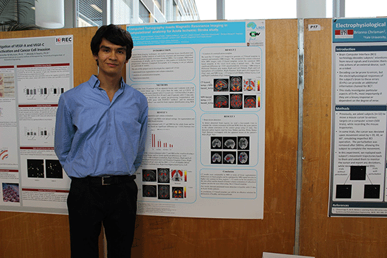
You probably noticed that I have a certain dislike for the traditional style poster. I will offer better conference poster designs later in this article. But first, let me acknowledge that there are some situations when this type of layout can be useful:
- The layout is benificial when leaving the poster unattended since it allows the visitor to autonomously learn about the research. Such situations include permanent exhibition of research projects in a hallway or a website of a research project.
- The traditional posters arguably have a better chance to receive the best poster award – simply because of the amount of information that can be packed within it. The judges usually award the prizes based on the depth of the content rather a than visitor-friendly design.
- The traditional style poster can serve as a great summary of your research. Printed on a conventional paper (rather than on a poster) such a One Pager provides a condensed summary of your research for those who are not interested to read an entire paper but might spend 5 minutes to go over the key points. Cases where this could be useful include handing out to potential collaborators from the industry or to stakeholders.
- Finally, sticking to the traditional layout might be a wise choice when you expect conservative academics to judge you. For example, if the professor sent you a template for a graded poster session at the end of the course, you might just do as you’r told.
In most cases, including a conference poster session where the author is required to stand next to the poster, the traditional posted design is next to useless . Instead, use one of the three conference poster templates that I offer next.
You will access these traditional academic poster templates in the download
No.2: Presenter’s poster template
In a typical academic conference, most of the text that you have pasted on the poster is pointless. It would be an extremely socially awkward situation if the visitor would spend 10 minutes reading your poster while you silently observe this process. I can assure you that after 20 seconds one of you is going to budge and start a conversation.
A conversation is the whole point of a poster session – you, the presenter, want to interact with people. And the visitors want to hear from the author. This means that you can delete most of the text because you will be there to explain it orally.
Another pitfall of the traditional posters is the sheer amount of information they hold. The visitors can’t spend 20 minutes chatting to the presenter because they also need to browse the other 150 posters.
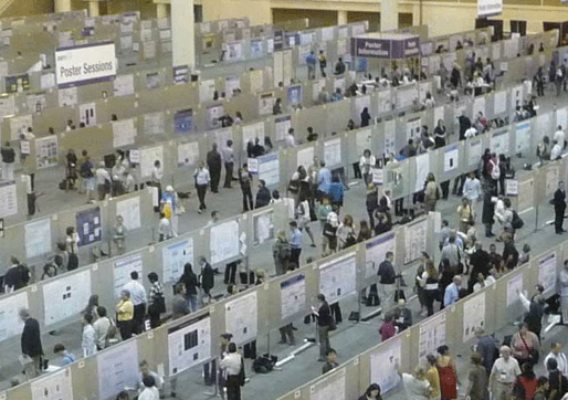
Actually you, the presenter, are also not interested in spending a lot of time with a single visitor because other potential guests, seeing that you are busy might simply pass by. This reduces your networking opportunities. Who knows – perhaps one of the people to whom you didn’t talk had a brilliant idea for a collaboration.
So there you go – most of the time neither the presenter nor the visitor are particularly interested in chatting for more than a couple of minutes. And yet, none of them knows how to politely get out of the conversation so it drags on.
Now that we have identified the key problems with the typical academic poster, let’s take a fresh look at designing a more effective one. The figure below shows a conference poster template that I designed to help you intuitively apply the best poster design principles. Its main focus is on visual information – graphs, flow charts, and illustrations. Since this template is going to be used when the author is present to explain the content, let’s call it The Presenter’s Poster.
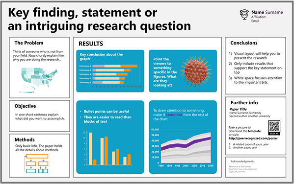
The template is simple enough to ensure that designing the poster will not take more of your time than creating the traditional poster.
When using the Presenter’s Poster template, focus on the most important results. If visitors want to dive into the details, hand out your full research paper or add a link on your poster for downloading it. Better yet, exchange contacts and agree to meet during the lunch break for an in-depth conversation. You can also exchange business cards and follow-up once you are back home.
Scrapping the excessive information from the poster is going to free up space on the poster. Now you can make the charts and illustrations large enough for people to see them without a magnifying glass. Not only will it facilitate discussions; larger figures are more likely to attract the interest of passers-by.
You will access these Presenter’s Poster templates in the download
A guide for poster design
My book Scientific Presentation Skills will explain what to include in each of the Presenter’s Poster sections to facilitate fruitful conversations.

No.3: #betterposter template
“So, tell me about your poster”
This is probably the most frequent opening when a visitor stops by a new poster. Mike Morrison, the originator of the #betterposter layout, thinks this alone shows the inability of the traditional poster design to convey anything meaningful about its content. If a glance at the poster would already answer this basic question, the visitor could approach the author with a more meaningful question thus making the conversation more efficient for both parties.
A peek at the poster should also signal the passer-by if he or she is even interested in a conversation. It is not worth chatting if either side will not benefit much and there are many other posters to visit.
The solution? Mike calls it #betterposter. See an example in the figure below.
SUPER excited to present my #BetterPoster built from the @mikemorrison concept at the @waynestate Lipids Symposium today! pic.twitter.com/TSHYkPoyjQ — Matt Kuhn, DVM, PhD (@MattKuhnDVM) May 7, 2019
You will notice that the first thing attracting attention in the design is the supersized text. This punchline is meant to summarize in plain English the take-home message of the poster. It allows the passers-by to quickly decide if they would like to get into more details. If they do, they can approach the author who then explains the research using the smaller bits of the poster. Mike Morrison puts it simply:
A poster that successfully communicates one thing is more effective than a poster that fails to communicate a thousand things.
When talking about the thousand things he is, of course, referring to the traditional academic poster.
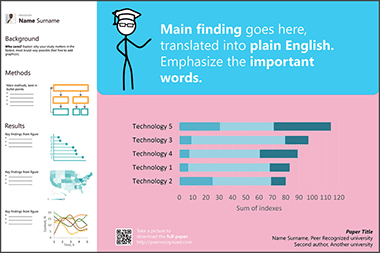
You will access these #betterposter templates in the download
Best of all, Mike has created two videos that explain the pitfalls of the traditional poster and how the #betterposter can help make poster sessions better. Grab some popcorn, they are worth watching!
No.4: Infographic style poster template
At every scientific conference, there will most probably be at least one neatly designed poster resembling the example figure below. It will immediately attract the attention of passers-by. More eyes on you promise many more fruitful conversations during the conference.
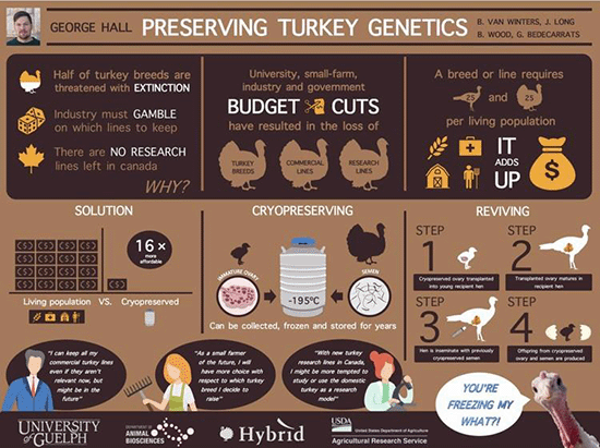
To create an infographic-style poster, you will have to come up with the design, create neat-looking graphics, care about the colors, and do many other things. This will take more work compared to the couple of hours you probably spent on creating the last poster. At the same time, the designing of one is less demanding than you probably think.
On http://peerrecognized.com/graphics you will help you see how to find useful graphics for illustrating a poster.
It is possible to design an infographic-style poster using PowerPoint, but a more specialized app will make it easier. One such tool is Canva, so I created this poster template using it. To use the tool, you will have to create a user profile but once this is done, the free version should serve your needs well enough.
You will access these infographic style poster templates in the download
A potential drawback of an infographic-style poster is that at some point it will fail to be scientific enough. For example, if you are attending a specialist research conference in your field, the visitors might want to see detailed charts, correlations, p-values, and jargon. Replacing these with pretty images, cartoons, and infographics might fail to leave an impression of you as a serious scientist. For this reason, before creating such a poster, consider the type of audience you will encounter.
Poster design software
Now that we have reviewed four radically different poster layouts, let’s look at some tools that will help create them.
PowerPoint is the No.1 used app for designing posters. For this reason, I made most of the templates using this tool. The familiarity of the software is its main benefit, but other tools (after a learning curve) might actually make the design process more enjoyable and the result – better. Cost: yes

Adobe InDesign is the go-to app professionals use for designing posters. It offers many features that PowerPoint doesn’t, for example wrapping of text around images. These features make InDesign a powerful tool for creating professional-looking posters. Once mastered, you might use it for other science-related tasks. Cost: yes.
Publisher is Microsoft’s version of page layout design software. Due to the general familiarity with Microsoft’s products, many might find it more intuitive than InDesign. Besides, it is quite likely that you already have it installed on your PC. Cost: yes.
Canva is an online tool that offers many stylish poster templates and useful icons for creating infographics and scientific posters. Cost: There is a free version and a premium upgrade with a larger library of images. I have found that the free version is enough, especially since I most often use my own images.
Piktochart is similar to Canva as it allows creating infographics, posters, presentations, and graphics. Especially useful for social media. Cost: yes
Finding images for posters
The posters will most often hold graphics with your results, flowcharts, or images that you created. But in some cases, you might need a generic image, for example, to visually demonstrate the problem you are solving (e.g. plastics littering a sandy beach if you are researching bio-degradable plastics). The problem is, you are not allowed to simply use whatever you find online. Images are by default protected by copyright and you need permission from the author to re-use them publicly. Fortunately, many people choose to make their work shareable.
Here are some tools that allow finding images that you can reuse freely. Check the license though. Even if you are allowed to re-use them, in most cases you are obliged to give attribution to the author.
Creative Commons is a non-profit organization that enables sharing of different types of creative works that normally would be copyrighted. It also offers a search engine for searching free-to-use images. Cost: free.
Unsplash offers a selection of generic photographs that the authors have chosen to make freely available to everyone. Even attribution is not mandatory, but of course, the authors will appreciate it. Cost: free.
Creating images for posters
If you need to create your own icon or drawing, here are some tools that will help to do it.
Adobe Illustrator is the go-to software many professionals use for creating and editing vector graphics. Cost: Yes.
Inkscape is an open-source alternative to Illustrator and it can do many of the same things without breaking the bank. There is also a strong Inkscape user community for when you hit a wall. Cost: free.
Adobe Sketchbook is a free drawing software by Adobe. It is especially nice to use if you own a digital drawing pad or a tablet. I used Sketchbook for creating all the illustrations for the Peer Recognized series books. Cost: free.
Krita is an open-source alternative to Adobe Sketchbook. Cost: free.
Other useful poster design tools
Not everyone has an eye for choosing matching colors. And we don’t have to, because tools like the Adobe color wheel help to select a color palette that is pleasing to look at. Even better, its accessibility feature offers a tool for selecting colors that ensure enough contrast for the easy readability of the poster. It can also serve as a check for making sure colorblind people can easily understand your poster. Cost: free.
Both Microsoft and Apple already include grammar-checking tools which will be enough for many. But for someone like me who is not a native speaker, Grammarly can do miracles by helping to improve the readability. Best of all, you can download an add-on for Windows, Mac, or your Internet browser. Get it here: https://app.grammarly.com/apps Cost: free for the most useful features.
Prepare for presenting the poster
Designing a good poster is only one of the steps in getting ready for a conference poster session. Now you have to prepare for presenting it to your visitors. The presentation and the following conversations might help you generate new ideas, form new research partnerships, or even find friends.
My name is Martins Zaumanis and with my book Scientific Presentation Skills I will show you how to make the most out of a poster presentation using a three-step system:
- select a fitting design for the particular audience
- polish a pitch for piquing the interest of visitors
- prepare for conversations.
Related articles:

One comment
- Pingback: How to create a scientific explainer video or video abstract (with examples)
Leave a Reply Cancel reply
Your email address will not be published. Required fields are marked *
I want to join the Peer Recognized newsletter!
This site uses Akismet to reduce spam. Learn how your comment data is processed .
Privacy Overview
| Cookie | Duration | Description |
|---|---|---|
| cookielawinfo-checkbox-analytics | 11 months | This cookie is set by GDPR Cookie Consent plugin. The cookie is used to store the user consent for the cookies in the category "Analytics". |
| cookielawinfo-checkbox-functional | 11 months | The cookie is set by GDPR cookie consent to record the user consent for the cookies in the category "Functional". |
| cookielawinfo-checkbox-necessary | 11 months | This cookie is set by GDPR Cookie Consent plugin. The cookies is used to store the user consent for the cookies in the category "Necessary". |
| cookielawinfo-checkbox-others | 11 months | This cookie is set by GDPR Cookie Consent plugin. The cookie is used to store the user consent for the cookies in the category "Other. |
| cookielawinfo-checkbox-performance | 11 months | This cookie is set by GDPR Cookie Consent plugin. The cookie is used to store the user consent for the cookies in the category "Performance". |
| viewed_cookie_policy | 11 months | The cookie is set by the GDPR Cookie Consent plugin and is used to store whether or not user has consented to the use of cookies. It does not store any personal data. |
Copyright © 2024 Martins Zaumanis
Contacts: [email protected]
Privacy Policy
By continuing to browse the site you are agreeing to our use of cookies and similar tracking technologies described in our privacy policy .
Poster & Scientific Paper Presentation Guidelines
Congratulations on being selected to present your poster or paper at physiatry ’25.
Here are some general guidelines to get you started:
- Posters will be on display in the Poster Gallery for one day of the conference (Thursday or Friday).
- You will be notified of your assigned presentation day.
- The days cannot be changed once they have been assigned.
- Scientific papers will be podium presentations scheduled throughout the meeting and are intended to highlight quality research practice, scientific merit, and educational value to the meeting participants.
- At least one author of your accepted Poster or Scientific Paper must register to attend the annual meeting.
- Registration for poster and scientific paper presenters is not complimentary.
Don’t forget to spread the word!
Share the good news about your accepted poster or scientific paper with your community using our “I’m presenting” graphic via email, Twitter, Facebook, Instagram, and any other digital platform you use. Graphics can be downloaded from the Presenter Hub . The official hashtag for the meeting is #Physiatry25 .
Poster Presenter Guidelines
Your poster should be a stand-alone, self-explanatory display, allowing viewers to read on their own while you address individual questions. Every poster should lend itself to presenting information in a self-explanatory format.
Sample Poster Layouts are available, as well as a poster template .
Poster Submission Guidelines
- You will not submit your poster electronically prior to the meeting. You will need to print your poster and bring it to the meeting to display in one of the Poster Gallery Receptions.
- IMPORTANT: The presenting author is the sole point of contact for all abstract co-authors. All communication and inquiries will be sent to the presenting author.
- All posters will be provided with 1/2 of 1 side of a 4’x8’ display board. Recommended printing size is 48 inches by 36 inches. Poster components must be able to fit on the display board without overlap.
- Fonts should be sans-serif (e.g., Arial, Calibri, etc.) and large enough to read clearly when viewing the poster.
- You are responsible for being available to answer questions about your poster during the assigned date and time.
- The Poster Galleries will take place on Thursday, February 27 and Friday, February 28.
Poster Printing
The AAP is partnering with and only endorses PosterNerd to offer poster printing services for Physiatry ’25 attendees. More information on the poster options is available on the PosterNerd web site. There is a 10% discount on PosterNerd services. You are not required to use PosterNerd for your printing if you have another printing service that is preferred.
Scientific Paper Presenter Guidelines
Your Scientific Paper (oral) presentation should include PowerPoint slides to describe your research and may also include figures, tables and references to highlight important aspects of your work.
Scientific Paper Submission Guidelines
- You will have a total of 12 minutes for your presentation, this includes 10 minutes for your presentation and 2 minutes for Q&A.
- Plan on 1 slide per minute when creating your presentation.
- All slides will be checked for adherence to ACCME policies by AAP staff prior to the meeting. Slides must be submitted for review no later than December 29, 2023.
- Slide #1 must be your title slide and Slide #2 must be your disclosure slide. Your disclosure statement should list all commercial relationships relevant to your specific talk. Disclosures must never include the use of a trade name or a product-group message.
- Download the AAP-approved slide template from the Presenter Hub .
- Do not reference any company/product brand names during your presentation. However, institution logos (e.g. non-company/product logos such as universities, non-profit associations and government agencies) are allowed.
- Bring a copy of your presentation on a flash drive with you. Presentations will not be preloaded onto the computers in the session rooms.
Publish Date
September 4, 2024
Resource Type
- Poster & Presenters
- Presentation
Related Resources
Published: September 2024
AAP Disclosure Form
Published: August 2024
Presenter Hub
Published: July 2024
Resource Guide for Aspiring Physiatrists
- Enter Our Giveaway
- Meta Quest 4
- Google Pixel 9
- Google Pixel 8a
- Apple Vision Pro 2
- Nintendo Switch 2
- Samsung Galaxy Ring
- Yellowstone Season 6
- Recall an Email in Outlook
- Stranger Things Season 5
How to create a Powerpoint Presentation

Powerpoint presentations are a great way to share information with a team, but making them is a skillset in its own right. We've got guides on general Powerpoint use , but if you're keen to just get started making a slideshow right now, this is the way.
How to create a Powerpoint presentation
How to build your first slide, how to add more slides to a powerpoint presentation, how to make an awesome slideshow presentation.
Here's how to make a Powerpoint presentation.
What You Need
Powerpoint or Microsoft 365 subscription
The first step in building your fancy slideshow is to create the presentation itself. Here's how to do it.
Step 1: Install Powerpoint (as part of Microsoft 365 ) if you haven't already, then open the app up.
Step 2: The home screen will give you a range of options for selecting templates and premade presentations to give you a great starting-off point. Select one of them if they're applicable. For even more options, select the New tab from the left-hand menu.
Alternatively, if you want to start from a blank canvas, select Blank presentation.
Step 3: From there, it's a good idea to name and save the presentation so you can come back to it later. Select File > Save or* Save As*, then name the file on the right, choose a location for it, and select Save .
Step 1: Your first slide will automatically have text fields for a title and subtitle. If you want to have that on your first slide, select them, then type in what you want them to read. You can also click and drag them around, or resize them using your mouse.
Hover your mouse over the white circles, then click and drag them to resize the box. Alternatively, select the rotational arrows near the corners of the box, to rotate it.
If you don't want those text fields, select their boundary individually and press the Delete key to remove them.
Step 2: If you want to add more text to this slide (or any others in the future), select the Insert tab, then select Text box. Click on the slide where you want the box to appear, then use your mouse to drag the box to the desired shape.
Then click the box and type in what you want that text box to say. The contextual home menu will automatically adjust to give you quick access to font choices and other text style options.
You can access more detailed text formatting options by selecting the Format tab. There you'll find options for changing text coloring, its outline, and any text effects you want to use.
Step 3: To add pictures to your slideshow, select the Insert tab, then select Pictures in the top-left. You'll then have the option to insert an image from your local PC, a selection of stock images, or a range of online images.
Step 4: You can also freehand draw or annotate your slides, using the Draw tab, or alter the entire theme of the slideshow by selecting Design.
To add a new slide to your presentation, select the Insert tab at the top of the screen, then select New slide on the left. Then choose the type of slide you want. You can have a blank slide to do it all yourself, or you can get a headstart on its design by copying a previous slide, using the same theme as another part of your presentation, or having a predefined layout.
Want even more tips on making a great slideshow? We've got you covered. Check out our guide on how to use Microsoft Powerpoint , for all the most important tips.
We've also got a guide for more tips and tricks for making engaging and attractive slides .
Editors’ Recommendations
- The best PowerPoint templates
- How to change the background in Powerpoint
- 5 ways to add music to PowerPoint
- How to print a PowerPoint presentation with notes
- How to convert PDF to PowerPoint
- How-To Guides

While PowerPoint is widely used to develop presentations, using Google Slides has become a popular alternative. Part of what makes it so popular is that it's free to use, as is other Google software such as Google Docs and Google Sheets – which is a stark contrast to the premium price you'll pay for Microsoft Office and PowerPoint.
Even if you know how to use Microsoft PowerPoint, you might want to jump ship to Slides, and Google makes it easy to do so. In fact, it takes little more than a few clicks to convert a PowerPoint to Google Slides. Whether you need to change the format for a coworker or want to permanently switch to the free platform, here's a look at how to convert your PowerPoint into a Google Slides presentation.
We all know that Microsoft’s PowerPoint software has been a presentations staple for a few decades now. And whether you only used it in school once or twice, or you use it for work on a daily basis, there’s always something new to learn about the classic Microsoft platform.
Even if you know how to use PowerPoint, did you know that you can embed videos in your presentations?
Creating a successful slideshow is no small task. So, if you’re new to Microsoft PowerPoint, you’ll need to familiarize yourself with the features and tools you need to build a presentation.
We’ll guide you through the process of creating a PowerPoint slideshow by adding slides and elements as well as how to present the show when you finish. These basics are just what you need as a beginner and should get you off to a terrific start with PowerPoint.
IMAGES
VIDEO
COMMENTS
Step 3: Write the content. Write or rewrite the content for the sections in your poster presentation. Use the text in your research paper as a base, but summarize it to be more succinct in what you share. Don't forget to write a catchy title that presents the problem and your findings in a clear way.
Research posters summarize information or research concisely and attractively to help publicize it and generate discussion. The poster is usually a mixture of a brief text mixed with tables, graphs, pictures, and other presentation formats. At a conference, the researcher stands by the poster display while other participants can come and view ...
Read more tips for making your poster stand out here. To make everyone feel welcome, stand to the side of your poster. This will make it easy for your potential audience to move closer and see the whole thing. Think of your poster as a conversation starter. Smile and say hello to everyone who walks past and looks at you or your poster.
Practice a 1- to 2-minute pitch until you feel comfortable. The poster and your pitch must be aimed at the audience that will be present. The clearer and more rational your poster layout, the easier it will then be for you to make a strong pitch. —Srinivas.
Effective Poster Presentations
Start with the visuals, and make them easy to understand for your audience. Use bullet points only for your text. Keep fonts consistent, a little effort goes a long way in terms of neatness. Have ...
How to design an award-winning scientific ...
The text of your headings should include important information (and not just introduction, methods, results). The paragraph text of your poster should be between 30 - 40 point size. Viewers should be able to read it from a few steps away. Details and references can be smaller, but don't go below 24 point size.
Make sure to follow the guidelines provided by the conference for poster size and format. Double-check this so your poster doesn't get rejected! Print your poster on high-quality paper or vinyl to ensure that it looks professional. When presenting your poster, be prepared to answer questions and engage with attendees.
Open access repository for posters and slide presentations across biology and medicine. ... This video provides an overview of some tools, resources and key elements to creating a conference poster. Content covers software, general content, design tips, provides image resources, and tips for improved print quality. ~35 min. ...
How to Make a Successful Scientific Poster
Poster presentation 101: Make your work stand out at a conference. Poster presentations are a great way for medical students and residents to showcase their hard work on a project. Learning how to do a poster presentation means finding the best way to present the information so that your work can stand out from the crowd.
HANDBOOK. A GUIDE TO AN EFFECTIVE POSTER PRESENTATION. Educational Service Division. ASHP. 4500 East West Highway, Suite 900 Bethesda, Maryland 20814 Telephone: 301 664 8682 [email protected]. 2019 American Society of Health System Pharmacists, Inc. ASHP® is a service of the American Society of Health System Pharmacists Inc. - Registered in ...
The Key Elements of a Successful Conference Poster. Creating a successful conference poster is both an art and a science. It requires careful consideration of design, content, and presentation to effectively communicate your research findings. Here are the key elements that contribute to a successful conference poster: 1.
A photo used as a background is too distracting and makes it impossible to have negative space on your poster. It's much better to leave the background white, grey, or filled with a light colour from your colour palette. Fonts: fonts and font sizes work a bit like colours. That is, the fewer you use, the better.
The goal of a scientific poster. The main goal of a scientific poster is to communicate your scientific project in a clear and concise manner. It also provides an excellent opportunity to network and showcase and get feedback on unpublished work. Image credit: Conference presentations: Lead the poster parade, Chris Woolston, Nature 536, 115 ...
patient care and raise the profile of the researcher, their organisation and the profession. A conference poster is one method of sharing valuable findings. This guidance briefly outlines how to create and present a research poster to convey study objectives, methods, findings and implications. Why do a poster presentation?
Poster. While your presentation is arguably the most important element of a poster presentation, the poster itself is generally what catches people's attention. This portion of the guide discusses the role that your poster plays in presenting your research. For information about formatting and designing your poster, see the Designing Your ...
Avoid clutter. Limit your poster presentation to a few main ideas. It's better to present a few of your findings well than present all of your findings poorly. Arrange your poster components to read from left to right and top to bottom. Emphasize important points on the poster with lines, frames or boxes, and arrows.
In your presentation, you should make sure to hit some key points about your research. Resist the temptation to read your poster and instead, use the oral presentation to supplement details that are in your poster or to draw attendees' attention to specific sections. Be ready to be flexible during your presentation: some people might ask you ...
This article provides an overview of the process of designing and creating academic posters. It will discuss tools and resources that will be of use to researchers who intend to submit an academic poster to a conference. Academic conference posters are a method of communicating academic research succinctly (Gopal et al 2017).
Scientif i c poster presentation tips for your next conference 1,3. Listed below are a few tips that could get you started in planning your next scientific poster presentation: Know your audience: A general idea of the conference attendees could help in deciding the information to be included. Read the guidelines, if any, and adhere to them.
No.1: Traditional academic poster template (PowerPoint) No.2: Presenter's poster template (PowerPoint) No.3: #betterposter template (PowerPoint) No.4: Infographic-style poster (Canva) After discussing the templates, I will share tools that make designing a poster more efficient and the result - better. Let's dive in.
Congratulations on being selected to present your poster or paper at Physiatry '25! Here are some general guidelines to get you started: Posters will be on display in the Poster Gallery for one day of the conference (Thursday or Friday). You will be notified of your assigned presentation day. The days cannot be changed once they have been ...
To add a new slide to your presentation, select the Insert tab at the top of the screen, then select New slide on the left. Then choose the type of slide you want. Then choose the type of slide ...