7 Call to Action Examples You Have Never Seen Before
At great risk to my sanity, I went online with the intention of finding as much advertising as I could.
The goal: to find call to action examples (CTAs) that were fresh, original, unique, and compelling.
My discovery: Almost everyone is using generic CTAs. Safe, boring, and forgettable. The 7 innovative call to action examples I found made those brands stand out immediately.
Your opportunity: By changing 2-3 words of a call to action, brands can stand out in a small way from the hopelessly ordinary competition.

Less than 0.00001% of CTAs Are Unique
This is not a scientific number. I came up with it out of spite after an exhausting search.
Refresh the examples in a listicle about calls to action, my editor said.
I thought this was going to be easy.
It was a nightmare.
Websites for brands large and small were universally boring in terms of calls to action. The most tantalizing offer I could find was usually “Free Trial”, which brought me to a page with miles of fine print.
I thought maybe the aggressive pay-per-click advertisers would put together some compelling calls to action. Nope. The name of the game there is using every conversion hack at once.
Here’s a typically boring call to action example that most people are using :

I think this offer hits every cliche tactic: the ticking clock, a warning emoji about sell-out risk, money-back guarantee, a steep discount, etc.
Then I tried social media, which was even worse. Facebook gave me nothing in the way of an inventive CTA. Absolutely nothing.
I checked Reddit–as always, a wonderful place, just not for buying things.
On X (fka: Twitter), I was hoping to find some good scammy infoproducts, maybe some clever hardsells. But I was disappointed. I could have made a full quilt that spelled out “unoriginal” with all the thread emojis inviting me to click and read a tweet-storm. Here’s why that trend is played out: 🧵/23
My wife told me that TikTok has been ruined by advertisers and influencers–so I was really excited about that. This is where the real ingenuity must be.
Nope. It’s a simple SHOP button that overlays influencer videos. That’s it.
But in the end, I prevailed. I found 7 examples of brands actually trying something new with their call to action. They used this small detail to support their brand image or speak to their audience.
7 Truly Unique Call to Action Examples
1. cloudflare.

“Under attack?”
That is a viable button you can click on Cloudflare’s site.
I love it.
Cloudflare has positioned themselves as a cybersecurity version of calling 911 when there’s an intruder in your house. And they did it using two words, a question mark, and a construction-zone orange button in the navbar.
I assume the majority of people who click that button are like me: not currently under attack, but curious about what the next steps would be if they were.
I wanted to learn more because of the clever call to action. If the button had said Learn More, I never would have clicked it.
2. Backcountry

The online outdoor retailer Backcountry hires the people who stay up around the fire fighting about which hiking stove weighs less. You know the type: Gearheads.
This is a huge selling point for Backcountry. When people buy kayaks, avalanche beacons, and so on, they really want to know that this gear works.
Call a Gearhead. Text a Gearhead. These are creative, on-brand calls to action nested in a familiar dropdown menu.
You have a question about climbing rope? Now you are talking with a woman who climbs 3 times a week.
3. LINGs CARS.com

This is actually a fairly tame example of the calls to action on LINGsCARS.com , one of the most successful car leasing services in the UK.
Ling broke every rule of web design to bring us this masterpiece. I know neons are in right now, but most people aren’t using all of the neons, at once, with a paisley background.
CrazyEgg will lock me out of WordPress if I actually recommend a call to action that includes three Order Now buttons that blink at random intervals. So I am not going to do that.
I will say with 100% certainty, however, that I have never seen call to action examples quite like this ever before.
4. Niki Whittle

Niki Whittle is an online personal stylist who has helped thousands of clients find joy instead of anxiety at the prospect of getting dressed and going out into the world.
The text of her CTA button speaks directly to that goal: Help me enjoy getting dressed!
If you swapped out Niki’s personalized text for a basic “Find Out More” button, I think the call to action would suffer.
Her choice of text is intimate. No adult is going to ask for help getting dressed unless they fully trust the other party to understand where they are coming from. The way that Niki has framed the call to action shows that she understands.

Due to California regulations, the beverage brand Ceria couldn’t exactly say what their new product was. With the help of the marketing agency Mother, Ceria found a clever way to get their audience to connect.
The call to action they used was a Spotify playlist people could download by scanning a barcode styled like the familiar Spotify audio waveform.
There’s a cool story behind this ad campaign, which appeared online and in-print in California.
I’m not going to rehash it here because you should go visit the site of the people who did the work , not hear about it third-hand, looking at screenshots I took while I was way behind schedule writing this post.

6. AllTrails

Have you ever seen a limited time offer that isn’t pushy?
AllTrails nails it with this email they sent me. If I go outside, this weekend only , they’ll plant a tree on my behalf.
It’s a positive push, encouraging me to do something for my health, and it won’t cost me a dime. Until AllTrails called me to action, I just had weekend plans. Now I am saving the forest.
The invitation to “Join In” isn’t super original, I know, even with those cute little tree icons.
But the call to action is social. It’s not “Register” or “Find out more”, it’s about connecting with other people. AllTrails has 50 million users. This is a real community, and AllTrails is smart to frame it that way.
7. Avocado Green Mattress

Avocado Green Mattress has upcycled bedroom furniture people can buy to complement their organic mattresses.
The call to action is “Shop Zero Waste” is a clear call to the type of buyer who is willing to pay a premium to minimize their impact on the environment. “Shop” would work, but it doesn’t highlight the key selling point of their furniture.
It’s a small detail, but most people buying online have 5-7 tabs open. I know I do. With buyers scanning all these different sites, I think it makes sense to foreground your unique features in the button text.
More Call To Action Examples
Here are some twists on classic calls to action. I can’t say I’d never seen these types of tactics before, but the following examples are well done.
The call to action text speaks to the audience, aligns with the brand image, or is simply more inviting than a generic “Try Now” button.
Kati Curtis Design

Kati Curtis Design opted for a slight variation on the Get In Touch call to action by including her name.
I’m not going to belabor the point about what’s going on here, but this slight personalization will absolutely stand out.
I think this is a good idea if you are the face of your business as opposed to a brand. “Get In Touch With The Owner” could work, too.

Havenly is an online interior design service company. I liked the invitation for customers to “Find Their Style.”
They could have stuck with “Learn More” or “Book a Consultation,” but those aren’t personal at all. Those are also fairly passive calls to action, versus “Find Your Style,” which is much more active.

Birchbox , the popular cosmetics subscription box opted to use an invitation style call to action:
“Build Your Box”
It’s intuitive, on-brand, and crisp.
One issue people have with subscription services is that they get products they don’t want. With this short call to action, Birchbox is countering that objection by offering their customers an active role in building their own box.
Art & Logic

Art & Logic is a software development company with an approachable call to action.
Yes, they decided to go with “Let’s talk about your project” instead of something sterile or gimmicky.
Building custom business software is insanely complex, but Art & Logic makes the next steps as easy as possible.
Make your website better. Instantly.
Keep reading about copywriting.

7 Steps to Become a Better, Top Tier Copywriter
A world-class copywriter can instantly tap into a target audience’s frame of mind, pull at their emotions, bring them on a journey, and inspire many…

How to Use the PAS Framework Without Being Cringy
PAS is a famous copywriting framework that identifies a problem consumers often face, raises the stakes by pushing the problem to its logical extreme, and…

AIDA vs PAS: My Pick on Which Formula to Use and Why
AIDA and PAS are two of the most popular copywriting formulas that marketers use today. They both work well in multiple traditional and digital settings…

The WORST Headline Examples + 5 Perfect Ones To Follow
Writing great headlines is a tough task. Simply put, there are infinitely more combinations of words that don’t sound great together compared to those that…

How To Balance Deep Copywriting Research With a Deadline
All the words you see on product packaging, the marketing emails you receive, the websites you browse, and even the advertisements delivered to your mailbox…

Most Copywriting Tips are Vague and Generic–Not These 9
Great copywriters aren’t born, they’re made. In fact, you don’t even have to be a great writer to nail the copywriting thing. You just need…

Everything I Know About Copywriting After Making $500K
$500K? Lucky, the disbeliever will say. You just got lucky with your words. Maybe. But most copywriters aren’t counting on luck or magic to put…

At great risk to my sanity, I went online with the intention of finding as much advertising as I could. The goal: to find call…
Best Creative Writing Courses Compared
Taking a creative writing course will help you to become a better writer. It will teach you how to tell a story, write descriptively, and…

How to Create Winning Headlines in 9 Simple Steps
In any ad, everything depends on the headline. It’s why some copywriters are known to spend 50% of their time on just the headline. As…

How to Write Killer Sales Copy (And See If It’s Working)
Sales copy matters more than you might think. It’s important to supplement your text with images and video, but words on the page have a…

The Five Sales Letters Every Marketer Should Know, Hands Down
If you want your visitors to buy, instead of bouncing off your site like a basketball… Ask yourself: What’s missing from my funnel? What’s missing…

15 Habits of Website Visitors That Will Completely Change the Way You Write Website Content
For the most part, website visitors are quite predictable. This gives you, a business owner, a huge advantage. Why? Psychology!

How To Increase Your Landing Page Conversions by Asking a Question
It’s believed that it takes users (who have no idea of what your site does) exactly three seconds to orient themselves and make up their…

16 Helpful Copywriting Articles To Launch You Into Web Writing Greatness
We all need a little help… from time to time. Actually, as online copywriters striving for greatness, we need all the help we can get….
Over 300,000 websites use Crazy Egg to improve what's working, fix what isn't and test new ideas.
Last Updated on May 3, 2019
Facebook Advertising Optimization Tool
- 17 Call To Action Examples (+ How to Write the Perfect Social CTA)
October 21, 2022 46 Comments Mark Quadros
A call to action can make or break the success of your social media campaign. If you use the right words, your CTA will inspire your audience to take action — click on your ad, download your ebook, add an item to cart… you name it. On the other hand, if your CTA isn’t catchy and persuasive, your audience will simply scroll past without noticing it.

Keep reading to learn everything you need to know about social media calls to action : what they are, what makes a CTA successful, and how to craft a persuasive CTA for your next campaign. We’ve also included 17 call to action examples (from social media and beyond) to get you inspired. That’s right: we’ve also included great examples from email campaigns and landing pages — because a good CTA is a good CTA, regardless of where it’s placed.
Let’s jump in!
What is a call to action (CTA)?
A call to action (or CTA) is a text prompt designed to inspire the target audience of a marketing campaign to take a desired action. For example, a call to action can encourage people to click on a link, leave a social media comment, visit an online store, make a purchase, etc.
A call to action can take up different forms:
- Plain text with no link
“Buy Now” or “Download Now” are typical examples of simple calls to action.
But a CTA can run longer, too, such as “Subscribe today so you’ll never miss a post.” The possibilities are endless.
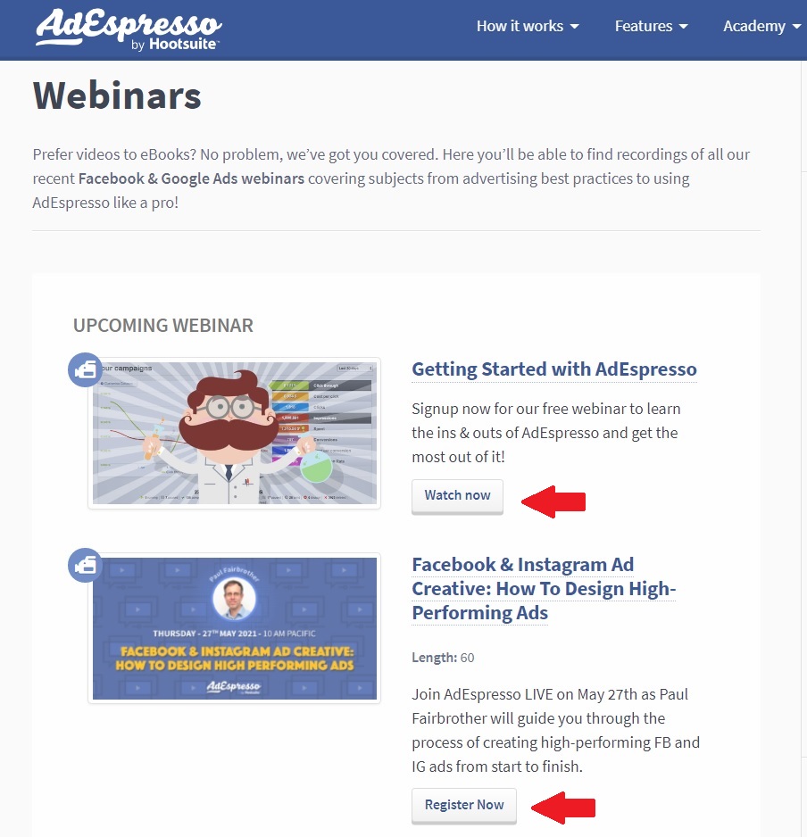
Call to action examples from AdEspresso
A good CTA can help with decision fatigue and give meaning to your content. Even if it’s just a two-word phrase, users need some direction to know what to do next.
CTAs that create a sense of urgency will also help increase conversions .
As long as it encourages potential customers to stay engaged on your site, then your call to action has done its job.
Note that having one CTA highlighted is the most common way. At the same time, some marketers use both primary and secondary call to actions in their marketing. We’ll review some best practices of this later on.
How to write an effective CTA for social media (and beyond)
Social media is all about getting users to click on your posts and ads and engage. However, it’s no longer as easy as it sounds. 22.3% of people using ad blockers say there are “too many ads.”
It’s tough out there.
To combat this, increase your conversions and engagement with a compelling call to action on your ads and elsewhere on the web. Let’s see how you can achieve this.
Use strong action words
Writing short and strong CTAs is not only more persuasive, but it’s also necessary due to the character limits on ads. Start with a verb (“buy”) and follow with an adverb (“now”) or a subject (“ebook”) or both.
Here are two call to action examples to the above statement: “Buy Now” or “Download this ebook now.”
Below are some of the most common call to action verbs broken down by intention. Simply pair them with the offering of your business.
Tip: check your call to action against the LIFT Model (see below).
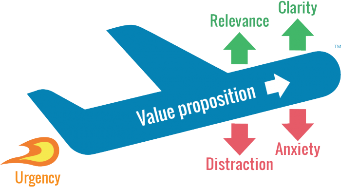
If we took our example from above, it would look something like this:
Download = relevance
this ebook = clarity
now = urgency
Download this ebook = value proposition
Use the text surrounding your call to action to:
- Reduce distractions (i.e., remove unnecessary links, images, etc.)
- Ease anxiety (e.g., add the disclaimer “no credit card required”)
Provoke emotion or enthusiasm
If you want to evoke an emotional response in your users, opt for a longer CTA. You’ll need to incorporate more modifiers in this case to get the desired effect.
Here are some examples:
- Add numbers: “Buy now and get 50% off!”
- Add adjectives: “Find your dream home with us!”
- Make a promise: “Lose weight in just 6 weeks!”
- Influence their FOMO: “Limited time offer. Get free shipping!”
- Play up your USP: “Order a hand-made soap now!”
Think up your own
You don’t need to stick to the good old examples, though. Get creative and make up your own call to actions.
First, verbalize to yourself what your company does for its customers (or simply look at your mission statement). For example, I run a spa where people get facial treatments.
Next, transform the verbs and modifiers into a 2-5 word call to action. Add relevant information where necessary → “ Get a free mud mask” or “ Treat yourself today!”
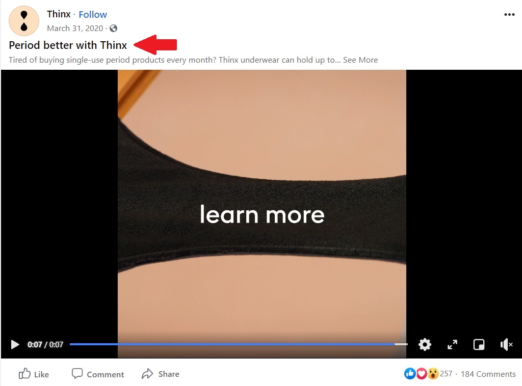
“Period better” – Thinx opted for the unique use of the word “period” as a verb in their CTA.
Tip: nobody gets their CTAs right the first time. Run at least one A/B test (but preferably more) on your ad to evaluate the strength of your call to action.
13 of the Best Call to Action Examples for 2022
In the following section, you’ll see what the techniques mentioned above look like in practice. Steal and customize the best CTA examples for your campaigns!
Facebook Ad CTAs
We’ll examine some Facebook ads with classic call to action examples. They may seem simple at first, but there’s more to uncover than what you see on the surface.
This ad from ClickUp is likely part of a retargeting campaign . Even if you don’t watch the video, the ad copy offers plenty of calls to action on its own.

Why it works
- Same CTA in the headline and the first sentence of the ad = the offer is clear (“Get 15% off”)
- The CTA is supported by objection-handling statements, such as “save 1 day a week”, “guaranteed,” and a list of features
- The “Learn More” call to action button assures the audience that they’ll get more info before committing
2. Shaw Academy
Can you spot all the call to actions in this Facebook ad? Hint: there are at least seven. Every element is coordinated here to instill a sense of urgency in the audience. Take note of the exploding colors, the alarm emoji, the many exclamation marks, and the multiple CTAs.
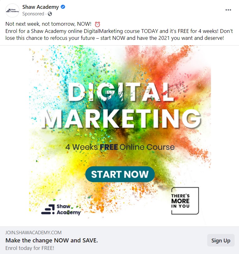
- Beautiful, contrasting colors with a CTA that stands out
- Multiple call to actions
- Sense of urgency to take action
Babbel is a language learning app that comes at you strong with various CTAs for their Facebook offer. It works because even if you don’t know this app, it quickly establishes a trust factor (“over 500,000 5-star reviews”). The post then draws you in with an attractive offer.

- The primary call to action is clear and direct: “Get up to 60% off!”
- They use the “Get Offer” CTA button to instill a sense of gratification in the audience
- Including the action word “join” + the number of reviews in the same sentence is a way to evoke the feeling of belonging to a community
4. Hootsuite
Hootsuite keeps it brief and concise with a few very targeted CTAs.
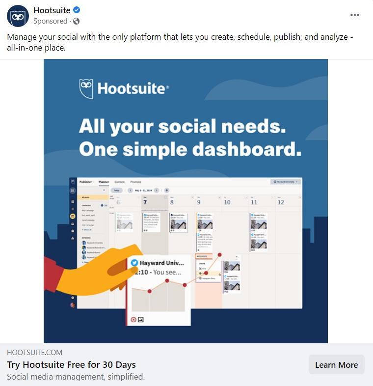
- All the call to actions are focused at the bottom while benefits are at the top of the post
- The “Learn More” CTA button leaves any extra info for the landing page
Instagram Ad CTAs
Sure, “swipe up” is available on Instagram ads, but you can get more clever than that. Below are some creative call to action examples for your Insta campaigns.
5. Headspace
Headspace’s Instagram ad is the perfect example of a custom-made call to action. “Snuggle up to Headspace” evokes a cozy feeling in users and personalizes the brand. Words like “snuggle” fit into the category of sensory words .
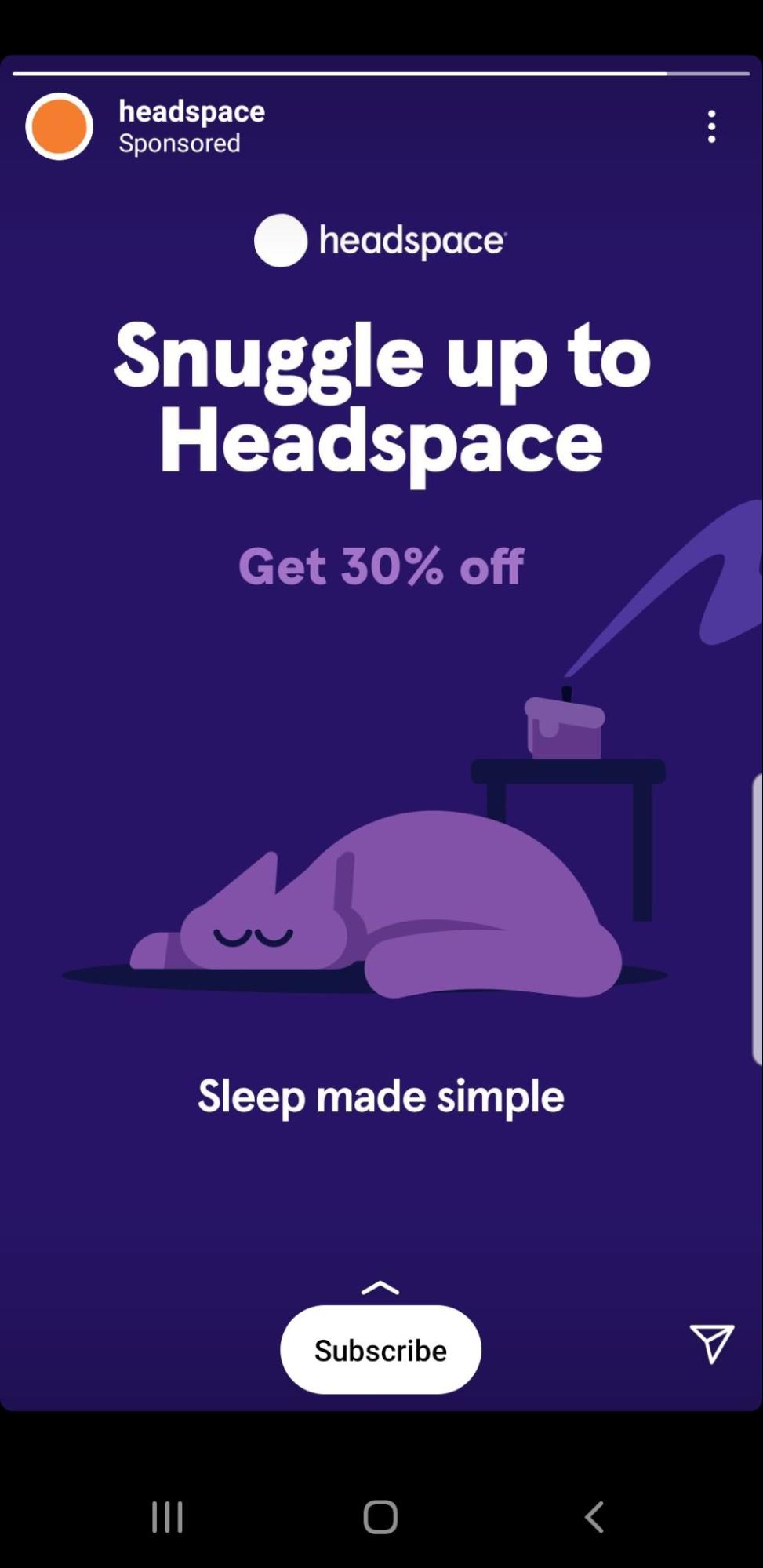
- They (smartly) opt to draw attention to the custom-made CTA and leave the “Get 30% off” as a secondary CTA
- They use the CTA button “Subscribe” after that to make it clear how that snuggling up will happen
- Coupled with a sweet, serene image, the whole CTA experience feels more like a gentle nudge for meditation and less like an ad
6. Elementor
As an event-type ad, Elementor gets it right. It displays all the key information regarding the event (name, speakers, date, and time).

Why it works:
- The two most eye-catching elements on the ad are the headline and the call to action button. They both have the same contrasting colors that stand out against the dark background.
- Both call to action buttons (‘Save Your Seat’ and ‘Book now’) are very concise and direct
- The old-school flair of the ‘save’ icon next to the CTA button works well with the target audience (likely consisting of more technical people)

7. Nøie Skincare
You have probably seen call to action examples like this in the advertising strategy of ecommerce brands. The main goal is to sell. At the same time, the ad focuses on the experience instead of rushing to take the user to a web page. In this case, “Shop Now” is the type of CTA that is direct, yet, the ad copy does most of the selling.
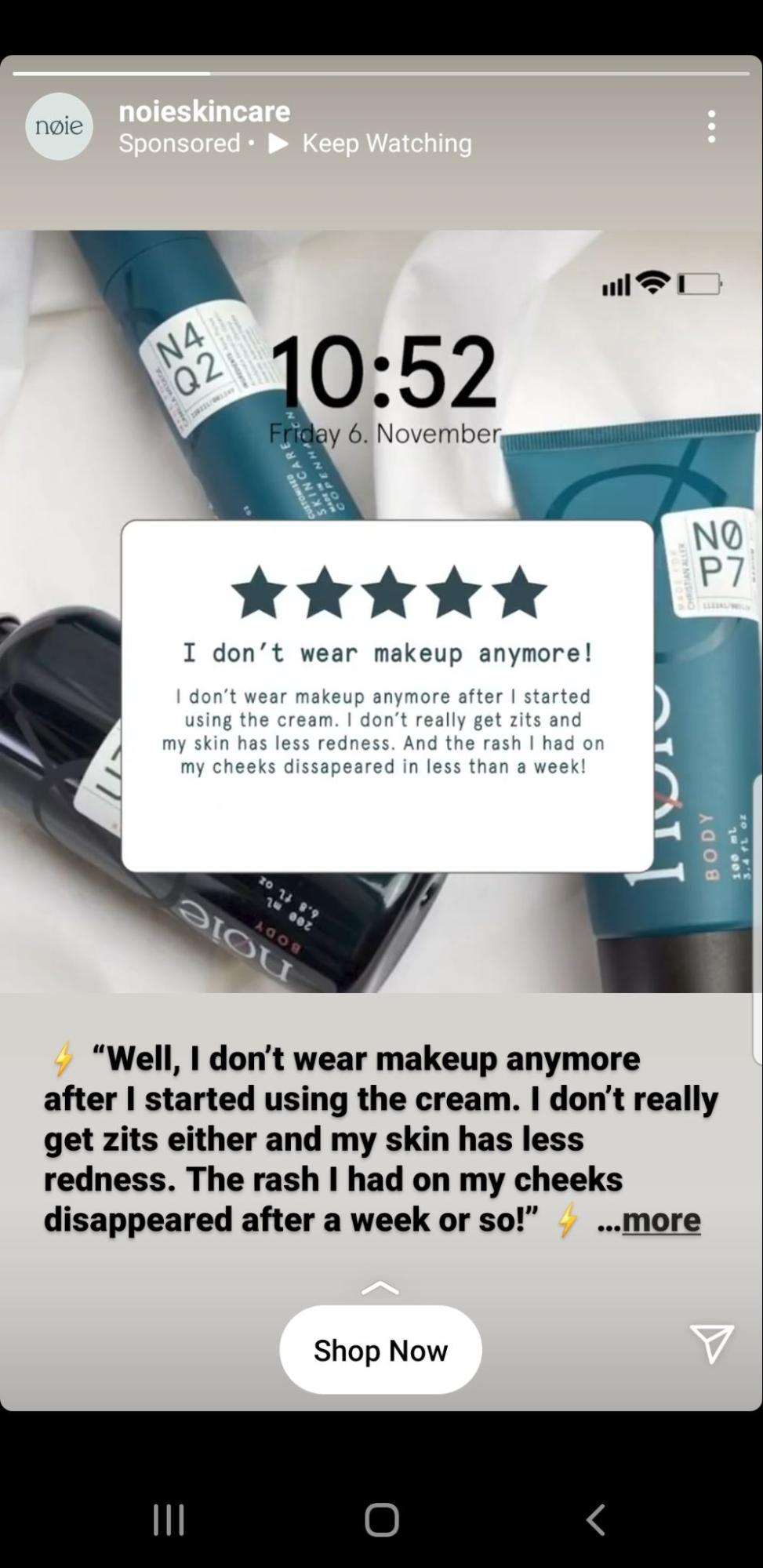
- The emphasis is on the product experience, which makes having just one call to action sufficient
- “Shop Now” is direct and to the point. The prospective customers know where they will be taken from the post
8. VAI Course
Esther Inman’s VAI Course ad keeps it fresh with the colors and a simple call to action button.
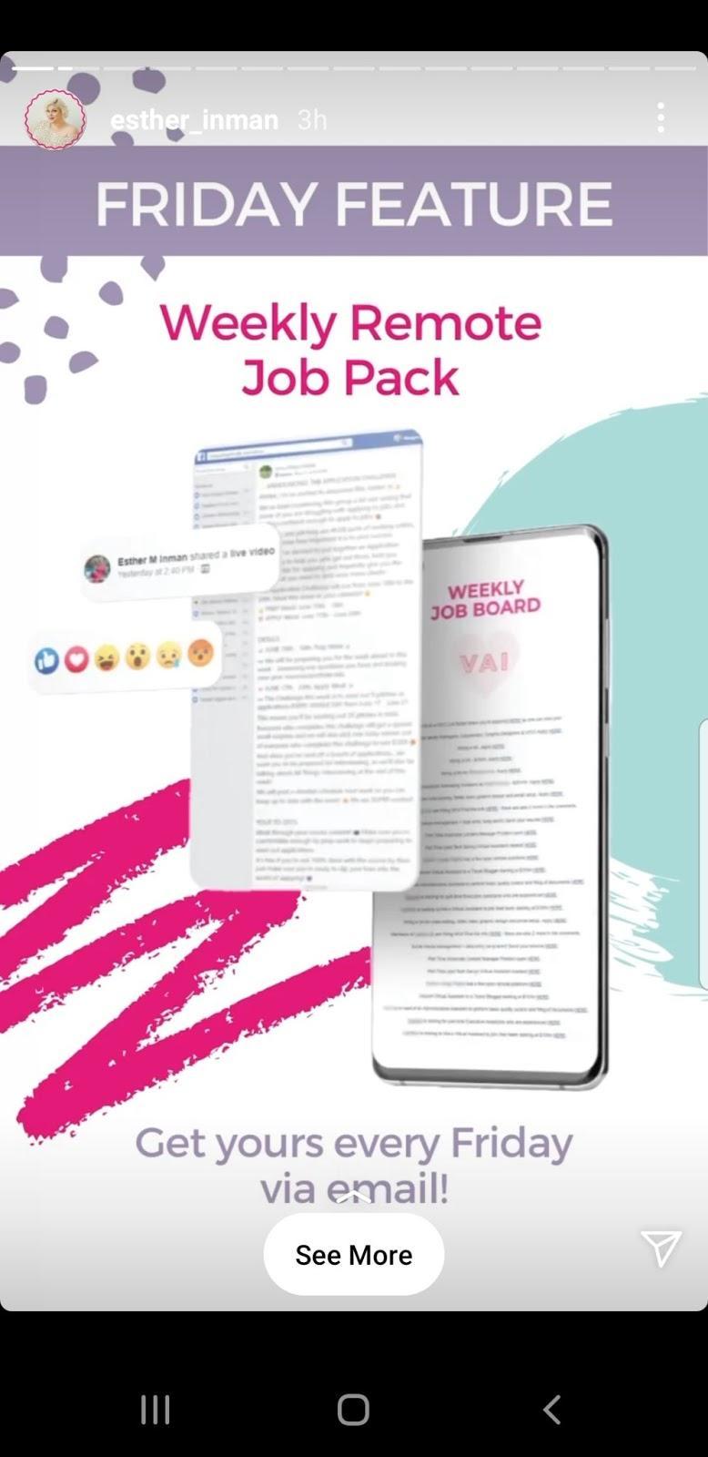
- The CTA text on the ad itself boasts about its main USP: the user gets a remote job pack every Friday
- The “See More” call to action button leaves the audience at ease knowing that they can still learn more about the product before signing up
Email conversion rates can soar as high as 15% . Take a look at the following email call to action examples from some brands who are doing it right.
9. Black Illustrations
Design agency, Black Illustrations prefers to use multiple CTAs in their email marketing. You can run your own test on this strategy, but it makes sense to include a few secondary call to action buttons if you have a relatively long email. Black Illustrations also adds a hyperlinked CTA to further help guide users to take action.
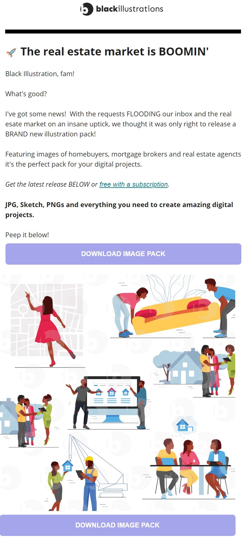
- Multiple CTA buttons (and hyperlinks) in a long email can increase your conversion rates.
- “Free with a subscription” stands out and keeps the main message clear for the user
- The color choice for the button works well with the brand yet still stands out
10. Audiense
The audience analysis tool, Audiense, prefers the long CTA route in their email marketing. Phrases like “show me…” or “take me to…” create a clear value proposition and helps the user feel in control.
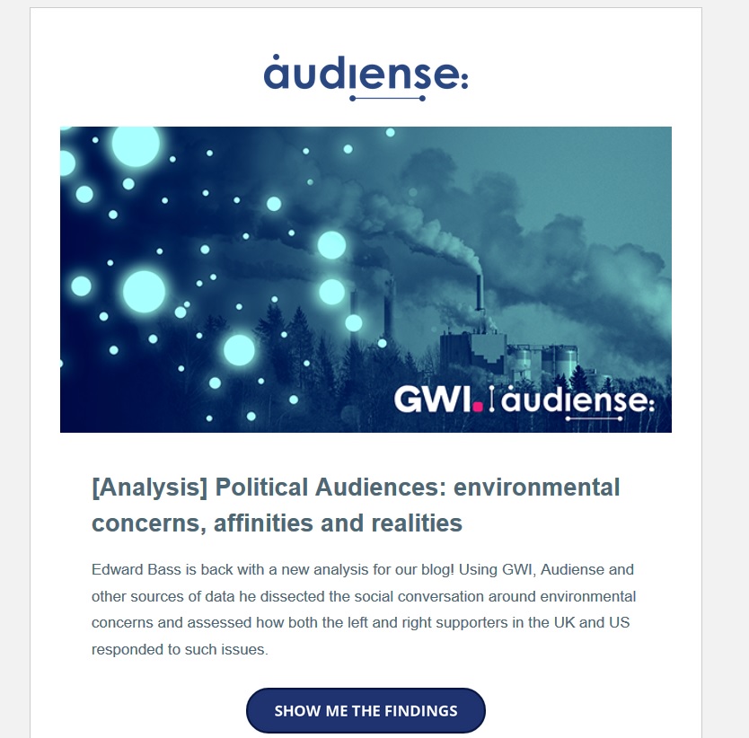
- Using multiple words and first-person phrasing in your call to action could increase your relatability and CTR
- Users get a better sense of the type of page that awaits them after clicking
- When using a long-form CTA, you get to test a wider variety of versions
Landing page CTAs
Landing pages are great subjects to run a CTA test or two on. Below are some great call to action examples for your next campaign.
11. Tim Ferriss
Tim Ferriss’s email sign-up landing page is as minimalistic as it gets. No top menu, no links, or other distracting web components.
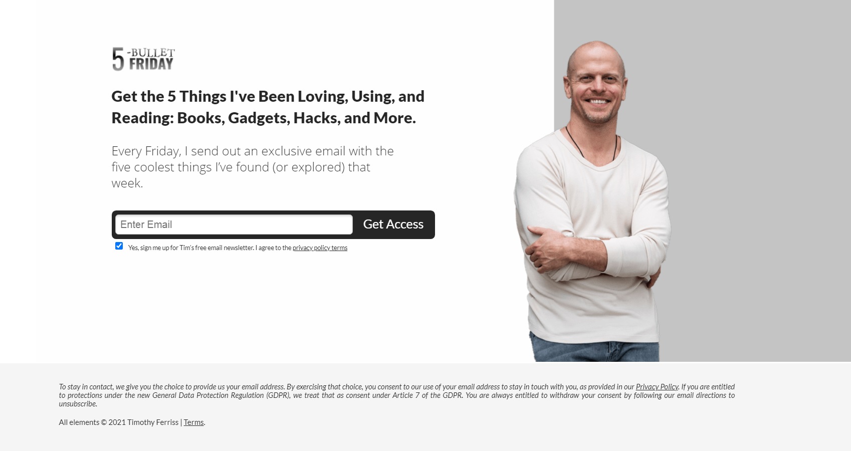
- The distraction-free page keeps the focus on the main CTA: to sign up for the newsletter
- The black headline and black CTA button provide a striking contrast to the white background
- “Get access” is a great call to action to use if you want to establish the feeling of receiving exclusive content in the user
Joy is a Canadian company that offers a razor subscription service for women. Their landing page is concise and fits all information to the visible area. The CTA button stands out as it’s the darkest element on the page.
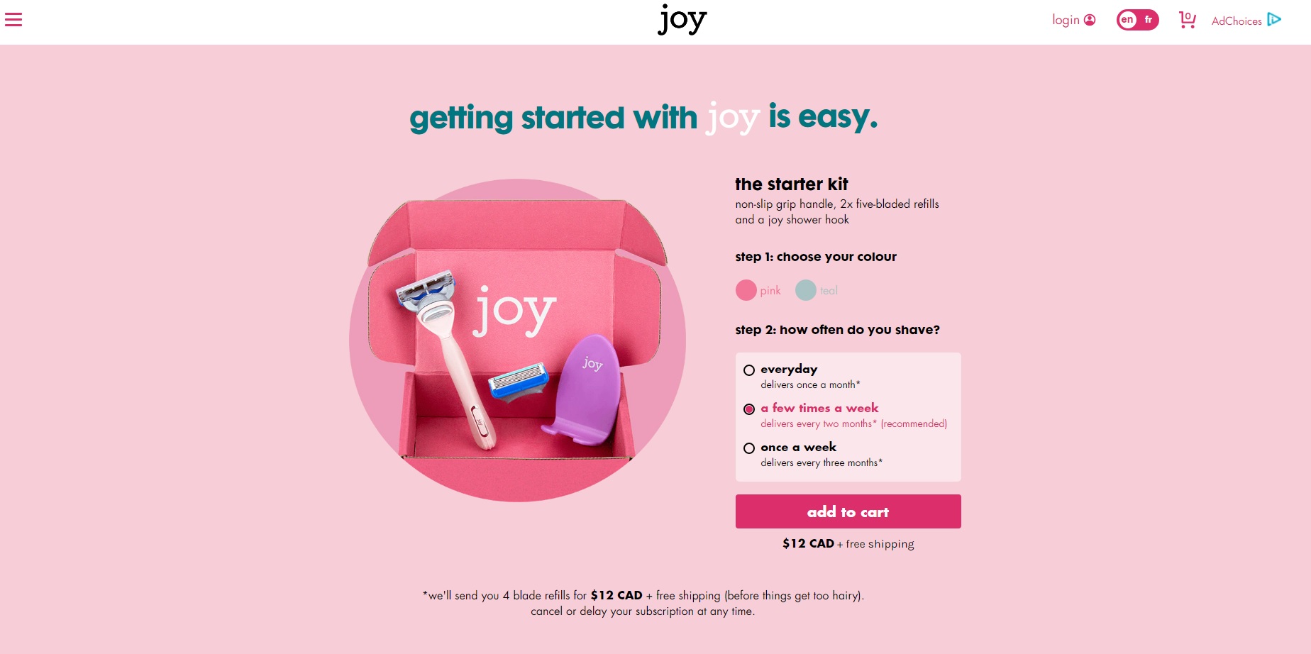
- The contrasting color of the button helps users easily navigate to the next step
- The CTA copy itself follows ecommerce best practices: “add to cart” is an easy-to-recognize button in the industry
- The small-cap lettering (which fits the brand) lends a unique look to an otherwise highly used CTA
13. Leadfeeder
Leadfeeder’s own lead-generation landing page is simple with a clear value proposition. On the left, you get a summary of the ebook. On the right, you will need to provide some basic info and then click “Get the Guide” to submit your request.
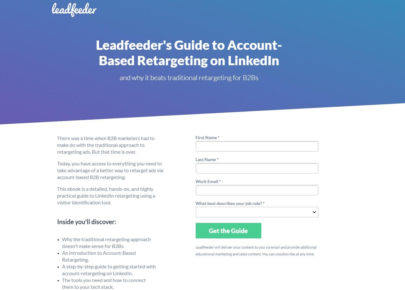
- The CTA button is the only green item on the page
- “Get the Guide” engages the users with a clear offer
Website CTAs
Your landing pages may be the focus of your ad strategy. Still, it’s necessary to create a homepage with just as much converting power. Meet a few thought-out CTA examples below for your website!
14. Touchland
Touchland is here to sanitize your hands without making a mess. The “checklist” on the left (keys, wallet, phone, touchland) is cheeky. It’s a clever storytelling technique to place visitors into a familiar scenario while introducing the product.
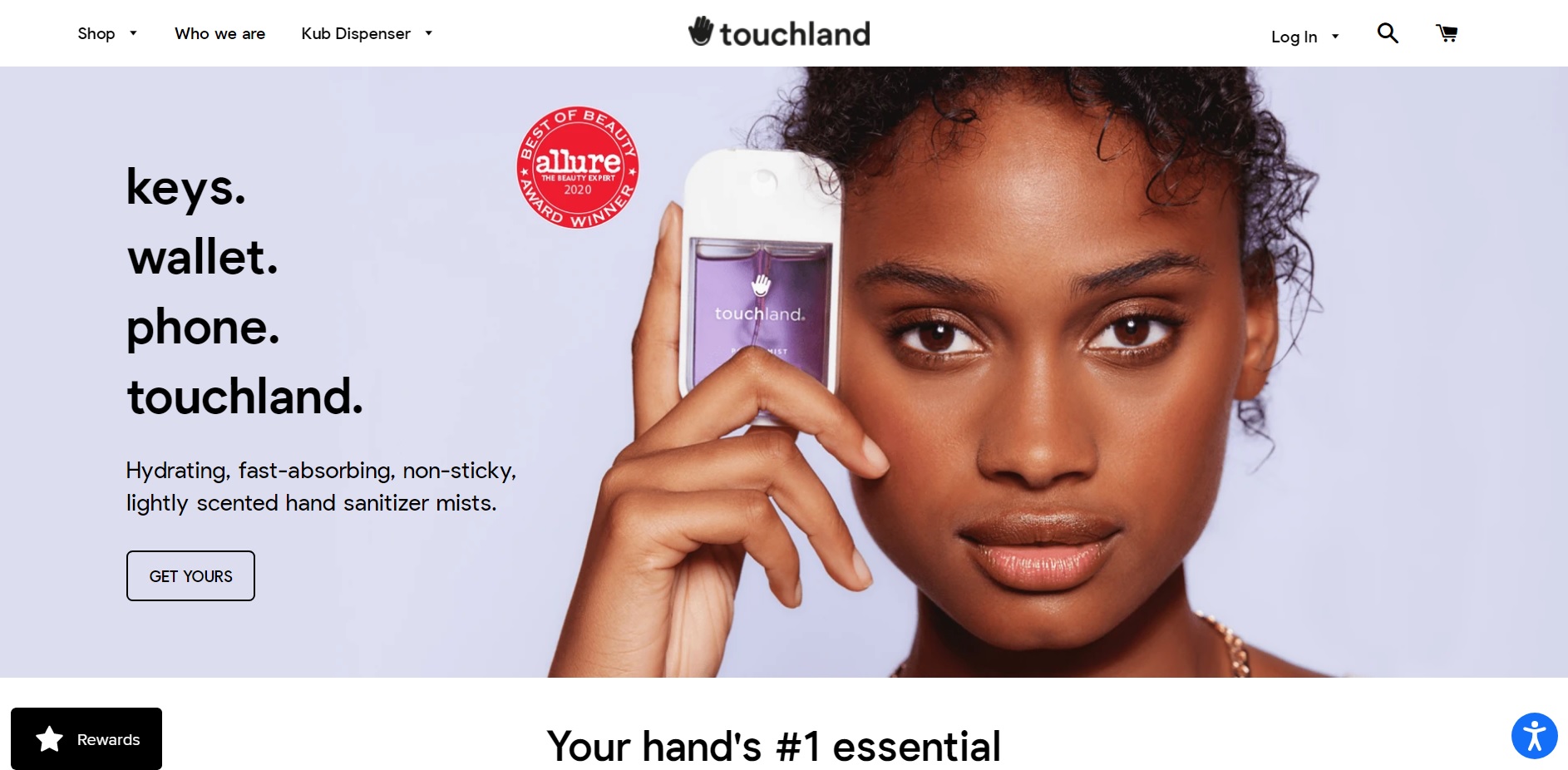
- “Get yours” implies that a lot of people already have one – you will only fit in if you get yours
- The transparent call to action button gives the website an airy feel to it, which is on track for a business that sells a mist
With COVID-19 restrictions coming and going, travel sites like Airbnb have to develop ways to stay top of mind. They achieve this by featuring a wishlist of outdoor spaces and a dreamy illustration on their website.
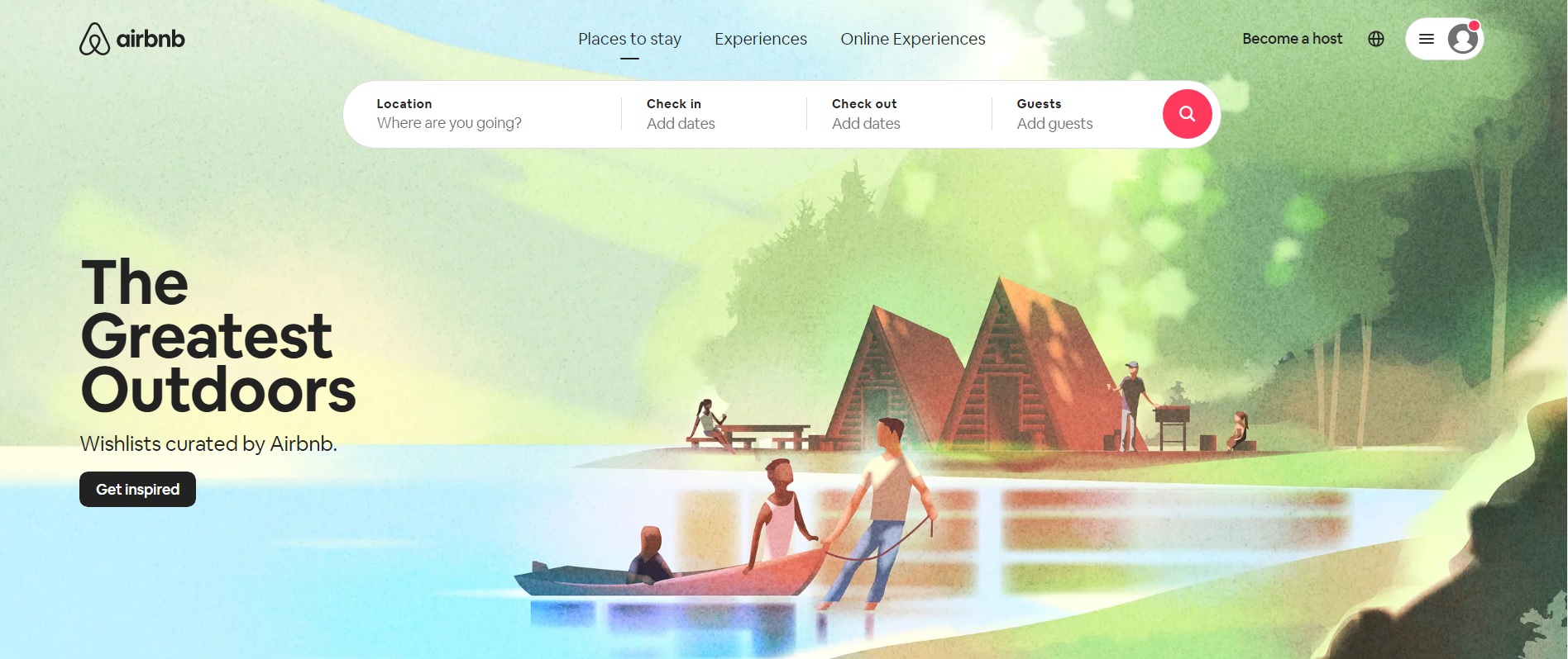
- “Get inspired” is a soft CTA that invites the user to explore ideas for future travel (and remarketing)
- The call to action button itself stands out against the pastel-colored background
16. Smartlook
Smartlook is a user behavior analysis tool. They closely follow website best practices by placing a “hero” section above the fold (tagline+description+CTA). The main goal of the site is to prompt visitors to sign up for a free trial.
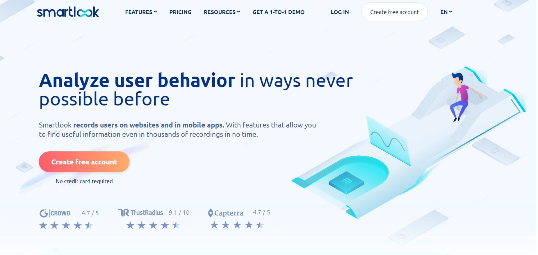
- The colorful call to action button provides a stark contrast against the grey and blue background – an immediate eye-catcher
- Using red and yellow colors on the button evokes a mixture of excitement and optimism in hesitant visitors
- The copy on the button says “Create free account” and the supporting text underneath is “No credit card required.” Both copies aim to overcome the subconscious objections of prospective users (Will it cost me anything? Will they charge my credit card?)
17. Ecom World
Ecom World is the website for “The World’s Largest Ecommerce Event.” They placed all of the most important info above the fold: what+when+where+the CTA.
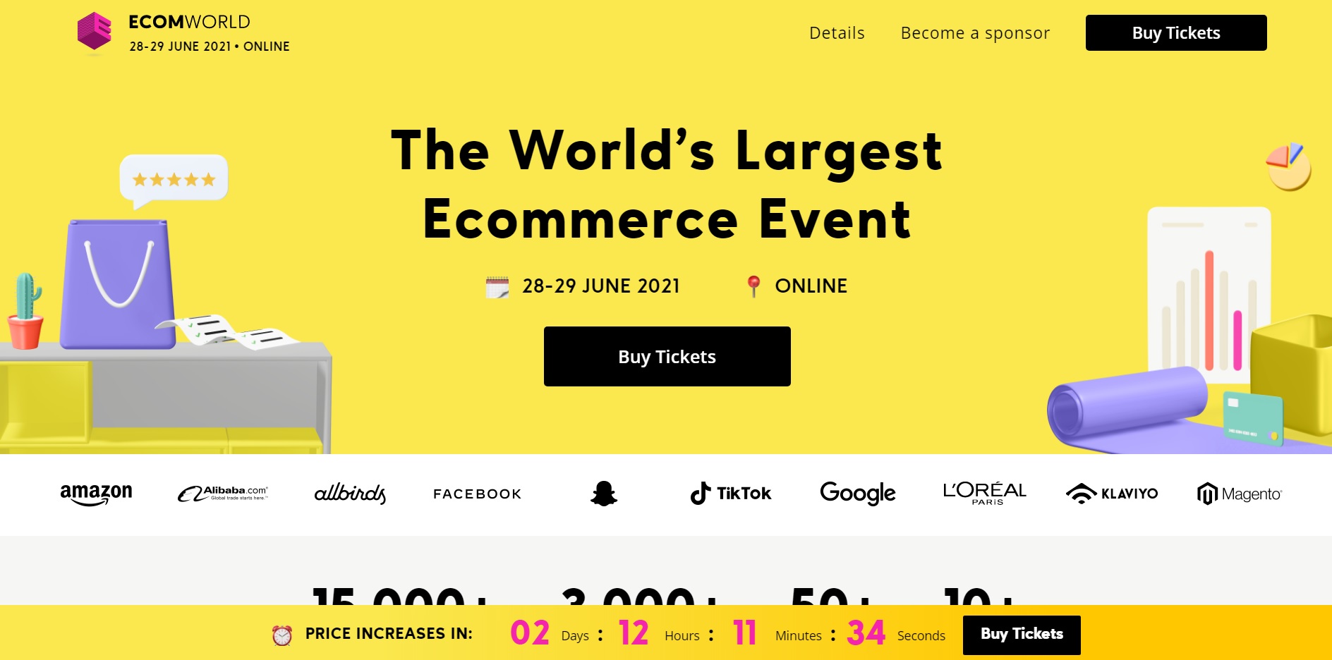
- The call to action button coordinates well with the rest of the design elements. Throughout the site, the most crucial info tends to be highlighted in black.
- Multiple CTAs could increase conversions . Here, the “Buy Tickets” CTA appears three times above the fold alone (main navigation, in the hero, and in the sticky nanobar)
CTA buttons: Why they matter & how to use them
You can — and should — use CTAs on all types of marketing materials and on every platform you’re marketing on. This includes PPC ads of course, but it also includes landing pages, websites, blogs, newsletters, emails, and more. Sometimes, this means that you just need to stick to a plain-text CTA that’s possibly hyperlinked.
In plenty of cases, though, there’s a good chance that you would benefit significantly from clickable CTA buttons.
That’s why even Facebook has short, clickable CTA buttons that you can add to every ad campaign, and why you’ll see so many landing pages with bright “Sign Up Now!” text in a big yellow button. Clickable CTA buttons specifically have been proven many times over to increase conversion rates significantly. One study found that adding a CTA button to their article templates increased conversions by 83%, and it boosted ecommerce conversions by 22%. Copyblogger found something similar; when their CTAs looked like buttons instead of plain text, they saw a conversion rate increase of 45% .
Let’s take a look at a few best practices for CTA buttons and how to use them in ads and on your site (including site pages, landing pages, and even your blog.
Facebook Ads
You know we had to start with Facebook Ads!
For a few years now, Facebook has had clickable CTA buttons built into the native interface. Button options include “Shop Now,” “Learn More,” “Download,” “Send Message,” and more. The idea is that you can use these CTA buttons to reinforce your ads, increasing the likelihood of conversion.
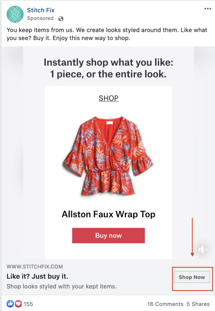
You should absolutely always include a CTA button on your ad campaigns in addition to using a CTA in the headline and/or description copy, too. Users intuitively are more likely to click when they see that button prompting them to take action without even realizing it.
Remember to tailor your CTA based on the ad that you’re running and the stage of the funnel that you’re targeting. Opting for “learn more” for users earlier in the funnel can feel lower-risk and less pressure than starting with a “Shop Now,” but this depends on the ad and the audience.
And if you’re wondering if these CTAs matter, know that they most definitely do. AdEspresso recently ran a $1000 experiment testing different types of CTA buttons on Facebook Ads to see what was most successful – and the result was astounding.
Overall, the top performer (Download) gained 49 conversions for $5.10 each, while the worst performing CTA (no button at all) achieved only 20 conversions at $12.50.
This means that you can end up paying more than twice as much for a conversion depending on the CTA you choose – something we would have never figured out without split testing.
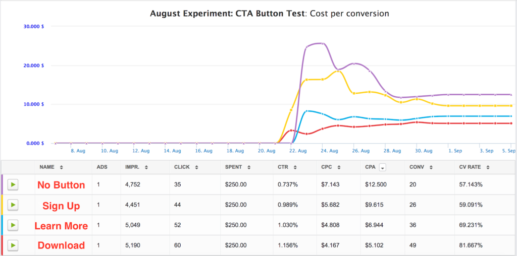
We recommend testing out your CTA buttons using our internal split test engine to see which your audience responds to. This will allow you to test every possible combination of CTAs, and allow you to easily determine which is giving you the most conversions for the cheapest price.
AdEspresso can even automatically pause your underperforming combinations using our Automatic Optimization feature , taking the guesswork out of campaign management altogether.
Your Website & Landing Pages
It’s always a good idea to use clickable CTA buttons to help users navigate through your site and to take certain actions. This is important both for your general website and your landing pages, too.
You can use these buttons to prioritize certain actions or to take users through typical paths that users follow when they’re most likely to convert. (On my site, for example, Google Analytics has shown that people who visit my portfolio page first are 6x more likely to get in touch with me than those who just view my contact page first.)

On landing pages and the home page of your website, you’ll want to make sure that the CTA button meets the following criteria:
- It uses contrasting colors to jump out at the user.
- It’s clearly a clickable button designed to improve navigation.
- It utilizes brief copy on the button itself but is often surrounded by copy that adds context and makes it more persuasive (like the example above).
- It should appear above the fold on the page, meaning that users can see at least one CTA button before they’d need to scroll down to see more information on the page. Make sure you take this into account on both desktop and mobile sites.
When you’re creating landing pages and site pages, remember to test them. Most people don’t realize that you can test site pages just like you would PPC campaigns when you’re using tools like Unbounce . Test different types of CTA copy, different placements, or even different colored buttons. Look for what works best, and optimize your pages accordingly. You can learn more about how to do this by checking out our $1000 case study here .
Save Save Save Save
You may also like reading:
- Social Commerce 101: How to Make Money Selling on Social
- 63 Instagram Caption Examples for 2023 (And How to Write Your Own)
- 15 Fresh Facebook Ad Examples to Inspire Your Next Campaign [2022]
- How to Create a Facebook Business Page (The Easy Way)
February 21, 2018 at 9:03 pm
March 14, 2018 at 1:14 am
What a list! Huge! Thanks for sharing such an incredible list. Either way, keep doing good work!
July 10, 2018 at 2:14 pm
My name is Kevin and I am a Senior Project Manager at IdeaPros, a company that turns ideas into real life businesses – similar to an incubator. Our team consists of experienced professionals, which have the capacity to turn any idea into a successful business. There is one aspect that we are lacking, which is the copywriting and compelling call to actions for landing pages/websites. We need someone that has experience in creating compelling call to actions and copywriting in order to intrigue customers/visitors to purchase a product.
Our company has over 120 clients, which is growing everyday. We are a high-caliber company with constantly growing client list.
We are looking for a marketing professional to refine the copy and call to actions on the websites that we make. From describing the product to creating simple sentences, we need someone to produce this content. There will be numerous projects a week and the work will never end, hence we will negotiate a price that is fair for the long run. Please let me know.
Warm Regards, Kevin Nguyen IdeaPros | Senior Project Manager [email protected]
July 11, 2018 at 11:18 am
Hey Kevin, I think this FREE webinar can be very helpful More Than Words: How To Write the Perfect Facebook Ads Copy It will go live on Tuesday, July 17th, at 10 am (PST). Mark it on your calendar and reserve your spot now by clicking here !
August 9, 2018 at 9:38 pm
Great!! nice to read!! thanks for sharing it Dth Button Bits Exporters
September 15, 2018 at 4:01 am
The information you’ve got shared is extremely attention-grabbing. this may extremely useful for users. Thanks for sharing such a meaty weblog
November 15, 2018 at 9:33 am
Very informative article with good reference. Very useful and informative for front end designers. Keep up the good work.
October 10, 2021 at 2:53 am
Can we have updated version of this article. Web has changed a lot since this was published first. Thanks
November 29, 2018 at 10:44 am
Thanks much, practical suggestions.
December 15, 2018 at 10:28 am
Thanks for the nice article, Ana. Just wondering whether the rules are sort of persisting or a fashion thing. If everyone is doing it the same way, won’t readers get fed up with it and resist the CTA? By the way, Happy New Year!
December 29, 2018 at 3:42 pm
Excellent article! Thanks for sharing exceptional value-added content.
January 8, 2019 at 1:33 am
thanks to sharing this very good article about call to action good examples ..good job
January 8, 2019 at 1:35 am
the wonderful information call to action thank you so much great job thank you
January 16, 2019 at 8:01 am
Thanks for sharing!
January 17, 2019 at 7:29 am
Hi Buddy, thanks for the nice and informational post… Loved it!
February 3, 2019 at 7:29 am
Thank you for sharing this valuable information which is easy to implement.
March 2, 2019 at 4:17 am
Excellent information
April 9, 2019 at 11:45 pm
great post on CTA
April 11, 2019 at 11:53 pm
These CTA examples are very useful.
April 15, 2019 at 10:45 am
Very informative & keep sharing, You are a student and don’t know how to earn? So don’t worry Now, you can Make Money As A Student easily.
April 17, 2019 at 10:09 am
Loved your article!!! Very detail explanation, thanks for sharing the information! I need to try it now 🙂
April 20, 2019 at 4:31 am
I am continually browsing online for ideas that can help me. Thank you! http://rahuldigital.org
April 21, 2019 at 10:48 pm
Nice information. Thanks
April 30, 2019 at 4:41 am
Amazing article – it is good to know, that other websites also name small details as the most crucial ones. We can see, that every step requires personalization, that is the reason why we created unique CTA phrases generator – http://www.ctagenerator.com
July 4, 2019 at 1:36 am
Hey Ana, I want to thank you for shariing your knowledge with us. I really appreciate you for such a great post. You have provided lots of information in an easy and understandable way.
September 20, 2019 at 10:33 am
Thanks for sharing such awesome call to action examples just loved it. definitely going to try these example in our next campagin.
November 9, 2019 at 4:10 am
A call to action is an invitation for a user to take some desired action. You often see call to action examples in persuasive writing. Once a brand has made its case in a blog post or video, for instance, they’ll often include a call to action at the end.
November 30, 2019 at 6:53 am
One of the best uses of FOMO in your CTA is to mention a sale or promotion that your company is holding, and which won’t last forever. You probably get emails with this sort of messaging all the time, I know I sure do. I’m talking about messaging like “Shop today! Sale ends on Monday,” perhaps during a three-day weekend. Or even “buy now while supplies last!” during the holiday season. It’s tough to ignore a prompt like that, especially during a time-sensitive, under-the-gun type of situation (e.g. the Christmas season). Similar to provoking enthusiasm as we discussed earlier, provoking fear of missing out in your CTA is sure to get you some additional clicks.
December 21, 2019 at 2:00 am
Getting the balance of ‘you’ and ‘us’ is important everywhere else in your website (and emails!). (Re #37 above)
January 24, 2020 at 3:14 am
Great post always testing different CTA on both Facebook and Adwords to see what can improve CTR and Conversions. The examples above are highly useful to get me thinking more creatively.
March 7, 2020 at 12:53 pm
Do you have a preferred call-to-action, or perhaps one that surprised you with how well it did? What about one that you were hoping would perform well but ended up bombing? I’d love to hear about it, so feel free to sound off below!
May 20, 2020 at 6:02 pm
I used CRO based CTR label variations with button colors and it helped me to improve leads.
June 7, 2020 at 11:31 am
informative article, thanks for sharing this article.
June 11, 2020 at 10:02 pm
Nice post I learned a lot here thanks.
June 19, 2020 at 2:20 am
Thanks for sharing such awesome call to action examples. you have explained it very will. i have also written on same you can visit my website: Hestabit
July 24, 2020 at 9:01 pm
This list is just what I was looking for. I was in need of a CTA for my ad I was doing so this was timely. Thanks!
January 26, 2021 at 10:38 pm
Absolutely useful article, I’m crafting my first landing page and I so need it.
February 13, 2021 at 2:42 am
You have a very good list of CTA examples here. Thank for working hard to provide these example with great explanations.
May 16, 2021 at 12:51 am
Very much useful article, I have been using this, But in different industries it’s very much useful.
Thanks again.
May 18, 2021 at 6:36 am
Having the right CTA can make all the difference to your business’s bottom line.
May 18, 2021 at 8:23 am
CTAs have always been a weak spot, but this is super helpful. Thanks!
[…] Almost all of your marketing content should have a well-crafted call to actions meant to encourage action. https://adespresso.com/blog/call-to-action-examples/ […]
[…] Call to Action […]
[…] to https://adespresso.com/blog/call-to-action-examples/ you cant just have any call to action, it must be strong enough so people will be convinced enough […]
[…] put a cap on this, without a call to action on your visual content, you risk drawing zero leads to your brand. Your CTA must not be less than three words. Even more […]
[…] 31 Call To Action Examples (And How to Write the Perfect One) https://adespresso.com/blog/call-to-action-examples/ […]
Leave a Reply Cancel reply
Your email address will not be published. Required fields are marked *
Save my name, email, and website in this browser for the next time I comment.
- Work with Us
- Marketing Services
- What’s new
- Facebook Ads Beginners Guide
- Google Ads Beginners guide
From the Blog
- Top Facebook Updates You Can’t Miss (December 2022 Edition)

Call to Action Examples and Best Practices
By David Alex
Download our free workbook and get started on your action plan to launch your business
The email you entered is invalid.
Thank you for subscribing.
By entering your email, you indicate that you have read and understood our Privacy Policy and agree to receive marketing from Squarespace.
You’ve got a great website, brand, and offering, but are you getting the results you want? Is your audience signing up for your newsletter, booking appointments, or buying your products?
A simple tweak to your call to action (CTA) could make a world of difference. For someone navigating an email, website, or social media post, CTAs are points of interest—usually buttons or standout text—to continue their journey.
Here’s what makes an effective call to action, how to write yours, and a complete list of 37 examples to spark your imagination.
What is a call to action?
As the name suggests, a call to action is a way to signal to a user to take some sort of action on a page, such as:
Sign up for a newsletter
Buy a product
Read a blog post
Get a quote
Start a free trial
Book a session
Take a survey
Sign up for something
Book a consultation
Get in touch
Start using a product
In other words, what do you hope they’ll do next from that page, email, or post?
A call to action actively encourages users to engage with your brand or content. It guides them to take the next step, whether that’s learning more about you or becoming a customer.
Without a clear call to action, users might feel confused or unsure how to proceed. That causes people to navigate away, and can be a missed opportunity for building a connection or converting a potential supporter.
How to write a call to action
These simple steps will help you write a great call to action, every time.
Define your goal. For example, “I want to sell more planners.”
Write down what you want your users to do when they land on your page. “I want users to buy the planners we sell.”
Create a simple statement telling your user what to do. “Explore our planners and pick the one you think might work for you. Shop Now.”
Check that this statement aligns with your goal in Step 1 and the desired action in Step 2.
Revise your statement to make it short, clear, direct, and appealing. “Explore our planners. Shop Now.”
A powerful CTA can transform your website into a tool for achieving your business or audience-building goals. With a little practice, you can master the art of writing CTAs that get results.
Here are a few examples of how this applies to different website goals.
Online store: If they’re exploring your products, nudge them to purchase.
Portfolio: If they’re impressed with your portfolio, invite them to fill out an interest form.
Restaurant: If they’re exploring your menu, entice them to make a reservation.
Therapist/Coach: If they’re considering your online session, invite them to book now.
Nonprofit: If they’re moved by your mission, invite them to donate or volunteer.
Local business : If they’re browsing your services, suggest scheduling a consultation.
No matter your business, a strong call to action benefits both you and your customer. The CTA solves their problem, and you gain their business.
Need help writing your calls to action? Try using Squarespace AI to draft a few ideas.
Understand primary and secondary calls to action
Your website should have a clear primary goal. But what if a visitor isn't ready to commit yet? That's where secondary calls to action come in. These are smaller steps that lead toward your primary goal.
For instance, if your primary call to action is "Book a Consultation," secondary CTAs could be:
Watch Video (leads to overview or demo video)
Learn More (leads to description of services)
Contact Us (leads to contact form)
37 call to action examples
Writing an effective call to action isn’t complicated, but it does take some thought. The best approach is to be direct, clear, and concise about what you want users to do.
And yes, a well-structured call to action can go beyond just a button. You can combine a headline, body text, and a button as your call to action. A strong headline grabs the attention of the user, while the description emphasizes the benefits they’ll gain by taking action. Finally, the button is a clear, immediate action to proceed, guiding them toward their desired goal.
37 CTA ideas
Book your free consultation
Get instant access
Book online
Let’s get to work
Work with me
Chat with us
View our gallery
Book reservation
Watch video
Reserve your spot
Browse listings
Join waitlist
Share your story
Install app
See if you qualify
Start today
Download now
Schedule an appointment
Get weekly inspiration
Join our newsletter
Order today
Sign up & save
Donate today
Register now
Discover more
Become a member
Best practices for CTAs
There are a few things to keep in mind to get the best results from your calls to action.
Build trust. Always deliver on the promises you make in your CTAs. Bait-and-switch tactics erode trust and put people off of clicking in the future.
Support your goal with every page and section. Subtly guide users toward your primary CTA, even in unexpected places like your "About" section. Think of it like creating a breadcrumb trail with each section.
Use action verbs. Replace passive language with strong verbs like "Shop," "Vote," "Explore," "Contact," or "Schedule."
Include power words. Use words that evoke emotion: "Exclusive," "Instant," "Free," "New," "Save," and "Enjoy."
Simplicity wins. Avoid CTAs that are overly wordy and complex. Short, direct CTAs are the most effective. Don't make users work to figure out what you want them to do.
Create urgency. Limited-time offers or phrases like "Act Now" can encourage immediate action.
Focus on value. Every CTA should provide something valuable—a solution, information, or an exclusive offer.
Make it irresistible . Does your CTA evoke your visitor’s curiosity? Are they dying to see your latest line or learn the newest trends? Whatever the case, make your call to action irresistible.
Remember to add CTAs anywhere you interact with your audience. Include your call to action on your website , social accounts , and email marketing .
CTA design tips
A strong call to action isn't just about the words, how you use it matters. Follow these key principles to maximize your CTAs' impact.
Be consistent across your site. Use the same primary CTA (and similar button design) throughout your website. Alternative phrasing for the same action is okay, but keep the next step consistent.
Clarity is key. Keep your language concise and easy to grasp. Confusing CTAs lead to inaction.
Design for impact. Use visually distinct buttons, banners, and occasional pop-ups to draw attention to your CTAs without overwhelming users.
Placement matters. Position your primary CTA near the top of the page and make it easy to find throughout your site.
Think mobile-first. More people browse websites on mobile devices than desktops. Make sure your CTAs are large enough to easily tap and that your site functions flawlessly on smaller screens.
By following these guidelines, you'll craft CTAs that effectively guide users towards the actions that help both you and your customers succeed.
Test and optimize with Squarespace Analytics
Analytics can be a goldmine of information for optimizing your CTAs. Just like email analytics can help you learn whether your subject lines are convincing subscribers to open, CTA metrics give you opportunities to improve. Here are some specific ways to use Squarespace Analytics data to make your CTAs more effective.
Track CTA clickthrough rates. See how many users actually click on your CTAs. This is a key metric for gauging their effectiveness. Low clickthrough rates might indicate the need to refine your CTA wording, placement, or design.
Analyze traffic sources. See where your users are coming from— organic search , social media, or paid advertising. This helps you tailor your CTAs to the specific audience you're attracting. For example, if your data shows that most of your users find you through organic searches, go through your site pages to add more CTAs that use your preferred target keywords.
Measure engagement. Track how long users stay on the page after clicking a CTA. This can indicate if your post-click content is engaging and supports the action you want users to take.
Getting users to take action is the key to turning your website into a success.
No two businesses are alike, so don't be afraid to get creative. Experiment with different CTA wording, placements, and designs. Then, track the results to discover which CTAs resonate best with your audience.
With a little effort and analysis, you'll master the art of calls to action and transform your website into a powerful tool for growth.
Ready to try CTAs for your audience?
Posted on 09 May 2024
Related Articles
Create an Effective User Experience and Calls to Action
By Nick Mitchell
10 Feb 2022
Welcome Email Examples and Best Practices
By Amanda Shih-Goel
17 Jan 2024
Subscribe to receive the latest MAKING IT blog posts and updates, promotions and partnerships from Squarespace.
By providing your email, you indicate you have read and understood our Privacy Policy .

Due to recent expansions in US sanctions against Russia and Belarus as well as existing country-level sanctions in Iran, North Korea, Syria, Cuba, and the Crimea region (each a “sanctioned country”), Zapier will no longer be able to provide services in any sanctioned country starting September 12, 2024. These sanctions prohibit US companies from offering certain IT and enterprise software services in a sanctioned region.
Starting September 12, 2024, Zapier customers will no longer be able to access Zapier services from a sanctioned country. We understand this may be inconvenient and appreciate your understanding as we navigate these regulatory requirements.
41 call to action examples: How to write compelling CTAs

Here at Teachable, we’ve seen a lot of call-to-action examples, so we know a good one when we see one. You can have the most well-thought-out course content and a beautiful presentation, but without compelling calls to action (CTAs) consistent across your marketing campaigns and channels, all your effort runs the risk of not gaining any traction. To support your small business, we’ve created some helpful copywriting tips, plus rounded up some of the most effective CTAs, to keep your audience engaged and your click-through rates high.
What is a call to action (CTA)?
According to Bryan Eisenberg and Jeffrey Eisenberg, authors of Call to Action: Secret Formulas to Improve Online Results (2006), the call to action definition is “a hyperlink that moves your visitor through your sales process.”
This word or phrase tells your target audience what you want them to do (or, if you’re really strategic, what they want or need) and inspires them to act—perhaps by buying digital products , scheduling an appointment, or signing up for a course.
Often, this kind of call for action is represented on a CTA button, which adds a visual emphasis to the hyperlinked text, draws attention, and makes it more clickable.
How to write effective CTAs to increase conversion rates
It’s important to know where you want to go—or rather, where you want your audience to go—so you can show them how to get there. What is the desired action you would like your audience to take when they encounter your:
- Social media post?
- Newsletter?
- Pop-up box?
- Website homepage?
- Specific landing page?
- Product page?
- Blog posts?
It might seem pretty basic, but start from where you’d like them to go and work your way backwards. To do this, it’s important to consider your marketing funnel . Rather than pointing them in many different directions, what is the ultimate action you want them to take? From there, you can start to funnel them in. Consider this general marketing funnel example: social media > lead magnet > newsletter > website or landing page
Calls to action can be found on each of these digital assets. While some CTAs might be the same or very similar, more often than not CTAs will differ depending on where they live in your marketing funnel. For instance, with this funnel example, your social media CTA would direct your audience to your lead magnet, perhaps a newsletter sign-up or pop-up, while your newsletter CTAs would direct your audience to your website to sign up for a course or purchase digital products.
Meanwhile, there can be many different CTAs throughout your website, pointing site visitors to different sections and pages. You can also monetize a blog by embedding different CTAs throughout your posts. On a sales landing page design , on the other hand, it’s a good strategy to have the same CTA repeating to close the deal, or reinforce the action you want the visitor to take.

The three essential ingredients for an effective CTA are: value proposition, urgency, and clarity. Another way to look at these three elements is what, when, and how:
- (WHAT) Value proposition: what are you offering, and does your audience care about it?
- (WHEN) Urgency: why should they click on it now (rather than later, when they are likely to forget about it)?
- (HOW) Clarity: how is this offer delivered? What exactly will they get when they click on CTA?
Tips for writing compelling CTAs
Tip #1: Keep it simple
Be short and sweet. You don’t have to have all of the elements mentioned above in your CTA. In fact, the more concise you can keep your copy, the better. A lot of the information can be inferred from your supporting text, for instance in your header and descriptions. The more you can say in fewer words, the better.
Tip #2: Be (pro)active
Active verbs are ideal because the action they’re prompting is very clear. If it’s not clear where a CTA button or link is taking you, visitors are less likely to click on it. Meanwhile, a good CTA will anticipate your audience’s wants or needs. For this reason, many marketers suggest writing in the first person (“Sign me up” rather than “Sign up”). To take it even further, try to weave in power words that elicit an emotional or psychological response whenever possible.
Tip #3: Create a sense of urgency
An obvious way to do this is adding “now” to the end of a CTA (i.e. “Sign up now”). Depending on where your CTA will live, however, you might also add in an expiration date or limited availability verbiage. For instance: “Use code XXXX for 50% off thru Thursday,” “Claim your rewards before they expire,” etc.

Tip #4: Add a personal touch
When copywriting your CTAs, keep your personal branding in mind. Consider what your typical tone of voice is. How do you talk to your audience? How do you want them to feel when they engage with your brand? Maybe you’re big on puns or word play, maybe you like to highlight your values and customer service, and maybe you’re somewhere in between. Whatever your brand voice is, CTAs are an extension of it and an opportunity to write creatively (and persuasively) .
Tip #5: Give a choice
Two is better than one: having two CTAs can keep your audience engaged longer by offering two different experiences. A common example of this is with a subscription service or app. Visitors can choose to pay for enhanced features or use the free version. If you have the tech resources, you might also consider testing out different CTAs via A/B testing to see which resonate with your target audience more.
Tip #6: Make a list
As a creative writing exercise, list out as many potential CTAs as you can. You can even time yourself (to add urgency!). Research shows that your first headline is never the best option, but if you make a list of potential headlines, you’re bound to generate more compelling ones. The same can be true with CTAs. We’ve gotten you started with 41 tried-and-true call to action examples. See how many more you can come up with.
Social media call to action examples
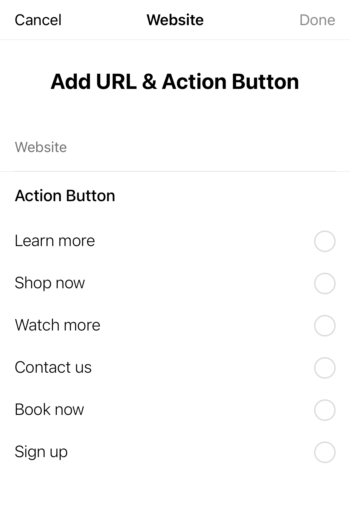
If you are creating a paid ad on Facebook or Instagram, CTAs are pre-selected. If your goal is to direct users to your website, the CTAs you can choose from are: Learn more, Shop now, Watch more, Contact us, Book now, and Sign up.
However, if you are simply posting to direct followers to your website or lead magnet, you can get creative and weave CTAs into your caption. For instance, if you mention at the end of your caption, you might say something link:
- Click the link in bio to claim your free <lead magnet, such as offer, resource guide, etc.> by Wednesday!
- Check out the link in my bio to…
- Click the link below to…
- Check out the link below for…

Website and landing page call to action examples
Generally, a website will have many different CTAs because different sections of your website will highlight different information. This is especially true on different landing pages. Website CTAs might include:
- Shop [now] >
- Learn more >
- Discover more >
- Explore [now] >
- Browse [now] >
- Get started [now] >
- Get gifting >
- Save my [alt: your] spot >
- Add to cart >
- Get my quote >
- Start free trial >
- Schedule a complimentary call >
- Download [now] >
- Continue >
- Meet the founder >
- Book now >

Pop-up call to action examples
Your pop-up is generally where you offer lead magnets , free resources or pieces of content you offer in exchange for website visitors’ email addresses. Or, it might simply be a place for list building . Here are some examples:
- Subscribe [now] >
- Submit [now] >
- Register [now] >
- Sign up [now] >
- Sign me up >
- Add me to the list >
- Get on the waitlist >
- Get my [alt: your] results >
- Be the first to know >
- I want in >
- I’m in >
- Join the club >
- Claim my [alt: your] offer >
- Reserve my [alt: your] spot >

Email CTA examples
Depending on the content of your newsletter, many of the above CTAs can be used in newsletters as well. That said, if you have a regular newsletter schedule (and you should!), you won’t always need your CTAs to be part of a funnel or sales strategy. Instead, you’ll want to come up with creative ways to keep your audience engaged.
“Even when you’re not writing to sell or promoting anything, give your readers something to do,” explains Laura Belgray , copywriter and founder of Talking Shrimp. “People love to be helpful, and they love to engage. The more they interact with you and your emails, the stronger a connection they’ll feel.” She suggests CTAs such as:
- Check out this podcast I’m loving.
- Are we connected on Instagram? Come find me there.
- Hit reply and tell me ____.
- What’s your biggest struggle when it comes to ____?
- Whenever you’re ready, here are 3 ways I can help you.
- Got questions about this? It’s our specialty. Hit reply and ask away.
What is an example of call to action?
The CTA meaning is call to action, and it’s “a hyperlink that moves your visitor through your sales process,” according to Bryan Eisenberg and Jeffrey Eisenberg, authors of Call to Action: Secret Formulas to Improve Online Results (2006). A CTA is generally a button or link that motivates someone to take action during a marketing campaign. Call to action buttons can be found on websites or landing pages, newsletters or email marketing, social media posts, and more. Some of the most common call to actions include “shop now,” “add to cart,” “learn more,” “sign up,” etc.
What 3 elements should be in CTA?

Katie Davidson , Katie is a freelance writer, copy coach, and certified yoga teacher currently based in California. Her work has been published on ELLE.com, InStyle.com, StyleCaster.com, and more. She has also been featured as a yoga expert on POPSUGAR Fitness. When she's not writing (or practicing her handstands), you can find her somewhere on a beach, cacao-chai latte in hand, with her beloved pup Toby.
Related articles

Create and sell anything Teachable
30M+ products have been sold on Teachable. Ready to launch yours?

IMAGES
COMMENTS
The following are the most common CTAs you'll see in marketing. Direct Action CTAs such as "Buy Now" or "Sign Up Today". Informational CTAs like "Learn More" or "Read the Guide". Social sharing CTAs such as "Share With Your Network" or "Repost". Feedback CTAs like "Leave a Review" or "Take a Survey".
4 call to action examples in persuasive writing. 1. Getting doers to do something. Doers are the worker bees of an organization. They are the ones that hear what needs to get done — and then do it. Doers don't shy away from physical tasks, and have the ability to round up the troops to inspire action in others, as well.
More Call To Action Examples. Here are some twists on classic calls to action. I can't say I'd never seen these types of tactics before, but the following examples are well done. The call to action text speaks to the audience, aligns with the brand image, or is simply more inviting than a generic "Try Now" button. Kati Curtis Design
For example, a call to action can encourage people to click on a link, leave a social media comment, visit an online store, make a purchase, etc. A call to action can take up different forms: Text link. Button. Plain text with no link. "Buy Now" or "Download Now" are typical examples of simple calls to action.
Or if not, the creativity of the no button at least gives you a memorable impression of that brand. Let's take a look at some examples. 22. No, I don't want to grow my business. This "no" call to action button is pretty standard. "No, I don't want to grow my business" is a good way to imply the value of the offer. 23.
Call-to-Action Example #21: Google Drive. Google uses a simple landing page to welcome users to their Google Drive app. They use a clear benefit oriented headline which states "A safe place for all your files", combined with an easy to follow CTA that says "Go to Google Drive".
These simple steps will help you write a great call to action, every time. Define your goal. For example, "I want to sell more planners.". Write down what you want your users to do when they land on your page. "I want users to buy the planners we sell.". Create a simple statement telling your user what to do.
Let's dissect some real-life CTA examples to learn how to use strategic copy, design, and placement to transform an ordinary CTA into a magnetic, can't-resist-clicking force. 1. JD + Kate Industries. CTA placement: Exit intent popup.
Review these steps to write an effective call to action that drives sales and customers to your brand: 1. Use action verbs to begin your call to action. You want to use the verbs that match the action you want potential customers to take. If you're posting on social media or ads to be shown on search engines, you need to be even more concise as ...
A CTA is generally a button or link that motivates someone to take action during a marketing campaign. Call to action buttons can be found on websites or landing pages, newsletters or email marketing, social media posts, and more. Some of the most common call to actions include "shop now," "add to cart," "learn more," "sign up ...